The Midlife Crisis
-
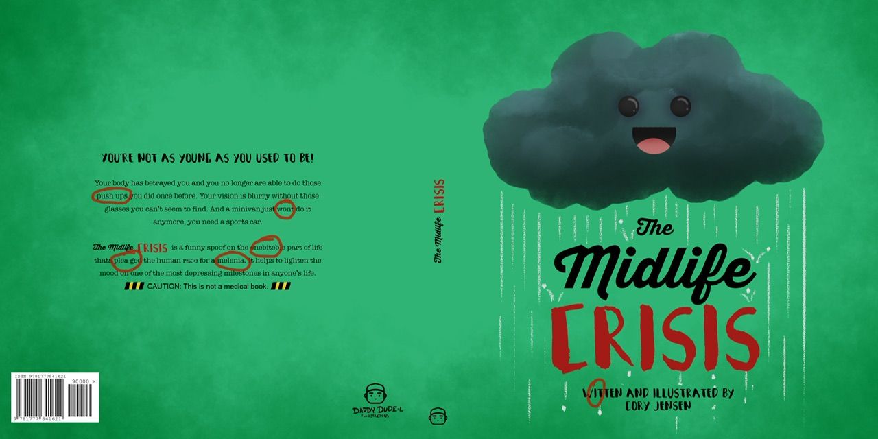
@Kori-Jensen oooh I really love that color! But it might be just me. I’m curious what everyone else thinks? @Chantal-Goetheer @Asyas_illos @Nyrryl-Cadiz
-
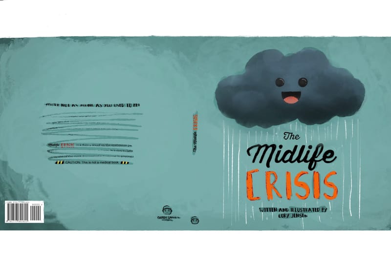
@Kori-Jensen this color is much more better! The green was bit too saturated
-
@Kori-Jensen I think you could go even lighter to separate values a bit more between the cloud and the background.
-
@Kori-Jensen this just me but I really liked that initial green bg
Portfolio: nyrrylcadiz.com
Instagram: https://www.instagram.com/nyrryl_cadiz/
YouTube: https://www.youtube.com/channel/UCbJCF1Im8ZO7hpGWTKOJMuA -
@Asyas_illos really? I like the melding of Gloomy and the backdrop. makes it look like he is part of the sky

-
@Kori-Jensen
I like what you've done.
I would go over your back cover summary again though as there are some spelling and grammatical errors. -
-
@Nyrryl-Cadiz I like the green more too. I love bright saturated colours
 . Pops out more.
 -
@AngelinaKizz This is just a concept and should not be taken as a final arrangement
-
@Chantal-Goetheer Thank you for your help I really appreciate it
-
@Jeremy-Ross LOL yah I think someone has mentioned it already, I have a couple of awesome language specialists living in my house. This is more for the concept
Thank you so much -
@Asyas_illos I also like this lighter version so the cloud pops more.
-
No worries, @Kori-Jensen - we’re here to help!
I thought it was final based on your post and with the barcode in all.
-
@Jeremy-Ross nope still editing i just wanted to know what people thought of the concept