Society of Visual Storytelling

    SVSLearn Forums

    • Register
    • Login
    • Search
    • Recent
    • Tags
    • Popular
    • Users
    • Groups
    • Search

    Book cover designs... Which one?

    Projects
    15
    32
    1732
    Loading More Posts
    • Oldest to Newest
    • Newest to Oldest
    • Most Votes
    Reply
    • Reply as topic
    Log in to reply
    This topic has been deleted. Only users with topic management privileges can see it.
    • kirsten-mcg
      kirsten-mcg @ajillustrates last edited by

      @ajillustrates these covers have been on my illustration "to do" list for a long time now. I'm planning on doing covers for at least 3 of the books. The chronicles of narnia were what started my love of all things fantasy. Thanks for the dragon idea!

      Instagram: https://www.instagram.com/kirsten.mcgonigal.art/
      Portfolio Site: www.kirstenmcgonigalart.com

      1 Reply Last reply Reply Quote 1
      • Kim Rosenlof
        Kim Rosenlof @kirsten-mcg last edited by Kim Rosenlof

        @kirsten-mcg I haven't read this book (I have only read the first two in the Narnia series), so I am not sure of the story. I like 1, 3, and 4 for different reasons. I like number one because of the mouth (teeth at top, at least I think those are teeth) and the close-up of the middle character. The mouth makes me want to know what is going on. I would move the middle character closer so that you aren't cutting off his feet; maybe cut him at the waist instead. I like the clouds in number 3 and how the boat peeks out and the text would fit well between everything. Number 4 is the only non-central composition so that is nice. It might be nice to see some part of a sail too. Is the mouse a central character and more important than the humans, or just as important in the story?

        Instagram: https://www.instagram.com/kiminyrose/

        kirsten-mcg 1 Reply Last reply Reply Quote 1
        • MiaNova
          MiaNova @kirsten-mcg last edited by

          @kirsten-mcg love the environment of 3 but 4 is also really good 😃

          1 Reply Last reply Reply Quote 0
          • Asyas_illos
            Asyas_illos last edited by

            2 and 3 are my favorites, I like the second over the first as it feels less crowded. 3 has a nice composition too.

            Asyasewardillos@gmail.com
            www.Instagram.com/asyas_illos/
            https://asyasewardillos.wixsite.com/mysite

            1 Reply Last reply Reply Quote 1
            • kirsten-mcg
              kirsten-mcg @Kim Rosenlof last edited by

              @Kim-Rosenlof Thanks for your input! The mouse is a central character, but not the main character, so it might be a little odd to have him the only one pictured large on the front cover. He's most people's favorite character though!

              Instagram: https://www.instagram.com/kirsten.mcgonigal.art/
              Portfolio Site: www.kirstenmcgonigalart.com

              1 Reply Last reply Reply Quote 1
              • Blitz55
                Blitz55 last edited by

                I like #3
                I kind of like it when the characters are not front and center and it's more about the mood and location. 🙂

                Draw, Draw, Draw, Draw and Draw Some More!
                Instagram: https://www.instagram.com/levisimpson55/

                1 Reply Last reply Reply Quote 1
                • kirsten-mcg
                  kirsten-mcg last edited by

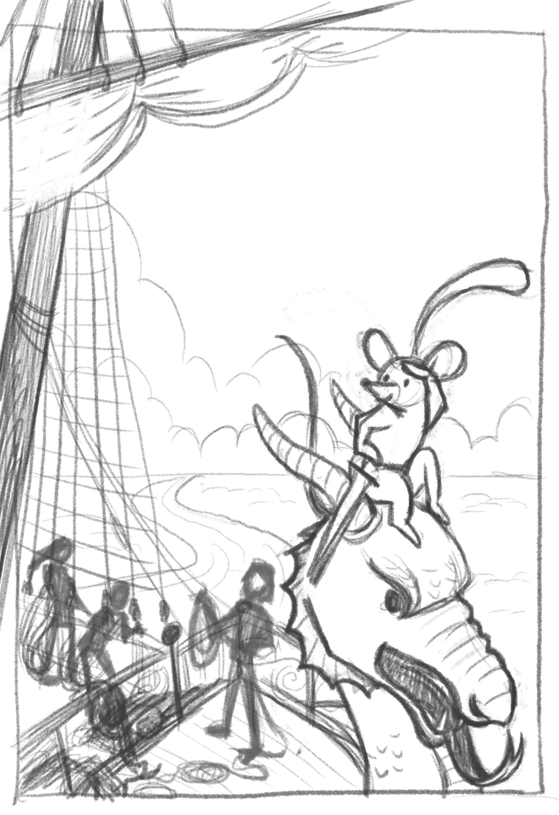
                  @ajillustrates @Chantal-Goetheer @NessIllustration @Mia-Clarke @ArtistErin @Kim-Rosenlof @MiaNova @Asyas_illos @Blitz55 This is the one I’ve decided to go with. I was still undecided after getting everyone’s opinions, so I asked my 12 and 14 year old sons which book they would like to read the most and they both picked this one! I figured that was a pretty good indicator that I was onto something here. I’ve flipped the image around and made a few more changes. Looking at it now I realize the perspective on the mast is completely wrong, so I’ll definitely be fixing that. Any other critiques or things I’m missing?0E813595-5AA1-462E-80CD-7D4A0BF56183.jpeg

                  Instagram: https://www.instagram.com/kirsten.mcgonigal.art/
                  Portfolio Site: www.kirstenmcgonigalart.com

                  ArtistErin Chantal Goetheer Mia Clarke ajillustrates G 5 Replies Last reply Reply Quote 5
                  • ArtistErin
                    ArtistErin @kirsten-mcg last edited by

                    @kirsten-mcg This is a cool redesign so far! I love the dragon and the way the mouse is "eyeing" his next adventure. Yes the perspective on the mast you'll figure out. The rest is spot on from what i can see. 🙂

                    Erin Richardson
                    instagram.com/erinrichardsondesigns21
                    www.erinrichardsondesigns.com

                    1 Reply Last reply Reply Quote 0
                    • Chantal Goetheer
                      Chantal Goetheer @kirsten-mcg last edited by

                      @kirsten-mcg I agree what @ArtistErin says. It looks great and can't wait to see the next step of this cover.

                      1 Reply Last reply Reply Quote 0
                      • Mia Clarke
                        Mia Clarke @kirsten-mcg last edited by

                        @kirsten-mcg Looks good, go for it!

                        www.miaclarkeart.com
                        https://www.instagram.com/miaclarkeart/

                        1 Reply Last reply Reply Quote 0
                        • Tom Harshberger
                          Tom Harshberger last edited by

                          I like #1 as it hits a ton of different things in one piece. I just recently read through Will Terry's '100+ things to put in a portfolio' off the show notes on the 'Building a Strong Portfolio' episode. With all that's going on in #1, it's a great way to show off a lot of different looks!

                          instagram.com/tomharshberger.art

                          kirsten-mcg 1 Reply Last reply Reply Quote 1
                          • ajillustrates
                            ajillustrates @kirsten-mcg last edited by

                            @kirsten-mcg I really like where this is going! My only note at this time is that between the feather in his cap, the dragon head and its tongue, and the mast crossbar, there are quite a few leading lines moving the eye off the cover. You could balance that out by turning the feather around to point inward, which would give you the added bonus of having it overlap or interact with the title desgn.

                            https://ajillustrates.com
                            https://www.instagram.com/aj.illustrates/

                            kirsten-mcg 1 Reply Last reply Reply Quote 2
                            • kirsten-mcg
                              kirsten-mcg @ajillustrates last edited by

                              @ajillustrates Good point! Thanks

                              Instagram: https://www.instagram.com/kirsten.mcgonigal.art/
                              Portfolio Site: www.kirstenmcgonigalart.com

                              1 Reply Last reply Reply Quote 0
                              • kirsten-mcg
                                kirsten-mcg @Tom Harshberger last edited by

                                @Tom-Harshberger That's a good thing to keep in mind! Thanks for the reminder. This is just the first of a book cover series I'm planning to do, so I might actually end up using that same design for another book. 🙂

                                Instagram: https://www.instagram.com/kirsten.mcgonigal.art/
                                Portfolio Site: www.kirstenmcgonigalart.com

                                1 Reply Last reply Reply Quote 0
                                • G
                                  GabeRobinson @kirsten-mcg last edited by

                                  @kirsten-mcg I really agree with your sons--I was into your other designs, but this one really does a lot more! I like how it includes both Reepicheep and the humans and you can clearly see it's a ship and it's an interesting angle. Nice!

                                  1 Reply Last reply Reply Quote 1
                                  • kirsten-mcg
                                    kirsten-mcg last edited by

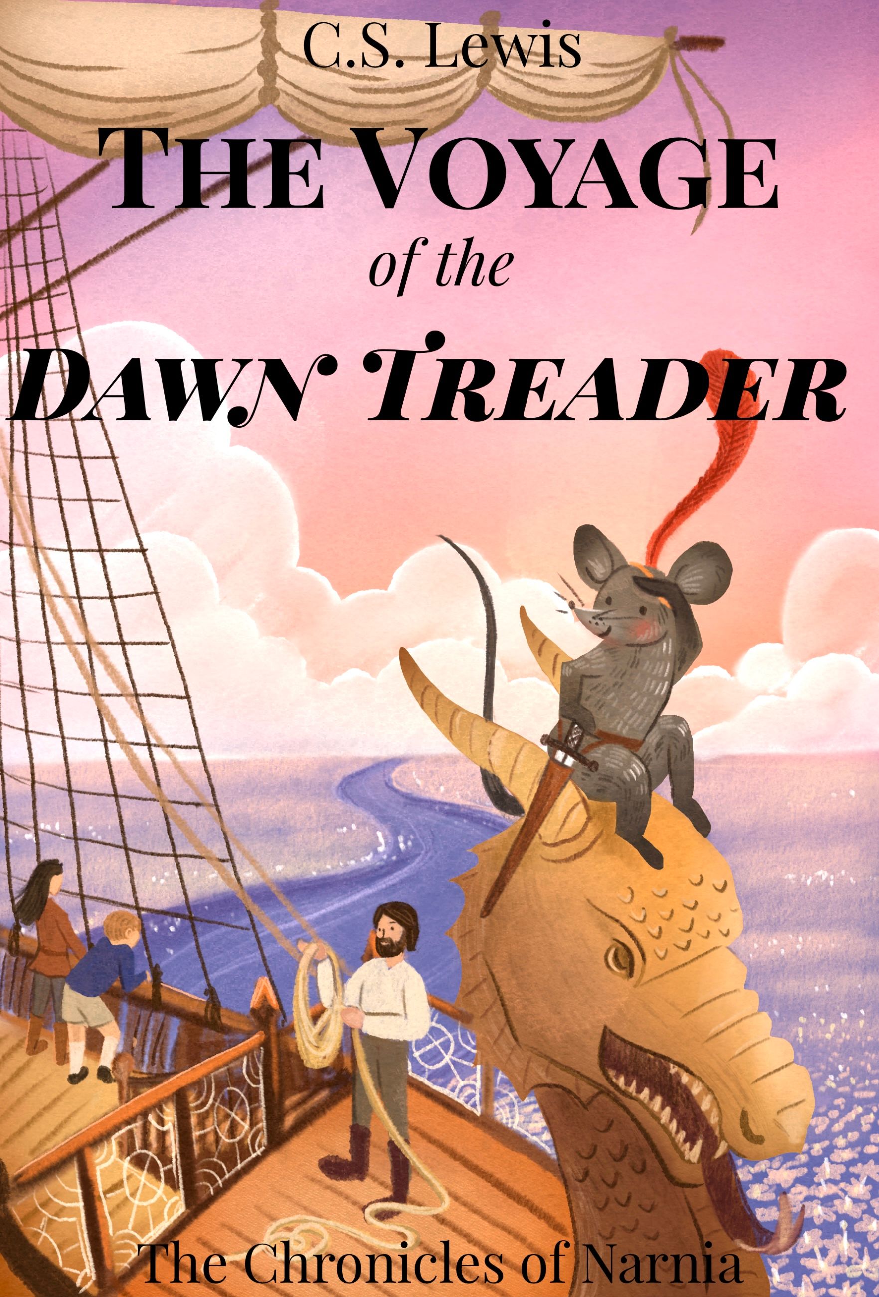
                                    I’m at the point where I’m tired of looking at this one, so I’m going to call it done for now! 170B2F23-DEEC-41DC-ADE7-821CABBB13DE.jpeg

                                    Instagram: https://www.instagram.com/kirsten.mcgonigal.art/
                                    Portfolio Site: www.kirstenmcgonigalart.com

                                    Mia Clarke Nyrryl  Cadiz ajillustrates 3 Replies Last reply Reply Quote 8
                                    • Mia Clarke
                                      Mia Clarke @kirsten-mcg last edited by

                                      @kirsten-mcg Oh, I love it, it’s so good! Beautiful work, Kirsten! 👏👏👏 This will make a wonderful portfolio piece.

                                      www.miaclarkeart.com
                                      https://www.instagram.com/miaclarkeart/

                                      kirsten-mcg 1 Reply Last reply Reply Quote 1
                                      • kirsten-mcg
                                        kirsten-mcg @Mia Clarke last edited by

                                        @Mia-Clarke thank you!

                                        Instagram: https://www.instagram.com/kirsten.mcgonigal.art/
                                        Portfolio Site: www.kirstenmcgonigalart.com

                                        1 Reply Last reply Reply Quote 0
                                        • Nyrryl  Cadiz
                                          Nyrryl Cadiz SVS OG @kirsten-mcg last edited by

                                          @kirsten-mcg looking good!

                                          Portfolio: nyrrylcadiz.com
                                          Instagram: https://www.instagram.com/nyrryl_cadiz/
                                          YouTube: https://www.youtube.com/channel/UCbJCF1Im8ZO7hpGWTKOJMuA

                                          1 Reply Last reply Reply Quote 1
                                          • blackhound rise
                                            blackhound rise @kirsten-mcg last edited by

                                            @kirsten-mcg I like all of them but mostly 1 and 3. they both give me an Escaflowne vibe. is this part of a marketing strategy as well? i don't know the story or target audience but i feel 1 will be catchy to young kids and still captures the fantasy visual and 3 has the mystery of who are the characters, how do they look? and what world is this.

                                            kirsten-mcg 1 Reply Last reply Reply Quote 1
                                            • First post
                                              Last post