SVS Virtual Studio FEBRUARY 2023
-
@Sarah-VanDam I Love this so much!! Such great movement and line. I think the second one is better, the direction of the flow of gesture makes better sense reading it from left to right, and the blue hue in the background makes the image pop. Beautiful work

-
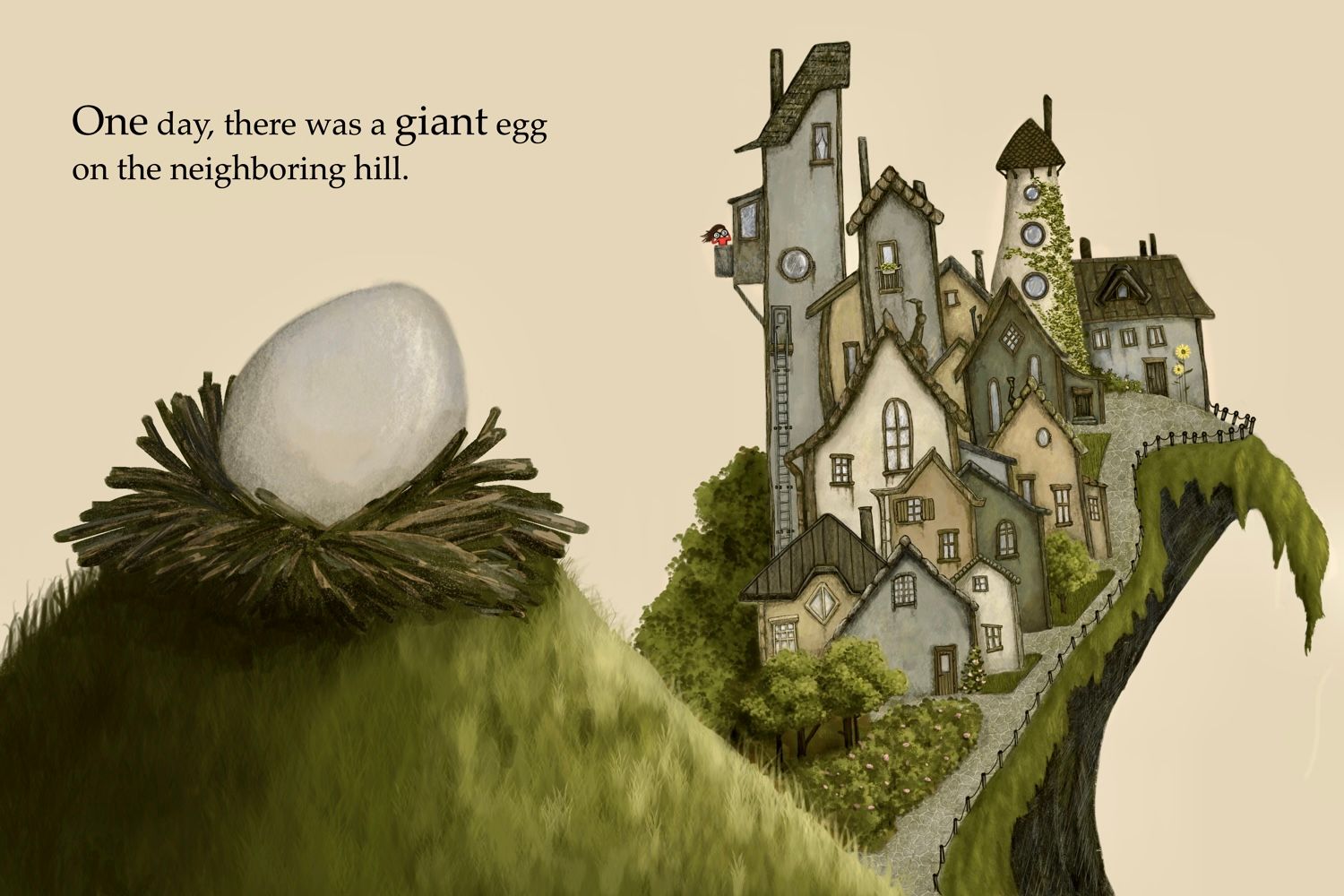
This took me forever, but I really enjoyed doing it. It's the opening spread for a dummy I'm working on.
-
@Sarah-VanDam Love these - so whimsical and beautiful too. The second one (right) for me. Combo of the colouring and composition makes it more eye-catching, for me at any rate!
-
@Sarah-VanDam wow this is great! I love it. I also like the one on the right the most.
-
@Mia-Clarke I am intrigued
-
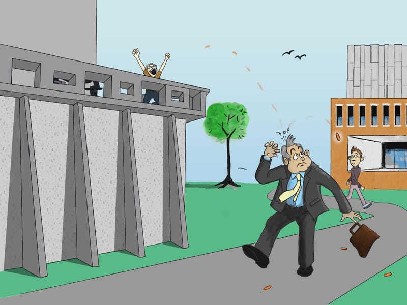
I was trying to think of something to draw and remembered a story an unnamed host told on the Three-point Perspective podcast about throwing carrots (or something) down on unsuspecting pedestrians below him. I couldn't find the episode again, so I'm just going from memory. I thought it would be a fun story to try to illustrate.
-
@Christijan at first I thought they were NERF bullets but carrots make sense
 .
. -
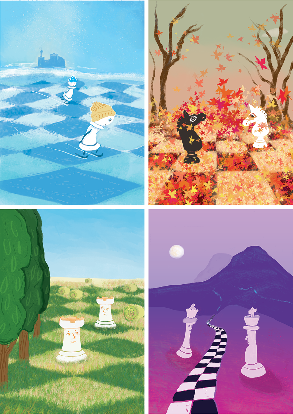
Four chess certificates to be handed out at junior school chess tournaments throughout 2023. Client logo and certificate info removed.

Looking at it, it's way too colourful (they are all conforming to colour themes requested by the client - blue, orange, green and purple for different award streams) but I've made a promise to myself to share my work here and remember it's all part of a journey towards becoming a better illustrator!
-
@von_Nimmermehr it looks great!! And a great career path, teaching. Keep up the writing next to the studying and illustrating. It makes a perfect combination.
-
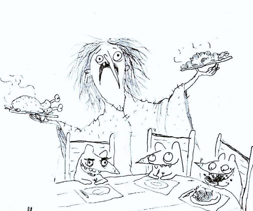
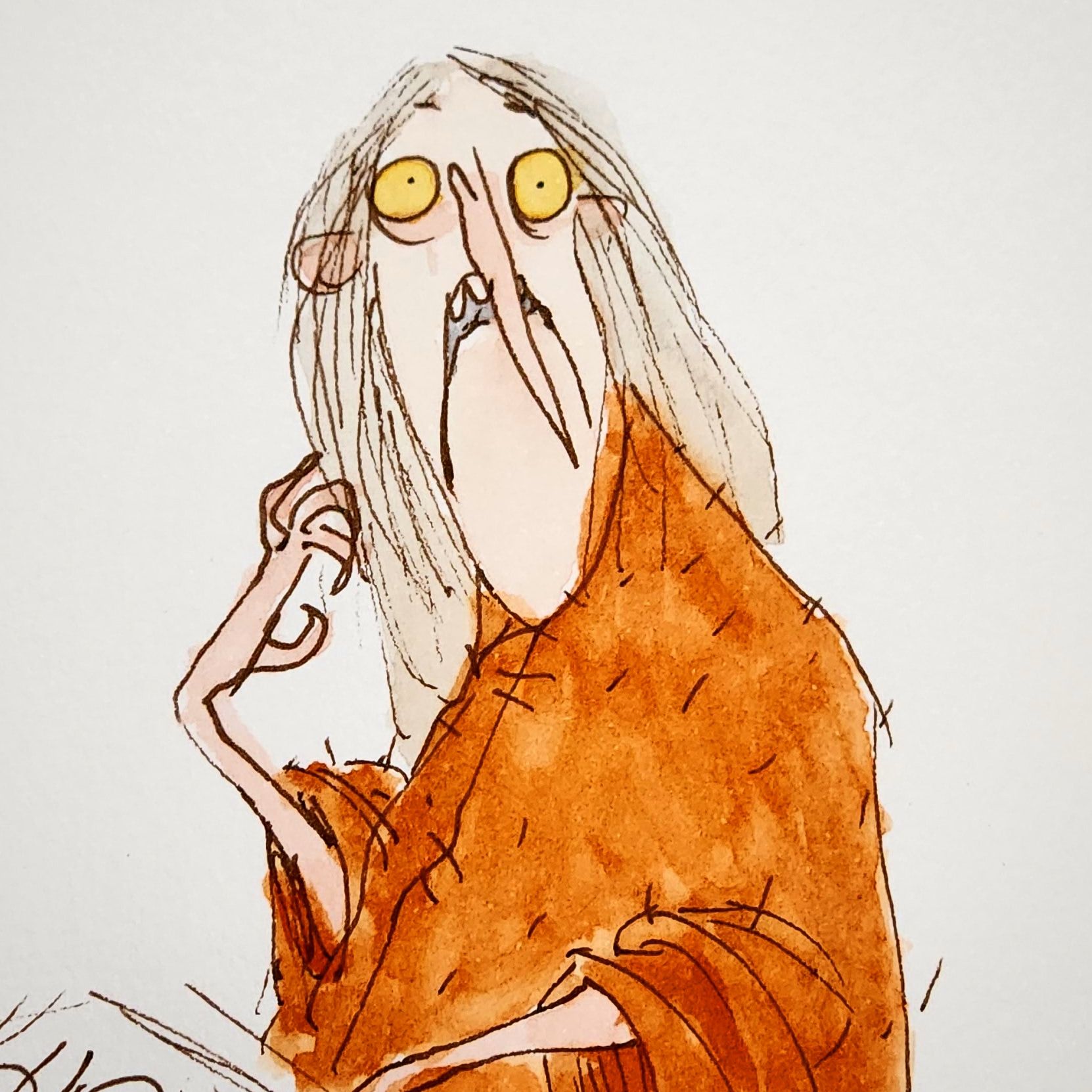
More Garden Witch -
@Sarah-VanDam this is beautiful!. I think I like the one on the right a little more.
-
@Mia-Clarke
The little town on the hill looks so cute! I love all the different houses. -
@Christijan LOL I remember that episode! And yes, I think they were carrots.
-
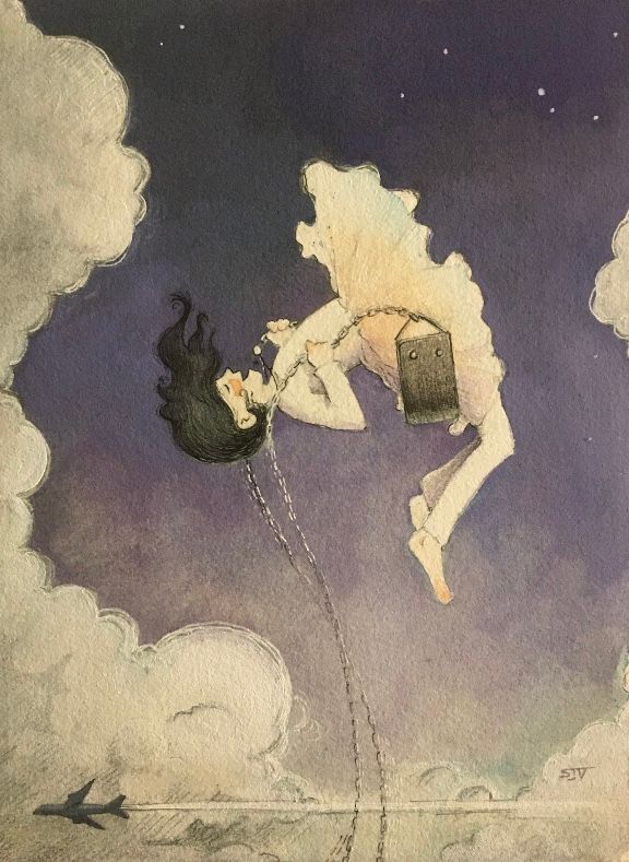
@Sarah-VanDam Okay, actually NOW this is done. Haha. STILL wasn’t entirely satisfied.
-
@Sarah-VanDam So cool! I am just wondering what the story is, and your process... obviously it's watercolor and colored pencil, am I right? I love the contrast and movement, the expression on the girl's face! Just wondering what the plane is about. And what is she holding?
-
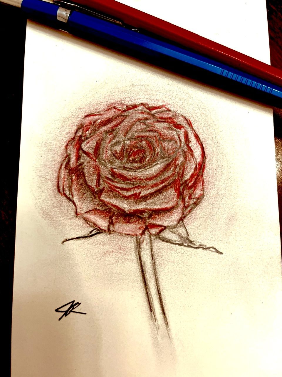
Happy Valentine’s Day!
I did a Timelapse on IG if you’re interested in seeing
 ️
️
-
@Sarah-VanDam love the plane and the girl swinging so high that she's meeting the planes! Love the dress looking a bit like a cloud and the arch of her body.
-
@ArtistErin I also wondered for a bit what she was holding. I thought it was a handbag at first! But it's a swing she's sitting on. Interestingly enough, I've been working on something similar for a story my husband wrote a few years ago. Very different styles though.

It does make me wonder whether perhaps the drawing of the swing seat/her dress needs to be adjusted a little so that it's clearer she's sitting on it.
EDIT: other than a slight adjustment to the angle or shape of the seat and dress, I wouldn't change a thing about this drawing. Love her stylised elongated body, slightly exaggerated position and the little aeroplane flying below. It's a beautiful work of art.
-
@ArtistErin Hi Erin!! Thanks so much for the feedback. It’s kind of a weird mix of watercolor, pencil, micron pen, white gel pen, and white acrylic paint. I went over the sky again with a mixture of the acrylic and purple watercolor.
This illustration was originally part of a contest I had against AI art, and also used it as practice for making a video. Here’s a link if you’re interested: https://www.youtube.com/watch?v=OPHg29B3DGs&t=41s
The prompt I came up for this piece is “A child bursts through the tops of cumulus clouds on a playground swing,” so my intention was to show this little girl high up in the clouds holding on to the chains of the swing. She also has a necklace on that’s suspended in the air. The plane is just for context to show just how high she is. I didn’t like my original outcome, so I just wanted to keep trying until I was satisfied with it.
So, that said, what’s working, and what doesn’t?
Also, awesome work on your website!!! I saw the thread for that, but haven’t responded yet. Would you like some of my more nuanced thoughts on that? Anyways, way to go. I think I need some feedback on my website, too.
-
@Sarah-VanDam @Sarah-VanDam Oh!! I get it now
 It's reminds me of the vintage illos in classic literature, reminiscent of some of the original Dutch illustrators, I absolutely LOVE this look. SOOOO GOOD!!
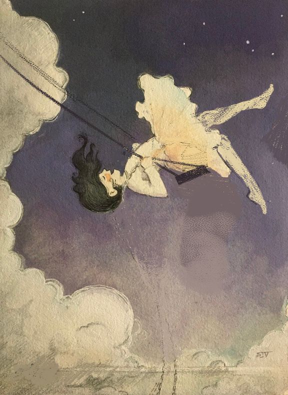
I did a draw over here, just a simpler approach and for sure you'd have to adjust the details to match the rest of your piece. And, of course, I only intend to help and so all advice or suggestion is merely what I would do, so hopefully I don't offend!
I studied the proportions of the girl I noticed her legs were unnaturally long, and angled back too far. If you look at the way people swing, when they are on the "upswing" they are pointing both feet or at least one, to show they are moving up or even coming back down. I also changed the of the chain so it looks more like there is tension in her holding herself on this structure, so let me know your impression of this. I also understand why you made the chain come from the bottom to show she is really up there however that seemed like she was dangling unnaturally and it wasn't believable enough to look like a swing so I moved it to a position that makes it more believable, you could create something like the swing is fixed on a cloud or a moon? I also took out the airplane because it seems out of context and unnecessary, since you have clouds, which demonstrates showing how high she is swinging. Anyway, the basis you have started is in my opinion a portfolio worthy piece!
I commend you in the traditional techniques. Hands down the best, I feel, especially in this digital world with AI and all that stuff! I wrote to another artist on IG and commented on how her colored pencil inspires me to go back to my pencils, and she said "Do it!" So I will... I keep reading about gouache and have never worked with it so that will be my next task. Thank you as well for the inspiration!

I would love your feedback on my website!
Some things I am planning on fixing :
- My brother is an excellent photographer and when I can get to Ft. Collins to see him he is going to set me up with some good clear photos.
- I am adding more images of kids with adults, in varying emotional situations.
- More scaled pieces with top-view angles and worm's eye perspective.
- A black-and-white/sketchbook section
- Traditional pieces, with full bleed images. I have yet to learn how to convert traditional media into digital files without changing the natural component. Recently I tried scanning in some stuff and I didn't like the way it came out digitally. I end up cleaning it up too much and when I did that it lost its organic natural appearance. I would like to know how you achieved this!!!!
- Book Covers
- The mobile app is strange when scrolling through the gallery, for some reason my name hangs on some of the art for a second. I need to adjust how it scrolls.
- I want to work my name in hand-illustrated text, with color. I love the vintage lettering in pen-and-ink, with either gouache or watercolor... so my branding is going to evolve in this direction somehow.