Critiques Please! Assignment #2 - Developing Great Visual Stories
-
If it is necessary that the cake is BURNING, it would be necessary for me to show also fire coming out of the mouth of the dragon, to tell visually: "This is where the fire on the cake is coming from."
Or the whole world aroung is also burning, but this would make it unnecessary to show the cake burning.It could also be ruined because panicing people run it over, woudn't it?
So maybe everything else in on fire, but the baker doesn't recognize it because of the cake. To me this would also make sense regarding color choices: "Sadness" is "colorless" for me, so a bright flame would not fit.
If everything around is colorful and only cake and baker are mutet, this also tells about his emotions.I agree on @Geoffrey-Mégardon that it would be interesting to try out more dynamic perspectives.
To me your first two thumbs are not working as good as the third one, as it really IS important to show the dragon and the other people and in the first twei thumbs they are simply not taking enough space to be visible enough.
-
@MimiHecher you make some great points - I think I’ll try to workshop the third one and maybe experiment with it not burning.
Thanks!
-
@Geoffrey-Mégardon those are great ideas - thanks!
-
@skeletortoise maybe have the baker and cake fill more of the camera/scene frame and the silhouettes in the background of the dragon shooting flames at the crowds running away. This is a fun concept!
-
@jenn Thank you! I am going to work on this during my "studio" time tomorrow. I'll try to incorporate some of these ideas!
-
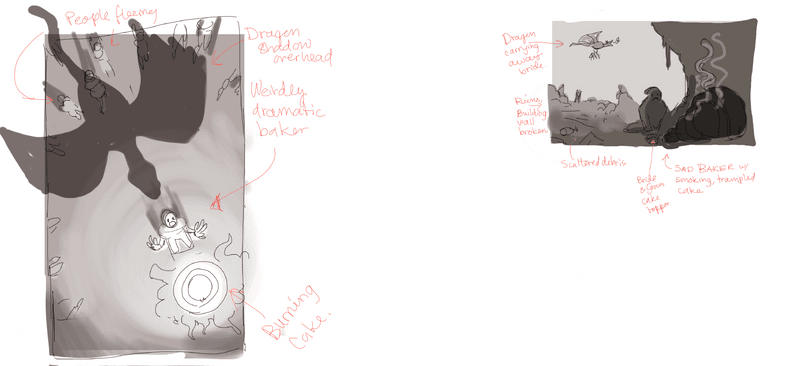
New thumbnails, incorporating some of the feedback:
Left: birds eye view showing a very dramatic baker upset over the burning cake (fire makes a good focal point). People fleeing around the baker, with dragon creating shadow over them.
Right: Wall broken showing the outside sky, w/ ruins and shredded curtains. Groom upset in the background with bride being carried away by dragon. Baker inside, sad about smoking, trampled cake.

I would like to move on to the sketches soon, but I'm open to more feedback here. Should I choose one of these designs or maybe combine with one of the first three?
Thanks again for all the feedback I've already received!
Sarah
-
@skeletortoise my pick is the right one. The secondary story works nicely with the dragon and groom scene in the background. I recommend moving the baker out of the center though because centering characters often creates a challenging composition. You could move the baker and the cake farther to the right. The cake could even go off of the page a bit. As long as it is still clear what has happened to the cake it should work.
-
I like the right side image as well. I feel like it tells more story. If you’re leaning towards the first maybe have the baker protecting his cake?
-
@skeletortoise I hate to say it now that you did two more but I personally think the 3rd one from your previous sketches is stronger. I feel like the cave isn't adding to the story in the new 2nd one.
 I like that you can see the people running around up above the baker in the 3rd one.
Also I agree he may need to look like he is protecting the cake, or is worried. He almost looks a bit frightened of the cake in this pose. Perhaps if his hands were on the sides of his face or he was fanning the cake, or he looked like he was garding what's left of the cake?
This will be really cool once you get it all finished up, can't wait to see the end result I think it is going to be really good when it's all finished once you find that composition.

-
@MerryMary thanks for the feedback! Honestly, even if I go with one of the first three, I’m still really glad I did these - I think they pushed it somewhere I wouldn’t have originally thought.
I do want to say though that the “cave” is really supposed to be the inside of the building and the dragon had broken the wall, exposing the outside. I’m just noting this in case you think it might be better if that as communicated better?
Thanks again!
-
@AngelinaKizz that’s a good idea! I think that might communicate his emotional state better.
Thanks!
-
@Griffin-McPherson wow, I did even realize he was central! Thanks for pointing this out!
-
@skeletortoise I think the reason the 3rd one is stronger from what I can see is because the baker is close enough involved in the action that it is easier to pick up the irony of the situation. In the new 2nd one, when he is so much closer to us, and facing so far away from all of the havoc around him in the distant background it feels less impactful to me. The bride and groom are so far away it seams like he would have less reason to be involved in trying to help them, he is just the baker and not a knight after all. His cake is also out of any more danger and its just the after math bummer. When he is closer to the action it makes it much more clear that he is completely focused on the cake and doesn't care who or what else is getting eaten.
Though I do think it is hilarious the the bride is up in the air about to be swallowed! Love it!That is just my general gut reaction from these little sketches. I think you have more vision for what you are going for and will have a clearer idea of what will work for the piece because of it

-
@MerryMary thanks so much for the in depth explanation! I'm working on a tighter sketch right now, trying to bring the best of everything, but we'll see how it goes.
-
This post is deleted! -
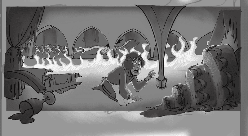
I just wanted to post an update on the sketch I’m doing now. The assignment is really just to get to the sketch phase, but I’m hoping to get the values to read as well. Any thoughts on this stage are welcome.

-
@skeletortoise this looks really good to me, I like it

-
@skeletortoise Just wanted to say this last one communicates the story a lot better to me! I think even more chaos / busyness in the background (more people fleeing, etc) would work, as long as you keep them distinctly grouped into foreground and background like you are doing with value and level of detail. Nice progression from your first sketches!
-
Hello all,
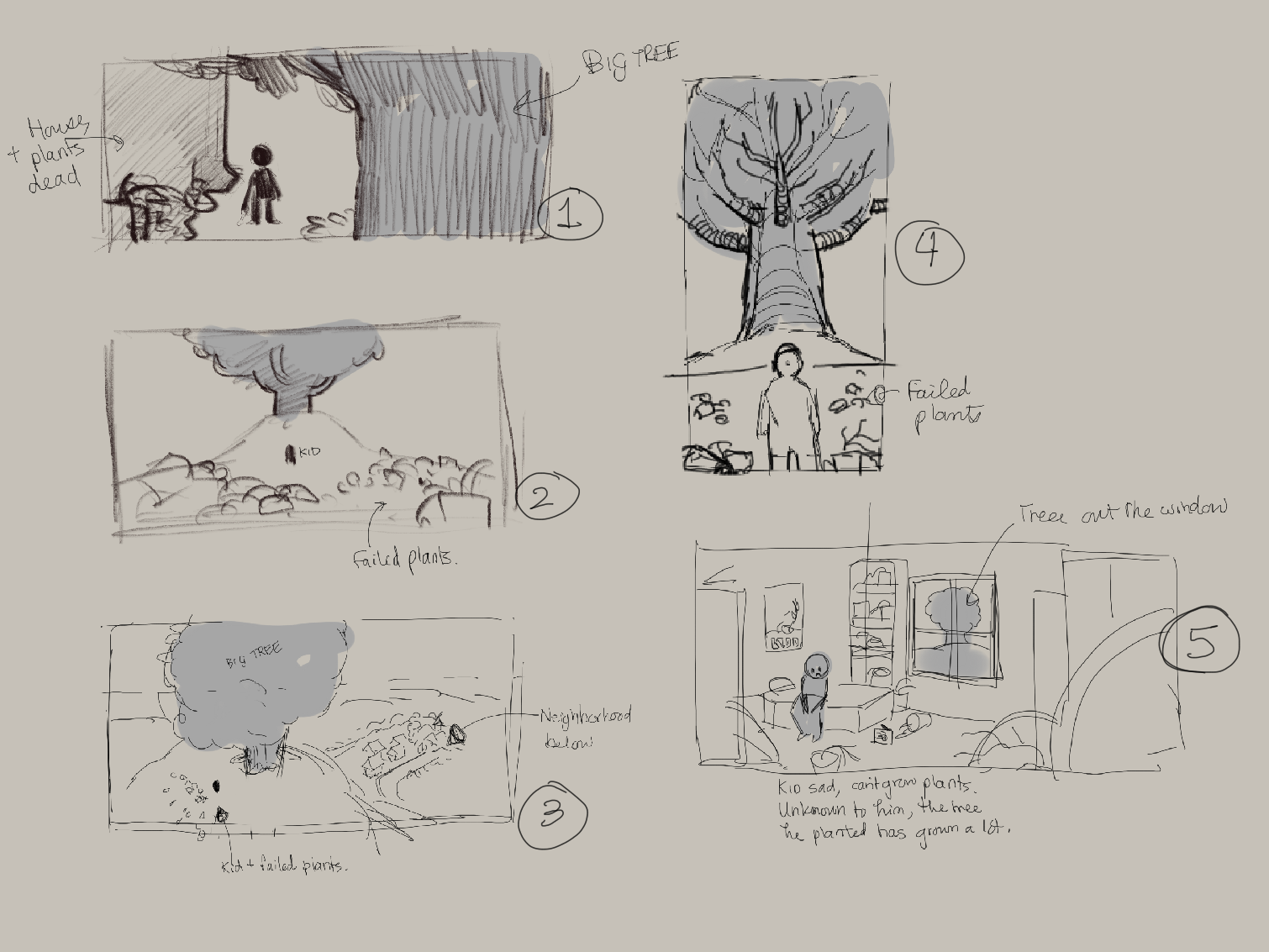
I am now doing the second illustration for Assignment 2 is Will’s course, and I would appreciate some feedback. I have 5 thumbnails and I would like to know which one seems the most interesting and present the most storytelling opportunity.
The story: a kid has been trying to grow a plant successfully for some time, but he had no success. One day, a tree he planted bursts to an enormous size!
- Kid is in backyard of home and comes across his tree, grown without his knowledge overnight.
- Kid goes to the field where he keeps his plants (dead, scattered around him - almost a plant graveyard) and finds his tree enormous
- Bird’s eye view of the enormous tree and the neighborhood and kid below. I feel this one is too impersonal but maybe you all disagree.
- Kid goes to field but an upshot.
- Kid inside his bedroom, and about his failed plants - doesn’t know his tree is enormous outside (window).

Thanks in advance for any notes you may have on the story or composition!
-
@skeletortoise Hi! Wow, you've chosen a tough idea to convey! I suppose the main way to show that the tree has grown overnight is in the child's expression, and maybe some destruction around it - like lumps of earth that have been pushed aside?
Here are my initial thoughts:
Number 4 looks the most effective to me, though it might be a clichéd point of view (though maybe it's overused because it's so effective...) but it really gets the point across that this is one enormous tree and that that it's surprising somehow.
Yes, the bird's-eye view, number 3, does seem impersonal. It looks more like a good establishing shot for a story that's about a tree and takes place near a town, but doesn't make the tree seem unusual or weird.
Number 1: it's hard to tell how large the tree is... Though if you want the focus to be on the child and his reaction, this might be a good starting point.
Number 2 is maybe a bit uninteresting. It's an image you'd see in any book. But maybe with the tree closer and more upheaval of the earth etc, it could be more effective.
Number 5 looks though the story is more about the child in his room than about the tree - the tree just looks like a background element. Though I suppose it could be right up close to the window as if it's trying to get his attention, or even pushing through the wall?! Then he would probably have noticed it and be reacting in some way.
Well, I hope something I've rambled about here will prove helpful in some way.
I hope you enjoy the illustrating!