Feedback: Another spread
-
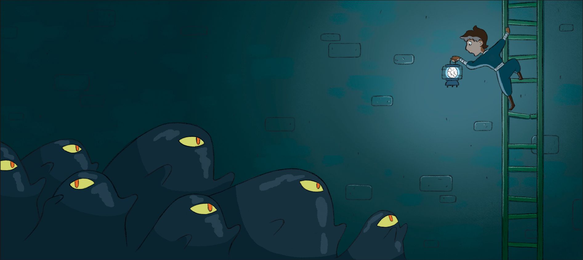
This is my third and final spread I’ve done for the sequential pieces I’ve done for my portfolio. It felt nice to do something less complex than the last two.
I’m at the point where I am pretty content with calling it done but I like to challenge that by getting some feedback to see if there are big improvements I could make.My making thoughts and concerns are these:
Do the bricks looks right? It can be hard to suggest a brunch wall without drawing every brick so I just want to make sure I get it right.Do the shiny reflections on the blobs look right? It’s hard to know how to place them and shape them because there’s not great references for something like this. I mostly went off of how No Face looks in Spirited Away for reference.
Any and all thoughts are always appreciated!
-
Great series of artwork!
The bricks look right to me
")
Maybe use an exponential decay for the light; as in it should be much stronger when closer to the source, illuminating the kids face.
In terms of the monsters, you lit them as if they were hit by a directional light. Most people won't care, but it can make it more interesting and consistent if you try to simulate a point light? might worth trying. Maybe place a bunch of spheres in Blender and look at how a point light will affect differently the closest and the farthest spheres. Also, the terminator would be much softer when you use a point light (but to use a hard terminator can be a stylisation choice).
In terms of the specular reflection. I would say it needs to look sharper, it looks too much like a round brush. Maybe use the lasso tool to draw them like this:
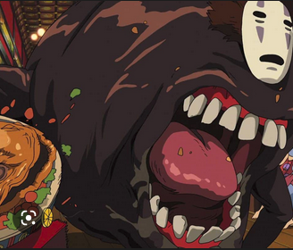
Finally you might want to play with a Fresnel effect. They seem to use that here:

Also, they use transparency.The reflections in Spirited Away seems very random to me. If you want to add realism, assuming that there is water underneath, your specular reflection will consist of two points, one being the reflection of the lantern, the other being the reflection of the lantern in the water. You migh also add a suggestion of the reflection of the water vs wall color.
-
@Griffin-McPherson I think this looks really cool
 I don't know a lot about lighting but I like this piece generally.
 -
@Griffin-McPherson this piece is so cool! To my untrained eye, the lighting and reflections all work fine. I do agree with Geoffrey that making them a bit more like the spirited away reflections might be a nice finishing touch, but all in all I think this piece really evokes a mood and the values are all great.
-
@Griffin-McPherson I think you have the right amount of bricks. They don't take away the focus from the most important details of the spread, which is what you ant.