Society of Visual Storytelling

    SVSLearn Forums

    • Register
    • Login
    • Search
    • Recent
    • Tags
    • Popular
    • Users
    • Groups
    • Search

    (WIP) Wizard of Oz portfolio pieces- critiques welcome

    Projects
    4
    16
    1234
    Loading More Posts
    • Oldest to Newest
    • Newest to Oldest
    • Most Votes
    Reply
    • Reply as topic
    Log in to reply
    This topic has been deleted. Only users with topic management privileges can see it.
    • kayleenartlover
      kayleenartlover last edited by

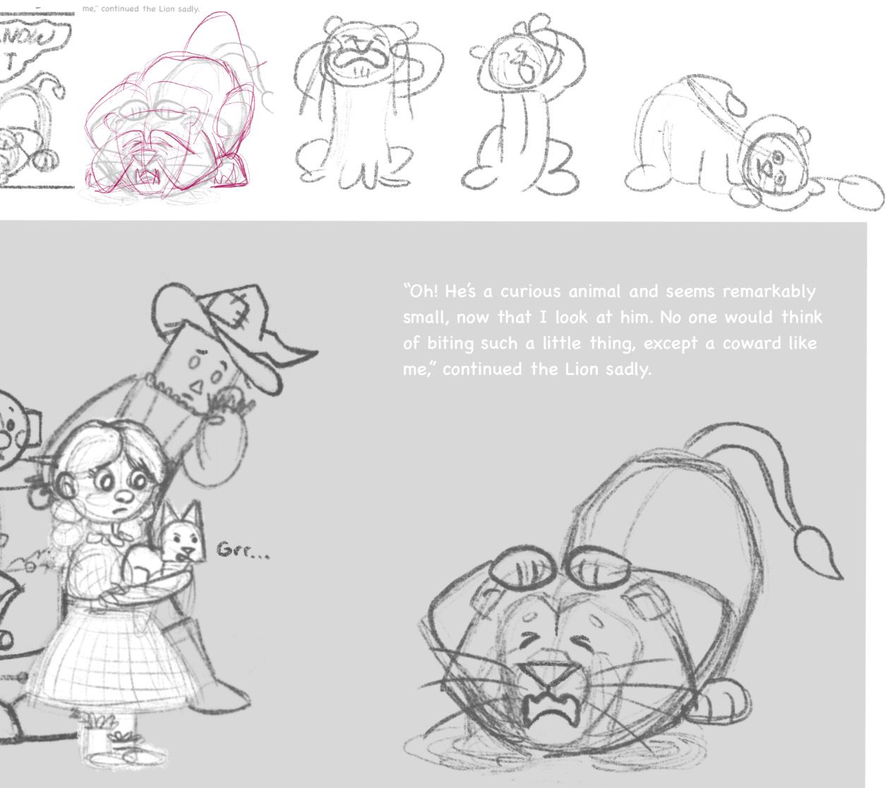
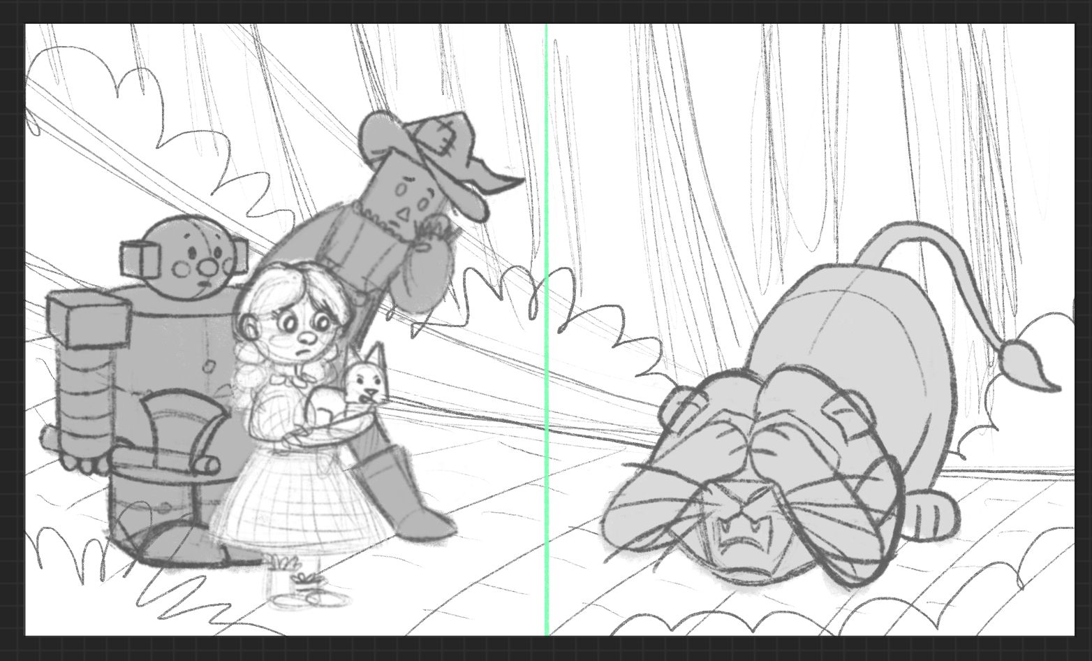
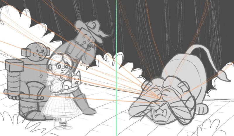
      What pose looks more interesting for the Cowardly Lion?

      IMG_0161685C0D39-1.jpeg

      1 Reply Last reply Reply Quote 0
      • kayleenartlover
        kayleenartlover last edited by

        Is this one worth putting in my portfolio? (Once it’s done of course.)
        IMG_5462.jpeg

        1 Reply Last reply Reply Quote 0
        • Robyn Hepburn
          Robyn Hepburn last edited by

          Hi!
          Looks like you've made a great start on this!
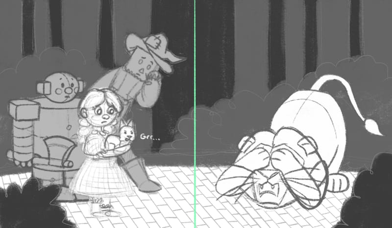
          I have a few opinions that you can take or leave:

          • Dorothy might be better smaller, to give a bit more contrast in size with the other main characters.
          • I know these are just sketches, but just a reminder that, if one foot is behind the other, it should be higher on the page, unless it's a worms-eye view.

          I think my favourite lion pose is the one where he's just lying there with a vacant expression, but that might not be dramatic enough... Otherwise I like the one like where he has his paws over his eyes.

          In your latest sketch I think a smaller Dorothy would make it more dynamic. And maybe some more movement in all the characters.

          I hope this helps!

          https://www.instagram.com/robynhepburnillustrates/
          www.robynhepburn.com

          1 Reply Last reply Reply Quote 0
          • kayleenartlover
            kayleenartlover last edited by kayleenartlover

            Cowardly Lion update:
            IMG_5463.jpeg
            IMG_5464.jpeg
            IMG_5465.jpeg

            1 Reply Last reply Reply Quote 0
            • kayleenartlover
              kayleenartlover last edited by

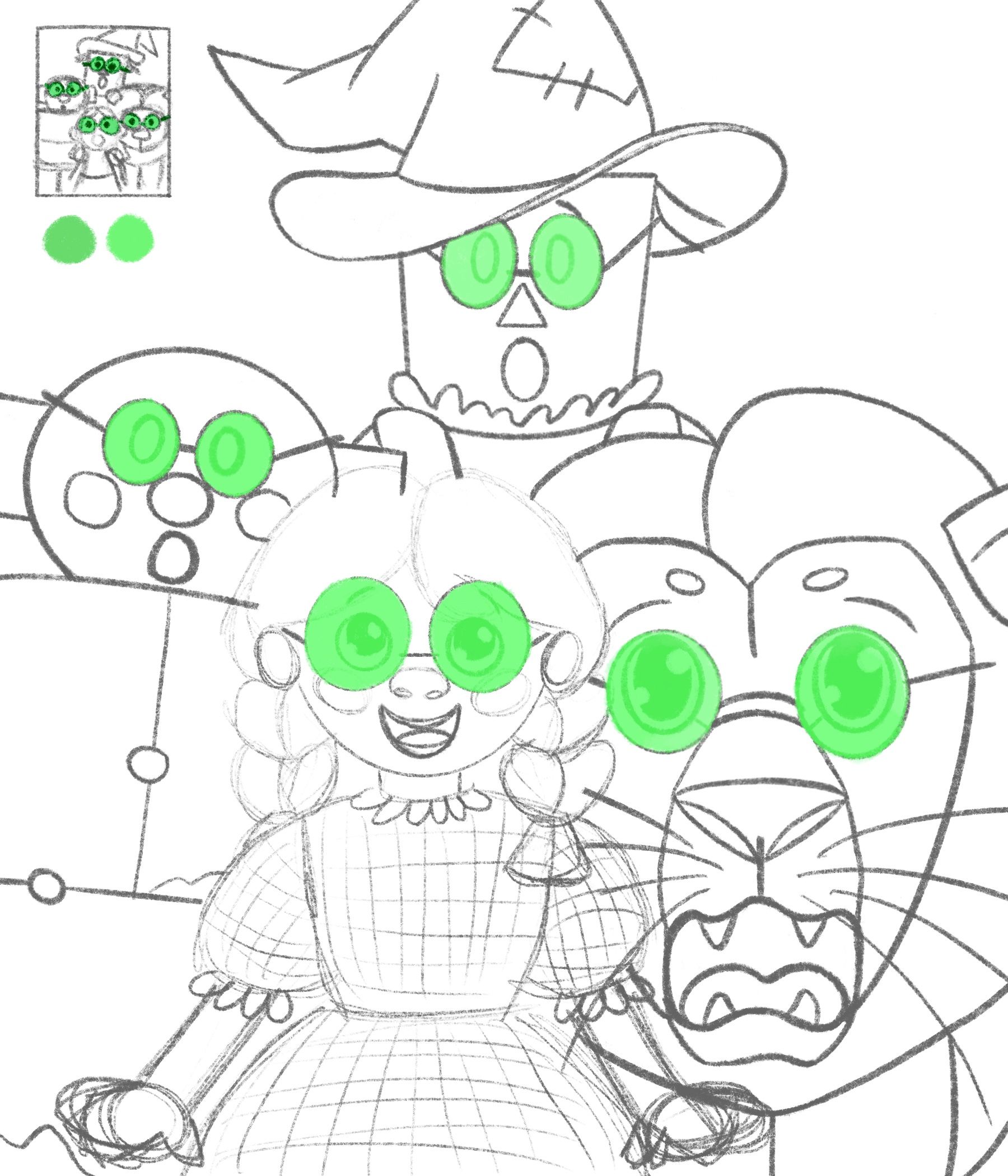
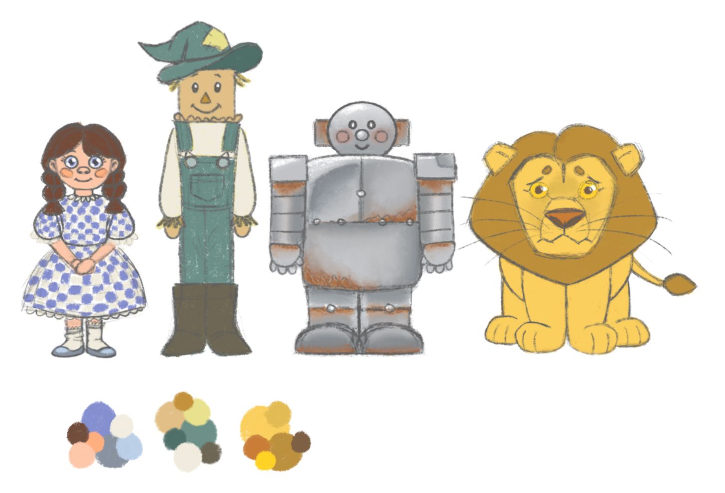
              I think I figured out what the colors will be for the characters. What do you guys think?
              IMG_5472.jpeg

              1 Reply Last reply Reply Quote 1
              • kayleenartlover
                kayleenartlover last edited by

                IMG_5475.jpeg

                1 Reply Last reply Reply Quote 0
                • kayleenartlover
                  kayleenartlover last edited by

                  IMG_5479.jpeg IMG_5478.jpeg

                  1 Reply Last reply Reply Quote 0
                  • kayleenartlover
                    kayleenartlover last edited by kayleenartlover

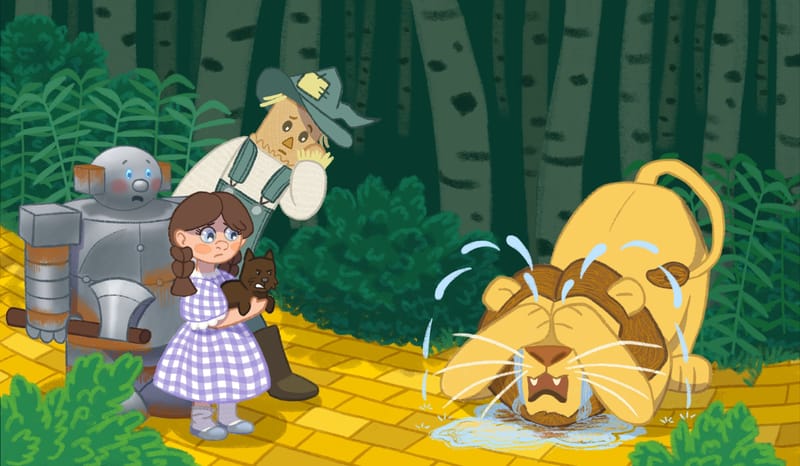
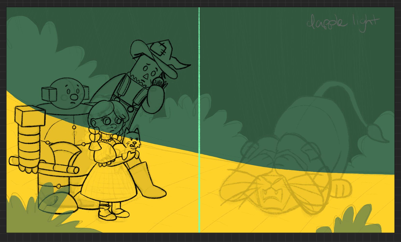
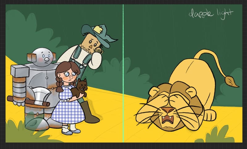
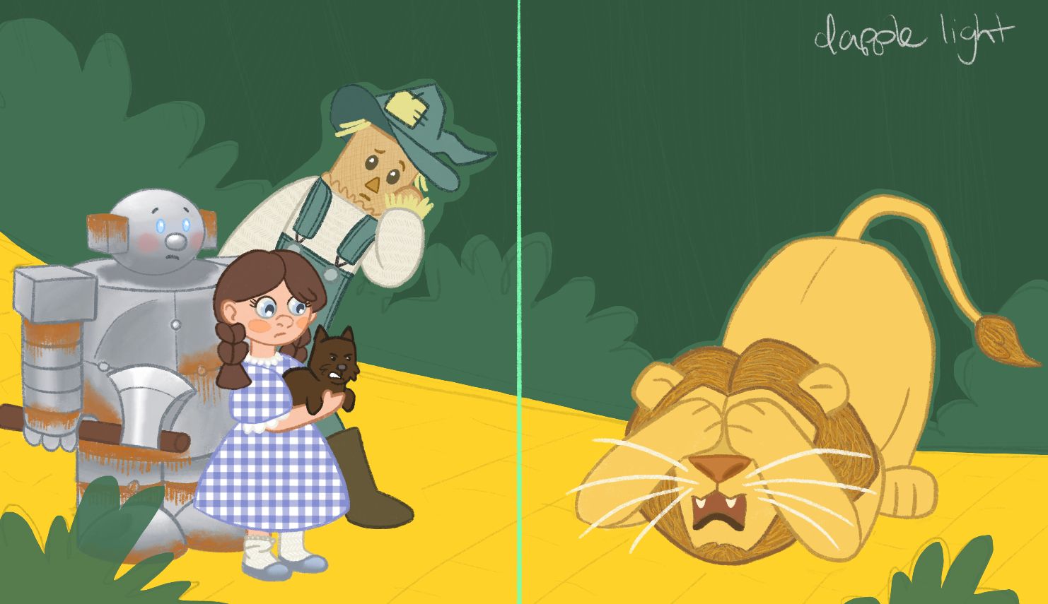
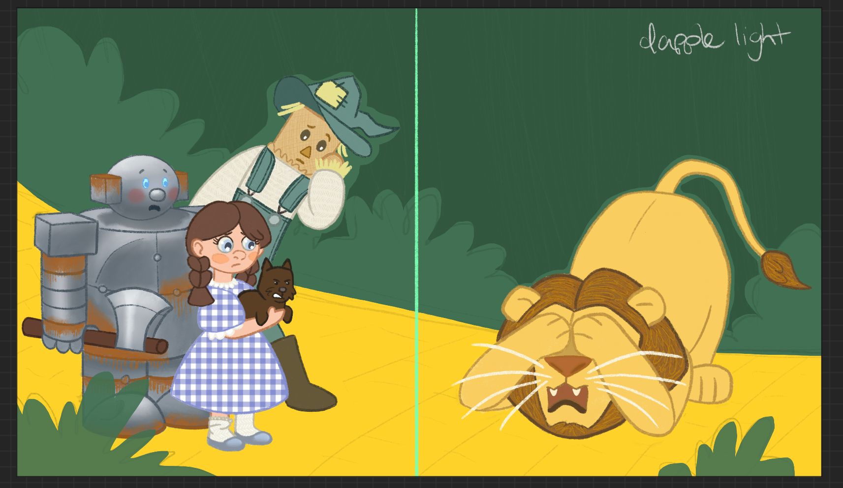
                    How does this look so far? I still need to do the background and lighting. So there may be some final detail changes to the characters left for the lighting part, but how does this look up close? Is the colored line art too much?

                    IMG_5481.jpeg

                    Sara Therese Art 1 Reply Last reply Reply Quote 0
                    • Sara Therese Art
                      Sara Therese Art @kayleenartlover last edited by

                      @kayleenartlover Hi Kayleen. It looks like it's coming along nicely! And it's fun to see your process.

                      Since you still need to do the background and lighting I'm not sure how much of this will be changed - but, here are my thoughts:

                      • The yellow of the yellow brick road is very vibrant and it draws my eye away from the characters more than I think it should.

                      • Will you be adding more light and texture to the Toto the dog? He seems a bit dark and undeveloped.

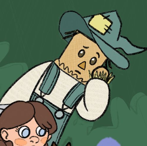
                      • I like the movement you've given to the Scarecrow, but the highlights in his eyes (coupled with his face being straight on) make it appear that he is not looking at the lion.

                      • I'm not sure the reasoning behind the lighter green outline in the bush around the Scarecrow's head and lion's body. I would remove this and keep the darker bush color which will help to add more value contrast between the bush and characters.

                      • I'd go darker with the bushes in the foreground as though they are in shadow.

                      • Have you considered giving the Tin Man and Dorothy a little more movement to their poses? With them standing next to each other, both straight and feet together, it seems a bit stagnant given the meltdown that the Lion is having.

                      I hope this helps. Looking forward to seeing more!

                      Sara Therese
                      https://sarathereseart.com
                      Instagram: @sarathereseart

                      kayleenartlover 1 Reply Last reply Reply Quote 0
                      • kayleenartlover
                        kayleenartlover last edited by

                        This post is deleted!
                        1 Reply Last reply Reply Quote 0
                        • kayleenartlover
                          kayleenartlover @Sara Therese Art last edited by

                          @Sara-Therese-Art
                          I fixed the scarecrow eyes, and added to Dorothy and Tinman's facial expressions. The outline around the characters is just because I removed the sketch of them underneath so the rest of the sketch is on a multiply layer to temporarily show what the background could look like. I will be doing a shady dapple lighting over everything so most of the road will be darker. Unfortunately I can't really change the poses of the characters at this point. I've been posting for a while and never got suggestions on how to change the poses so now there is too many hours and detail put into it that I'd have to redo. My goal was to have the lion be uncharacteristically sobbing and the others being surprised and not sure how to respond yet. Do the facial expressions look better?
                          D1524EE8-5314-49C2-96C1-9A9BE3AD465A.jpeg

                          Sara Therese Art 1 Reply Last reply Reply Quote 0
                          • Sara Therese Art
                            Sara Therese Art @kayleenartlover last edited by

                            @kayleenartlover Yes, I think the facial expression of the Tin Man is more expressive.

                            Sara Therese
                            https://sarathereseart.com
                            Instagram: @sarathereseart

                            1 Reply Last reply Reply Quote 0
                            • kayleenartlover
                              kayleenartlover last edited by kayleenartlover

                              Does this look finished for a portfolio?
                              IMG_5527.jpeg

                              1 Reply Last reply Reply Quote 0
                              • First post
                                Last post