Society of Visual Storytelling

    SVSLearn Forums

    • Register
    • Login
    • Search
    • Recent
    • Tags
    • Popular
    • Users
    • Groups
    • Search

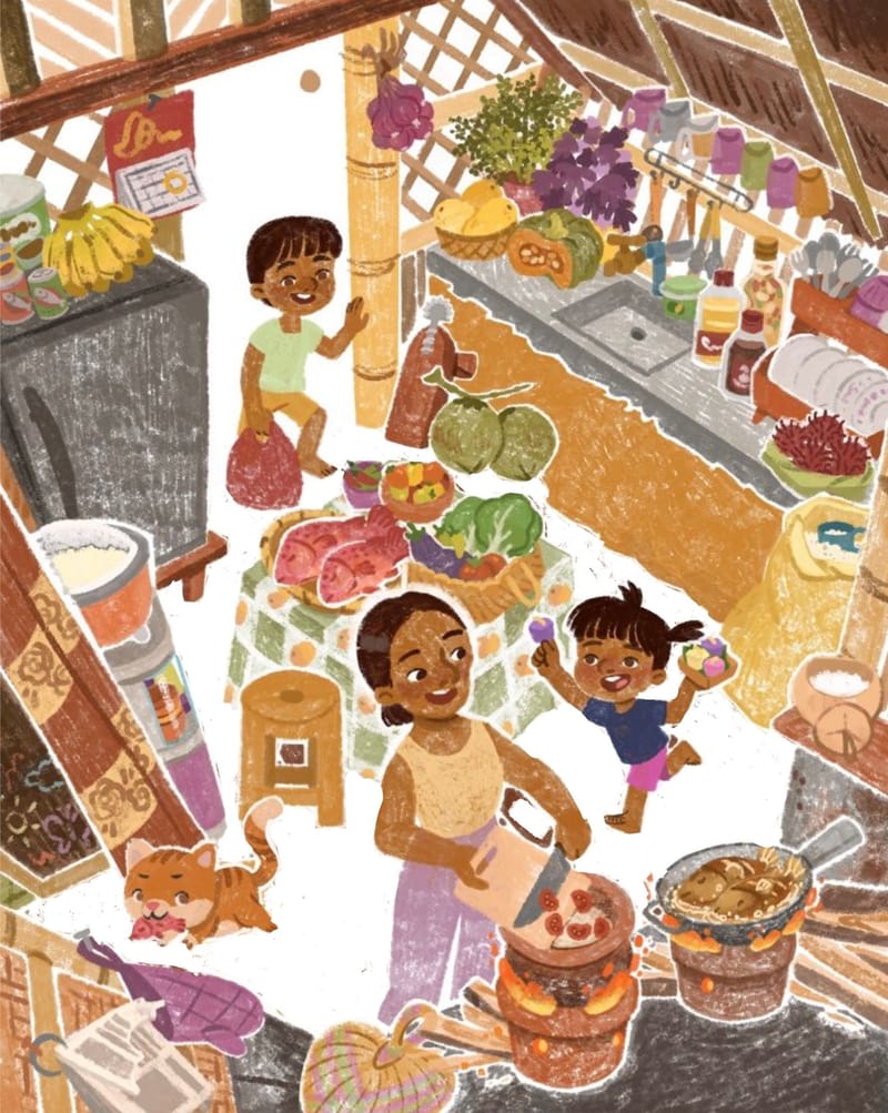
    Help me choose best floor color

    Artwork
    13
    16
    856
    Loading More Posts
    • Oldest to Newest
    • Newest to Oldest
    • Most Votes
    Reply
    • Reply as topic
    Log in to reply
    This topic has been deleted. Only users with topic management privileges can see it.
    • braden H
      braden H @Nyrryl Cadiz last edited by

      @Nyrryl-Cadiz I'm gonna rock the boat and say pick the first one because the contrast is too strong on the other two 😬

      danielerossi Kristen Lango 2 Replies Last reply Reply Quote 2
      • MerryMary
        MerryMary @Nyrryl Cadiz last edited by

        @Nyrryl-Cadiz I like the 3rd one the best. I feel like I can enjoy looking at their faces and the items serounding a little more easily.

        1 Reply Last reply Reply Quote 2
        • NessIllustration
          NessIllustration Pro @Nyrryl Cadiz last edited by

          @Nyrryl-Cadiz The darkest one! It provides the most contrast and helps the characters and objects stand out.

          vanessastoilova.com
          instagram.com/vanessa.stoilova/

          Check out my Youtube channel for tips on how to start your career in illustration! www.youtube.com/c/ArtBusinesswithNess

          1 Reply Last reply Reply Quote 2
          • danielerossi
            danielerossi @braden H last edited by

            @braydin-hawlette I agree. I like the first one due to contrast. The people disappear into the floor the other two versions.

            https://www.instagram.com/heyfrankybanky

            1 Reply Last reply Reply Quote 1
            • Julia Hegetusch
              Julia Hegetusch @Nyrryl Cadiz last edited by

              @Nyrryl-Cadiz Yes, nr.1 !

              https://moanamaureen.com

              1 Reply Last reply Reply Quote 1
              • Jeremy Ross
                Jeremy Ross @Nyrryl Cadiz last edited by

                Hi @Nyrryl-Cadiz, this is such a great scene!

                What do you think about going white for the floor to give the characters some room?

                A5D6BA1D-34AA-4423-ABBF-C137F570542D.jpeg

                https://www.instagram.com/jeremyrayross
                https://www.jeremyrayross.com/
                https://twitter.com/jeremyrayross
                https://jeremyrayross.substack.com/

                Kristen Lango 1 Reply Last reply Reply Quote 6
                • Anita Okoye
                  Anita Okoye last edited by

                  I’d go with the 1st one, but a slightly darker version. The other 2 have so much contrast and the people blend in with the ground. Going slightly darker with the 1st one would provide just enough contrast so the floor stands out, but doesn’t blend with the characters

                  1 Reply Last reply Reply Quote 1
                  • Jim Gleeson
                    Jim Gleeson last edited by

                    I am thinking about what we need to focus on, and looking for ways to enhance that focus and to not be distracted by things we should not be focused on. .

                    Jim Gleeson Aka The Jimitationâ„¢ Illustration: Accept no originals, only the Jimitationâ„¢.
                    instagram @jimitation_illustration

                    1 Reply Last reply Reply Quote 1
                    • Kristen Lango
                      Kristen Lango @braden H last edited by

                      @braydin-hawlette I second this opinion

                      https://www.kristenlango.com/
                      https://www.instagram.com/kristendraws/

                      1 Reply Last reply Reply Quote 2
                      • Kristen Lango
                        Kristen Lango @Jeremy Ross last edited by

                        @Jeremy-Ross Oh this is a nice idea too

                        https://www.kristenlango.com/
                        https://www.instagram.com/kristendraws/

                        1 Reply Last reply Reply Quote 1
                        • lizbrizzi
                          lizbrizzi last edited by

                          First of all, I love this piece! Second, have you tried going lighter instead of darker?

                          1 Reply Last reply Reply Quote 1
                          • Nyrryl  Cadiz
                            Nyrryl Cadiz SVS OG @Nyrryl Cadiz last edited by

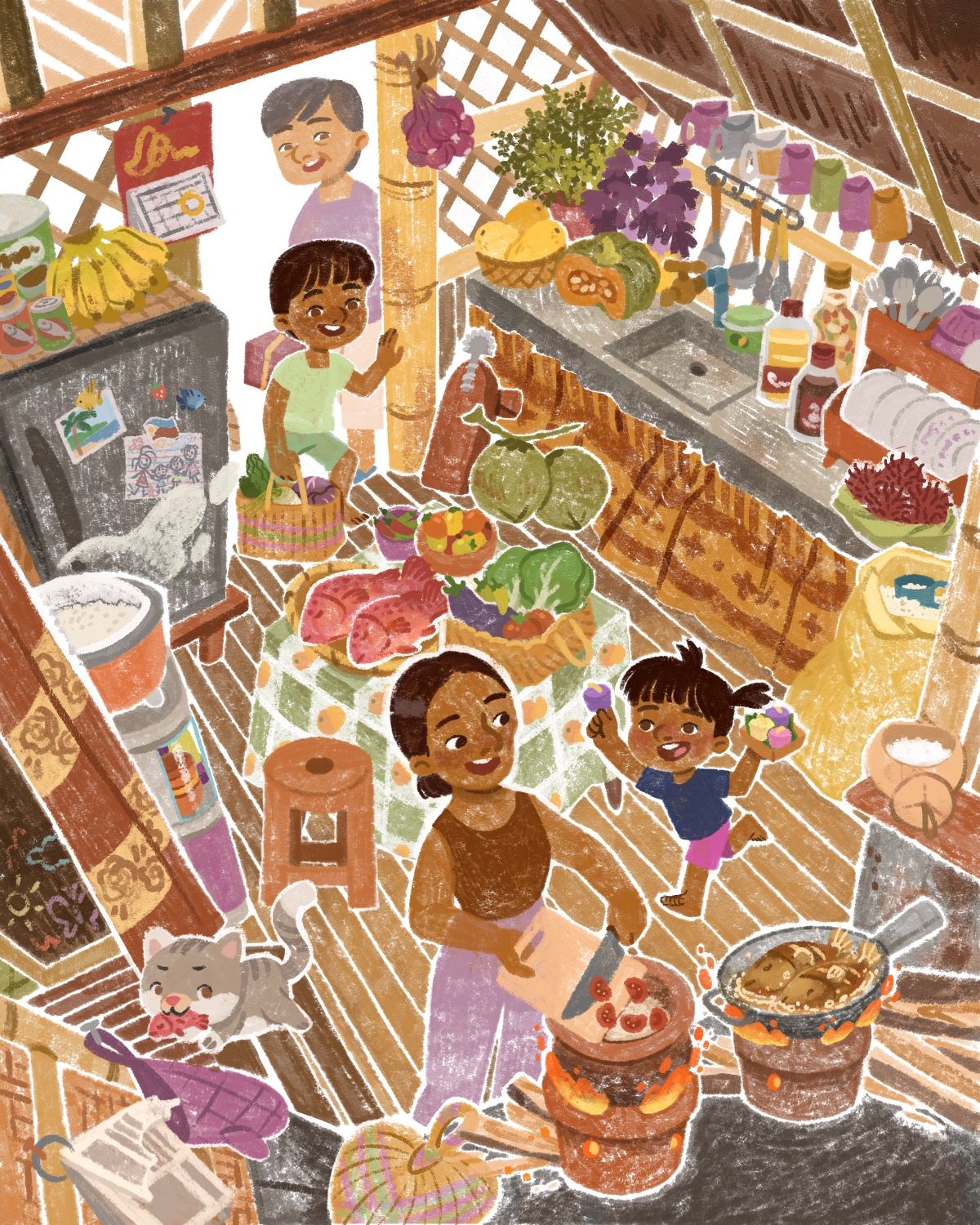
                            Hi everyone! Sorry for the long wait. I got very busy with work and life. I only finished this piece last week.

                            I wasn’t satisfied with either option 1 and 2 so I compromised and combined both.

                            Here it is. Thank you to everyone who shared their thoughts. It was very helpful.

                            56004B3C-6418-4AA4-84AC-5C3DE24C44D8.jpeg

                            Portfolio: nyrrylcadiz.com
                            Instagram: https://www.instagram.com/nyrryl_cadiz/
                            YouTube: https://www.youtube.com/channel/UCbJCF1Im8ZO7hpGWTKOJMuA

                            KathrynAdebayo 1 Reply Last reply Reply Quote 3
                            • KathrynAdebayo
                              KathrynAdebayo @Nyrryl Cadiz last edited by

                              @Nyrryl-Cadiz The details in the kitchen are incredible. 🙂

                              Nyrryl  Cadiz 1 Reply Last reply Reply Quote 1
                              • Nyrryl  Cadiz
                                Nyrryl Cadiz SVS OG @KathrynAdebayo last edited by

                                @KathrynAdebayo thank you! 😊

                                Portfolio: nyrrylcadiz.com
                                Instagram: https://www.instagram.com/nyrryl_cadiz/
                                YouTube: https://www.youtube.com/channel/UCbJCF1Im8ZO7hpGWTKOJMuA

                                1 Reply Last reply Reply Quote 0
                                • First post
                                  Last post