"Flight" WIP (Nov HTFYA) - Alex Wilkins
-
@alexw Really like the overall composition of this! The pose of the characters is really clear. And I also dig the foreground tomatoes

One thing worth considering is the overall concept - for reference I've watched all of the critique arena feedback and a common phrase from Will would be something like this:
"Hey everyone! Look! It's a kid throwing a paper plane!"
"It's a great composition, but why do we care?".Ultimately it comes down to, to quote Will again, having a piece "change the viewer emotionally", whether that be happiness, sadness, anger, compassion etc.
So, I wonder what concept could be introduced to this great composition that would change the viewer emotionally? What element could be introduced to make throwing the paper plane surprising?
Food for thought

-
I love how dynamic the image is already!
What you've written sounds a lot like what I've been struggling through with my own 'flight' illustration. But at least you've got a sketch!There's a sticky-note in front of my desk that I find helpful, which says, "how do you want the audience to feel?"
It might help to write out some notes about the reaction you want, the personalities of the children, their backstory, or even just what you'd really like to draw. (I don't guarantee this will help, but it's worth a shot.)I'll throw out some random ideas if you like:
Could someone or something be riding on the aeroplane (or clinging on behind)?
Could the children be 'trapped' - maybe between the railway and tall buildings, or in a tiny back yard? So the aeroplane can do what they can't: fly away/escape.
Maybe there's a 'baddie' in the image... Are they Hansel & Gretel type characters?
Maybe the plane could be really badly-made and misshapen, yet is flying way better than the boy expected (his could be lying somewhere)?I hope something here helps!
-
This is really insightful!
I sometimes forget the bigger picture or goal which is to invoke an emotion in someone, to create a response to the "event" illustrated. Which I guess is create a reason why it's important that the plane is flying and being thrown.
Thank you!
-
@Jason-Crowley This is really helpful!
I feel like I can use your ideas and jumping off platform and take flight. HAHA
But seriously, these are really helpful! I feel much more equipped now! The subjectivism of the piece feels like there could be a clearer direction. Like guard-rails for my ideas.

-
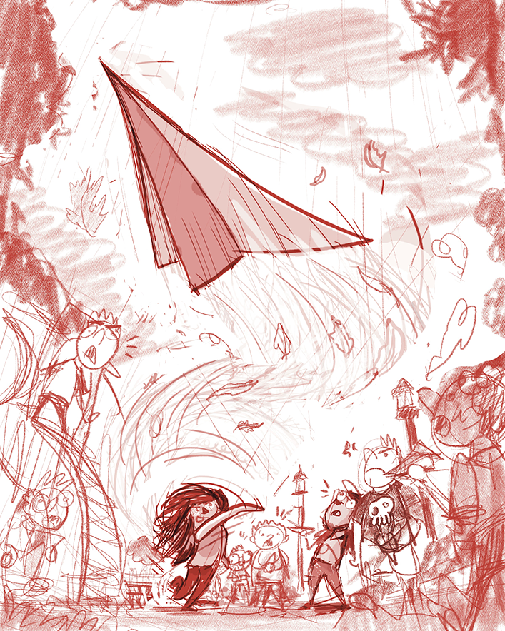
Okay, so I took @Jason-Crowley & @Robyn-Hepburn's very helpful advice and I put some context to the piece.
Context: Why do we care about Wendy? Well it turns out she's the only girl at the school park that can actually successfully flight her paper airplane.
Buster the park bully (skull shirt), amongst the rest of the boys, was not too happy about it.
Thoughts on this? Obviously this is all rough, so it's very hard to see each of my story element ideas, but there are boys in the park and one girl and when she throws the paper air plane it WHOOSHES through the air, making all boys except Buster surprised. He's just mad. And she has a look of confidence.
-
Working on Wendy. I'm a fan of #5 for my sketches. Ideally she'd have long hair to continue the eye movement on the piece, but I've always liked the idea of her being kind of this "cool" girl with a backwards cap, and I think I can get away with shorter hair.
I did a few concepts in pencil in my moleskin, but what do you guys think?
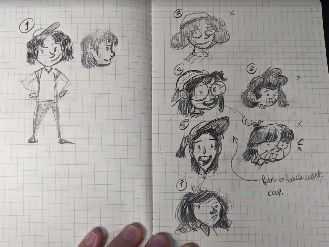
(not a fan of big hair for this character. and not sure what clothes she'll wear. Also my side profiles look like pickles: Gross to look at!
 )
)It's funny how when you're drawing, you're like "Ya, I'm cool, man. This is legit. I like these drawings!" You post it, and it's like... "Good Lord, what did I just draw?!?!?"
-
@alexw
 Yes! I definitely know that feeling! But sometimes it's worse: when you're drawing you're like, "argh, this is awful. Everything I draw is terrible." So at least this isn't that bad.
My personal preferences: number 4 (love the glasses and sticking-out hair) and number 7 (the frizzled hair and attitude!)
Number 5 looks a bit older, like a teenager, I think.I like that there's a story and lots of characters!
Oh, for the profiles, it might be helpful to draw the whole head first before the hair.
Also, from the front your heads are quite wide, so from the side you could give it more space too; maybe move the ear back further? Like Calvin, who, I've just noticed, doesn't even have a chin.

-
@alexw Nice one! It's really telling a story now

-
@Jason-Crowley Thank you! That's the goal!!
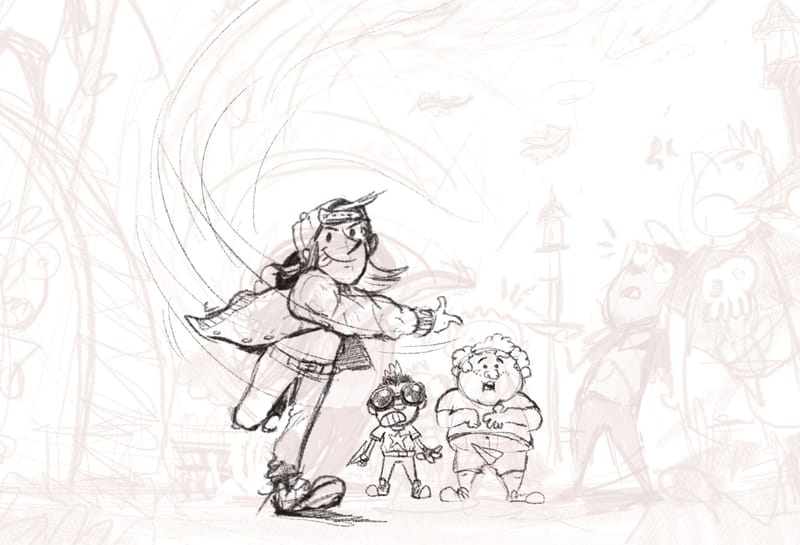
Here are the first three kids so far.
Below is also an inspiration board I've been utilizing. I don't know if this is too much information, but I've always enjoyed sharing my entire process and work that goes into a single piece of work. I'm not that kind of artist that can just whip up a piece in my head and start drawing, there's a lot of moments I have to slow down and think about what I'm doing, otherwise my pieces come out extremely messy.
I'm realizing a couple of things:
- I jump way to quickly into rendering, which slows my process down when I realize the pose is incorrect or disproportionate.
- Fashion plays a huge role in creating a character.
- If you want your facial expressions and poses to feel more dynamic, studying animation drawings and sketches is really helpful!
- If you're drawing a round character in perspective, it's important to drawing your curved lines in the correct bowed direction, (e.g. the plump kid's belly was initially wrong when I first drew him, hence he wasn't in perspective. Instead of upper half circle is a line or bent the wrong way). So perspective really does play into subtle organic shapes like these characters.
Is this everyone else's experience?
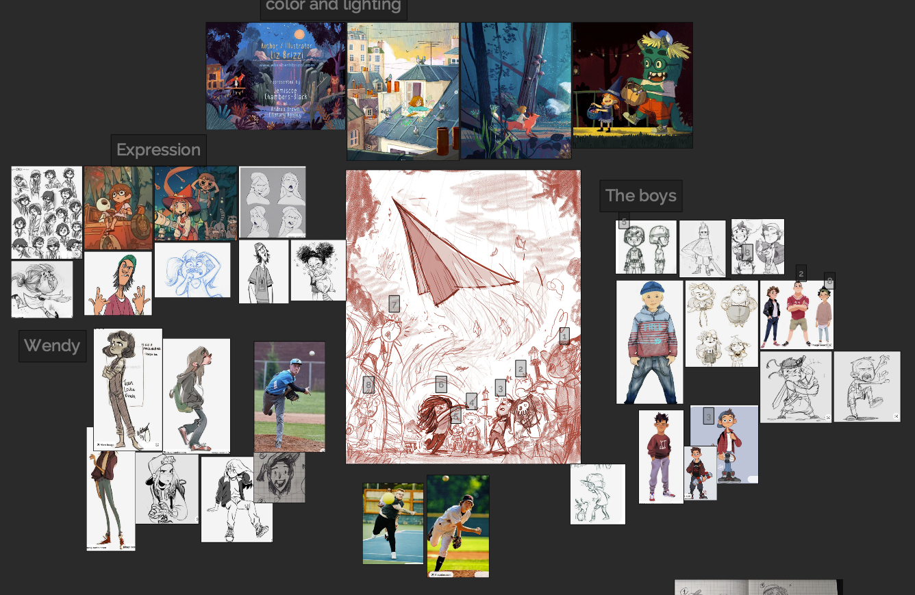
If y'all are curious, I use PureRef for reference making. It's free, but you should definitely donate, because it's an amazing piece of software.
-
My two scents, you’ve put me to shame with all your prep work but I think that why it’s coming together so well. My two cents is I’m concerned that her been a “cool girl” with the backwards baseball cap and shorter hair she won’t read enough as a “girl” but more ”one of the guys “ which may detract from for the reason for “shock” reaction from the boys. I think the faces and reactions of the on lookers you pulling together will really carry the story. Great work.
-
@Larue I was having some similar thoughts too, thank you!
I think remember the bigger picture of the "shock" like you're saying is important.
And to your note about prep work, I'm probably over doing it, but I want to produce some really quality work!
-
I was going to say the same, Wendy is looking a lot like a boy, which would be fine if you had a whole book to tell her story with...
One more tiny thing: the chubby boy dropping his plane: I think the plane should be pointing downwards more so we don't think it's flying, and if it's closer to the ground it might read more clearly as a separate object rather than a picture on his pants.
It's coming along fantastically! -
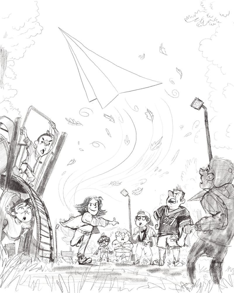
Alright. I believe the pencil work and composition line art is done. I honestly have no clue what I'm gonna do next, but I feel confident with this composition.
I worked the last three days on the boy characters and took y'alls advice about Wendy's persona.
Let me know if you see any problems with this piece or any helpful critiques. Definitely trying to make this the best possible for the Critique.
-
@alexw what would you think of adding a couple crashed paper planes below the main character (upfront) following the flight line so our sight goes from plane to her to the planes in the ground and then itll be easier to find the paperpplanes on the other kids hands?
I had this idea because I had to look for the planes so I thought it might be helpful feedback.It is an amazing research work, thank you for sharing
-
@makekong That's a great idea! I have to go back today and clean up the line work, so I will definitely put your thoughts into the piece.
It goes to show that even though this is a solo piece, it takes a team to build something cool!

-
@alexw your work inspires creativity so I thank you for it!
-
Hi Alex,
I like how you took the suggestion to give the piece more of a story - I like what you came up with.
 I also second the crashed planes idea that someone shared.
One suggestion I'd offer for your consideration is based on the assumption that your characters are intended to be children. Some of the figures seem to have pretty adult-like faces. You could give the feeling that your characters are young by softening some of their features and bringing their eyes lower on their faces. Lassoing the eyes and nose and pulling them down tends to have a wonderful de-aging effect.

I hope this is helpful. Best wishes for your piece!
-
@KathrynAdebayo This is very helpful! I had a couple of individuals in my life mention the same thing. I need to practice drawing child-ish faces more for sure. This illustration has definitely revealed a lot of lacking skills. But your guys' feedback has been super helpful.
-
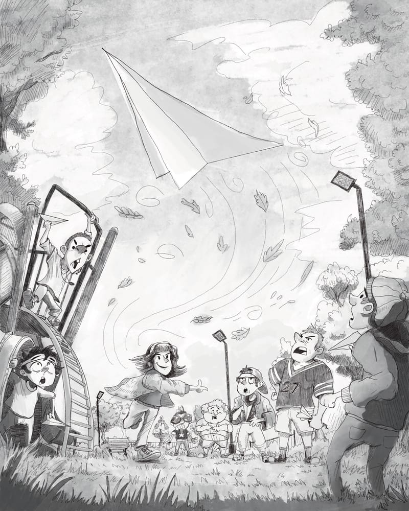
I'll be attempting to do color paint overs on this piece starting today.
I'll be honest. I have no clue what I'm doing, but this experience truly has challenged me and revealed a lot of weaknesses. And the evidence of that is I'm finding a lot dissatisfaction in the process and the product of the work involved. Meaning, when I'm sitting, putting headphones on a re-drawing lines, painting over areas twice or three times because it doesn't look right, that's when you can very easily just want to give up, move onto something else, or just think it's an automatic failure.
Ya, maybe this piece isn't chosen for the critique, but at least all of the work involved taught me things:
- Learning to deconstruct objects in the world into simple shapes, enables you to place them in proper perspective.
- Stylizing a human character still requires anatomy.
- Try to draw something from memory, if you can't really do it well or if it doesn't look right, then look at references, draw something in a cheaper sketch book to get a feel of the object you're trying to draw.
- Thumbnails and a lot of planning and messy drawing construction is very important at the start when planning a composition to look good.
- I think gauging a completed "area" of a paint over or a drawing section, is considered "good enough" if you stop having that "this urks me" feeling. For instance, the park on the left for me is "good enough" because it generally looks like a park. It might not look appealing but it conveys the message.
- Getting feedback is helpful because different perspectives can spark a new and improved idea.
- Showing your work while you're in the middle of making the drawing is helpful because you can see if its readable or accomplishing your goal. Wendy for too long wasn't a girly girl, so now she has bangs and a head band. Whether this improved it significantly, IDK but I should probably keep going.
One extra note:
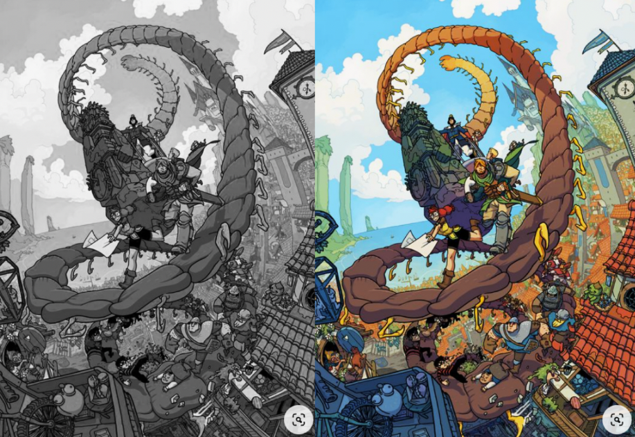
Trying to paint over my grayscale with a Multiply/Soft Light layer and the color wasn't coming out and I realized I needed more grays in the sky. So I took a gander on the internet and found a sky I liked and realized that Sky, grayscaled, is pretty "dark" in a way. Another thing to brush up on, when drawing black and white gray scales.
Colors REALLY make things "pop" so to speak. My perception of sky feels like, the blue in the sky is bright so a lighter gray? But I guess with paint overs, you'd do a 50% or a 40% gray instead. This can get pretty technical.
-
@alexw love the concept, the angle, the characters and the whole composition! Really cool. Only thing I notice is that you could definitely push the gesture of the character throwing a lot more. Could get a lot more dynamic than it currently is.