WIP Portfolio piece: farm animal field trip
-
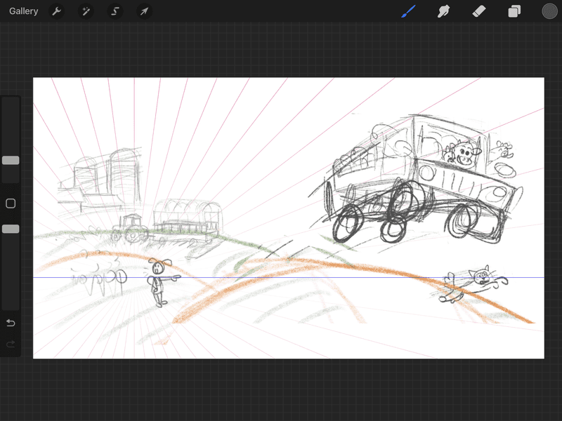
I drew the rough idea sketch before doing any perspective guide lines. I will be redrawing on top of this but need to know if the horizon line and view point looks correct before redrawing where the hills should be. Does this look correct? What placement will work for the overall composition I’m going for?
-
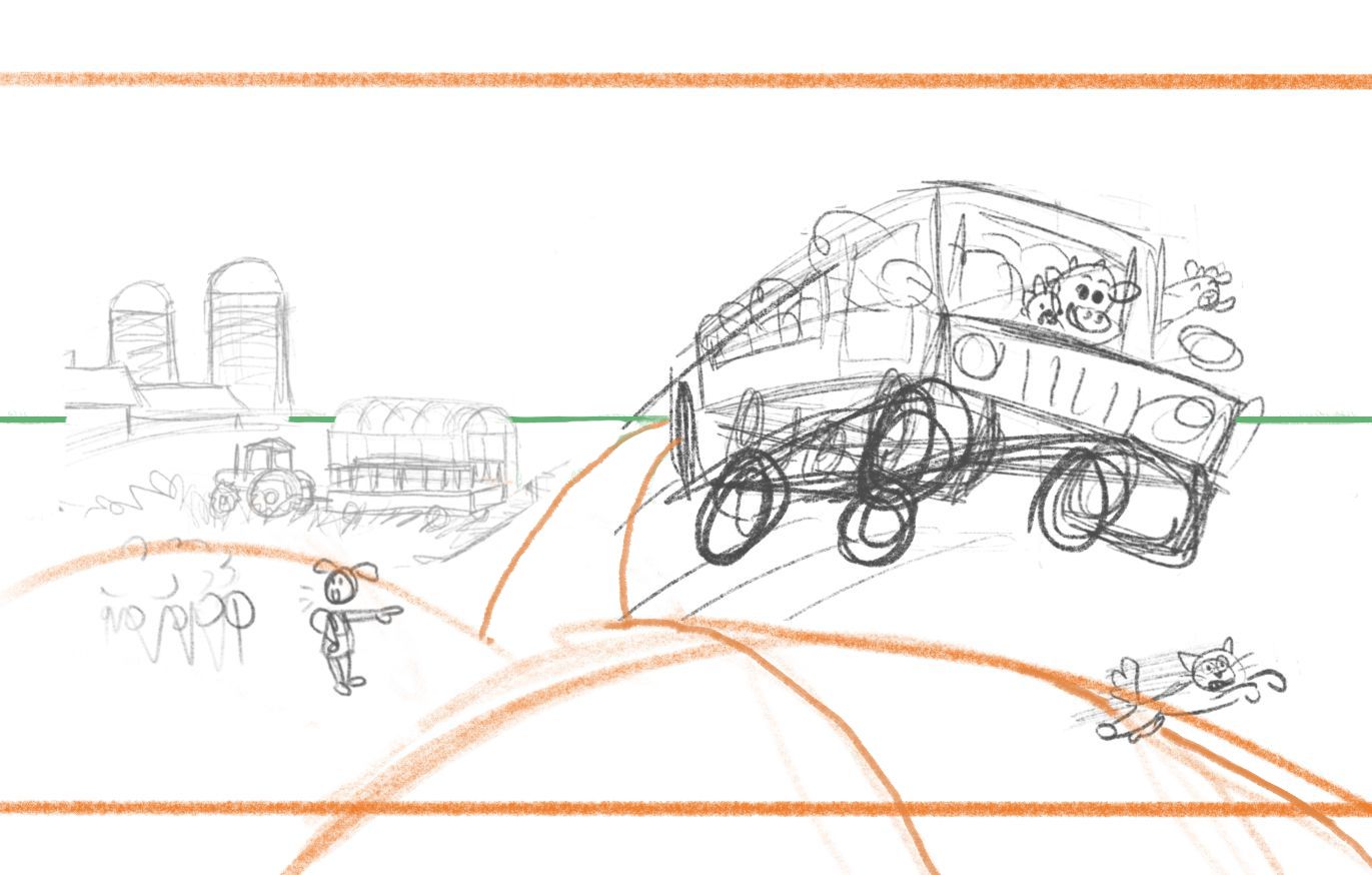
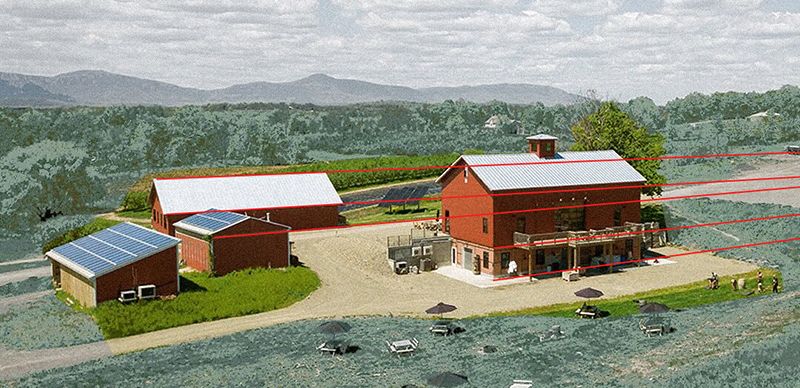
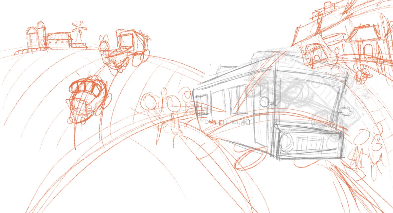
@kayleenartlover I think my draw over below shows a better placement for your horizon, based on the basic "camera" angle you have already established. And for perspective, look at the farm image I have included, which is similar to your sketch. The (red) lines go way off the page, as I believe your perspective would need to as well for the farm. Using the guides you have now, your farm will be pretty wonky. And I could be wrong, but with this illustration, you might need more than one vanishing point. And lastly, while you want your environment to look correct, don't get too caught up in the perspective and lose the life of the piece, if that makes sense.
-
@tom-barrett thank you so much! This is exactly what I needed so I can better visualize all the details


-
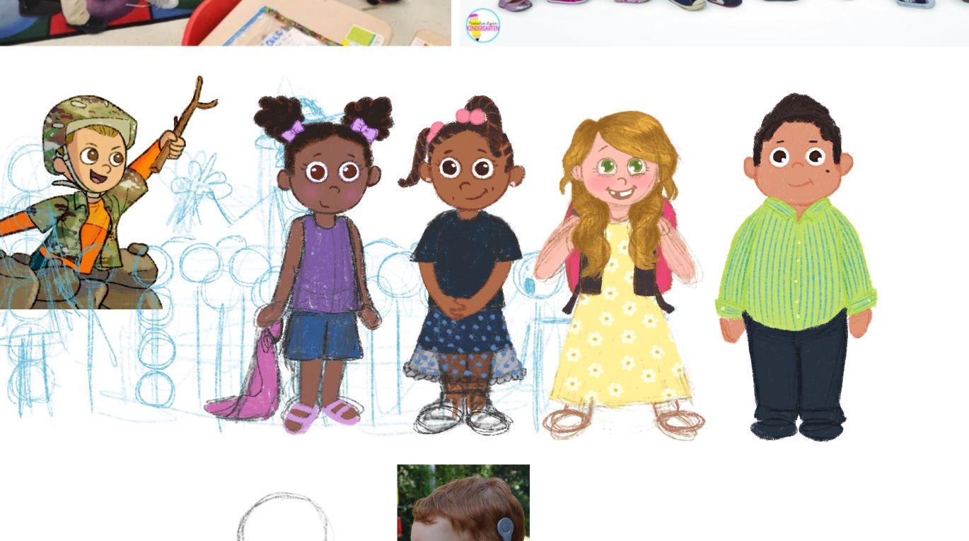
I started on drawing some kids for the illustration, and probably other future illustrations as well since they will be a lot smaller and might not even show their faces in the one I’d working on. This took a lot longer than it should’ve, already.
-
-
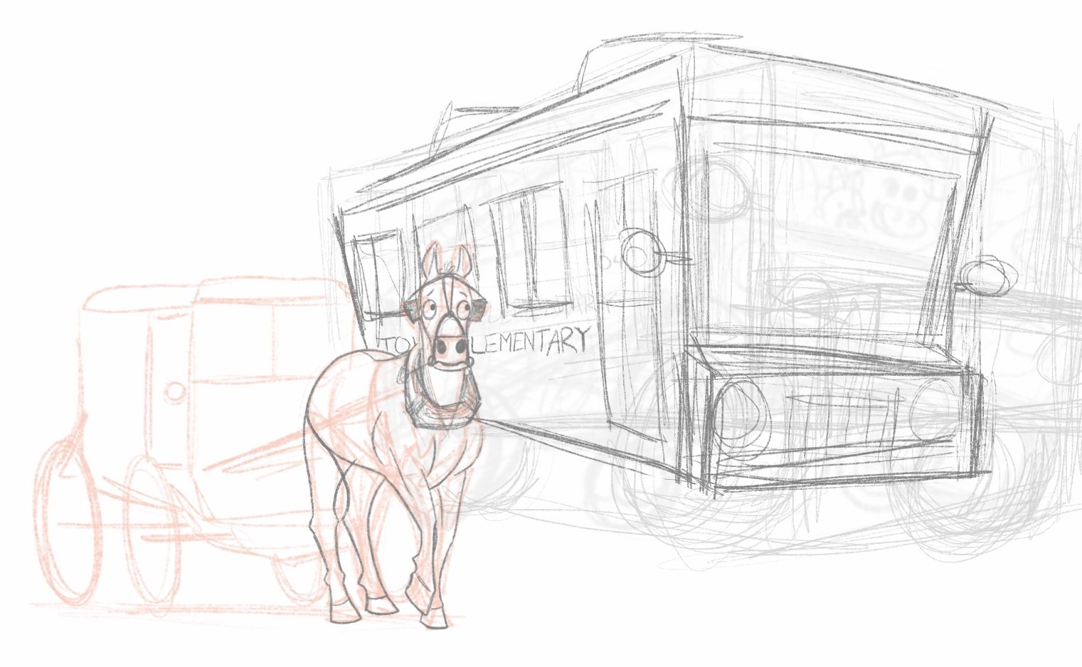
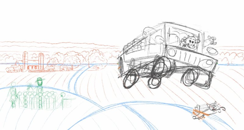
@kayleenartlover looking really good. Nice work on the background, and I love the horse and his expression. I assume that is an Amish buggy, yes?
A couple observations:
I would have the cat jumping to the left, so it is going more out of the path of the bus.
Not knowing the story, I have to ask why the kids, teacher, and farmer are all bunched together in a field so far from the farm.
-
@tom-barrett yeah so the original sketch made things a bit closer to eachother but it didn't fit the perspective for the landscape. I want to have elements other than the elementary school bus driven by farm animals to tell the story of what's happening. So I'm trying to figure out other options.
What happens is this: first grade-ish field trip to local amish farm (grew up in Lancaster, Pennsylvania) and while the class and teacher is distracted the animals take their bus to go on a field trip of their own. So at some point they see it drive away, and probably go after it. -
@kayleenartlover I understand. I am sure as things develop, the illustration will become more clear. The story sounds great and has numerous directions it could go. Keep posting updates as you go. Would love to know how it comes together!
-
-
-
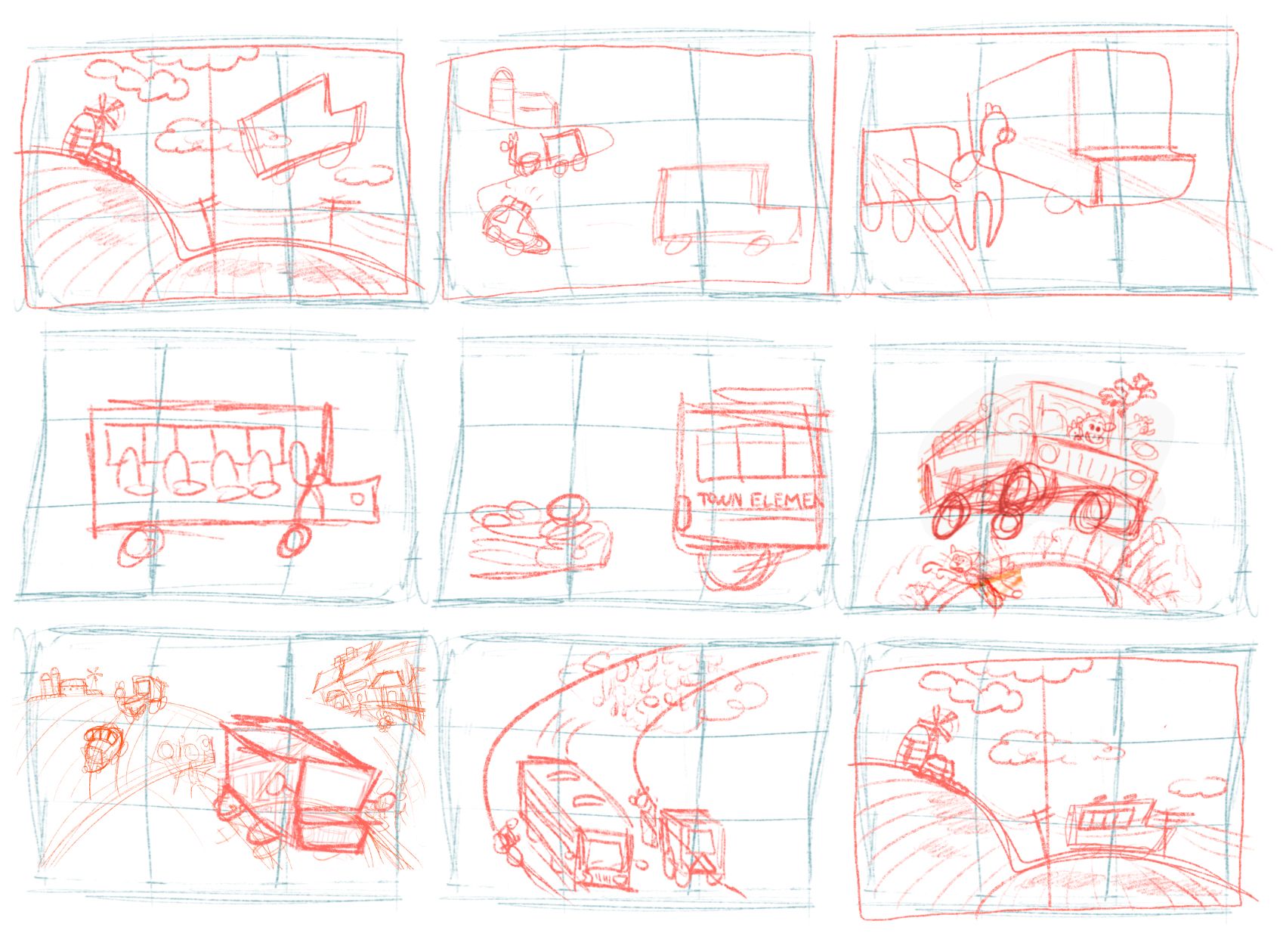
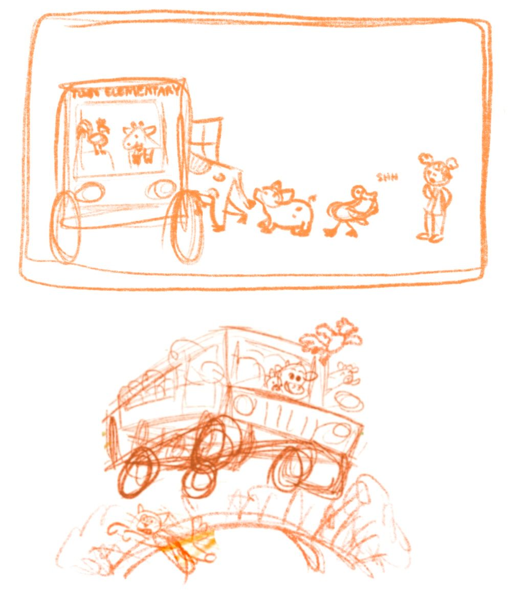
I want to pick a thumbnail sketch that has the best storytelling. Does one of these do that better than the other?
-
@kayleenartlover I really love the one of the cow driving the bus! There is so much action and movement, it if very fun!
-
@kayleenartlover I also like the cow driving one the best, with the chicken coming out of the window XD Lot's of story going on in there already. Even without a story.
-
@Avondrood-art Okay cool! I really want to make sure my portfolio has some illustrations with storytelling and that sketch was kind of an early one but none of the other thumbnails I've tried since were working for me. Hopefully it's safe to move on to actually sketching it...
-
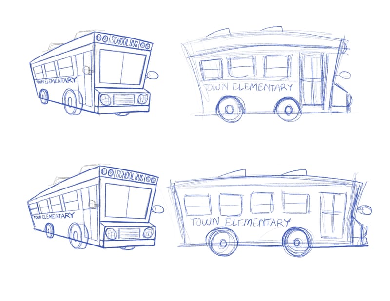
Working on drawing the bus design from a couple different angles before drawing it in the final illustration. Should I do the short one with 3 windows or the longer one with 4 windows? Does the shape work or look too cartoony?
-
@kayleenartlover the short one has more personality/character. I would, however, put the front wheel ahead of the door. Looks off balance now.
-
@kayleenartlover I like the shorter one. It’s more cute.
-
@tom-barrett What he said ^^
I'd do the shorter one too. Looks way cuter. @kayleenartlover -
@tom-barrett I see. I used a reference photo for the tire placement but that was for a bus that is completely flat on the front. Other buses have it in the engine part but that would make the front "nose" wider. Should I do that?
-
@kayleenartlover I looked up some photos and see what you are referring to. However, remember that as illustrators, we have a bunch of creative license to modify elements to fit our style or story, or both. On a flat-nosed bus, the wheel behind the door looks balanced, but when you add a nose to the bus, it makes it look odd with so much "unsupported" at the front. On your sketch, it appears to have enough room to place the wheel up front without making the nose any longer. Or maybe you could make the wheels smaller to fit. Or you could make the nose even less long (just a hint of the nose) so the wheel behind the door works better.
And keep in mind, this is my subjective opinion.
 You have to do what works for you. Once you place the illustrations on the page, then that becomes what busses are in that world. So, in the end, not a huge deal either way.