I need help with my color rendering
-
Hi
 , this community is super helpful so I thought I'd ask for your opinion and/or help regarding the color-rendering. @Jake-Parker said in the January live stream that I'm over-rendering with colors. I've been trying to think and experiment on what would be an appropriate amount of rendering because I recognize that sometimes I go too far with it.
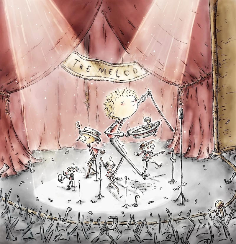
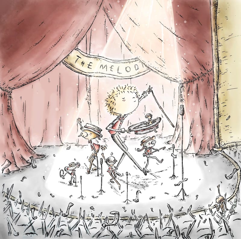
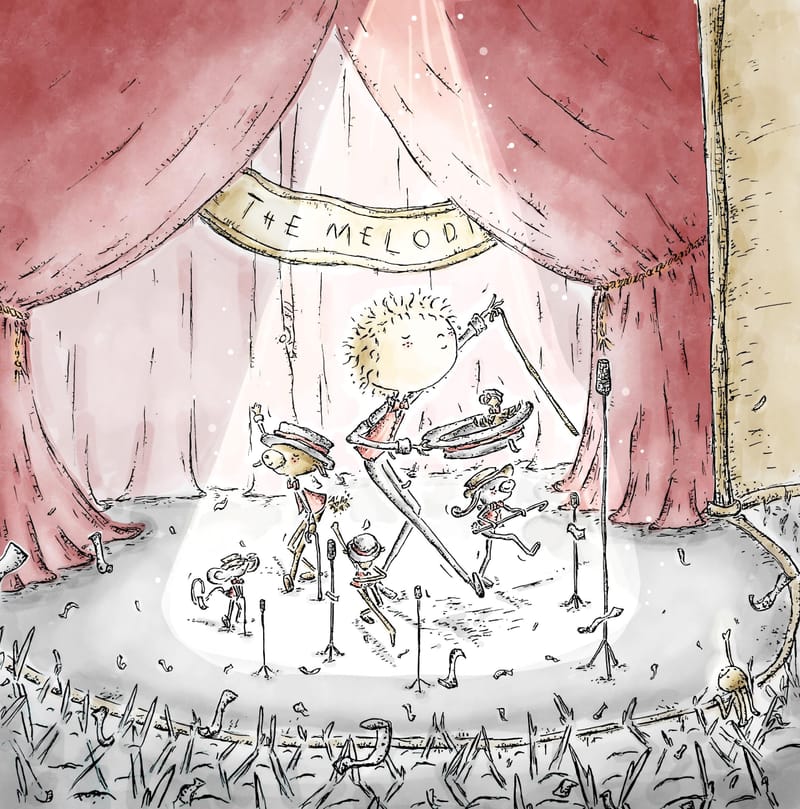
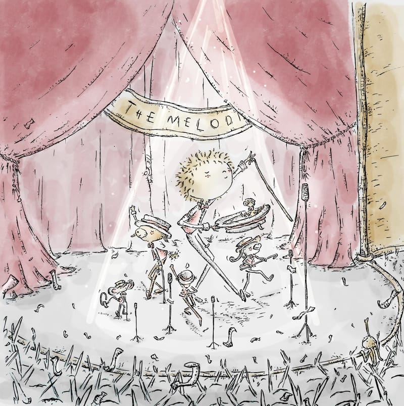
It would be a great help if I could get some opinions on what amount of color rendering looks best. I made a random drawing and tried different levels of rendering on it. Which of the images below looks best in terms of color rendering? The one at the top is the most rendered, and as you go down, they are progressively less rendered. The last one is quite hastily done and not very neat, but it gives an idea of how minimal rendering looks. The lighting and color saturation varies in each of the images, but don't let that distract you.
1.the most rendered
-
the second most rendered
-
the third most rendered
-
the least rendered (still at the sketching stage but it gives some idea)
Thank you in advance!!

-
-
@Enni-Heikura hey! This is cute, obvious story with good poses and silhouettes! The most color rendered has the best value contrast and readability, i think you could still push it a bit farther though—this is a great step in the right direction for reading your pictures, if you dont mind me saying. Great job!
Blog: mamatheartist.blogspot.com
Coloring page newsletter: https://bit.ly/Color-in -
@Enni-Heikura Hi.
") Your work is unique and recognizable. Very nice... I think the third most rendered works best with your style. The most rendered looks like it's out of balance with the looseness and sketchiness of your line work to me, but that may be because the shadows are being created with black. You might try looking into how to choose colors for shadows, or ask on the forum so people with more expertise than me can chime in.
Your work is unique and recognizable. Very nice... I think the third most rendered works best with your style. The most rendered looks like it's out of balance with the looseness and sketchiness of your line work to me, but that may be because the shadows are being created with black. You might try looking into how to choose colors for shadows, or ask on the forum so people with more expertise than me can chime in.The less rendered options look more like watercolor to me, and the more rendered ones look more like acrylic. I'd consider which effect matches most with your ink style and go from there.
Hope that's helpful! Thanks for sharing your process.
-
@Enni-Heikura I like 3 and 4 because your style is very simple, like a watercolor doodle. It reminds me of Calvin and Hobbs style. I do think sometimes your least rendered versions lack contrast. But even if you're using less shading layers, you can have more contrast by having a darker base color.
I would suggest to you to show the strongest highlights by leaving the highlight area white, like on a watercolor. And you could use your black pen to fill up some areas as blocks of black, for example the hats in this illustration. All this would add contrast without the need to over-render your illustration.
The strength of your style is the simple, doodly feel of it
Compared to other artists who can render more, it doesn't take much for your pieces to look over-rendered because less is more with your style.vanessastoilova.com
instagram.com/vanessa.stoilova/Check out my Youtube channel for tips on how to start your career in illustration! www.youtube.com/c/ArtBusinesswithNess
-
I like version 3 because it has contrast to lead the eye, without the colors being too overpowering.
studiojcd.com
she/her/hers
Insta/Twitter: @chengdesautels -
@R-Fey-Realme Thank you very much for your advice and feedback!
I also like the contrast in the first picture, but I'm not sure if it's too rendered and therefore somehow "tight" in terms of color. But this is currently my top priority as I try to explore and improve so just more practice and investigation . -
@KathrynAdebayo Thank you so much for these comments and tips
, they're really valuable and helpful! I also maybe like the third or second picture the most. You're absolutely right that the lines and colors need to be balanced, and in the first one, it feels like the colors are a bit too overpowering...  In the future, I'll try not to render the colors too much; I tend to fall into that trap so easily..
 -
@NessIllustration Thank you very much for your feedback and advice!
I also think that in the first picture, the coloring might be a bit too rendered, but of course, achieving contrast is more challenging if the coloring isn't as intense. Those are really good tips you gave regarding that!Sometimes it also feels like the use of colors depends on the image; sometimes less works, and sometimes more...On the other hand, I wouldn't want to go for a completely comic book-like coloring, but I need to find the most suitable style for myself through experimentation. Maybe more of a Quentin Blake style of coloring, but not quite as loose.
-
@jenn Agreed with you there! Thanks for your feedback!
-
I like the third one as the eye is nicely drawing to the middle. I really do like your unique style but I think you should use more values to draw the eye to what is important in the image. I think it was in the critique of the Griffin image where it was really difficult to make out of where to look. So maybe experiment more with minimal colour rendering and more value? Does that make sense? Sorry, I feel like my brain is missing the right vocabulary today. I actually do have the same issue when I draw in colour. That's why I currently stick to only black and white... my lazy escape
