Pinpoint what is wrong here?
-
Thank you to everyone who has given me feedback on all of the work I have been posting this year. I have logged all of the comments and will be making changes to my work once I get a free minute to do so. In the meantime, I have to keep making new work so I have another one that needs diagnosing!
I signed up to do the SCBWI Illustrator Nuts and Bolts critique with Agent Christie Megill. The focus is on characters. We are required to submit on Monday one character design, one character study and 3 sequential images. Thankfully, the way the event is structured, we get to do revisions to our work to receive a second round of feedback from the agent. However, I am still in a rush to finish this and I ended up making a bunch of errors.
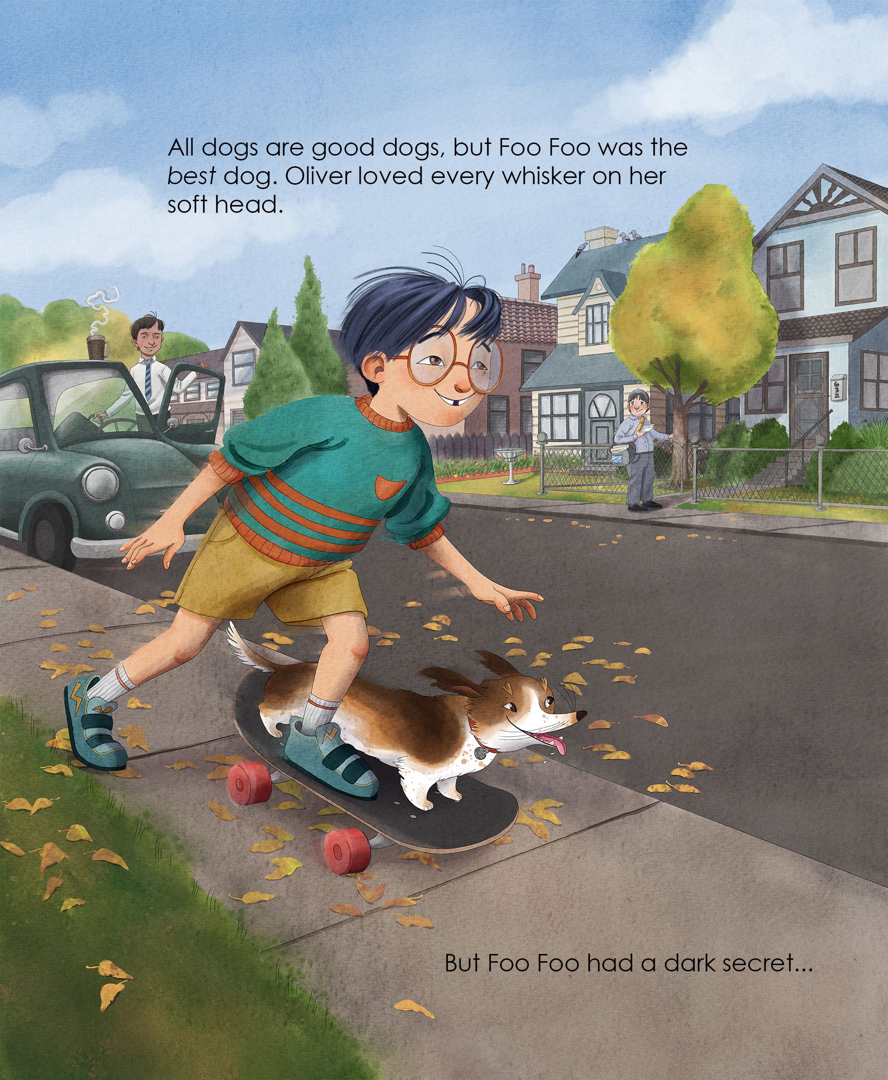
This is the first of 3 images (I'll post the other two sketches that are yet to be colored below as well so you can get a sense of the story I am trying to illustrate.) I feel like the issue is with the color and contrast. I want the background to recede, so I tried laying a cool filter over it all but I don't think it really works so well. I'd love your thoughts.
Thank you!!
-
@Jeanne-M-Bowman You're very good at drawing backgrounds, but it looks like your draw the whole neighborhood and then put the characters in it. That's actually backwards! At the planning stage, you decide where you characters will be and then design the background behind them in a way that won't interfere too much with reading them. Unlike with photography, you're not stuck working with reality. You can design the environment to suit your needs.
You have a very detailed house right behind your character, and that's really attracting attention but doesn't really need to be there. The houses left and right tell us already where we are, so in the middle you could just put a tree and suggest a less detailed house behind it, or even leave it empty. We still understand where we are
") The further away elements are, the less detailed they can be. Right now your background has a very high amount of details, and that does attract attention a bit too much. I would simplify a bit where that improves readability (for example, through the car window).
The further away elements are, the less detailed they can be. Right now your background has a very high amount of details, and that does attract attention a bit too much. I would simplify a bit where that improves readability (for example, through the car window).You can also push your filter much more to create depth and make this easier to read. It's too subtle right now. You can make it especially strong around the character to make him stand out.
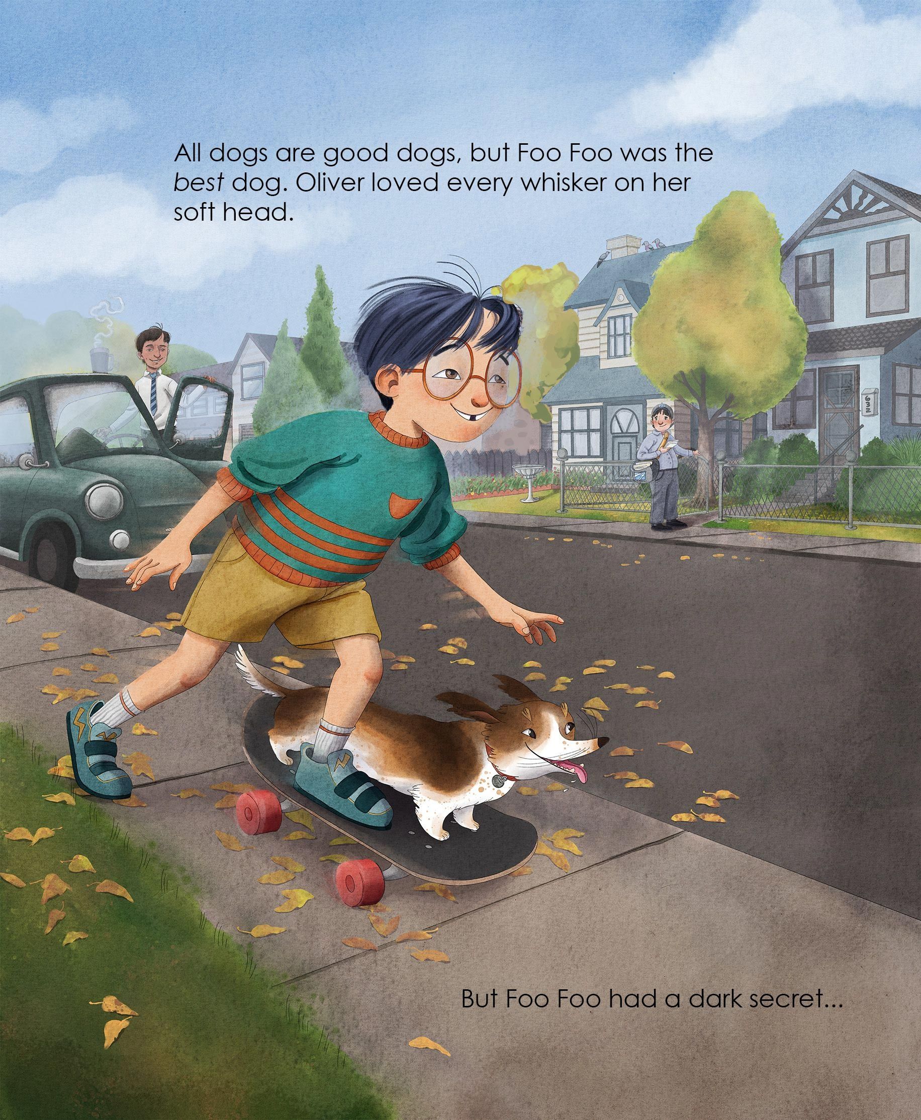
Right behind the boy's face, I reduce the high contrast of the house's corner (which attracts too much attention) and covered up the 2 windows, opting for a simple brick texture to suggest a building. Then the tree and filter!
vanessastoilova.com
instagram.com/vanessa.stoilova/Check out my Youtube channel for tips on how to start your career in illustration! www.youtube.com/c/ArtBusinesswithNess
-
@NessIllustration Oh! That helps SO MUCH thank you! You are totally right- I always feel like I have to include every detail- but I don't! I have to remember that for the future! Thank you so much for this!! I can't wait to revise it!
-
@Jeanne-M-Bowman My pleasure!
-
Hi @Jeanne-M-Bowman ! The image looks pretty good to me, there's nothing I'd consider very wrong given the illustrative look. To me there's like three things that kinda jumped out:
- the edges around the objects are a bit like a few different sheets pasted together, like the trees in the back & the house doesn't quite share the same "edge style", so it looks as if they are not together on the same level of depth (in terms of fore/middle/background).
- shading edges are kinda smooth all around, "airbrushy", but again it might be due to the illustrative style, which might not be a bad thing here.
- A particular thing with the placement of those leaves. I'm not sure if you are copy-pasting those, but notice the scale of the leaves on the ground. You can reference the size by the width of the brick, currently the leaves to me are not "reducing the size at the same rate as the ground perspective", also a bit repetitive... I might suggest that you concentrate those leaves in one or two very dense region and leave only a few extra scattered, that way it will appear less repetitive, and the perspective scale problem also less noticeable because you don't have a lot of the "same" things to compare with visually.
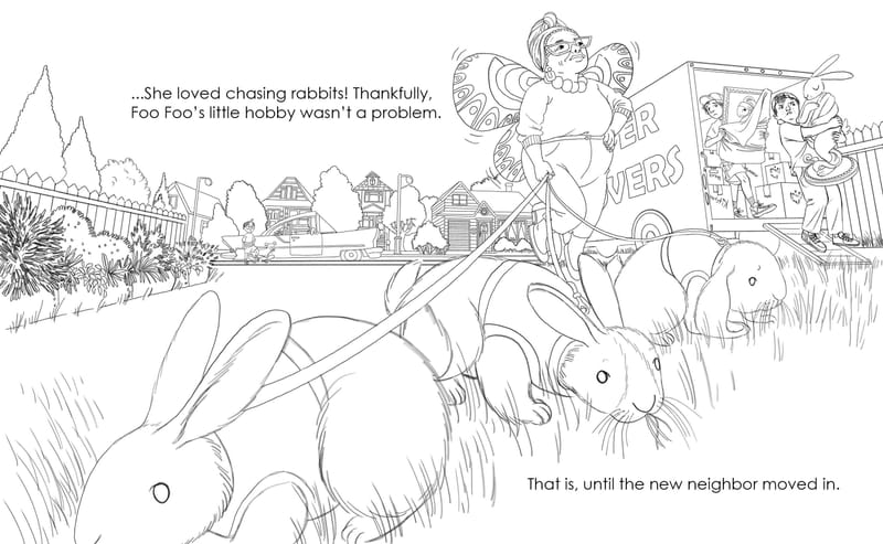
I like the second image with the rabbits. Looks like you are leaning quite heavily on perspective on the truck and the environment too

Overall great work! Keep it up!
I have a messy website: https://ChengduLittleA.com
-
@Yiming-Wu Hi! Thank you so much for the in depth critique. I am a little confused by what you mean around the edges of objects. Do you mean the way that I have removed the outline from the trees but kept it on the houses and everything else?
-
@Jeanne-M-Bowman said in Pinpoint what is wrong here?:
Do you mean the way that I have removed the outline from the trees but kept it on the houses and everything else?
Hi! Yes, I think I meant that. I don't typically draw in this illustrative style, But I do see some artworks have this quality. TBH I don't really know this look enough to know how to make the tree and house more "unite" with each other... It's definitely already workable to me, so maybe this is just a little nip picking

I have a messy website: https://ChengduLittleA.com
-
Hi @Jeanne-M-Bowman , I agree with other feedback, but also suggest you lighten the sidewalk a bit so the text reads better. Good luck!!
-
@Yiming-Wu It's actually quite common to have a slightly different rendering on background elements, and helps the characters and foreground elements stand out more. Less contrast, less details, and less rendering on background elements all help the readability of the overall image
vanessastoilova.com
instagram.com/vanessa.stoilova/Check out my Youtube channel for tips on how to start your career in illustration! www.youtube.com/c/ArtBusinesswithNess
-
@NessIllustration Ah I see. Thanks for the explanation
-
@NessIllustration this looks great! I only have one kind of knit picky suggestion. I understand that you placed your character on the skateboard to make room for their dog, but where their foot is it would cause the side skateboard to tip down. I think if you adjusted that it would give your piece a little more gravity :).
Overall beautiful work and fun story!