Critique Request - Page from Dummy
-
@matt_gallagherrr I think you need to slow down and work on mastering your basics. Here are some things you could work to improve in this spread:
-
Anatomy and shape construction. Currently the characters are looking flat. You see them pretty straight-on regardless of the perspective of the rest of the illustration. The basic shapes that make up things like the excavator are rendered inconsistently. I'm particularly noticing this on the wheel tread. You shouldn't be able to see that much tread under the front-most wheel in a top-down view.
-
Use of brushes. It looks like you're going for a watercolor look with the translucent brush you've chosen but the execution looks rushed. Edges are messy in places but not in others. The brushstrokes overlap to create a lot of shapes and visual noise that detracts from the illustrations.
-
Use reference. The excavator is missing crucial parts like a windshield, doors, and joints in the arm. It's okay to simplify objects but they still need to make sense and function in the world you've created. Your character forced to look out the side of the excavator because there's no way for him to see out the front of the machine.
-
Work on your compositions. On the right, consider some other compositions that make better use of the space on the page. The top right corner is not being utilized and it makes the page feel bottom-heavy and unbalanced.
Overall, this is a really great start. You've considered the character's expressions and the way the illustrations interact with the text to tell a story. Those things are working well!
Taylor Woolley
(Formerly Taylor Ackerman / StudioLooong)
Website: www.woolleystories.com
Instagram: https://www.instagram.com/woolleystories/ -
-
@matt_gallagherrr I just want to congratulate you on starting this project, taking feedback seriously, and asking for advice. It seems like humility and commitment like that takes people far in this field.
-
Thank you! @NessIllustration this was exactly what I was looking for, thank you for taking the time to describe where this was falling short.
-
@StudioLooong Thank you so much for taking the time to give this feedback! It is immensely helpful! I see what you are saying on all these points, and it's giving me some nice specific things to work on.
-
@KathrynAdebayo Thank you Kathryn! I really appreciate that. I have been writing picture books for a while now but started working on illustrating a year or two ago. My goal was to just get a finished dummy completed. And now it's on to looking at all the areas that need improvement
 The feedback from everyone on this post has been super helpful and your congratulations and encouragement are a great morale booster.
 -
@matt_gallagherrr Thats a rough place to be in, where you have thrown everything you have at it, and the pros (clients or critiquer) say “nice rough draft, excited to see the finish!” But it happens for everyone who wants to be serious in art, and you are approaching it with the humility to fight through it and figure out “finished”.
There is a creative podcaster named Andy J Pizza who goes into this a lot on his podcast because a similar moment was the turning point for him. He graduated from college and immediately got approached by his dream client, but when he sent in the finals they said “these roughs look good, excited to see the finals”…..
he had to go on a journey after that. He talks about it a lot, but here is another episode that i would recommendSomething that really helped me when I was struggling with this question at the end of college was this quote from artist/teacher robert henri (i read it in this book The Art Spirit, which is a collection of the advice and critiques he gave his students) he said something like: “if it isnt finished in the begining, in the sketch, it will never be finished”
Its daunting, but also comforting for me to think i need to spend 98% of my effort getting the base correct “finished” completely worked out, setting myself up to be able to really finish the piece.
Another thing that really helped me when working on my own first dummy after college (my own manuscript) was to go to the library and pull like 20 childrens books off the shelves at random and then read/study/absorb them all. At that time was trying to figure out how i could make the finished spreads (fully rendered ones) look like they were done. It was a style question really bc i want to draw flat characters but i cant get away from perspective and realistic lighting in the environment and it always felt off for me. In looking at so many books i found an artist who somehow managed to do it beautifully and he has been my north star ever since.
When i submitted that book dummy to the scbwi critique event they told me (everyone) i like the story, but i cant tell if i like your art…..
That was so helpful for me, because it gave me an idea of how dialed in my first dummy has to be since i havent published a book before. Right now (1 year later) i am working through another pass at that dummy so i can submit it to publishers who allow unsolicited submissions.
In the time between then and now i took time to do some self discovery, a master study of that book i found at the library (my north star), and i made 13 coloring pages involving my main character and his family and friend. That has been the biggest help because i got practice drawing him and now i have a pretty good idea when ive got the face wrong and how i can fix it.Blog: mamatheartist.blogspot.com
Coloring page newsletter: https://bit.ly/Color-in -
@matt_gallagherrr the main thing you have accomplished with this effort is you have created an honest rendering from your own understanding. This is important because it provides an accurate snapshot of where you are in your journey to become an author and illustrator. A prideful person might be tempted to copy the work of others to come off as being more advanced but you didn’t do that. You chose originality and honesty. I like that about you.
The first thing you might want to do as an author developing a storyline is to ask yourself what role the excavator has, why it is used to get the attention of the principal character’s friend and if it is involved in diverting the meteor, how does it do something that seems implausible.
-
Great feedback from everybody so far!
I agree with @NessIllustration that a raw, sketchy style tends to benefit from a strong sense of design and clean presentation. So I had a go at redesigning the illustrations you already made.Couple things to keep in mind when illustrating a book.
Don't repeat yourself. Every image should tell the reader something new.The three panels were visually communicating the same information.
So I would make the first panel the "establishing shot"The second panel(s) should focus on the character interaction. In this case the blue boy is worried about the meteor, while the red boy is worried about the blue boy showing up in a backhoe!
The third panel can then show the two boys moving forward in the story. Note that the design of the panels moves from upper left to bottom right (reflecting the way we read a book)
The right page wants to be a full page illustration so just lean into what the page wants to be and make it full page full bleed. The drawings in the dirt seem to be instructions of some kind. But for the reader to understand them they would need to turn the book upside down. More efficient for you (the illustrator) to do that for the reader.
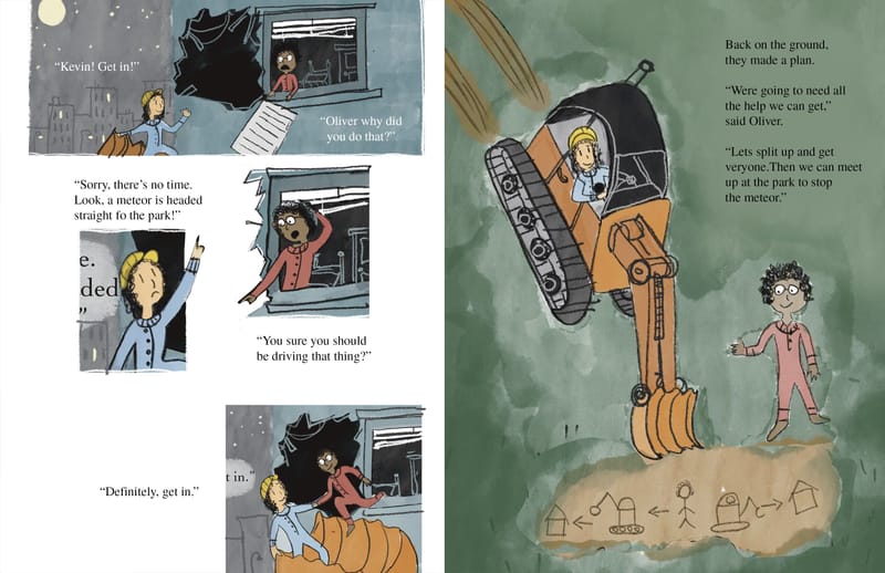
You'll see that I did add some drawing to your images. Not much. just some details that give the images a stronger sense of location. (And I definitely needed to look at a backhoe)To get a sense of what other illustrators working in a raw, sketchy style are doing to make "finished" work I looked at Beatrice Alemagna.
-
Thank you, everyone, for all of the comments, critiques, and encouragement! This honest and thoughtful feedback was exactly what I was looking for and I really appreciate everyone taking the time to provide their insights. I think it's helped me bypass months of toiling haha. And the encouragement has provided more fuel to keep working through it.

@NessIllustration - @StudioLooong - @KathrynAdebayo - @Fey-Realme - @thomas-young - @davidhohn
-
@Fey-Realme Thank you! It makes me feel better that the "nice rough draft, excited to see the final." is a fairly common occurance. I'll definitely check out Andy J Pizza's podcast and that episode, it sounds great. This is great timing as I've just worked my way through all of the episodes of the podcast First Draft with Sara Enni (which I highly recommend) and I've been looking for another creative podcast. Also want to read The Art Spirit now. I do feel like I have a specific style in my mind that I think would work well for this book but haven't been able to do it, it could definitely help to find someone out there who has accomplished something similar. Congrats on your dummy and good luck when you start submitting it!
-
@davidhohn - Thank you! So awesome you did some redesigning to illustrate the points you and others were making. I love the new composition and the idea of the establishing shot with that then freeing me up to just focus in on close ups with the spot illustrations. The left-to-right flow is much more satisfying than the previous straight-down setup. And it definitely adds humor to have the two kids pointing in opposite directions. That was a last minute text change (the red kid was questioning the existence of the meteor before), but it seemed funnier to have him question the backhoe and now I love how it looks with them pointing in opposite directions.
The full page makes a lot of sense as well, and putting the text in the top right cleverly and simply solves what @StudioLooong was saying about the empty top corner.
It's wild how those couple of details you added created a much better sense of location and depth.
Thanks again!
-
I don't think there is much I can add to what's been said, it's all good advice. You said yourself that you're early in your illustration journey, so these kinds of critiques are going to happen because you have so much to learn still and it's not easy putting an image together using all these different skills, concept, composition, line work, rendering, proportions, anatomy, design..... It's a lot, and you don't have to be perfect at all of them before you can do illustration, in fact, you're proof of that, you're doing it, and that is GOOD! But if I'm being honest I can see why they may have thought that upon first glance. It probably didn't help that you were rushing to complete it as well.
Just keep your chin up and keep trying and learning, art/illustration is really a never ending journey of trying and learning. Embrace that and you're gonna be just fine!

I recently had a good friend of mine who is an amazing artist and was lead conceptual artists for games like Halo Reach and Destiny give me a pretty harsh critique that kind of hit home. It happens at every level really, it's just a way of getting pushed to do more, be better.
Cheers!
-
@davidhohn thank David, this was really helpful to me as well.
-
@Sara_C Glad you found it useful!