Share July HTFYA Ideas & WIP - (Food Truck)
-
@LauraA I like what you have here. What I see is that the food truck makes the clients dreams come true. I think the lines around the mermaid helped make that clear to me. I think you have done a great job.
-
@jahn Hi! Just a couple thoughts:
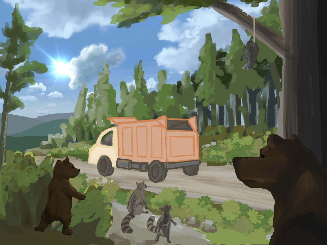
You’re doing a great job of getting highly detailed with the background, but your focal point is ultimately going to be a food truck, so I’m thinking that all of your rendering and detail will detract from what you want the viewer to look at. You’ll eventually want to knock back the background pretty substantially (probably making it lighter and bluer to add atmospheric perspective). You might want to start with the truck and animals themselves and then fill in the background from there.
Also, this forest landscape seems to have a higher vantage point than your sketch where you show the bears in the foreground, so that could cause some issues for you.
-
@LauraA I’m picking up on the popsicles being magical—They turn whoever eats them into whatever the popsicle is shaped like. That’s awesome! However, I can also see Will or Lee pretty quickly pointing out that the area of payoff is way too small. I think you need to zoom way in on the girls getting the ice cream. Also, there are a few details that feel a little out of left field: It makes sense that two little girls would want to be mermaids, but who got turned into giant fish in the background? And would a dog want to be turned into a car? (It was hard to discern that there was a car-shaped popsicle in the dog’s mouth, but it’s a bit confusing for me.) Also, it seems a bit confusing that there is an anthropomorphic dog handing out ice cream AND a relatively normal dog running on all fours in the same scene.
-
@Sarah-VanDam Thank you! I realize that I jumped full in to rendering the background and should have plotted out all my layers first. The vantage point is my biggest issue, because I would have to redo everything or make it from the point of view of a raccoon up in a tree. I haven't decided what I'll do yet.
-
@The-Artful-Spoldger I had a very similar idea!
 I'll have to continue brainstorming, you got to it first. Great minds think alike.
-
Thanks @Mandy-Forte and @Sarah-VanDam. Mandy's guess was closer to my intent, but still, it needs to be perfectly clear.
Good point about the two dogs. In my mind the dog running on all fours was just an expression of his extreme enthusiasm, but I get your point and agree that that one is harder to read. I have another character that I could put there instead.
I also understand about the space/focal point issue. I had originally drawn a double spread so I could put in lots of examples, but maybe the scope has changed. Maybe putting the characters closer together would also make their popsicles larger and therefore the point clearer. I'll take another look at that.
-
@Sarah-VanDam @LauraA These are my thoughts exactly. I could figure out what's going on but there was something off about the picture and I didn't know what I think you explained it well. I feel there's too much going on and it's confusing. Also I thought the dog is holding a photo camera

-
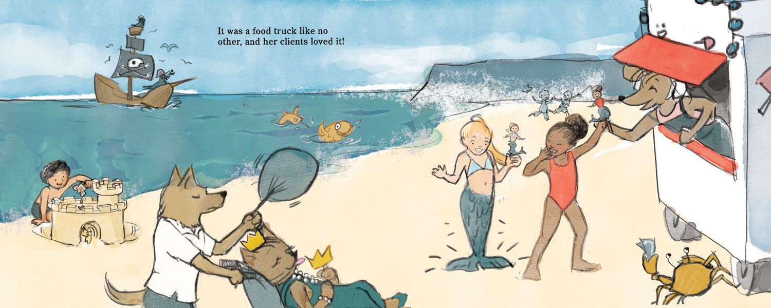
@evka8D @Sarah-VanDam Is this version clearer? I just took out the fish with the treat because in fact there's no way to tell which way the transformation is going. I decided the other fish could be clients arriving on the scene. I also took out the boy's crown and cape so it would be evident that he's concentrating on his sand castle and also so there was no confusion about two crowns now that I've added a cat queen. And I took out the dog because it was confusing. Does it work better?
I tried a cropped version, but this one was just more harmonious. Since it's a still spread version, it also leaves room for the gutter.
-
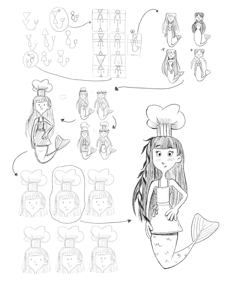
So my general idea is a "Seaweed Pie" food truck run by a mermaid. Her customers will be pirates. I'm still refining the idea and the story/ twist to the idea, but started with the character design of my foodie mermaid character. Here I share my process:
-
@LauraA Hmm I am not sure. To me it still seem like there's too much going on on the picture. It's possible to figure out what's happening but there are too many things which seems confusing to me for example if the treats are supposed to make your wishes come true why is that boy playing with a sand castle? Isn't a sand castle something he could easily build without any magic? I would expect a real castle or at least some way more exciting sand castle. I still don't get what is that fish doing? Who wishes to be a fish? I mean someone probably does but here it's hard to figure that out from the picture and it adds to confusion in my opinion as it's not the most typical wish you'd expect. I guess if there was more context like if this was a part of a wider narrative in a book for example, it probably could work better but for this prompt alone, I feel like it's trying to cover too many narrative points.
On the other hand I find the mermaid girls part the most interesting. Personally, I'd only focus on that part and add maybe more girls who want to transform but that's just my suggestion. -
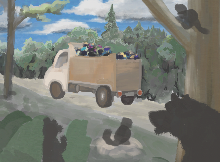
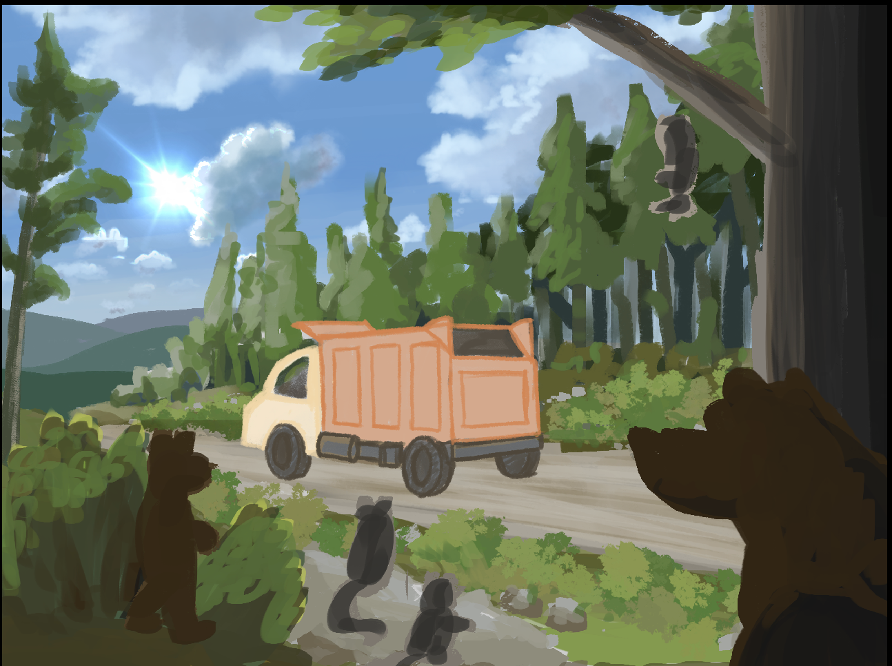
I decided to start over again and focus on blocking in shapes and colors first and avoid details. Below, my second attempt felt flat and drab, so I started over again. Below that is the third attempt where I am at currently. I am more satisfied with the progress and am hoping that bringing details and shading in will complete it well. Any thoughts?
-
@jahn wow those are all pretty crazy ideas! Thanks for making the thread, i wasnt going to participate because i guess idea generation burn out—its hard to really spend a long time trying to come up with a special story and angle to get feedback like “man you really missed out on doing this super obvious story” which really means “your idea was still not condensed enough and you didn't present it to me in a way that i could grasp it”—or alternatively, this moment is not action packed enough to be a full story.
But reading this thread (and finding a little free time) made me interested in trying, so i asked chat gpt what i should draw, (A: a tranquil landscape) q:weird character (for some reason i hoped it would say giant floating eyeball?) (a: mecanical jellyfish, that sells ornate glowing underwater lanterns). I asked a few other questions but nothing really interested me, so i went back to work.
All that was bouncing around in me brain and i threw this together
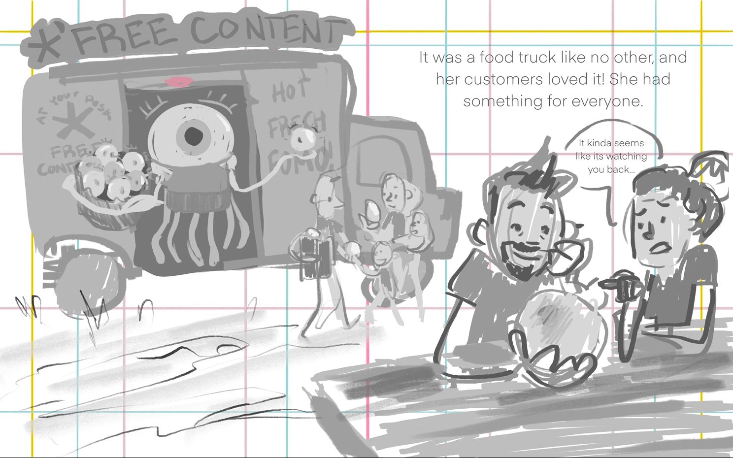
If i find more time might finish itEdit june 29:
I made another version and am struggling with color now lol. It is my greatest weakness right after everything to do with rendering.
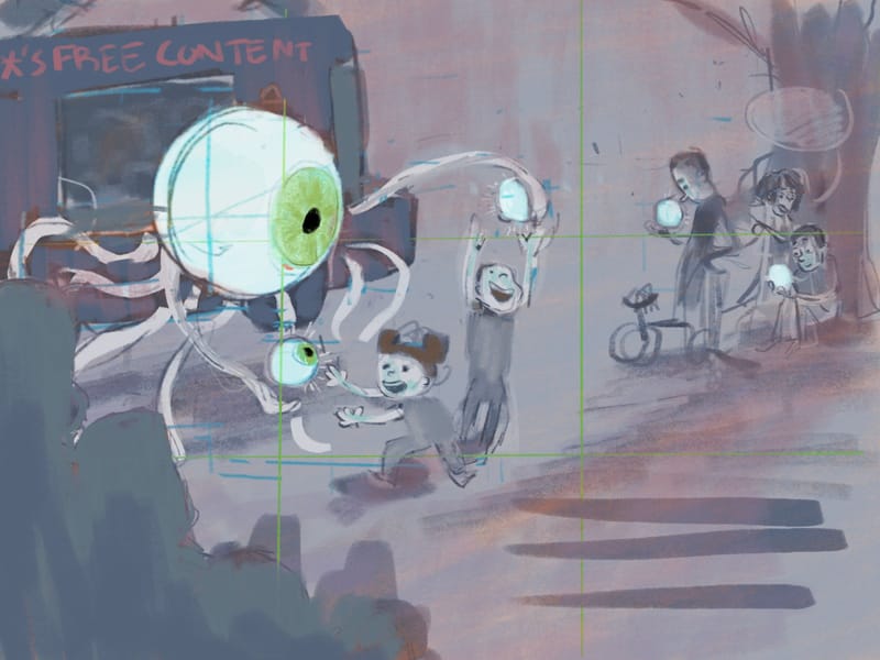
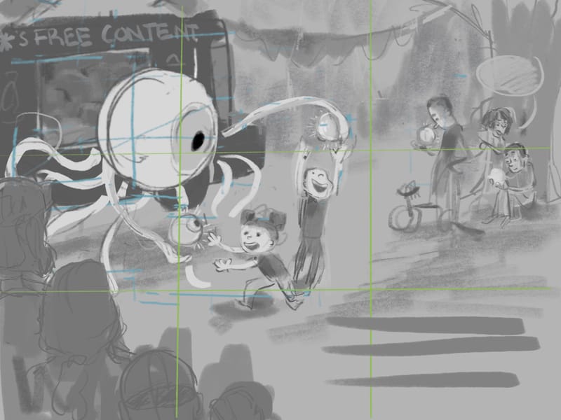
-
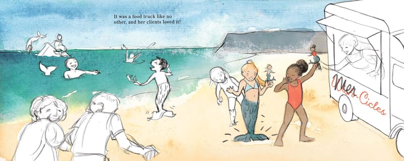
@LauraA I do agree with @evka8D —I think I still have to suspend my disbelief about too many things in the image to the point where I feel like this magical world doesn’t have enough constraints, and I’m not sure what’s important or how things work. I think it could be fun to focus on just one magical “rule,” and popsicles that can turn you into a mermaid could be a GREAT one to do. You’ve got a good start with that. For example, here’s a quick mock-up of your image zoomed in on the girls:
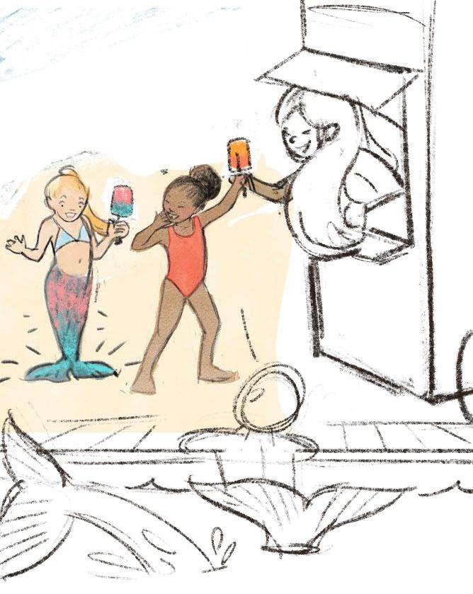
Here’s me brainstorming if I could take your image in any direction I wanted: Maybe, instead of the ice cream truck being run by a dog, it’s run by a merperson with rainbow hair, scales on her arms and fins by her ears or something. Maybe the popsicles give you a mermaid tail with the same colors as the flavor of the treat. And maybe the truck is right next to the water (I drew the edge of a pool here), where you can see people who are already transformed swimming around.
-
@Sarah-VanDam Thanks! I did something similar last night, though it still has the larger format. All mermaids. The color part is funny, though!
-
@Mandy-Forte I like the first one too!
-
@Fey-Realme Well, it's an off the wall idea for sure! And I hear your concerns, and I get the analogy. I guess my only question is: Is it food? Do they eat the content? I'm guessing they "consume" it.
-
@jahn I feel like the (well-executed) sun flare is distracting me from the main point, which is clever. I'd make the animals a more prominent part of the scene. Work on making their silhouettes interesting, and put some lighting on at least some of them, so we can have some character interest.
-
@LauraA I agree, once again I got too focused on detailing the sky before composing the rest of the piece, but yesterday I brought more of the animals forward and I am planning on finishing the details and adding shading afterward. Also, the sun flare was conveniently a custom brush I purchased haha.
-
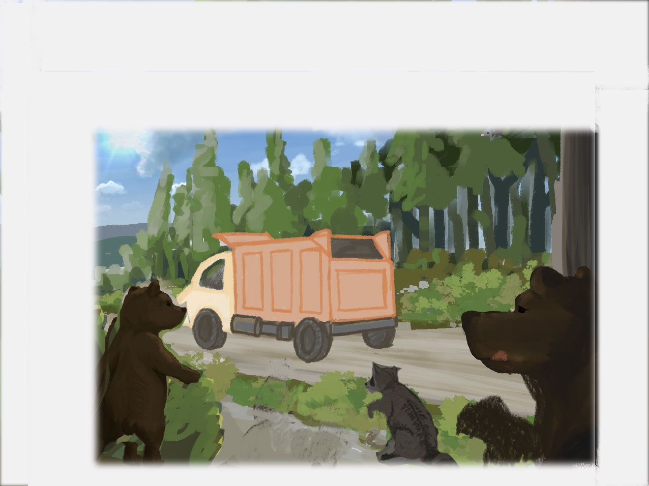
@jahn Here's an example of what you can do with some cropping. I didn't spend long in it, but it's an idea. Also, a lot of AD's don't want to see the back of a character. I didn't intend to create such a focal point on the smaller bear so you might need to move it around, but you could play it up and consider having the baby bear turn around to look excitedly at its mother. As for lighting, you do need dark values, but can put on some rim lighting. Just some quick thoughts.
-
@LauraA
I think your suggestion does contain the focal point a little better than my wider angle. I will have to play around with my cropping a little more.
I was originally thinking of doing a night or evening scene, and the animals would be more of a shadowy silhouette but one of my friends pointed out "Why would they be going to the dump at night?"
I am planning on bringing shadows to the truck and trees and some rim lighting to the animals to help make it all look a bit better and more cohesive.