does this work? composition and value... edit: back to the start! composition thumbnails
-
I think this is lovely. I like the circular framing of the mouse couple. Nice simple composition. I'm especially drawn to the rug tassles and the tree-branch lamp - nice small details that make the scene believable. The only thing I see is I think the window frame looks a bit wide on the far edge of it, maybe make the wider part towards us, the viewer, as it is closer. Is this for a book project you're currently working on?
-
thanks for your help, I'm refining a few things still and pushing the contrast a small bit, but like you said leontine, I would like to keep it soft
true for the frame, rebecca, I'm going to fix that (still have a few things to re-draw anyway, the window frame was one of them)no book project right now, just working on my portfolio
")
-
The composition of the piece is very nice. You have things in the best spots to create flow and movement but keeps you focused on the characters (which are lovely by the way). A couple small things to look at. The window, which I know you are looking at but wanted to reiterate that. Also the flower pot on the right side. Move it in just a touch so that it's not getting cut off. I think that will help it not feel crammed in there. You could remove the acorn to move the flowers. Also the three photos seem a little off. If I was the mouse and I was hanging photos I don't think I would put them there. Maybe just put one photo there. That might help.
Hope any of this helps. Great work and keep it up! Can't wait to see the finished piece.
-
I think it looks really nice and cute. Can't wait until it has been painted. Great work.
-
Looking good Audrey! Your characters are sweet and believable and your drawing skill shines.
The big thing I want to emphasize (and I always emphasize) is showing more options (usually at least three). This way it gives viewers a chance to see what the other possibilities can be. Based on your drawing skill, I think the composition is a bit weak here (sorry! It's my job to say that). It's perfectly centered with an awkward amount of space behind both characters. Think of it as a graphic design. Would you put two big circles right in the middle of the page that are exactly the same size and shape? Probably not. But once the circles become cute little hamsters, we tend to forget about that stuff because we are focused on the scene and all the "stuff" we have to put in there.
I'd go back to the drawing board and bang out 15 more and then post the top three. You can do this very quickly. I timed myself at 30 seconds a piece for these just to show how quick and loose the process can be. Think about big shapes vs. small shapes and making a more dynamic composition. Put more work on the front end before refining your characters and adding detail.
Hope that helps some. Let me know if you have any questions at all. : )
-
argh, I was afraid someone was gonna say that!

I plead guilty, I've thought for a while that the composition was a bit boring but I didn't want to go back for lack of time (and laziness?... mainly time though!). I was hoping it could work like that
I guess there's no escaping it now, I really want to get a nice piece with this, so...
thanks Lee -
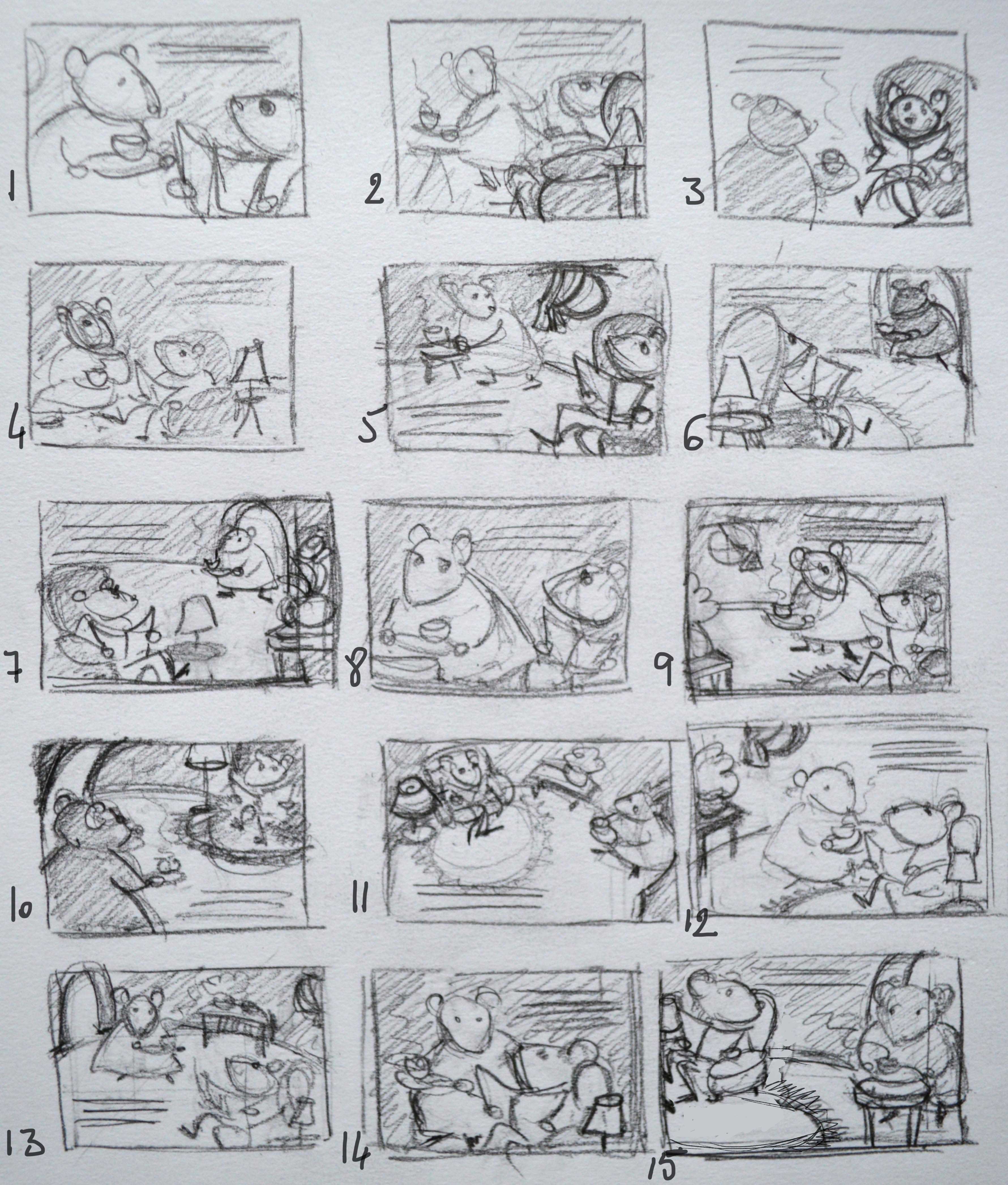
So, it's the 1st time that I make so many thumbnails for one illustration and I kind of need some guidance.
Are they all too similar? Did I miss something? Or can I work with that?
After so many options, I feel a bit confused as to which one would work best. I put down my thoughts here after going through this process:- I really wanted to keep the eye contact between them
- I like the idea of Mrs Mouse putting the tray on a table, while turning her head towards Mr Mouse, it gives a sense of movement.
- I feel a bit frustrated not to find a way to show the room a bit more but I find that the close ups work better than the the large views, because it's an intimate scene. number 6, 7, 10 or 11 for example, are too distant, too impersonal
- I struggle to visualize how to make the light sources work in the close-up ones though, but I guess the window for example doesn't really need to be seen, right? the lamp on the table is easier to fit in the illustration. also, the door frame, as a light source, might be interesting as well and it makes sense to see it since Mrs Mouse is coming from there
that said, I still find it hard to pick one ^_^ I'm thinking 9, 14 or 15... with a door frame
what do you think?
-
@audrey-dowling my personal favorite would be 14 and yes you can use an off scene light source such as a window.
-
Number 3, 8 and 14 are my favourites. great job on these Audrey.
-
Looks like it to me.
Where do you learn about value in the courses? -
@eleanor.m so far I've seen them talk about value in "10 steps to digital painting", "Light and shadow" and "Painting color and light"
-
I like the close up in #1 which would be fun to draw because you can get in there and really work on their expressions and character. I like #3 because that's just a such a fun shot of the mouse the way his legs are crossed and holding the paper. Number 11 would be fun because you can really go to town fleshing out the room that they are in. Those are my favorites anyway.
-
I think you really did a great job on this Audrey! Great variation on your thumbnails (I really don't think they look too much alike!)
I don't know why but I really like #2. I like the gesture of her looking behind her shoulder at M Mouse. I know 14 came up a lot but it's a little like what Lee said about 2 circles in the middle of a page. I also like # 15.
Nice work!
-
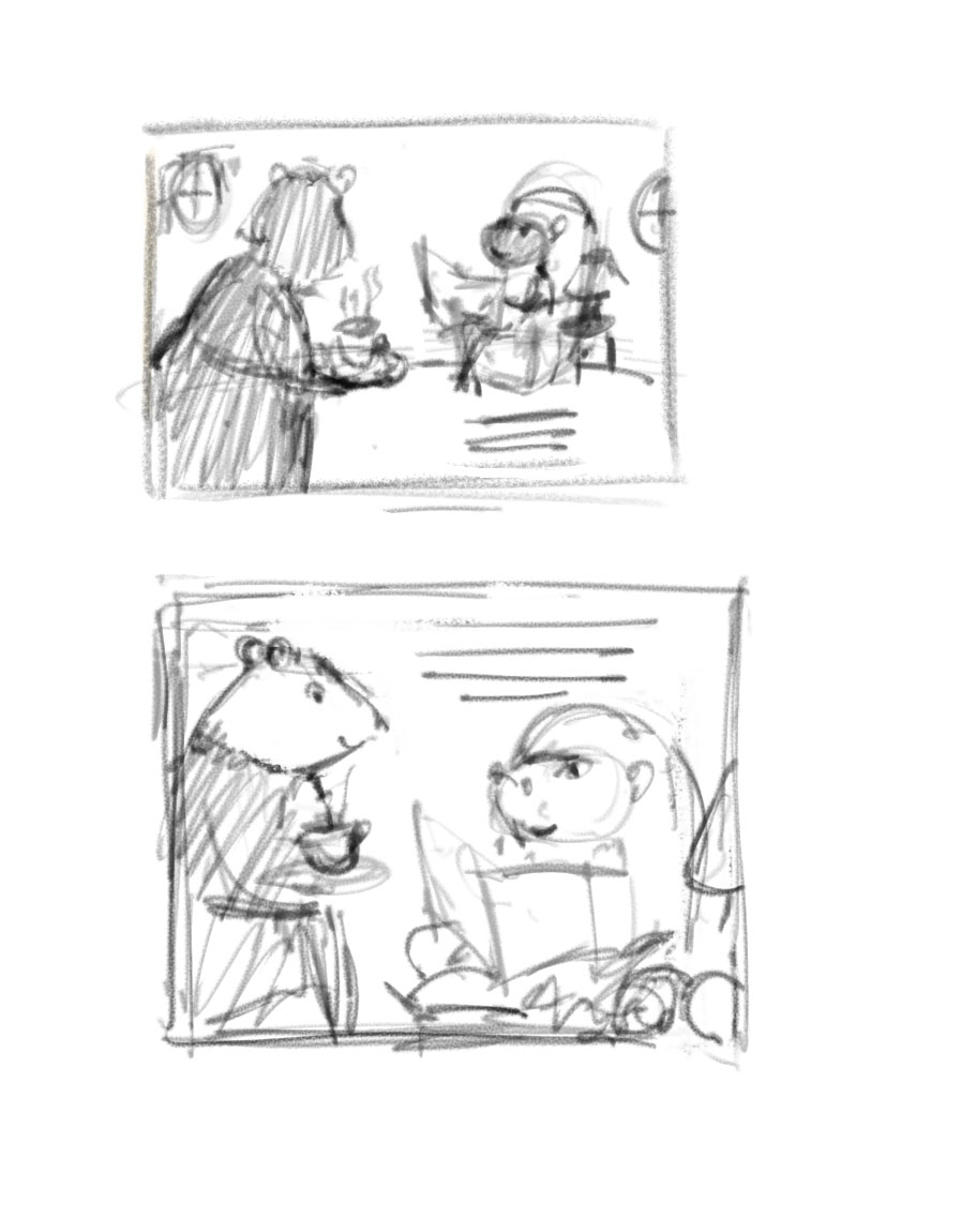
how about that?
-
@audrey-dowling good job on the thumbnails. I think I like #9 too. your other choices are split in half or centered.
-
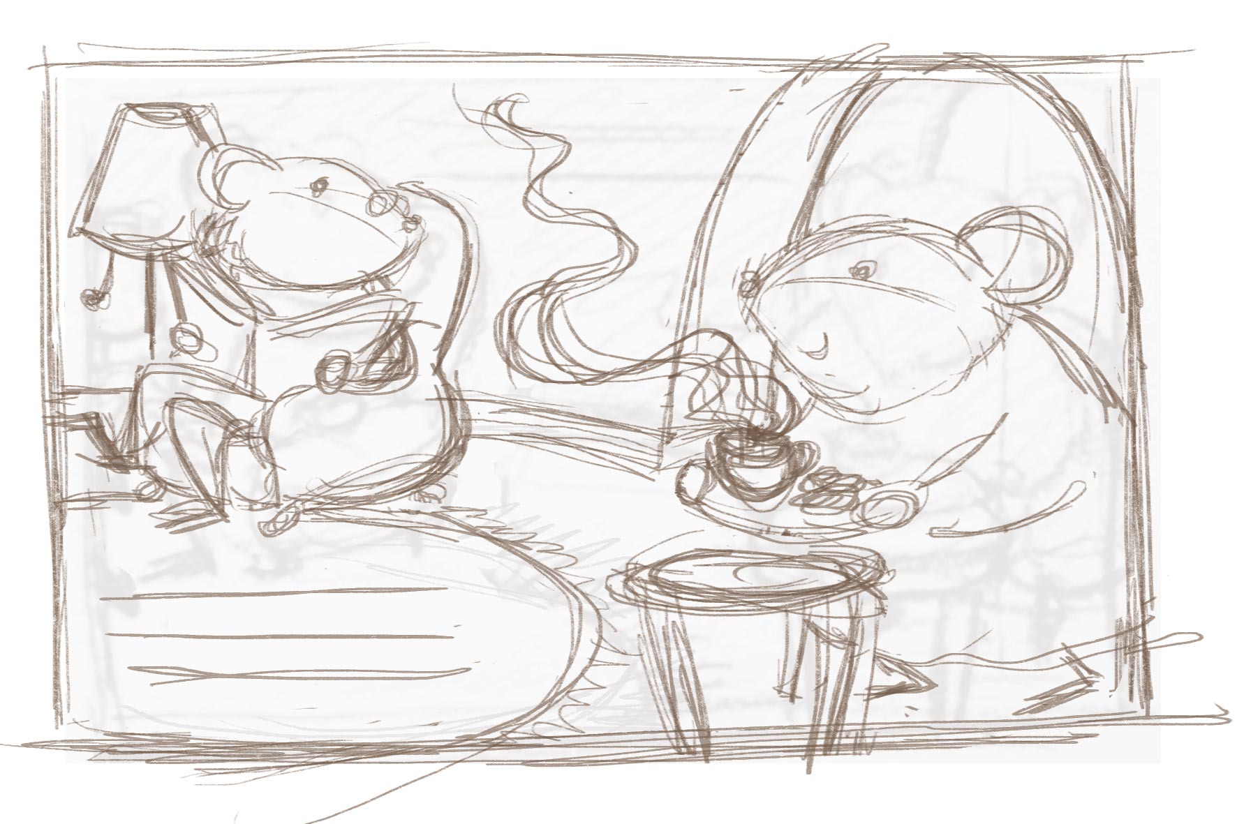
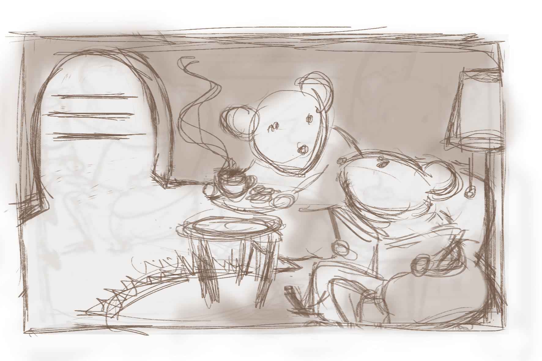
@audrey-dowling I think it's really nice! However, the table is very far from him and it isn't clear that she is bringing the tea to him... But maybe if there was a table beside him and two cups of tea in her tray we would get that she has a cup of tea for him too!
I think the idea is really worth the work you are putting in! These characters are so cute, I really want to see the final version
-
I love the new rough draft that you've posted. I do agree with @nowayme that it isn't clear what is happening in the picture so either moving the table and Mrs. Mouse or having two cups of tea could easily fix that.
So far this draft is a lot stronger than your first. I can't wait to see it progress. Great job.
-
@audrey-dowling I love this one, it was my favorite too of the new ones! I liked your very 1st sketch as well! Nice work!!
-
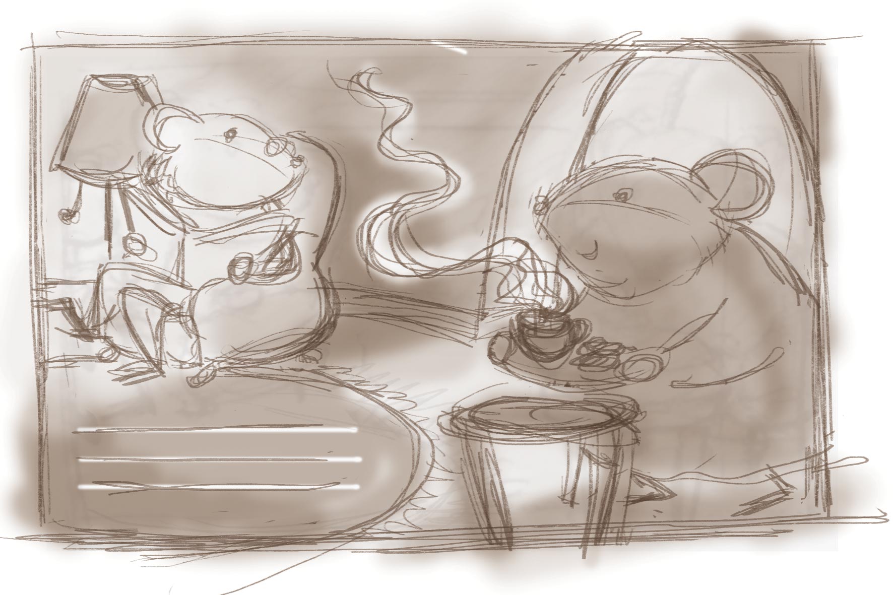
I tried something else, to avoid the "table too far" issue. It's also more simple value wise, it makes it more readable I think
I was afraid it would be unbalanced: are the big shape of the frame, the strong light value and the text enough to balance it out on the left?
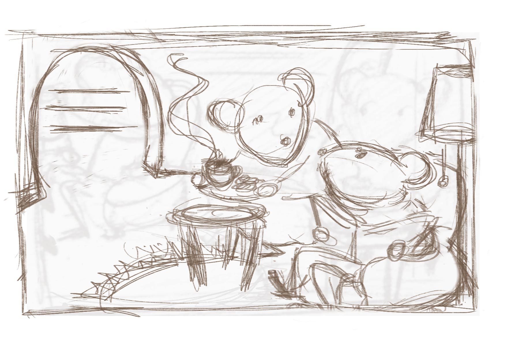
what do you think? -
I like this last one, the door opening would be an opportunity to show some awesome mousey door with little carvings or something... I like it.