Society of Visual Storytelling

    SVSLearn Forums

    • Register
    • Login
    • Search
    • Recent
    • Tags
    • Popular
    • Users
    • Groups
    • Search

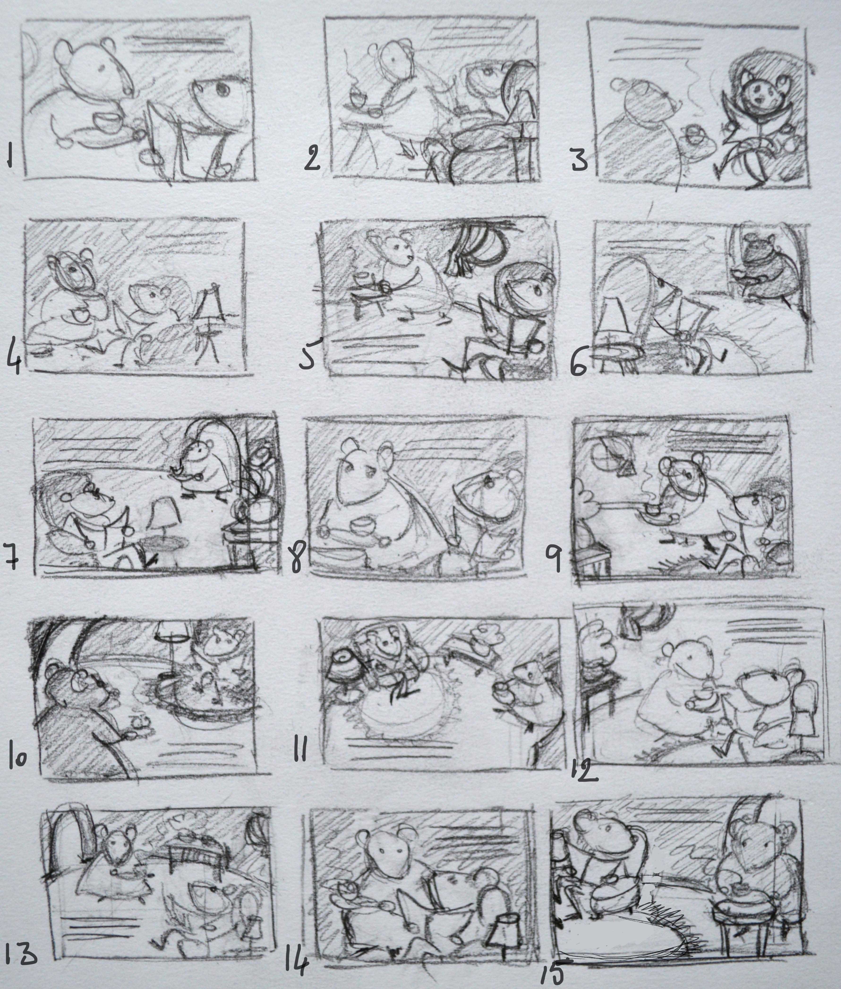
    does this work? composition and value... edit: back to the start! composition thumbnails

    General Discussion
    17
    34
    16473
    Loading More Posts
    • Oldest to Newest
    • Newest to Oldest
    • Most Votes
    Reply
    • Reply as topic
    Log in to reply
    This topic has been deleted. Only users with topic management privileges can see it.
    • audrey dowling
      audrey dowling last edited by

      So, it's the 1st time that I make so many thumbnails for one illustration and I kind of need some guidance.
      Are they all too similar? Did I miss something? Or can I work with that?
      After so many options, I feel a bit confused as to which one would work best. I put down my thoughts here after going through this process:

      • I really wanted to keep the eye contact between them
      • I like the idea of Mrs Mouse putting the tray on a table, while turning her head towards Mr Mouse, it gives a sense of movement.
      • I feel a bit frustrated not to find a way to show the room a bit more but I find that the close ups work better than the the large views, because it's an intimate scene. number 6, 7, 10 or 11 for example, are too distant, too impersonal
      • I struggle to visualize how to make the light sources work in the close-up ones though, but I guess the window for example doesn't really need to be seen, right? the lamp on the table is easier to fit in the illustration. also, the door frame, as a light source, might be interesting as well and it makes sense to see it since Mrs Mouse is coming from there
        that said, I still find it hard to pick one ^_^ I'm thinking 9, 14 or 15... with a door frame
        what do you think?
        DSC_2615.JPG

      website: https://audreydowling.wordpress.com/
      twitter: https://twitter.com/audreydowling
      facebook: https://www.facebook.com/Audrey-Dowling-Artist-Illustrator-498582176906242/timeline/?ref=bookmarks

      Rich Chabot Leontine 2 Replies Last reply Reply Quote 3
      • Rich Chabot
        Rich Chabot @audrey dowling last edited by

        @audrey-dowling my personal favorite would be 14 and yes you can use an off scene light source such as a window.

        1 Reply Last reply Reply Quote 1
        • Lee Holland
          Lee Holland last edited by

          Number 3, 8 and 14 are my favourites. great job on these Audrey.

          https://www.facebook.com/pages/Lee-Holland-illustration/285517801577676?
          https://www.instagram.com/lee_holland_illustration/
          http://lholla56.wix.com/lee-holland

          1 Reply Last reply Reply Quote 1
          • eleanor.m
            eleanor.m last edited by

            Looks like it to me.
            Where do you learn about value in the courses?

            audrey dowling 1 Reply Last reply Reply Quote 0
            • audrey dowling
              audrey dowling @eleanor.m last edited by

              @eleanor.m so far I've seen them talk about value in "10 steps to digital painting", "Light and shadow" and "Painting color and light"

              website: https://audreydowling.wordpress.com/
              twitter: https://twitter.com/audreydowling
              facebook: https://www.facebook.com/Audrey-Dowling-Artist-Illustrator-498582176906242/timeline/?ref=bookmarks

              1 Reply Last reply Reply Quote 0
              • evilrobot
                evilrobot SVS OG last edited by

                I like the close up in #1 which would be fun to draw because you can get in there and really work on their expressions and character. I like #3 because that's just a such a fun shot of the mouse the way his legs are crossed and holding the paper. Number 11 would be fun because you can really go to town fleshing out the room that they are in. Those are my favorites anyway.

                http://www.palacioillustration.com/

                https://www.scbwi.org/illustrator-gallery/illustrator-detail/?illustrator_id=84142

                https://www.pinterest.com/evilrobot2/pins/

                https://twitter.com/MyEvilRobot

                1 Reply Last reply Reply Quote 1
                • NoWayMe
                  NoWayMe last edited by

                  I think you really did a great job on this Audrey! Great variation on your thumbnails (I really don't think they look too much alike!)

                  I don't know why but I really like #2. I like the gesture of her looking behind her shoulder at M Mouse. I know 14 came up a lot but it's a little like what Lee said about 2 circles in the middle of a page. I also like # 15.

                  Nice work!

                  noemiegionetlandry.squarespace.com
                  noemie_illustration on Instagram

                  1 Reply Last reply Reply Quote 2
                  • audrey dowling
                    audrey dowling last edited by audrey dowling

                    how about that?
                    thumbnail3.jpg
                    thumbnail2.jpg

                    website: https://audreydowling.wordpress.com/
                    twitter: https://twitter.com/audreydowling
                    facebook: https://www.facebook.com/Audrey-Dowling-Artist-Illustrator-498582176906242/timeline/?ref=bookmarks

                    NoWayMe Thrace 2 Replies Last reply Reply Quote 5
                    • Leontine
                      Leontine @audrey dowling last edited by

                      @audrey-dowling good job on the thumbnails. I think I like #9 too. your other choices are split in half or centered.

                      Leontine
                      "A picture is worth a thousand words."

                      https://leontineillustrator.com
                      https://www.instagram.com/leontine.illustrator/
                      http://www.facebook.com/leontineillustration

                      1 Reply Last reply Reply Quote 1
                      • NoWayMe
                        NoWayMe @audrey dowling last edited by

                        @audrey-dowling I think it's really nice! However, the table is very far from him and it isn't clear that she is bringing the tea to him... But maybe if there was a table beside him and two cups of tea in her tray we would get that she has a cup of tea for him too!

                        I think the idea is really worth the work you are putting in! These characters are so cute, I really want to see the final version 🙂

                        noemiegionetlandry.squarespace.com
                        noemie_illustration on Instagram

                        1 Reply Last reply Reply Quote 2
                        • laurencrest
                          laurencrest last edited by

                          I love the new rough draft that you've posted. I do agree with @nowayme that it isn't clear what is happening in the picture so either moving the table and Mrs. Mouse or having two cups of tea could easily fix that.

                          So far this draft is a lot stronger than your first. I can't wait to see it progress. Great job. 😃

                          laurencrestillustration.com | facebook.com/laurencrestillustration | laurencrestillustration.tumblr.com | https://plus.google.com/+LaurenCrestIllustration | instagram.com/laurencrestillustration

                          1 Reply Last reply Reply Quote 1
                          • Thrace
                            Thrace @audrey dowling last edited by

                            @audrey-dowling I love this one, it was my favorite too of the new ones! I liked your very 1st sketch as well! Nice work!!

                            1 Reply Last reply Reply Quote 1
                            • audrey dowling
                              audrey dowling last edited by audrey dowling

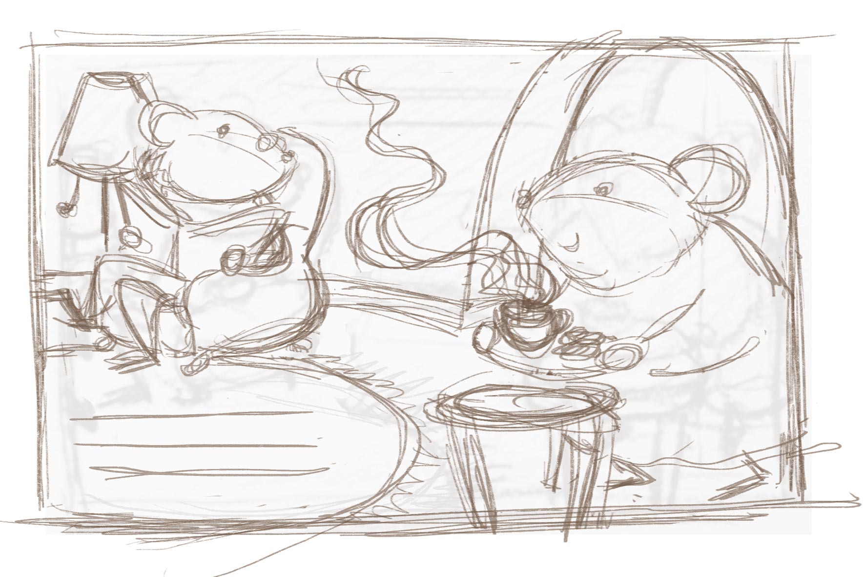
                              I tried something else, to avoid the "table too far" issue. It's also more simple value wise, it makes it more readable I think
                              I was afraid it would be unbalanced: are the big shape of the frame, the strong light value and the text enough to balance it out on the left?
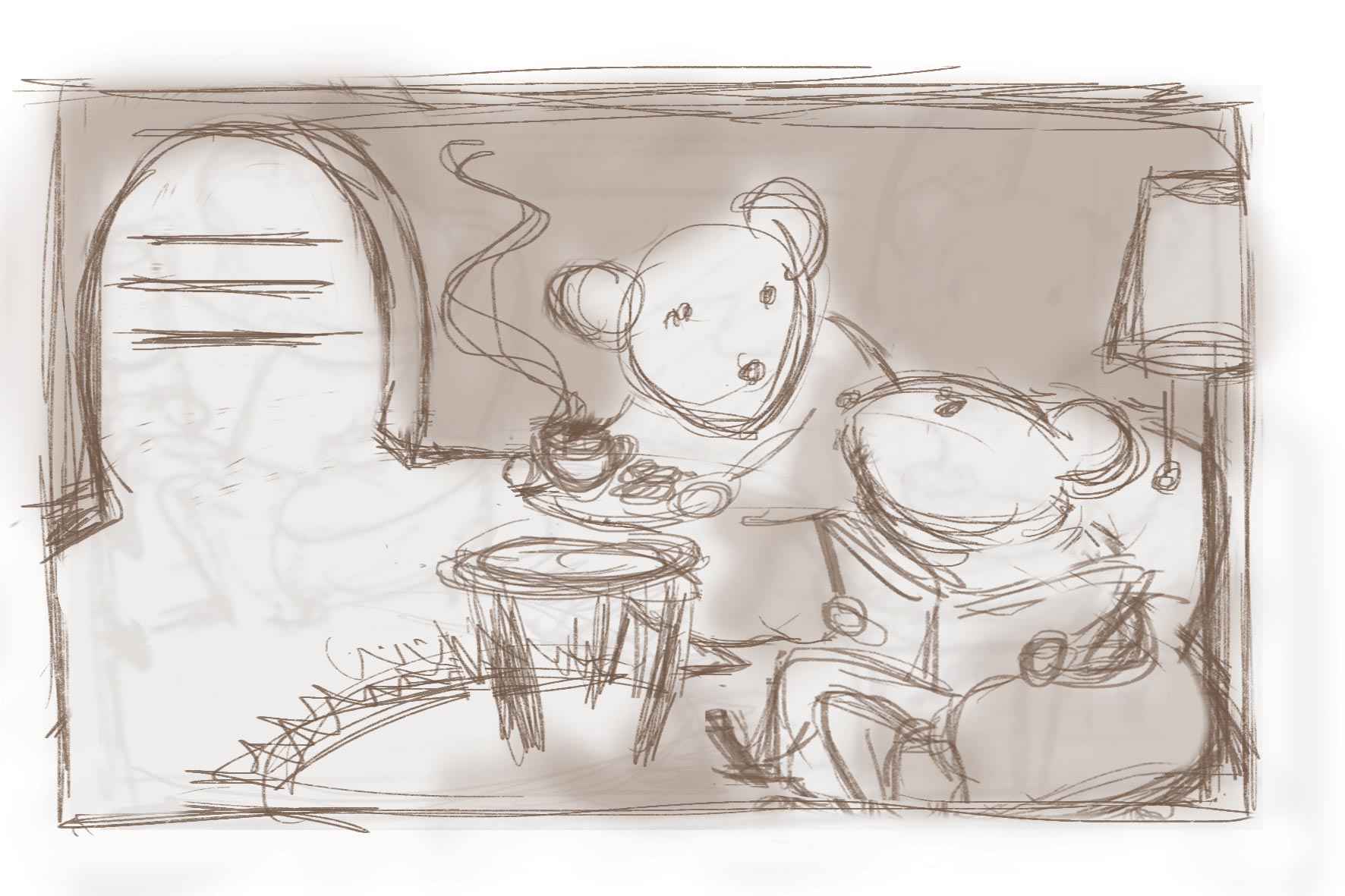
                              thumbnail4.jpg
                              thumbnail5.jpg
                              what do you think?

                              website: https://audreydowling.wordpress.com/
                              twitter: https://twitter.com/audreydowling
                              facebook: https://www.facebook.com/Audrey-Dowling-Artist-Illustrator-498582176906242/timeline/?ref=bookmarks

                              Kevin Longueil 1 Reply Last reply Reply Quote 2
                              • Russ Van Dine
                                Russ Van Dine last edited by

                                I like this last one, the door opening would be an opportunity to show some awesome mousey door with little carvings or something... I like it.

                                1 Reply Last reply Reply Quote 1
                                • Kevin Longueil
                                  Kevin Longueil SVS OG @audrey dowling last edited by Kevin Longueil

                                  @audrey-dowling Really great to see all of your process on this one - your thumbnails look great! - for me I like this last version a lot and your original version too - when skimming through the thread before I read it all I thought that Lee's thumbnails were yours also and I thought "oh, she cropped out the window on the second thumbnail...that looks perfect" I think too that I would love to see your original with the window cropped out and this new one with the door cropped out so that the steam was leading us into the picture - what ever you do will be good though I'm sure - I love your characters 🙂

                                  Portfolio: kevinlongueil.com
                                  https://www.instagram.com/kevinlongueil/

                                  1 Reply Last reply Reply Quote 1
                                  • lmrush
                                    lmrush Pro SVS OG last edited by

                                    My favorite is the one posted three days ago with close up of Mrs. Mouse to the right carrying in tea. Your characters are so sweet

                                    Lisa Rush
                                    www.lisarushgallery.com
                                    www.facebook.com/ArtbyLisaRush/
                                    www.instagram.com/lisarush11/

                                    1 Reply Last reply Reply Quote 1
                                    • audrey dowling
                                      audrey dowling last edited by

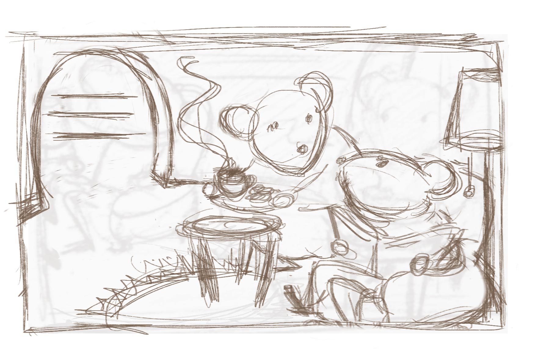
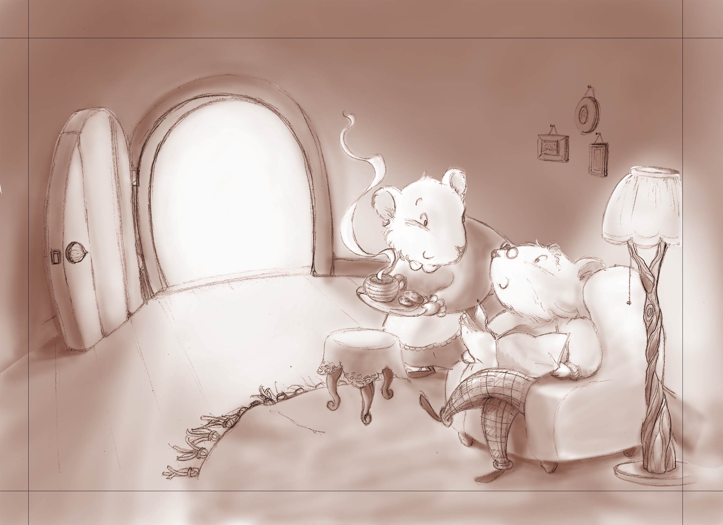
                                      now, I'm done with the values.
                                      overall, much better than the 1st illustration, I think, I'm quite happy with it so far
                                      let me know what you think please
                                      0_1461061719235_value.jpg

                                      website: https://audreydowling.wordpress.com/
                                      twitter: https://twitter.com/audreydowling
                                      facebook: https://www.facebook.com/Audrey-Dowling-Artist-Illustrator-498582176906242/timeline/?ref=bookmarks

                                      1 Reply Last reply Reply Quote 3
                                      • Russ Van Dine
                                        Russ Van Dine last edited by

                                        I love your art. Very good, clean, emotional... Now I want to know who is coming through the door. If the door is closed the two mice are the focal point...

                                        audrey dowling 1 Reply Last reply Reply Quote 0
                                        • audrey dowling
                                          audrey dowling @Russ Van Dine last edited by

                                          @Russ-Van-Dine the text will be in the door and Mrs Mouse came through this door. so I'm thinking it's a focal point that has a justification (+ lighting): the reader might read the text first, then look at the image and see the characters in the actual image

                                          website: https://audreydowling.wordpress.com/
                                          twitter: https://twitter.com/audreydowling
                                          facebook: https://www.facebook.com/Audrey-Dowling-Artist-Illustrator-498582176906242/timeline/?ref=bookmarks

                                          Russ Van Dine 1 Reply Last reply Reply Quote 0
                                          • Russ Van Dine
                                            Russ Van Dine @audrey dowling last edited by

                                            @audrey-dowling Nice, hadn't thought of that... love the lamp!

                                            1 Reply Last reply Reply Quote 0
                                            • First post
                                              Last post