Society of Visual Storytelling

    SVSLearn Forums

    • Register
    • Login
    • Search
    • Recent
    • Tags
    • Popular
    • Users
    • Groups
    • Search

    May Third Thursday - bouncing ideas

    General Discussion
    20
    49
    23265
    Loading More Posts
    • Oldest to Newest
    • Newest to Oldest
    • Most Votes
    Reply
    • Reply as topic
    Log in to reply
    This topic has been deleted. Only users with topic management privileges can see it.
    • Carrie
      Carrie last edited by

      I like #5 the best.

      1 Reply Last reply Reply Quote 0
      • Lee Holland
        Lee Holland last edited by

        Your ideas look great. I think the roller coaster idea would be great fun and I also like the trampoline idea. great job

        https://www.facebook.com/pages/Lee-Holland-illustration/285517801577676?
        https://www.instagram.com/lee_holland_illustration/
        http://lholla56.wix.com/lee-holland

        1 Reply Last reply Reply Quote 0
        • Russ Van Dine
          Russ Van Dine @smceccarelli last edited by

          @smceccarelli #4 and ou could have a few of her fishy friends giving her quizzical looks...

          1 Reply Last reply Reply Quote 0
          • evilrobot
            evilrobot SVS OG last edited by

            For me #3 and #5 seem to hit the mark.

            http://www.palacioillustration.com/

            https://www.scbwi.org/illustrator-gallery/illustrator-detail/?illustrator_id=84142

            https://www.pinterest.com/evilrobot2/pins/

            https://twitter.com/MyEvilRobot

            1 Reply Last reply Reply Quote 0
            • jacs
              jacs last edited by

              I love the idea! I like the simplicity of number 3....

              Magical, fairy tale art. Www.jacquelinewild.com

              1 Reply Last reply Reply Quote 0
              • DanetteDraws
                DanetteDraws last edited by

                Love this idea @smceccarelli! I think a number of you compositions work, but I like #3 best. It reminds me of a scene in the Little Mermaid where she's singing about various do-dads she's collected. What's great about all her treasures too is that she guesses at their use and does strange things with them (like combs her hair with a fork) - so getting across that 'I LOVE this thing - but what IS it?' would be great. Suggestion: maybe she's got a look of pure love on her face, but then there's a fish or some other sea creature who's eyeing it up skeptically next to her

                https://danettebyatt.com
                Twitter @DanetteDraws
                Instagram @DanetteDraws

                smceccarelli 1 Reply Last reply Reply Quote 1
                • smceccarelli
                  smceccarelli Pro SVS OG @DanetteDraws last edited by

                  Thank you all! Now I feel like I have solid ideas for both and can move on...one at a time...

                  1 Reply Last reply Reply Quote 0
                  • Dulcie
                    Dulcie SVS OG last edited by

                    @smceccarelli I love these latest ideas! Really, really nice, it's difficult to choose which thumbnail - I actually like #4 a lot, because I could see the lighting/values working really well to highlight the shoe as focal point. But as others have said I also like 3a and 3b - beautiful shapes with the mermaid's tail and swirling hair.

                    If you do choose #3 I wonder if the crop could be extended upwards just a tiny tiny bit, so that the shoe hits more of the 'third' in composition terms - it feels a little high for such an important focal point. But I like the way the mermaid is holding it upwards to admire it - really nice gesture so wouldn't change that.

                    I agree with @DanetteDraws, it also reminds me of the Little Mermaid where she places such a high value on little trinkets that she doesn't understand...I love that you took the shoe idea and took it further by making the recipient a mermaid who could never wear a shoe but loves the gift anyway. Can't wait to see the next version!

                    www.dulciemascord.com
                    https://www.instagram.com/dulciemascord
                    https://twitter.com/dulciemascord
                    https://www.facebook.com/dulciemascord

                    1 Reply Last reply Reply Quote 1
                    • smceccarelli
                      smceccarelli Pro SVS OG last edited by

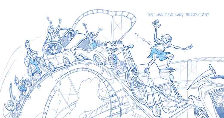
                      I have been fighting with every inch of this drawing - and it probably shows....I really need training with turning things in my head and this viewpoint was very challenging. And also the receding sizes, I am not sure it works. It does not need to be correct perspective, but at least believable.
                      Looking forward to input before I proceed to color!
                      alt text

                      1 Reply Last reply Reply Quote 4
                      • Russ Van Dine
                        Russ Van Dine last edited by

                        very nice line work

                        1 Reply Last reply Reply Quote 0
                        • Dulcie
                          Dulcie SVS OG last edited by

                          Wow, this looks amazing! Gorgeous linework…I have no critique at all, just want to say how nice it looks already...I love the elderly man balancing on his wheelchair 🙂

                          www.dulciemascord.com
                          https://www.instagram.com/dulciemascord
                          https://twitter.com/dulciemascord
                          https://www.facebook.com/dulciemascord

                          1 Reply Last reply Reply Quote 0
                          • evilrobot
                            evilrobot SVS OG last edited by evilrobot

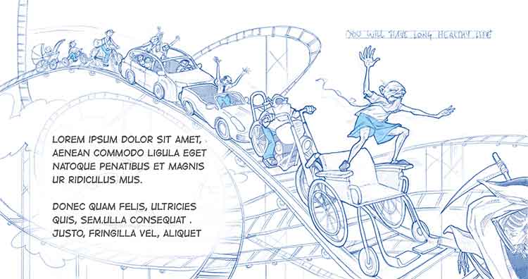
                            The line drawing is awesome. On the first side of the spread there is that big empty space with the clouds in the middle. (It almost looks like an area left there on purpose for text) You could put some of that fake text in there and i think that would solve the whole problem. Or you might start your roller coasters of characters from the bottom corner there. I did a quick dirty Photoshop warp to see how it might look. There would still be a little gap there but you would be taking up more of the page and we'd get to see those characters a little larger.Anyway it looks great there just seems to be something need in the middle there. ![0_1462631443991_LongLife_Sketch_FINAL.jpg](Uploading 100%)0_1462631557446_LongLife_Sketch_FINAL.jpg
                            0_1462632335903_LongLife_Sketch_FINAL.jpg

                            http://www.palacioillustration.com/

                            https://www.scbwi.org/illustrator-gallery/illustrator-detail/?illustrator_id=84142

                            https://www.pinterest.com/evilrobot2/pins/

                            https://twitter.com/MyEvilRobot

                            smceccarelli Thrace 2 Replies Last reply Reply Quote 3
                            • smceccarelli
                              smceccarelli Pro SVS OG @evilrobot last edited by

                              @evilrobot Wow, the warped drawing does look cool! It would mean re-drawing a bunch of stuff, but may yield a much stronger piece indeed. I will give it some serious thinking. Or put in some dummy text...Would you think that would make it more interesting as a children´s book piece?
                              I am doing color studies right now, so still some time to think before I start the painting....

                              1 Reply Last reply Reply Quote 0
                              • evilrobot
                                evilrobot SVS OG last edited by evilrobot

                                To me I got the impression that it is a children's book spread and the way everything wraps around and leads my eye it's telling me "look right here, this is where the text goes" So I think that if that's what you meant that area for then you have it perfect already. You just need to make sure to leave a white area when you are coloring so the text will be easy to read. I don't think you need to put the text in the actual image just leaving the white will let us know that's what the space is for. It could also work really good for an editorial piece about growing old so lots of possibilities with this piece.

                                http://www.palacioillustration.com/

                                https://www.scbwi.org/illustrator-gallery/illustrator-detail/?illustrator_id=84142

                                https://www.pinterest.com/evilrobot2/pins/

                                https://twitter.com/MyEvilRobot

                                1 Reply Last reply Reply Quote 0
                                • Thrace
                                  Thrace @evilrobot last edited by

                                  @evilrobot I think this is awesome, everything about it!! I love that you use that blue color on his pants in every image of him. I know this is picky and certainly not necessary but you might find a way to use that color on him in the baby carriage (perhaps a hat) and the one with him driving his family. Just a thought. I can't wait to see this finished!! I loved the mermaid too and hope that you will finish 3 or 5 as a portfolio piece!

                                  1 Reply Last reply Reply Quote 0
                                  • smceccarelli
                                    smceccarelli Pro SVS OG last edited by

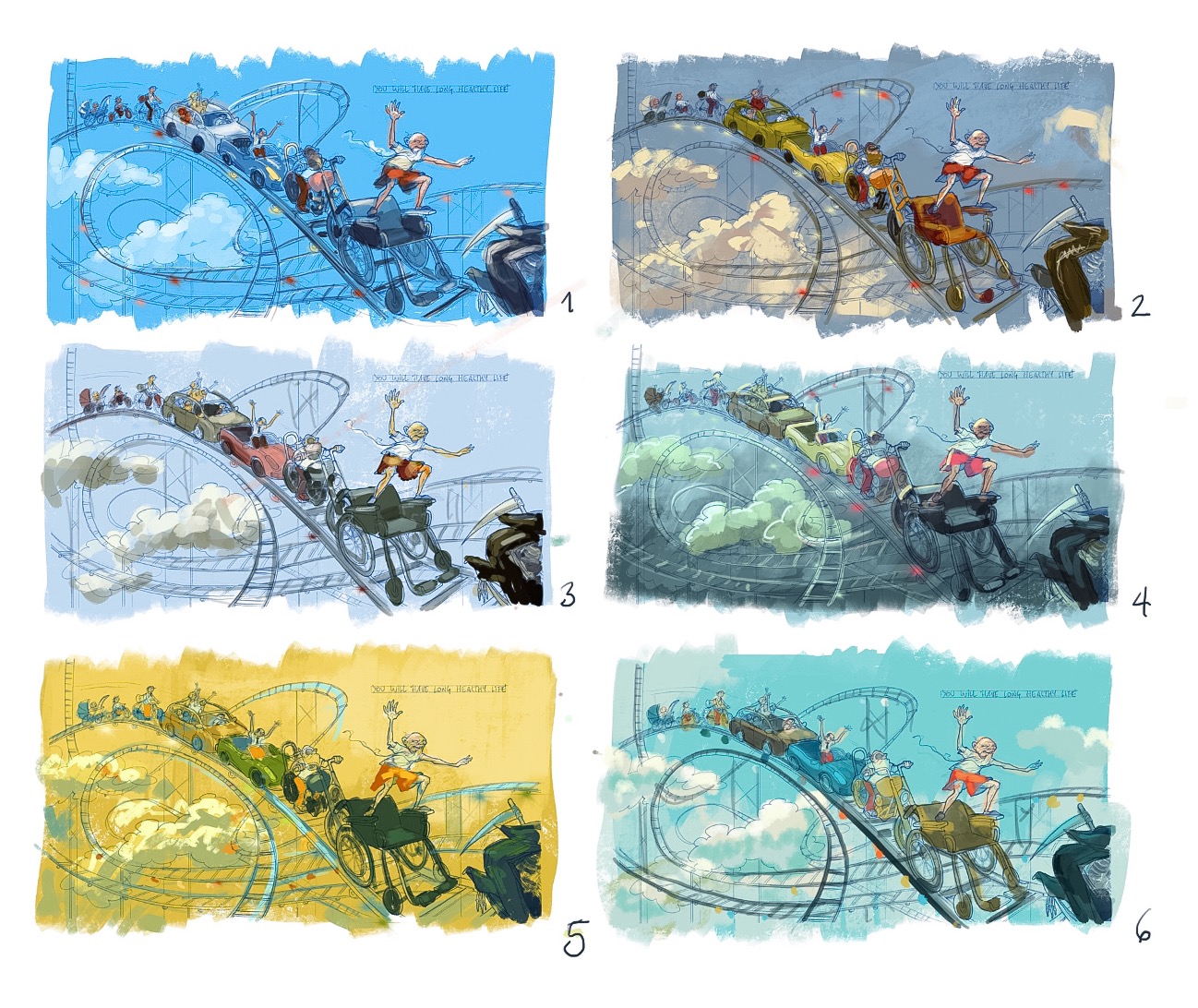
                                    Going through color thumbs while I think about your suggestions on the drawing. As usual, I could do tenths of these, I love playing with color schemes 😉
                                    0_1462639078385_image.jpeg

                                    Thrace Rich Green Kevin Longueil 3 Replies Last reply Reply Quote 6
                                    • Thrace
                                      Thrace @smceccarelli last edited by

                                      @smceccarelli I like #5

                                      1 Reply Last reply Reply Quote 0
                                      • evilrobot
                                        evilrobot SVS OG last edited by

                                        Wow hard to say. I love #5 it's a different direction than I think anyone would expect with the yellow sky and I love that. #4 is super interesting but it's drawing too much attention to those clouds in the dead space again. I think #3 is working the best if the goal is to have us looking at the old man first.

                                        http://www.palacioillustration.com/

                                        https://www.scbwi.org/illustrator-gallery/illustrator-detail/?illustrator_id=84142

                                        https://www.pinterest.com/evilrobot2/pins/

                                        https://twitter.com/MyEvilRobot

                                        1 Reply Last reply Reply Quote 0
                                        • Russ Van Dine
                                          Russ Van Dine last edited by

                                          #5 or #6

                                          1 Reply Last reply Reply Quote 0
                                          • Rich Green
                                            Rich Green SVS OG @smceccarelli last edited by

                                            @smceccarelli There is something really special about #5 - it is striking!

                                            www.richgreenart.com instagram.com/richgreenart/

                                            1 Reply Last reply Reply Quote 0
                                            • First post
                                              Last post