Ascension June Challenge
-
Love the characters! The old mans left leg looks to be off. It may just be the lines on the back of the knee cap, but it looks like his leg is twisted. Looks really cool and looking forward to seeing more.
-
I think it's looking great so far And I do agree with Katrina about the arm. great work
-
This looks like it is going to be an exciting piece! I agree with @Chip-Valecek about the leg... it looks like the bottom part of the leg is having to twist to reach the rock. Will be good to see how this progresses
")
-
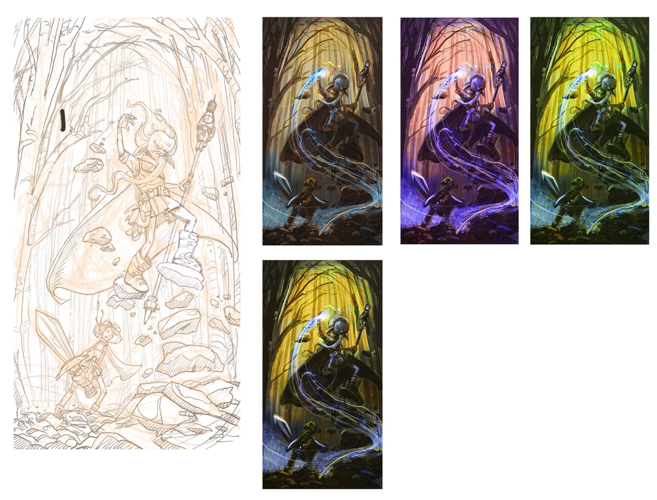
So, corrected (I hope) arm and leg, though I am still not totally sure the anatomy is even remotely correct. I will probably need to get a ref photo for this one or do a quick skeleton in 3D and see how it holds together. This is already taking more time than I have to dedicate to it! Anyhow, some color/value studies. The wizard must have a dominant cool color according to the brief. Glad to hear your thoughts!
-
Looking great. I just think the wizard is a little close to the right picture edge though- don't know why exactly but its bothering me- perhaps add more space to the right and see what happens to the composition ? The colour studies really bring this to life, look forward to seeing what you go with.
-
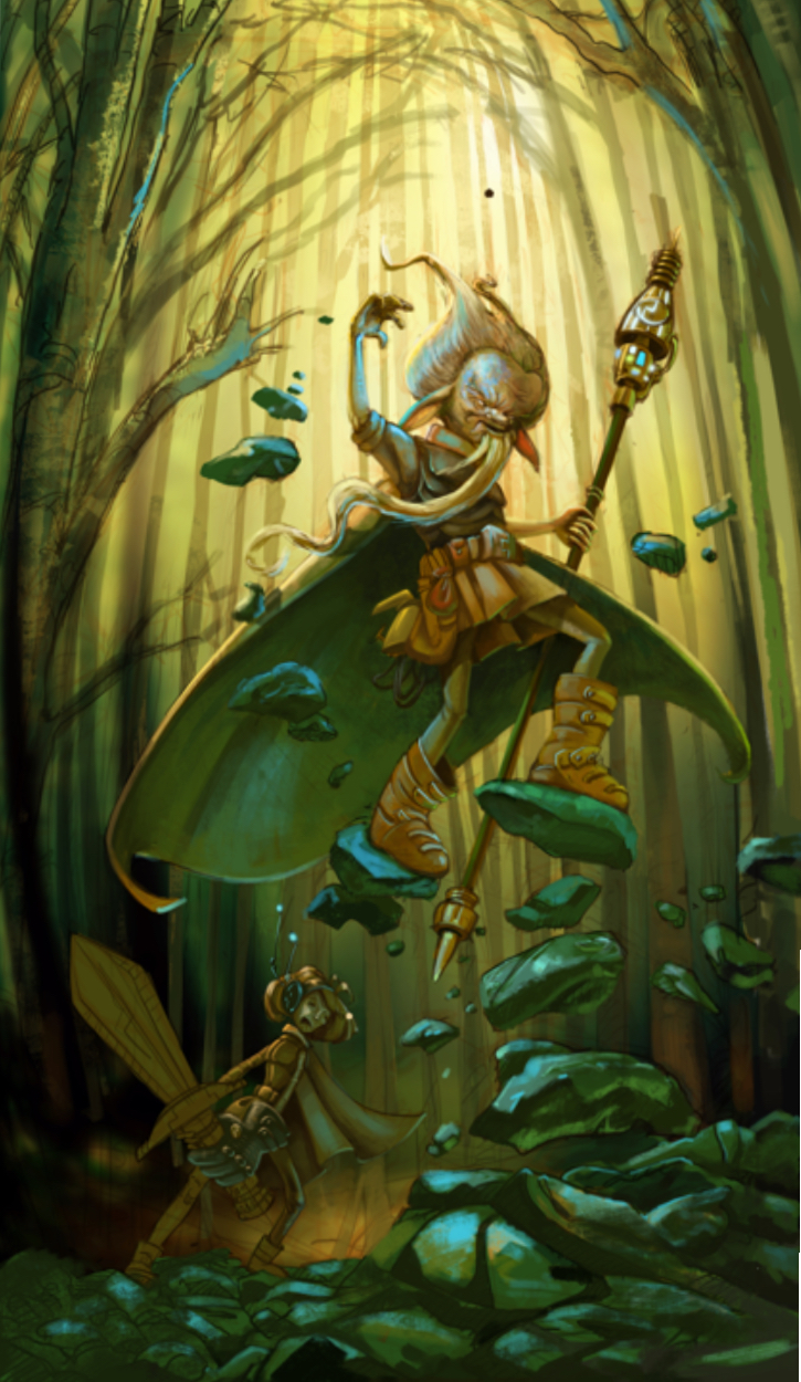
Really nice job. I think the very last color comp is working really well.
-
Here is where I am so far. I think I have actually missed the deadline - I have just been too busy with other stuff, and things are getting worse. Now, to finish or not to finish, that is the question. I am sort of in-between losing hope and seeing promise....
-
Ok, spent a few more hours on it today and I will call it quit - unless you notice something that really would help make it better!

-
I really like it! There is one thing that's bugging me though, and maybe I am wrong. I think the right leg look twisted... it looks like the right and left legs are crossed. I think it would look better with the right leg going in the opposite direction (i.e. we would see the inside of the boot). Also, I don't understand where is "sword" is going (through the cape ?) I can't really explain it better than this, but the relationship between the two legs and the sword is somewhat off... I think!
Other than that, great work!
noemiegionetlandry.squarespace.com
noemie_illustration on Instagram -
@smceccarelli O.k. sorry to add my thoughts so late in the process but i agree with @NoWayMe on the legs - it is hard for me to tell if the leg closest to the right side of the canvas is the right leg or left leg - does that sound crazy? i think the angle of the bottom of that rock is really making it hard for my brain to decide if his torso is really very twisted and it is his right foot on the rock or if he is not so twisted at the waist and it is his left foot on the right hand rock.... feel like i am not making sense...the relationship between the staff and the cape and the rocks keeps bringing me back to it being his left foot being on the right hand side of the canvas...but then the rock under that foot is tilted so far forward it seems that it cannot be his left foot.... and there you have it
That made no sense right? Anyways i love your work. -
@NoWayMe @Kevin-Longueil - you are both so right! I was really unhappy with this piece and so much in a rush. Shows you should stop and put aside art that you do not feel is working. And maybe come back to it later! Yes, I forgot to redraw the stab over the cape after painting it. And the anatomy is definitely not right, which is what bugs me most. I will let it rest for a few hours and see if I can at least correct the most evident things - and see what I learned out of what I consider a not-so-successful piece... Thank you so much for your feedback, which really nailed the problems!
-
Wow, this illustration is so captivating! I adore the detail in the characters