Society of Visual Storytelling

    SVSLearn Forums

    • Register
    • Login
    • Search
    • Recent
    • Tags
    • Popular
    • Users
    • Groups
    • Search

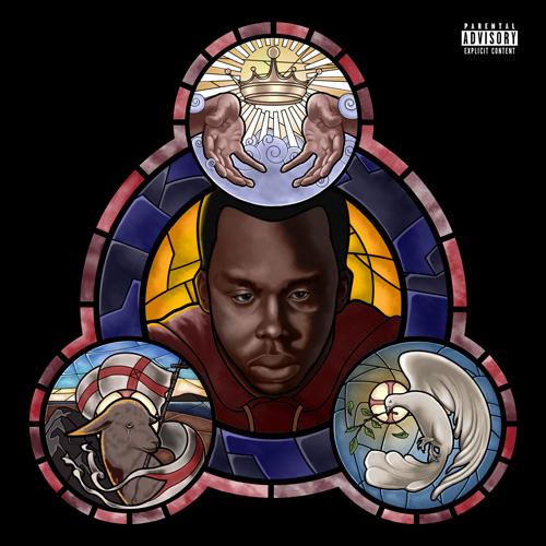
    Stained Glass Illustration

    Projects
    11
    35
    12257
    Loading More Posts
    • Oldest to Newest
    • Newest to Oldest
    • Most Votes
    Reply
    • Reply as topic
    Log in to reply
    This topic has been deleted. Only users with topic management privileges can see it.
    • Durrell Odom
      Durrell Odom @MOO last edited by

      @Marsha-Kay-Ottum-Owen Thanks! Much appreciated.
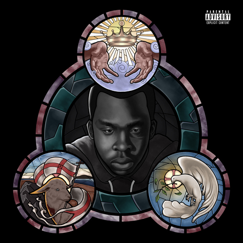
      www.durrellodom.com

      1 Reply Last reply Reply Quote 0
      • Durrell Odom
        Durrell Odom last edited by

        A little update

        0_1465176384240_svs_6.jpg

        www.durrellodom.com

        1 Reply Last reply Reply Quote 3
        • Larissa Brown Marantz
          Larissa Brown Marantz last edited by

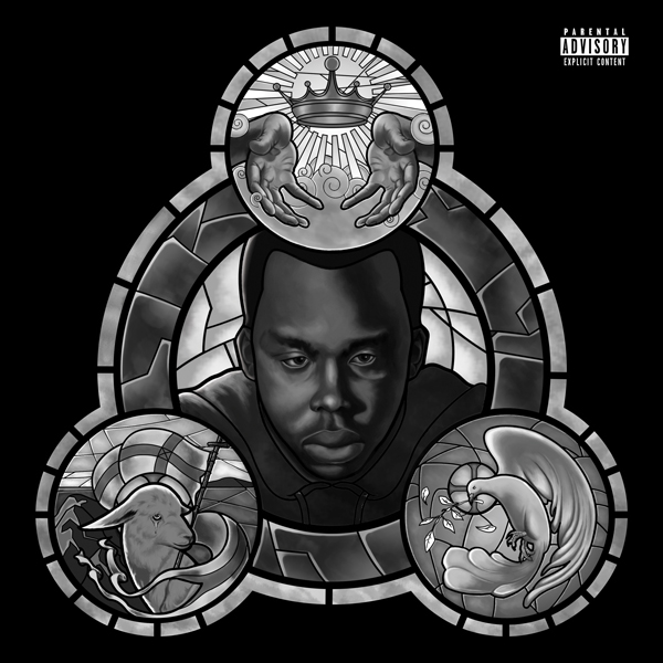
          It's turning out beautifully. Nice job on the hands. I always have a hard time with the hands. Looking forward to the colored version.

          IG: @larissadrawsstuff
          Twitter: @ocartstudios
          Blog: larissamarantz.blogspot.com

          Durrell Odom 1 Reply Last reply Reply Quote 0
          • Durrell Odom
            Durrell Odom @Larissa Brown Marantz last edited by

            @Larissa-Brown-Marantz thank you. It'll probably be much more difficult to figure out. Lol

            www.durrellodom.com

            1 Reply Last reply Reply Quote 0
            • Sarah LuAnn
              Sarah LuAnn SVS OG last edited by

              Late to the party here, and I want to mention first that I think that you have an awesome start so far. It is beautifully designed and the values are looking really nice.

              The one comment I have to make is one of those weird technical nitpicks that only some people would even care about--as someone who has actually done some stained glass (not much, just enough to know a bit about how it works), one of the first things I notice first is that some of the glass shapes you've drawn would not actually work as a real piece of glass--they would break very easily. Glass won't stay together if you have anything "hourglass" shaped--a shape that is wide, then very narrow, then wide again. It would split somewhere in the narrow area. Similarly, anything that cuts deeply into a shape before turning back out again would probably cause a split.

              This is probably not something important enough to you to change your design at this point, but I thought I would mention it. I think that when you are trying to imitate one medium using another, it is useful and interesting to know how the medium you are imitating works, which is why I mention it. I'm looking forward to seeing the colored version of this!

              sarahluann.com

              Durrell Odom 1 Reply Last reply Reply Quote 0
              • Durrell Odom
                Durrell Odom @Sarah LuAnn last edited by

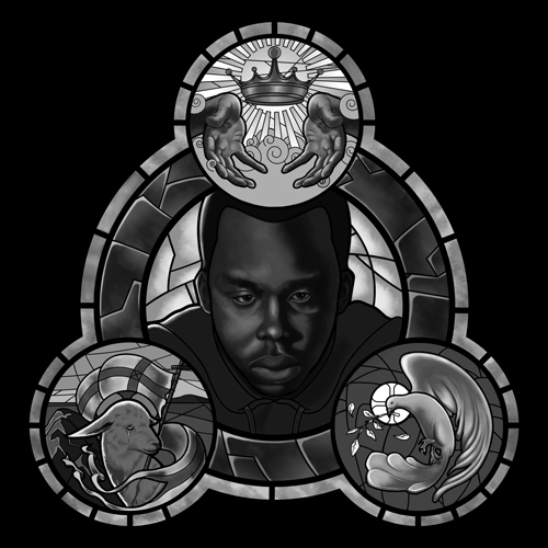
                @Sarah-LuAnn Thanks for the insight! I learned a lot during this whole process and it seems I still have a ton to learn too. Wasn't easy, but it was fun enough. I focused on trying to keep this simple as possible because I had no knowledge of stained glass and also trying to replicate it through digital painting which is was not easy. Also thanks for complement. Here's the final b/w detail. Now onto color.

                0_1465448348686_svs_color.jpg

                www.durrellodom.com

                Christine Garner 1 Reply Last reply Reply Quote 2
                • Christine Garner
                  Christine Garner @Durrell Odom last edited by

                  @Durrell-Odom Its looking great.

                  website: https://thimblefolio.com

                  1 Reply Last reply Reply Quote 0
                  • Durrell Odom
                    Durrell Odom last edited by

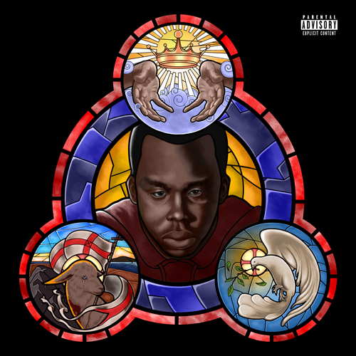
                    Any thoughts on the color application?

                    0_1465882588772_albumcoverfront_colorsvs.jpg

                    www.durrellodom.com

                    Kevin Longueil 1 Reply Last reply Reply Quote 1
                    • Kevin Longueil
                      Kevin Longueil SVS OG @Durrell Odom last edited by

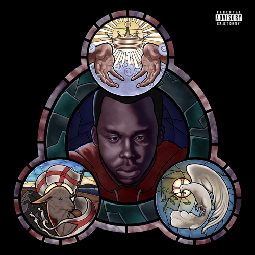
                      @Durrell-Odom Hey Durrell this looks really good - i think i would try desaturating everything quite a bit except for the center area - there is a sponge tool in Photoshop where you can desaturate easily just the areas you want to - it works like a brush... you probably know this already - i tried desaturating in Procreate and i think it really helped to shift the focus onto the artist's face - right now the saturated colors around him really tug at my eye - anyways - really nice work - i think your client is going to be really impressed!

                      Portfolio: kevinlongueil.com
                      https://www.instagram.com/kevinlongueil/

                      Durrell Odom 1 Reply Last reply Reply Quote 2
                      • Durrell Odom
                        Durrell Odom @Kevin Longueil last edited by

                        @Kevin-Longueil Thanks for the tip. How about now?

                        0_1465887731040_albumcoverfront_colorsvs.jpg

                        www.durrellodom.com

                        Kevin Longueil 1 Reply Last reply Reply Quote 1
                        • Kevin Longueil
                          Kevin Longueil SVS OG @Durrell Odom last edited by

                          @Durrell-Odom I think it looks great! - the artist seems to me to be the focal point now - my eye goes to the center first and then wanders around to discover the other panels of the Trefoil - but i end up eventually back in the center

                          Portfolio: kevinlongueil.com
                          https://www.instagram.com/kevinlongueil/

                          Durrell Odom 2 Replies Last reply Reply Quote 1
                          • Durrell Odom
                            Durrell Odom @Kevin Longueil last edited by

                            @Kevin-Longueil Thanks for your feedback. It was really helpful. Unfortunately my client wants some significant color changes but not too much though.

                            www.durrellodom.com

                            1 Reply Last reply Reply Quote 0
                            • Durrell Odom
                              Durrell Odom @Kevin Longueil last edited by

                              @Kevin-Longueil Night version.

                              0_1465892895124_albumcoverfront_colorsvs.jpg

                              www.durrellodom.com

                              Kevin Longueil 1 Reply Last reply Reply Quote 0
                              • Kevin Longueil
                                Kevin Longueil SVS OG @Durrell Odom last edited by

                                @Durrell-Odom This still looks good Durrell - i think the sky in the top left of the lamb is where i keep ending up now though - the high contrast you had between the artist and the orange background really helped make hime the focal point - maybe knocking back the saturation of the sky a bit in lamb panel will help the middle pop a bit - is it possible to put a bit more light on the side of the face with the highlights - i think even a very small amount of increased lighting would be worth looking at - i really like the lighting of the last version - maybe put that layer under this one and erase with a low opacity eraser to bring back some of that warmth you had in the shadows -
                                i do have to mention here that i think you are a much better painter than i am so take my opinions lightly - you could easily call this done and good!

                                Portfolio: kevinlongueil.com
                                https://www.instagram.com/kevinlongueil/

                                Durrell Odom 1 Reply Last reply Reply Quote 0
                                • Durrell Odom
                                  Durrell Odom @Kevin Longueil last edited by

                                  @Kevin-Longueil "Final" version. Depending on my client; tired of working on this. lol.

                                  0_1466009950056_albumcoverfront_color_bwsvs.jpg

                                  www.durrellodom.com

                                  1 Reply Last reply Reply Quote 1
                                  • First post
                                    Last post