Society of Visual Storytelling

    SVSLearn Forums

    • Register
    • Login
    • Search
    • Recent
    • Tags
    • Popular
    • Users
    • Groups
    • Search

    Looking for feedback

    Sketchbook
    12
    28
    9224
    Loading More Posts
    • Oldest to Newest
    • Newest to Oldest
    • Most Votes
    Reply
    • Reply as topic
    Log in to reply
    This topic has been deleted. Only users with topic management privileges can see it.
    • Kimberli Johnson
      Kimberli Johnson last edited by

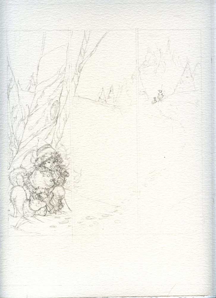
      Hey guys! i am working on a mini comic and I would love some feed back before I start inking! here is the first page. hunterpg1.jpg

      1 Reply Last reply Reply Quote 0
      • Steve Young
        Steve Young last edited by

        I would enlarge the little girl and a dog a little, and the left side of the image seems a bit empty. Otherwise a great little drawing.

        Never give up, always push yourself two steps further than you believe you can go.

        1 Reply Last reply Reply Quote 0
        • A
          Alberto M last edited by

          don't use that paper if you're gonna do a comic sketche, expensive and not apropiated for linework

          1 Reply Last reply Reply Quote 0
          • Kimberli Johnson
            Kimberli Johnson last edited by

            Steve, Alberto thank you for the feedback! I really appreciate it, Steve I steered away from what I was originally going to do and I think I will go back to that, thanks that was very helpful.

            Alberto, thank you for the suggestion, I do my comics in watercolour, so I do my inking on watercolor paper. It works out for me, but I agree, if I were scanning and coloring digitally I would use a different paper!

            1 Reply Last reply Reply Quote 0
            • Steve Young
              Steve Young last edited by

              Look forward to seeing you what you do 🙂

              Never give up, always push yourself two steps further than you believe you can go.

              1 Reply Last reply Reply Quote 0
              • Rob Smith
                Rob Smith last edited by

                This is a really detailed sketch! I too am looking forward to seeing the finished painting.

                1 Reply Last reply Reply Quote 0
                • Kimberli Johnson
                  Kimberli Johnson last edited by

                  You guys are so nice, I will post here as I go along!

                  1 Reply Last reply Reply Quote 0
                  • Kimberli Johnson
                    Kimberli Johnson last edited by

                    I just wanted to update you guyscrossbowpg1web.jpg

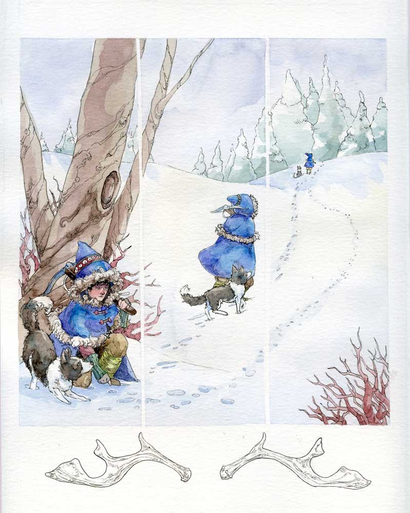
                    here is the color for the first page.

                    1 Reply Last reply Reply Quote 6
                    • Steve Young
                      Steve Young last edited by

                      Wow you have done a excellent job. Great use of color.

                      Never give up, always push yourself two steps further than you believe you can go.

                      1 Reply Last reply Reply Quote 0
                      • Naroth Kean
                        Naroth Kean last edited by

                        This is great I really like your color and drawing!

                        http://narothkean.com
                        https://twitter.com/narothkean
                        https://www.instagram.com/narothkean

                        1 Reply Last reply Reply Quote 0
                        • Thrace
                          Thrace last edited by

                          Very nice work, has an "old timey" feel!

                          1 Reply Last reply Reply Quote 0
                          • Kimberli Johnson
                            Kimberli Johnson last edited by

                            Thanks, I feel like I could really work on my painting skills, they never turn out how I want them to.

                            1 Reply Last reply Reply Quote 0
                            • Rob Smith
                              Rob Smith last edited by

                              Yes...terrific! Your color choices and handling of the media are well done.

                              1 Reply Last reply Reply Quote 0
                              • Rob Smith
                                Rob Smith last edited by

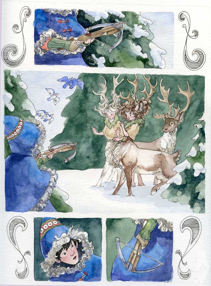
                                If I were to add one point of critique is was for me the crossbow in the first panel. I couldn't really tell what the character was holding at first. The bow seemed to get lost in the figure/clothing. In the second panel it is much clearer that the character is holding a weapon which clued me in to the fact that there was the crossbow in the first panel.

                                The dog is very well done!

                                1 Reply Last reply Reply Quote 0
                                • S
                                  Shannon Perkins last edited by

                                  Love the traditional medium and texture. I would suggest cleaning up the gutters and making them pure white. As is, it's hard to read the panels as 3 separate images.

                                  http://shannonreneeperkins.tumblr.com/

                                  1 Reply Last reply Reply Quote 0
                                  • Kimberli Johnson
                                    Kimberli Johnson last edited by

                                    Rob, do you think I need to tweak the value on the crossbow? would that help it stand out more?

                                    Shannon, Thanks I see that now I will make those a little more defined in photoshop!

                                    Thanks for your feed back very helpful!

                                    1 Reply Last reply Reply Quote 0
                                    • Sarah LuAnn
                                      Sarah LuAnn SVS OG last edited by

                                      This looks so awesome! I would read this whole comic, you do beautiful work. One tiny thing--I don't quite see one of the eyes of the character in the first panel, and that may be why the gaze seems to be going off to the right rather than at what is being pointed at. I'm not sure if that was intentional, I just thought I'd point it out.

                                      sarahluann.com

                                      1 Reply Last reply Reply Quote 0
                                      • Vicky Vicky
                                        Vicky Vicky last edited by

                                        Ooh, nice! Love the style. Could there be a bit more variation in the clothing and dogs? I think for the person farthest away, the blue would be lighter.

                                        1 Reply Last reply Reply Quote 0
                                        • Kimberli Johnson
                                          Kimberli Johnson last edited by

                                          here is the second page Huntercomicpg2.jpg

                                          Leontine 1 Reply Last reply Reply Quote 1
                                          • Leontine
                                            Leontine @Kimberli Johnson last edited by

                                            @Kimberli-Johnson What lovely paintings you make Kimberli! Appealing and lively, but also easy to read. I Love it!

                                            Leontine
                                            "A picture is worth a thousand words."

                                            https://leontineillustrator.com
                                            https://www.instagram.com/leontine.illustrator/
                                            http://www.facebook.com/leontineillustration

                                            1 Reply Last reply Reply Quote 0
                                            • First post
                                              Last post