Society of Visual Storytelling

    SVSLearn Forums

    • Register
    • Login
    • Search
    • Recent
    • Tags
    • Popular
    • Users
    • Groups
    • Search

    (1st) August 3rd Thurs.

    General Discussion
    7
    16
    3566
    Loading More Posts
    • Oldest to Newest
    • Newest to Oldest
    • Most Votes
    Reply
    • Reply as topic
    Log in to reply
    This topic has been deleted. Only users with topic management privileges can see it.
    • smceccarelli
      smceccarelli Pro SVS OG last edited by

      Wonderful thumbnails! I like number 2, 5 and 7 (though for seve, I love the unsymmetrical socks abut I am not sure about the patches on her dress). Five looks a lot like out of.a sit com of the 50s, 2 and 7 are more timeless. All three are very appeling. The choice will depend also from how the rest of the characters look!

      Jodi Gregg 1 Reply Last reply Reply Quote 0
      • Larissa Brown Marantz
        Larissa Brown Marantz last edited by

        I like 2 and 12... #12 seems like a tough and stronger Dorothy character by her posture. These two seem the most solid to me. # 6- the pose is awkward. But I also like how #9 is totally different from everything you've done.
        #7 would be interesting, too. I'd like to see her developed more and in color.

        IG: @larissadrawsstuff
        Twitter: @ocartstudios
        Blog: larissamarantz.blogspot.com

        Jodi Gregg 1 Reply Last reply Reply Quote 0
        • Chris Perry
          Chris Perry last edited by

          I like 6. Thanks for sharing I like seeing the variation.

          Jodi Gregg 1 Reply Last reply Reply Quote 0
          • Jodi Gregg
            Jodi Gregg @smceccarelli last edited by

            @smceccarelli Thanks! I started out with a simple re-design and then wanted to try a 50s vibe. I'm still undecided, but maybe I'll try to add more asymmetry to the designs.

            www.girlgreggarts.com
            http://girlgregg.tumblr.com/

            1 Reply Last reply Reply Quote 0
            • Jodi Gregg
              Jodi Gregg @Larissa Brown Marantz last edited by

              @Larissa-Brown-Marantz Thank you! I keep going back and forth between 2 and 12 to go a cute or tough direction. I might try some more tough poses/designs. I'll try to develop a few more.

              www.girlgreggarts.com
              http://girlgregg.tumblr.com/

              1 Reply Last reply Reply Quote 0
              • Jodi Gregg
                Jodi Gregg @Chris Perry last edited by

                @Chris-Perry I like 6's design but maybe not the pose. I'll keep uploading more thumbnails as I go! Glad you like them.

                www.girlgreggarts.com
                http://girlgregg.tumblr.com/

                1 Reply Last reply Reply Quote 0
                • Jodi Gregg
                  Jodi Gregg last edited by

                  0_1470780415503_ozredesign02wip02.jpg

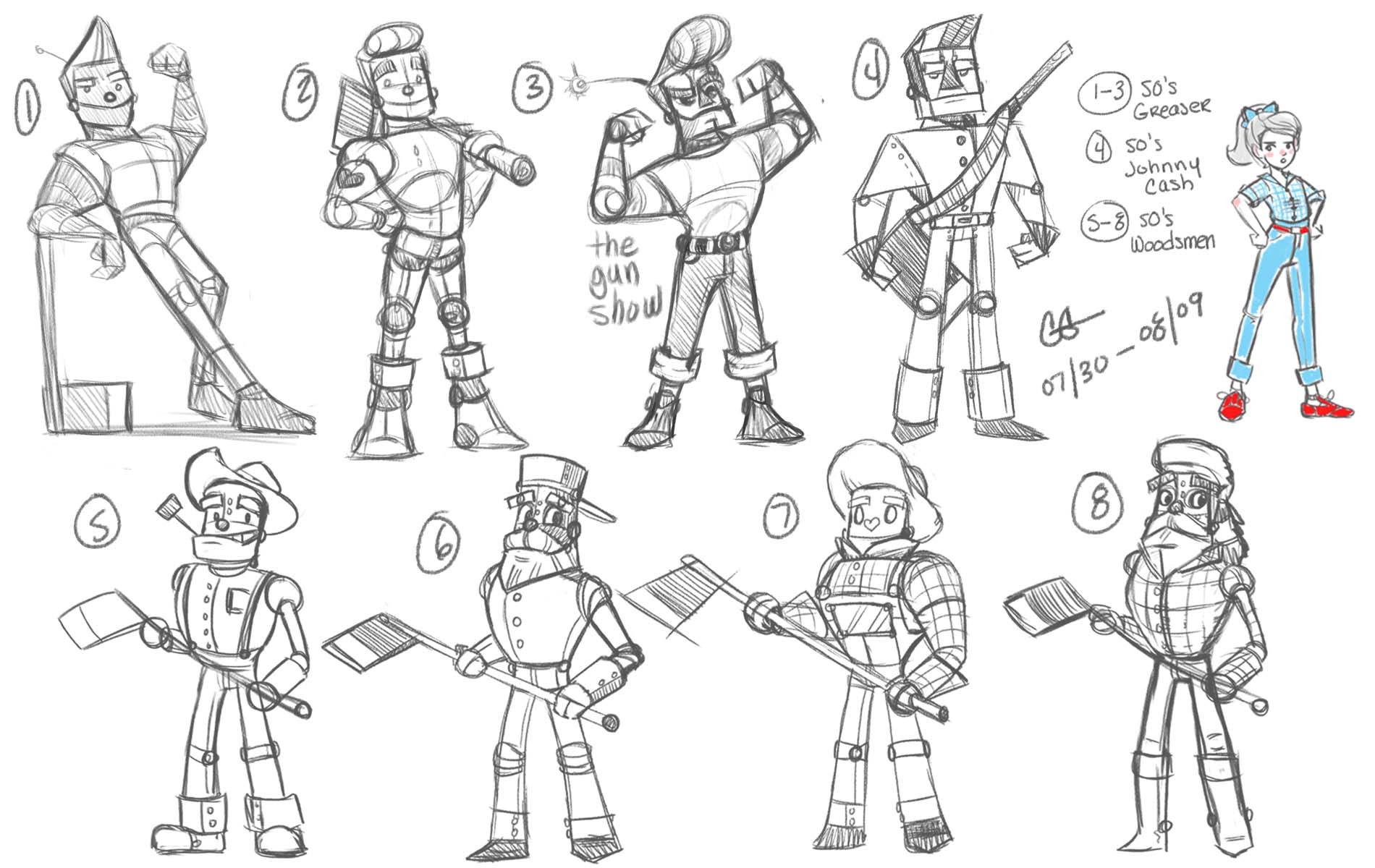
                  Fell a bit behind, but am kicking it into full gear tonight! Decided on a 1950's update theme. Decided on Dorothy #12, I just really dig her tough tomboy attitude. Had three ideas for the Tin Woodsman: 1) A 1950's Greaser, 2) 50's Johnny Cash, or 3) a more traditional 50's Woodsman/ Logger. My faves are 1, 8 for design, 5/6 for the face construction.

                  Moving on to the Scarecrow, and then either the Lion or Glinda. Will circle back to the one's that look best together and adjust as needed.

                  www.girlgreggarts.com
                  http://girlgregg.tumblr.com/

                  1 Reply Last reply Reply Quote 3
                  • natiwata
                    natiwata SVS OG last edited by

                    Your drawings have a really nice looseness and weight to them! Welcome to the forums!

                    Nat Iwata
                    www.iwataillustration.com

                    1 Reply Last reply Reply Quote 0
                    • smceccarelli
                      smceccarelli Pro SVS OG last edited by

                      I like them all, but my favorite is number 7. I think it is because of the age - he looks like he could be Dorothy´s friend rather than Dorothy´s grandad, like the others. Number 2 is also nice (for the same reason!), but I believe it reminds too much of the main character of "Robots".However, they are really all good, so all valid choices!

                      1 Reply Last reply Reply Quote 0
                      • Lisa M Griffin
                        Lisa M Griffin last edited by

                        I like 6... great gesture and has a fun "teeny bopper" appeal. Great approaches, lots of variety to choose from. 🙂

                        instagram: lisamgriffinart

                        1 Reply Last reply Reply Quote 0
                        • Jodi Gregg
                          Jodi Gregg last edited by

                          Process Update #1:

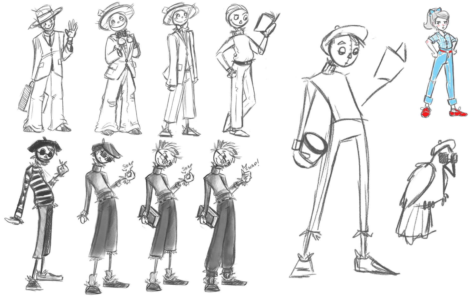
                          So things got crazy and handed this in just in time. So here is the process update. These are the Scarecrow sketches. The two ideas I had were a 50s Salesman or a Beatnik. As much as I loved the beatniks they did not feel cohesive in the line (will get to that later). 0_1471453827665_scarecrowsheet.jpg

                          www.girlgreggarts.com
                          http://girlgregg.tumblr.com/

                          1 Reply Last reply Reply Quote 0
                          • Jodi Gregg
                            Jodi Gregg last edited by

                            Process Update #2:

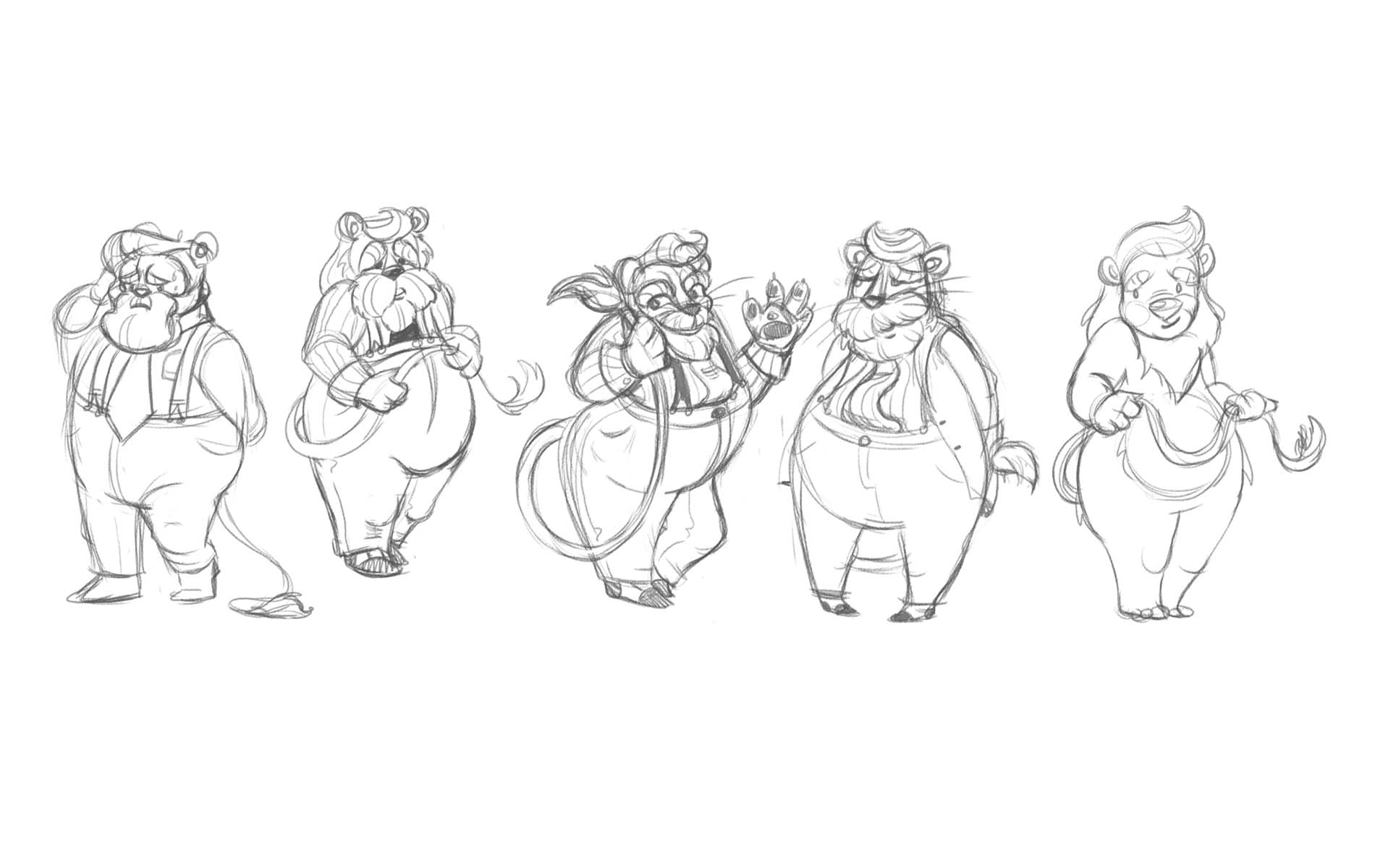
                            When I was still trying to make the scarecrow a beatnik. I tried to make the Lion a salesman... decided that I wasn't feeling the lion in clothes, plus time was starting to run down, so I went with the last design.0_1471453944610_lionsheet.jpg

                            www.girlgreggarts.com
                            http://girlgregg.tumblr.com/

                            1 Reply Last reply Reply Quote 0
                            • Jodi Gregg
                              Jodi Gregg last edited by

                              Process Update #3:

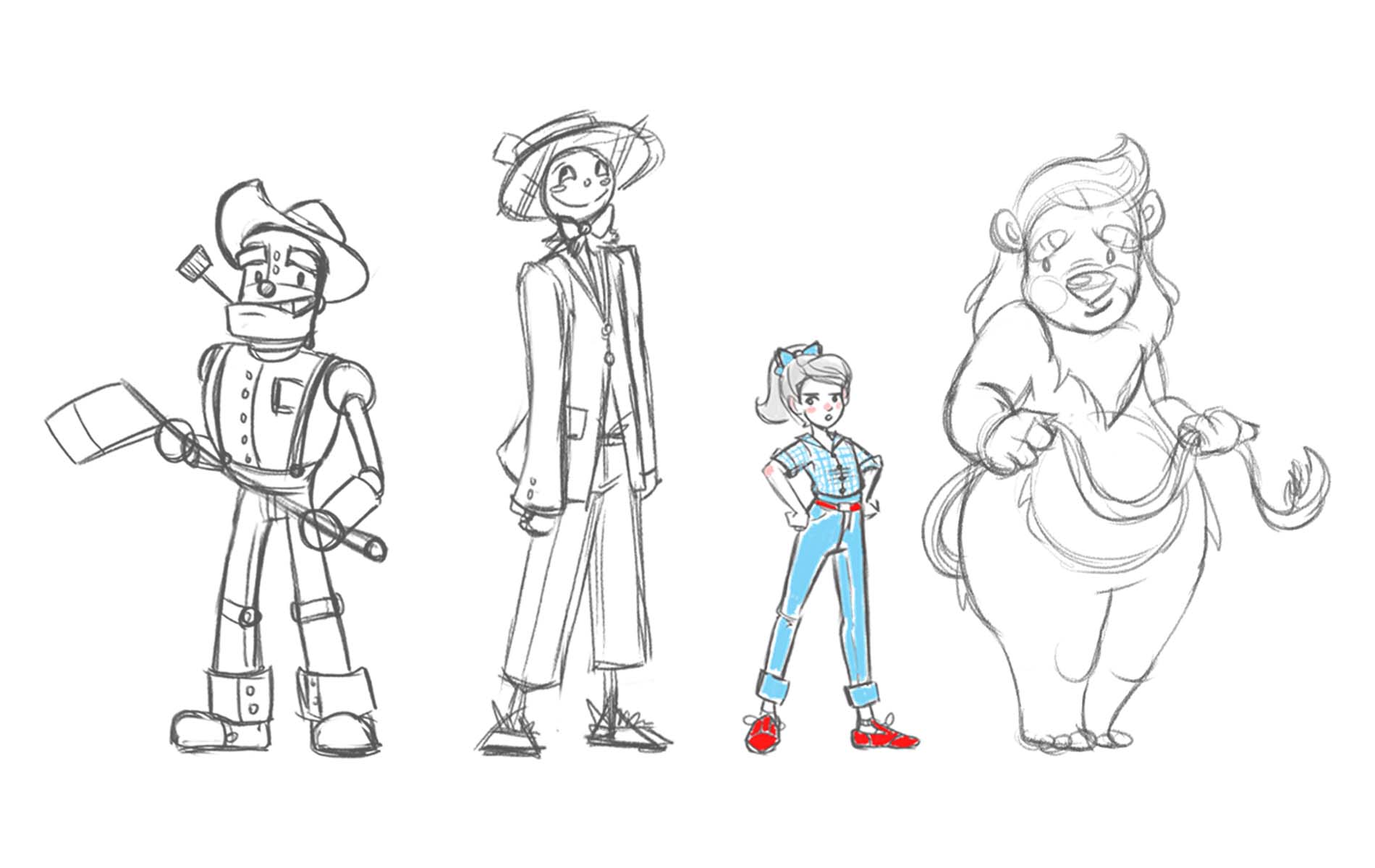
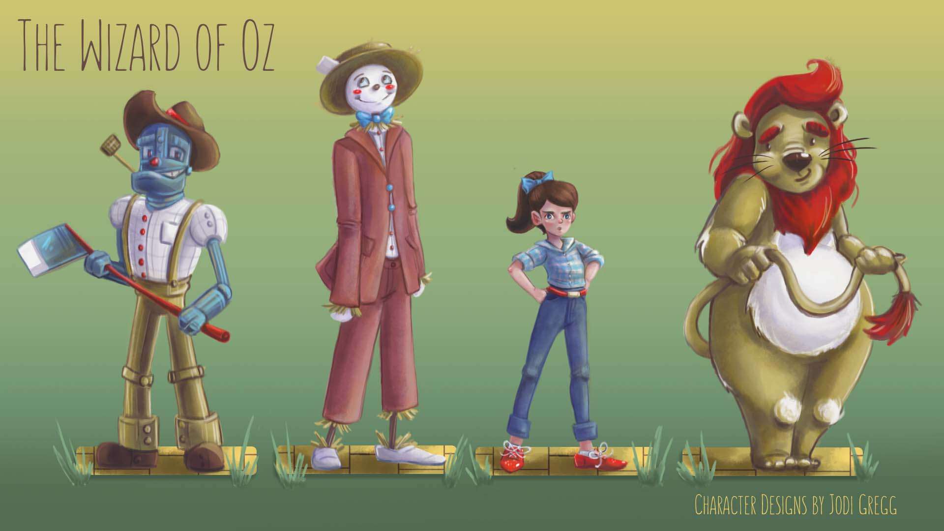
                              After some debate, decided the final lineup based on which designs went together the best. 0_1471454010339_ozlineup_lineart.jpg

                              www.girlgreggarts.com
                              http://girlgregg.tumblr.com/

                              1 Reply Last reply Reply Quote 0
                              • Jodi Gregg
                                Jodi Gregg last edited by

                                Process Update #4:

                                And here is the final submission! Thanks for all the feedback and support! Sorry I fell behind with the updates.0_1471454105102_ozlineup04snall.jpg

                                www.girlgreggarts.com
                                http://girlgregg.tumblr.com/

                                1 Reply Last reply Reply Quote 5
                                • bharris
                                  bharris last edited by

                                  Really good! I love love the tufts of fur on the lion's knees!

                                  www.brittanyharrisillustration.com/
                                  www.instagram.com/britillustration/

                                  1 Reply Last reply Reply Quote 0
                                  • First post
                                    Last post