(1st) August 3rd Thurs.
-
I like 6. Thanks for sharing I like seeing the variation.
-
@smceccarelli Thanks! I started out with a simple re-design and then wanted to try a 50s vibe. I'm still undecided, but maybe I'll try to add more asymmetry to the designs.
-
@Larissa-Brown-Marantz Thank you! I keep going back and forth between 2 and 12 to go a cute or tough direction. I might try some more tough poses/designs. I'll try to develop a few more.
-
@Chris-Perry I like 6's design but maybe not the pose. I'll keep uploading more thumbnails as I go! Glad you like them.
-
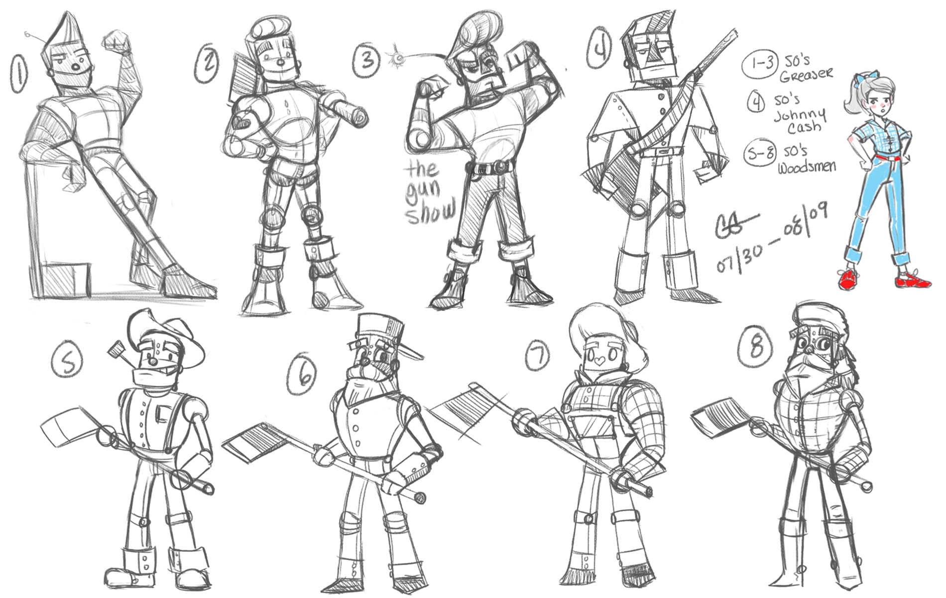
Fell a bit behind, but am kicking it into full gear tonight! Decided on a 1950's update theme. Decided on Dorothy #12, I just really dig her tough tomboy attitude. Had three ideas for the Tin Woodsman: 1) A 1950's Greaser, 2) 50's Johnny Cash, or 3) a more traditional 50's Woodsman/ Logger. My faves are 1, 8 for design, 5/6 for the face construction.
Moving on to the Scarecrow, and then either the Lion or Glinda. Will circle back to the one's that look best together and adjust as needed.
-
Your drawings have a really nice looseness and weight to them! Welcome to the forums!
-
I like them all, but my favorite is number 7. I think it is because of the age - he looks like he could be Dorothy´s friend rather than Dorothy´s grandad, like the others. Number 2 is also nice (for the same reason!), but I believe it reminds too much of the main character of "Robots".However, they are really all good, so all valid choices!
-
I like 6... great gesture and has a fun "teeny bopper" appeal. Great approaches, lots of variety to choose from.

-
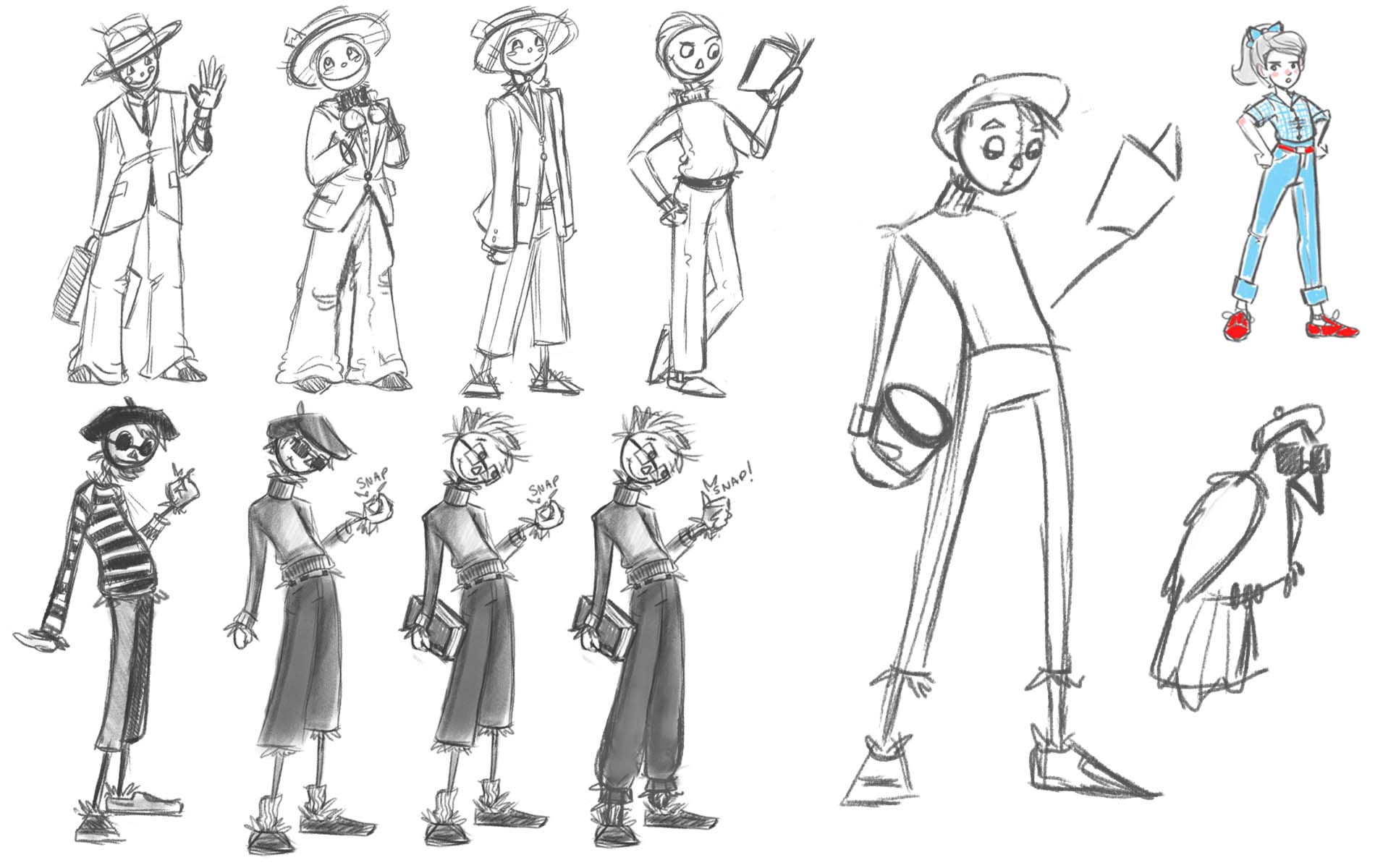
Process Update #1:
So things got crazy and handed this in just in time. So here is the process update. These are the Scarecrow sketches. The two ideas I had were a 50s Salesman or a Beatnik. As much as I loved the beatniks they did not feel cohesive in the line (will get to that later).
-
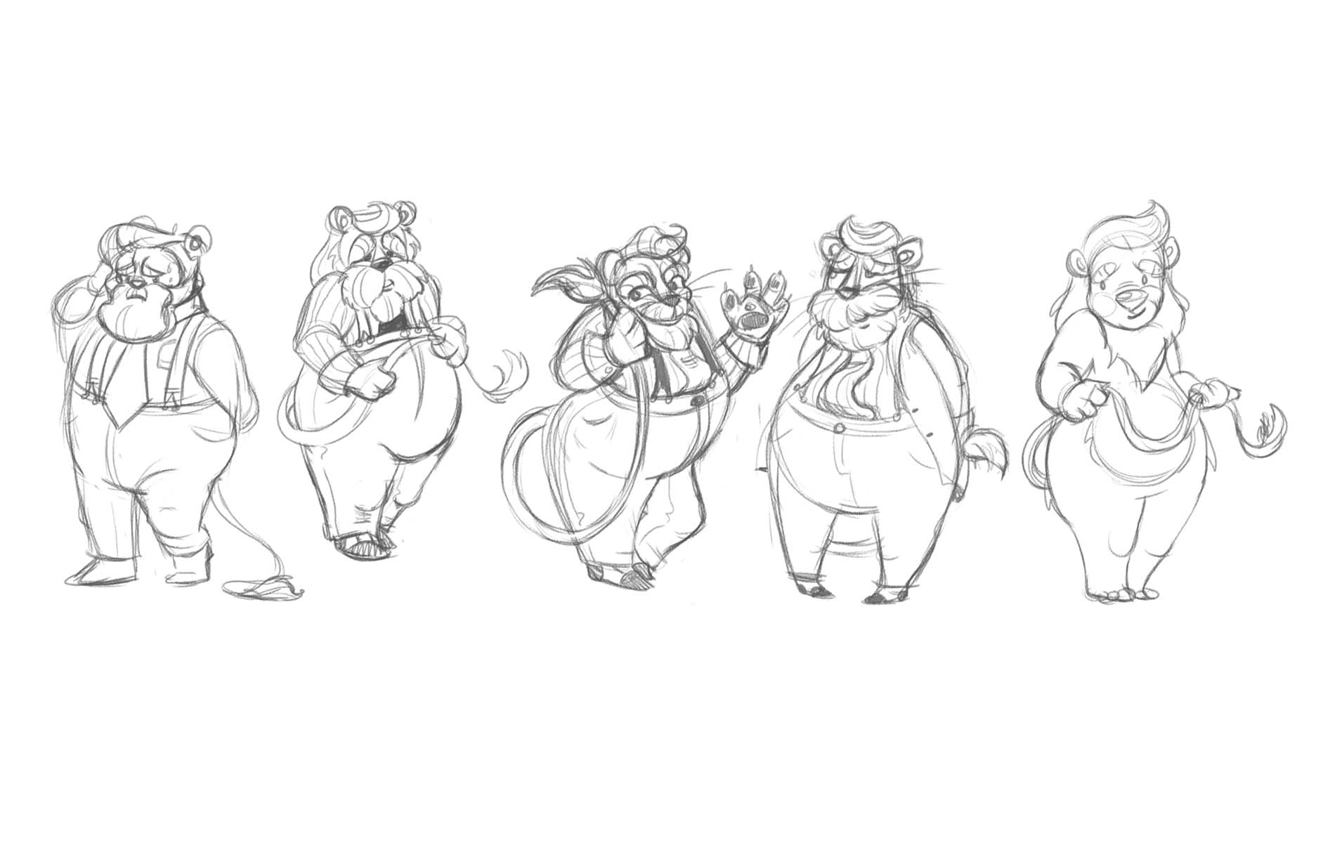
Process Update #2:
When I was still trying to make the scarecrow a beatnik. I tried to make the Lion a salesman... decided that I wasn't feeling the lion in clothes, plus time was starting to run down, so I went with the last design.
-
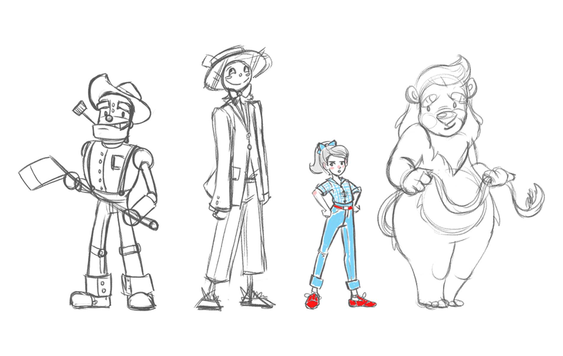
Process Update #3:
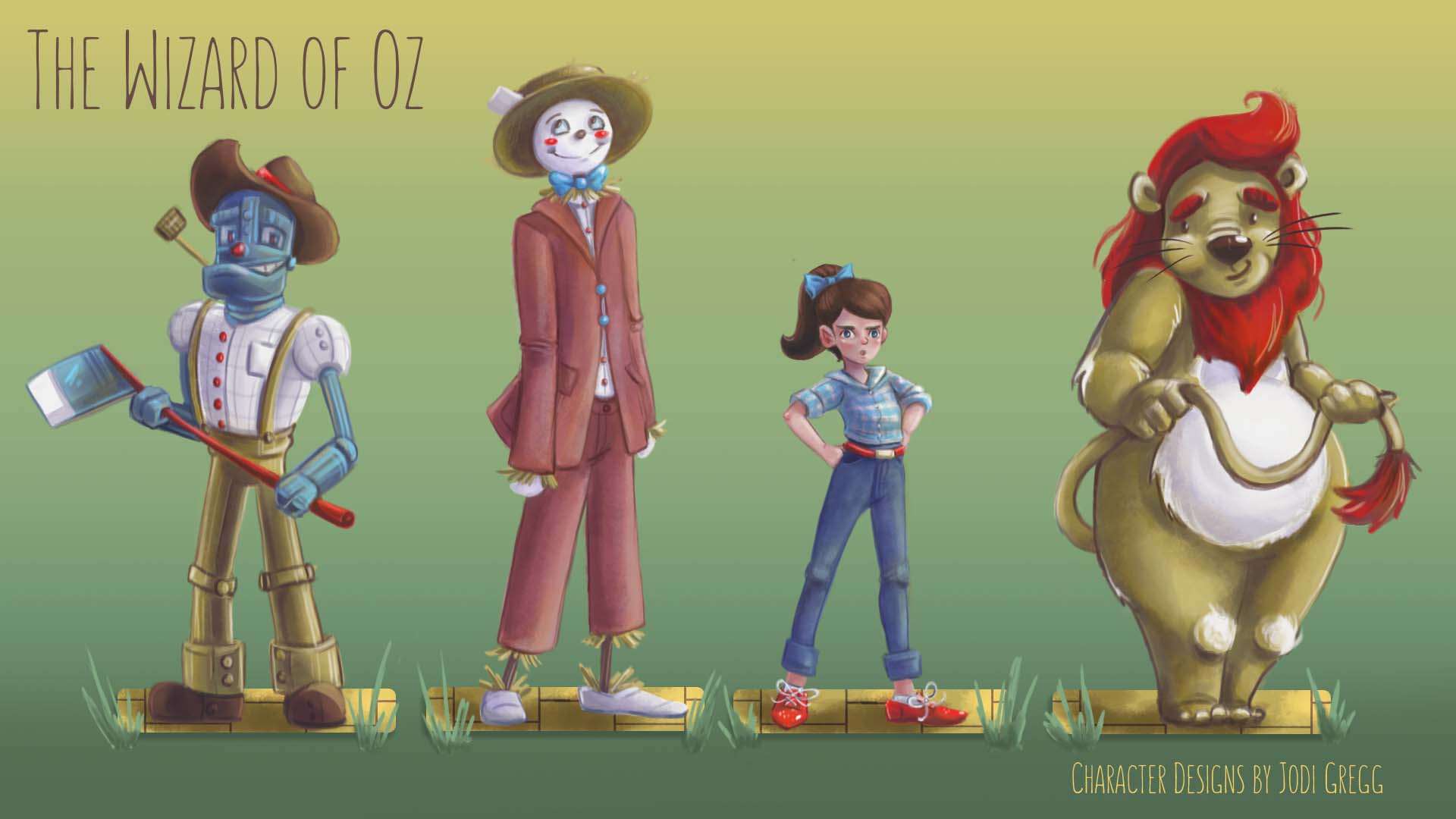
After some debate, decided the final lineup based on which designs went together the best.
-
Process Update #4:
And here is the final submission! Thanks for all the feedback and support! Sorry I fell behind with the updates.
-
Really good! I love love the tufts of fur on the lion's knees!