Ixspen's Sketchbook
-
@ixspen Welcome to the forums!
-
@Chip-Valecek Thank you.

-
Sketch
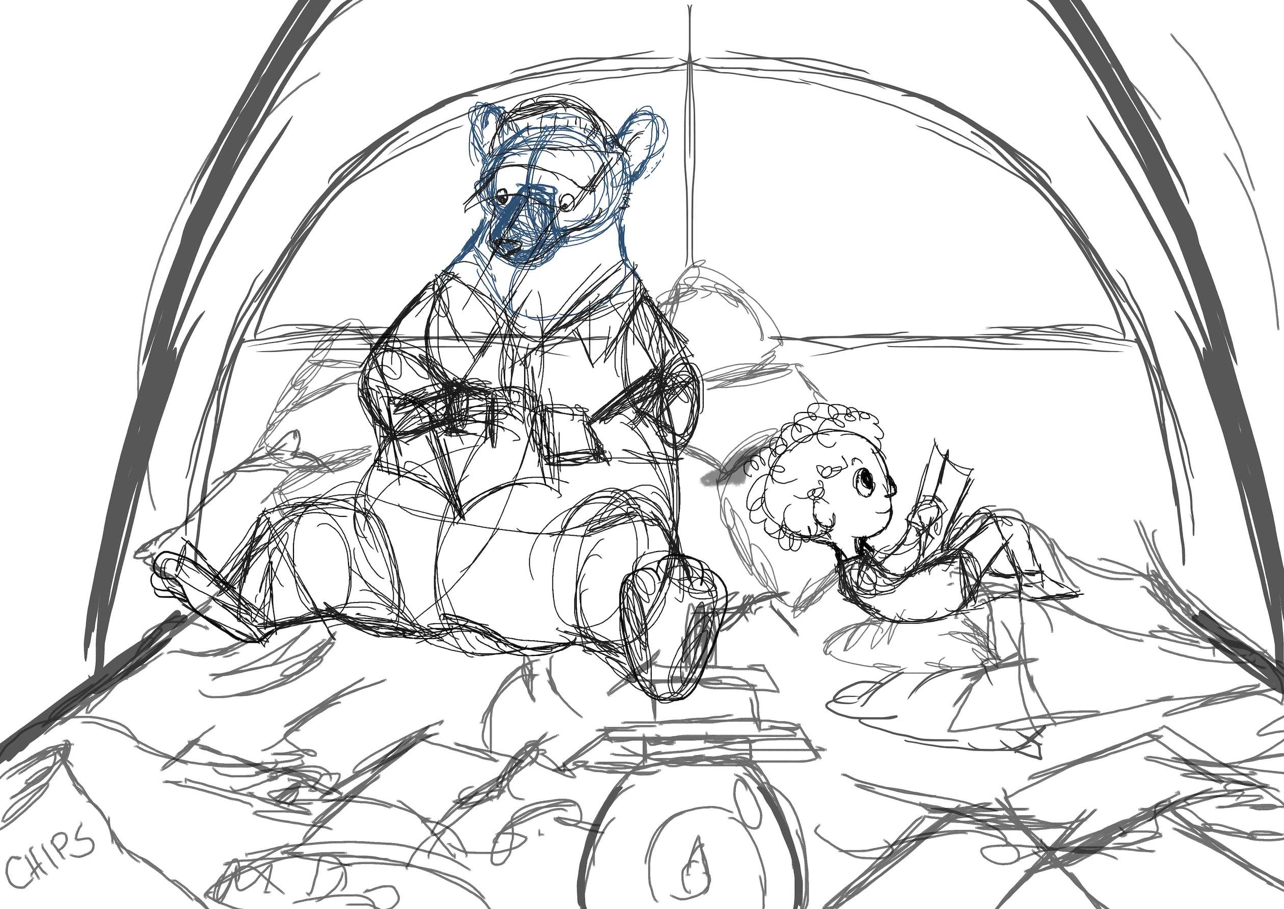
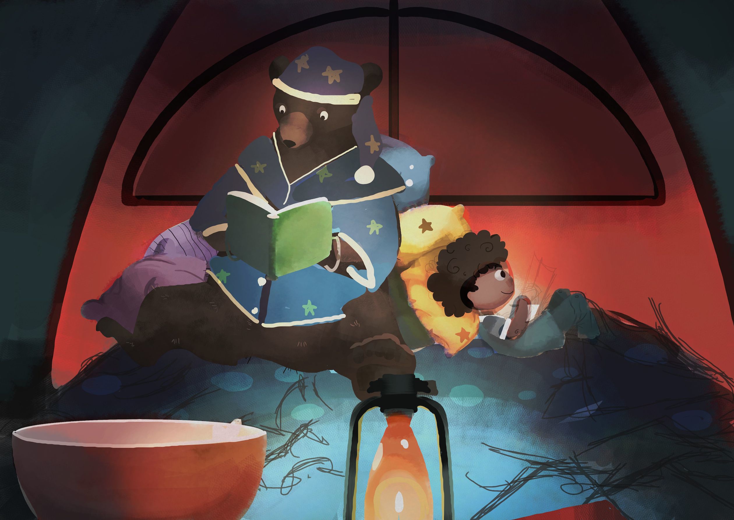
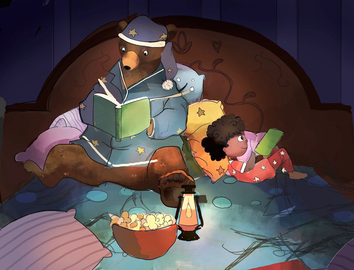
I started this piece earlier this week, and after coming back to it...I feel like something's off. I know I need to finish the hands and add folds and creases to the bear's PJs, but I feel like but I feel like there's something something off...
Is it the perspective of the bowl and lantern?
-
Welcome! My favorite is the one on the bottom. The black and gray. How do you pronunce your name?

-
@Marsha-Kay-Ottum-Owen Hi! And thank you!
 Also, it's pronounced "ik-spen". Sorry for responding so late, I've been away from the site for a bit.
 -
This post is deleted! -
@ixspen I think the bowl is too straight on, from the angle of the figures we should be able to see more of the inside. The lantern probably the same but I'd actually get rid of it or place it away from the direct center.
To be honest, the bowl doesn't have to be there either unless it's some integral part of the story. I think it might look better to crop the sides and bottom of the image.
Love the colors and the character designs.
-
Thank you very much, mattramsey!

When I posted my last piece, I forgot to upload the alterations I did to the camping picture after I had gotten some feedback on DeviantArt. I didn't move the lantern from the center, but I scaled it down and slid it back so it wasn't dominating the foreground. Still think I should scrap it?
Also, thank you for the help with the bowl. I wanted it to seem like the two were having a sleep over and staying up late. There's no written story tied to this piece, but I figured kids have snacks at sleepovers (?) (I never had one as a kid) so that's why I added it. I'll be sure to fix the angle.
-
@ixspen I think this could be a really nice piece but I think it needs a few changes to bring the focus in. The first thing that I would look at all the colors and the values. If you squint at this image your eye doesn't know where to go it just looks like a bunch of shapes there's no real focus to the composition. Part of that are your values you have some of the pillows are very light even the ones that move out from the center of the image, and the other thing is that there are bright eye-catching colors like orange or pink scattered around. If I were approaching this piece I would start with everything in shades of blue and then add color and light where I wanted the viewers I to go. Something else that might help ground some of the elements is that a central light like the lamp would cast shadows out around it from the bowl from the pillows the character those but also create lines I would point towards the center of the image and might help with focus.
I hope some of this helps!
-
Everything you said was a lot of help! Thank you! :3
When I de-saturated it I see the issue with the values now..
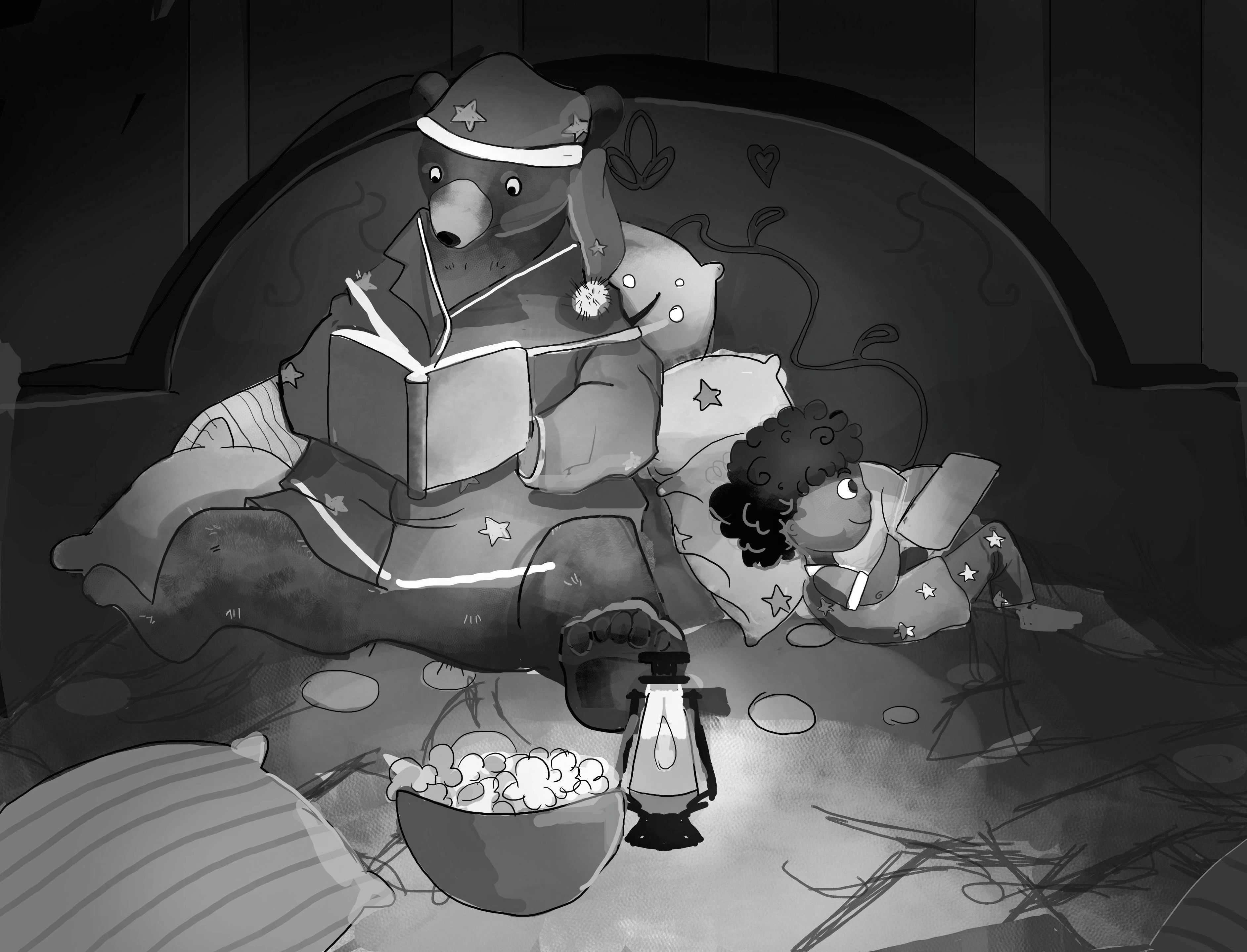
I started recoloring in shades of blue instead of gray and so far I think it does look a lot nicer. The shadows look more natural too. Thank you very much for that suggestion and the rest of your feedback!
-
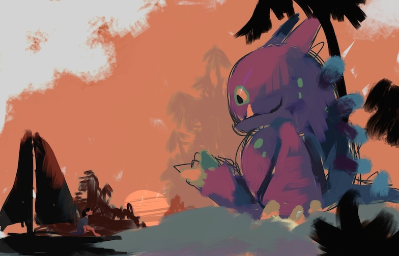
-
nice work!
-
@Kelly-Lane
Thank you, Kelly.
-
This post is deleted! -
-
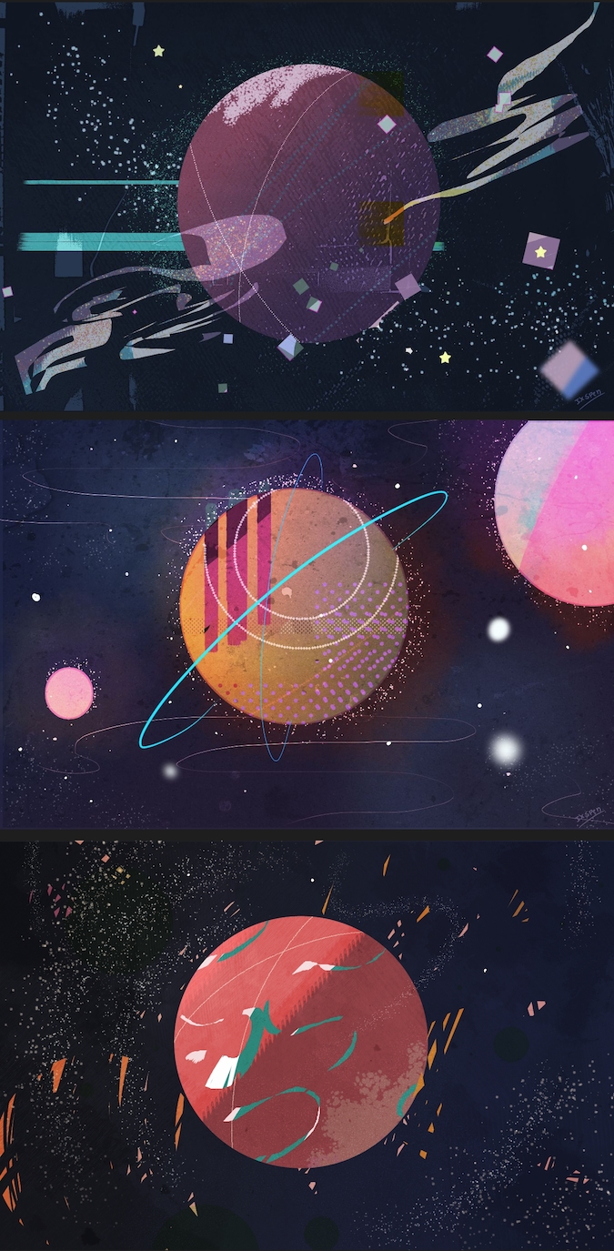
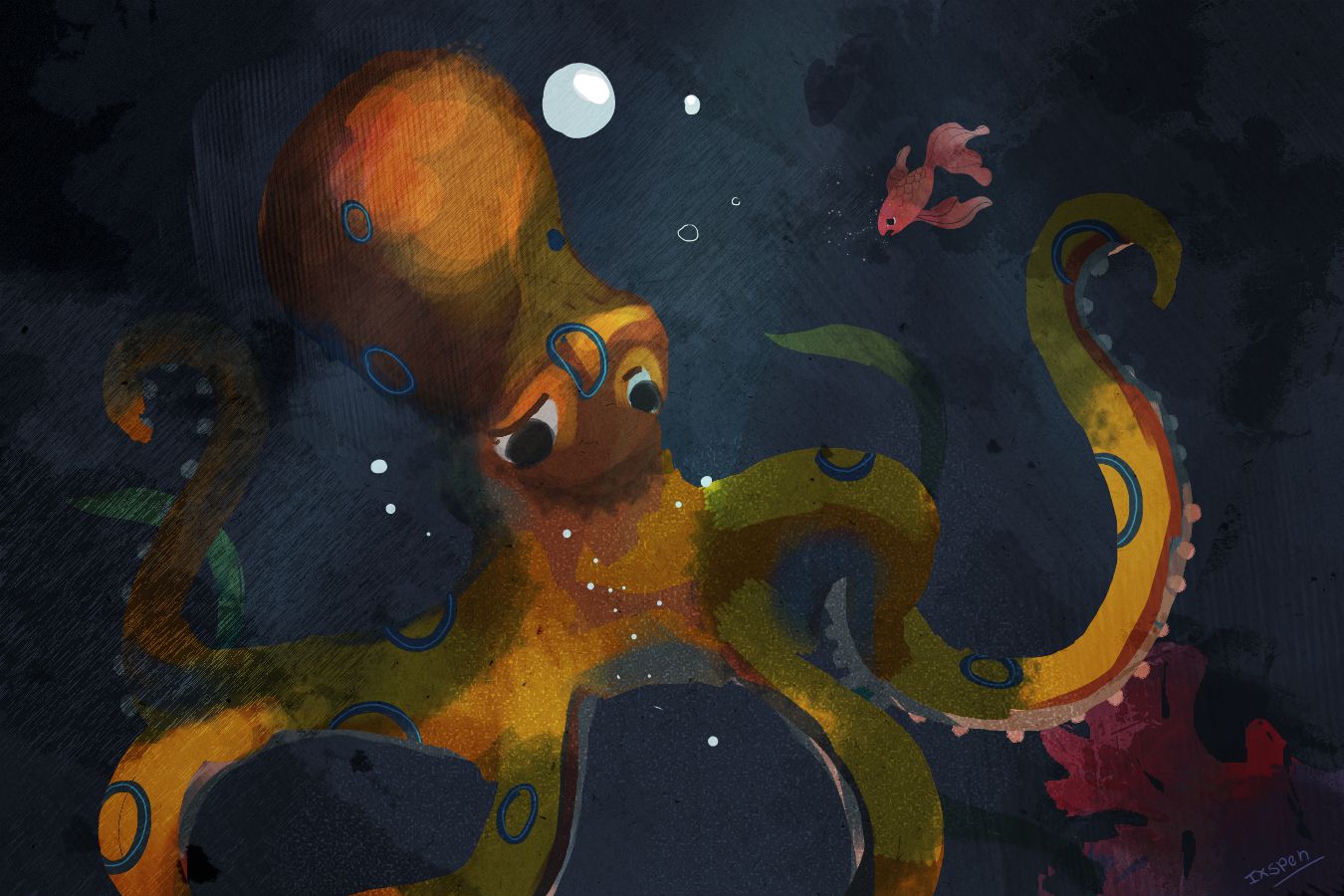
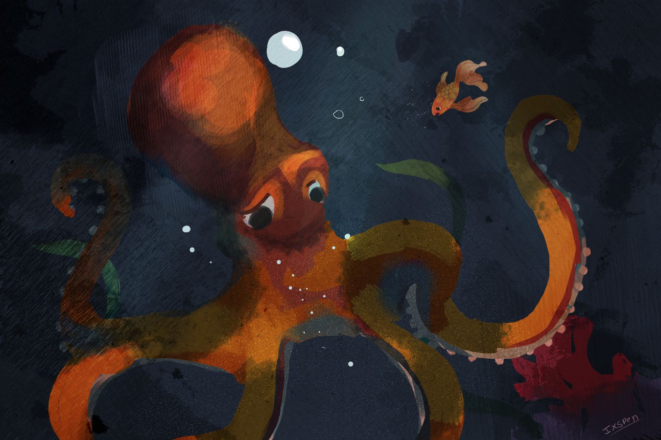
Welcome to the forums! Great artwork! I love the color palettes and the textures you use.

-
-

-
-
This post is deleted!