Society of Visual Storytelling

    SVSLearn Forums

    • Register
    • Login
    • Search
    • Recent
    • Tags
    • Popular
    • Users
    • Groups
    • Search

    Swift_SCBWI September prompt and beyond

    General Discussion
    20
    71
    33158
    Loading More Posts
    • Oldest to Newest
    • Newest to Oldest
    • Most Votes
    Reply
    • Reply as topic
    Log in to reply
    This topic has been deleted. Only users with topic management privileges can see it.
    • evilrobot
      evilrobot SVS OG @smceccarelli last edited by

      @smceccarelli Some amazing work on this! I really need take a cue from you and work on some of these more complex compositions. Again just fantastic work.

      http://www.palacioillustration.com/

      https://www.scbwi.org/illustrator-gallery/illustrator-detail/?illustrator_id=84142

      https://www.pinterest.com/evilrobot2/pins/

      https://twitter.com/MyEvilRobot

      1 Reply Last reply Reply Quote 1
      • Rich Green
        Rich Green SVS OG @smceccarelli last edited by

        @smceccarelli I feel like a broken record when I comment on your work - but once again - WOW!!!! You are amazingly talented!!!

        www.richgreenart.com instagram.com/richgreenart/

        1 Reply Last reply Reply Quote 1
        • lmrush
          lmrush Pro SVS OG last edited by

          love this!

          Lisa Rush
          www.lisarushgallery.com
          www.facebook.com/ArtbyLisaRush/
          www.instagram.com/lisarush11/

          1 Reply Last reply Reply Quote 0
          • bluesky71
            bluesky71 last edited by

            Love this...

            https://www.instagram.com/lokibear71/
            Jenniferwillimott@rocketmail.com

            1 Reply Last reply Reply Quote 0
            • Dulcie
              Dulcie SVS OG last edited by

              I agree with everyone else, your work is amazing! I love the characters, the gestures, and the overall composition. It is sure to be a really fantastic piece.

              But since you asked for feedback, I will add some thoughts....the main thing that I wonder about, is whether it is deliberate that the closest wing has the jet engine, the turbine thing and the wheel under it, while the other wing doesn't? It also looks very slightly more curved at the wingtip, even taking the perspective into account...but of course that could be deliberate, or it could just be me seeing it like that, when it's not (please ignore if you don't think so!). And of course this is a very nit-picking level amongst such lovely drawing. Will look forward to the coloured version!

              www.dulciemascord.com
              https://www.instagram.com/dulciemascord
              https://twitter.com/dulciemascord
              https://www.facebook.com/dulciemascord

              smceccarelli 1 Reply Last reply Reply Quote 1
              • smceccarelli
                smceccarelli Pro SVS OG @Dulcie last edited by

                @Dulcie Very well caught! I decided to eliminate all the stuff from the back wing so as to keep it clearer behind Donky. I keep second-guessing wether that was a good decision or not. On the one hand, I think asymmetry in a odd vehicle like this is to be expected. On the other hand, it is noticeably dis-balanced. But there is something wrong with the perspective of the back wing, I agree with you. I will look at it with fresh eyes tomorrow before I start rendering and see how to correct it.

                1 Reply Last reply Reply Quote 0
                • Rebecca Hirsch
                  Rebecca Hirsch last edited by

                  Great work as usual! My thoughts: The front tire looks a bit off to me, I think the fender should overlap the tire in the back - it's reading flat to me instead of 3-D. I also think the loop of the rope should be just a bit closer to Donky to increase the tension of him about to be caught. Can't wait to see the finished result.

                  1 Reply Last reply Reply Quote 1
                  • Pamela Fraley
                    Pamela Fraley SVS OG @smceccarelli last edited by

                    @smceccarelli beautiful work! I love it!!

                    instagram.com/fraleycreates

                    1 Reply Last reply Reply Quote 0
                    • drawingmelee
                      drawingmelee last edited by

                      Amazing! Love it!

                      Instagram: https://www.instagram.com/drawingmelee/
                      Twitter: https://twitter.com/drawingmelee
                      Website: http://www.drawingmelee.com

                      1 Reply Last reply Reply Quote 0
                      • Lee Holland
                        Lee Holland last edited by

                        Really great work. Can't wait to see this painted.

                        https://www.facebook.com/pages/Lee-Holland-illustration/285517801577676?
                        https://www.instagram.com/lee_holland_illustration/
                        http://lholla56.wix.com/lee-holland

                        1 Reply Last reply Reply Quote 0
                        • smceccarelli
                          smceccarelli Pro SVS OG last edited by

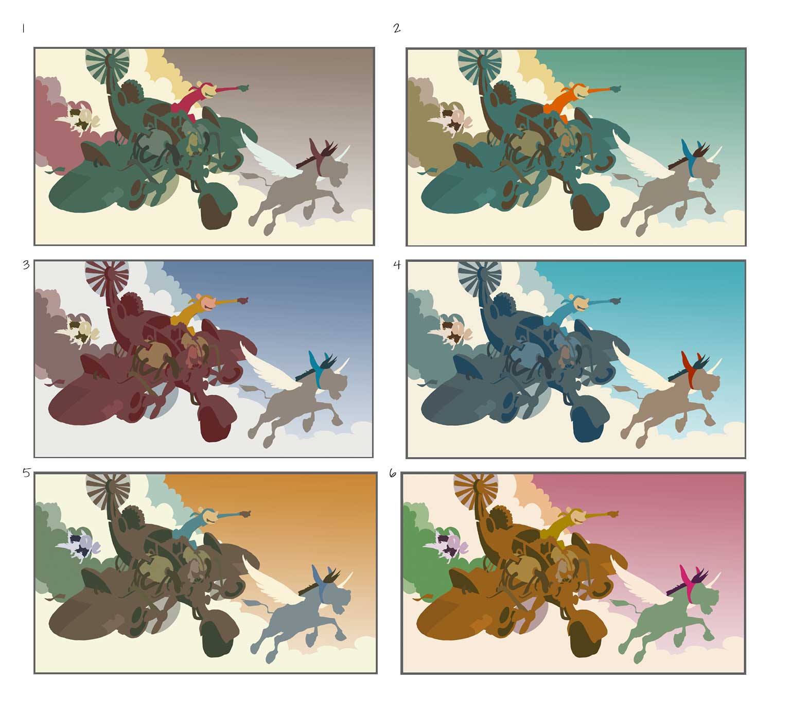
                          Thank you for the feedback everybody! I have corrected the drawing as per @Dulcie and @Rebecca-Hirsch suggestions. I think I am happy with the value structure, but now is color time! Which scheme? Unfortunately need to decide fast - I have studio time in the next few hours...

                          0_1473937083640_ColorStudies.jpg

                          Rich Green 1 Reply Last reply Reply Quote 2
                          • Dulcie
                            Dulcie SVS OG last edited by

                            I like #5 and #2 best...very difficult to pick between those...followed by #4. I like that in #5 the plane is brown - lends itself well to a rough piratey look, and the blue monkey on yellow is nice contrast... then with #2 you also have the monkey in bright orange against the green...overall it is a pleasing colour set but still different. With #4 I like it, it looks very much like midday, bright sunshine, a bit cleaner...it is nice but I think the slightly warmer palettes suit this better.

                            I wouldn't choose #1 because of the grey sky, and in #6 the pink sky is a bit distracting...though with your skills you could undoubtedly make any of these colour schemes work 🙂

                            www.dulciemascord.com
                            https://www.instagram.com/dulciemascord
                            https://twitter.com/dulciemascord
                            https://www.facebook.com/dulciemascord

                            1 Reply Last reply Reply Quote 1
                            • Rich Green
                              Rich Green SVS OG @smceccarelli last edited by

                              @smceccarelli I really like #2 followed by #5.

                              www.richgreenart.com instagram.com/richgreenart/

                              1 Reply Last reply Reply Quote 0
                              • Carrie
                                Carrie last edited by

                                I'm drawn most to #2.

                                1 Reply Last reply Reply Quote 0
                                • smceccarelli
                                  smceccarelli Pro SVS OG last edited by

                                  Thank you! Across all media, favorites are (In this order) 4, 2 and 5. I will go for 2, as I think it is between 4 and 5 and 4 is a bit too happy/sunny for the mood I want.

                                  1 Reply Last reply Reply Quote 1
                                  • smceccarelli
                                    smceccarelli Pro SVS OG last edited by

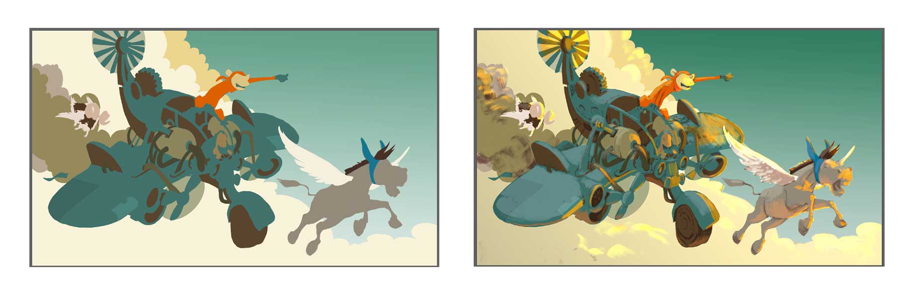
                                    In case anyone is interested in my process, this is my transition from color study to underpainting or painting master reference. This is for me where an illustration is born. From now on is just tightening and refining = meditative noodling for many, many hours watching webcasts/courses/tutorials. All decisions have been done (apart from minor adjustments) and I can relax.

                                    0_1473954485988_Process.jpg

                                    Kevin Longueil 1 Reply Last reply Reply Quote 7
                                    • Kevin Longueil
                                      Kevin Longueil SVS OG @smceccarelli last edited by

                                      @smceccarelli For me this is really great to see - i keep hoping you'll do another youtube video 🙂

                                      Portfolio: kevinlongueil.com
                                      https://www.instagram.com/kevinlongueil/

                                      1 Reply Last reply Reply Quote 1
                                      • smceccarelli
                                        smceccarelli Pro SVS OG last edited by

                                        WIP - still need to render the goat and at this point, I am not sure if it should be in it at all. Actually, I am not sure about anything anymore, I have worked too many hours in a row and something is still not looking right, and I am running out of time... only about 4 hours of studio time left before deadline.
                                        What do you see?

                                        0_1474229951480_WIP.jpg

                                        Kevin Longueil 1 Reply Last reply Reply Quote 4
                                        • Dulcie
                                          Dulcie SVS OG last edited by

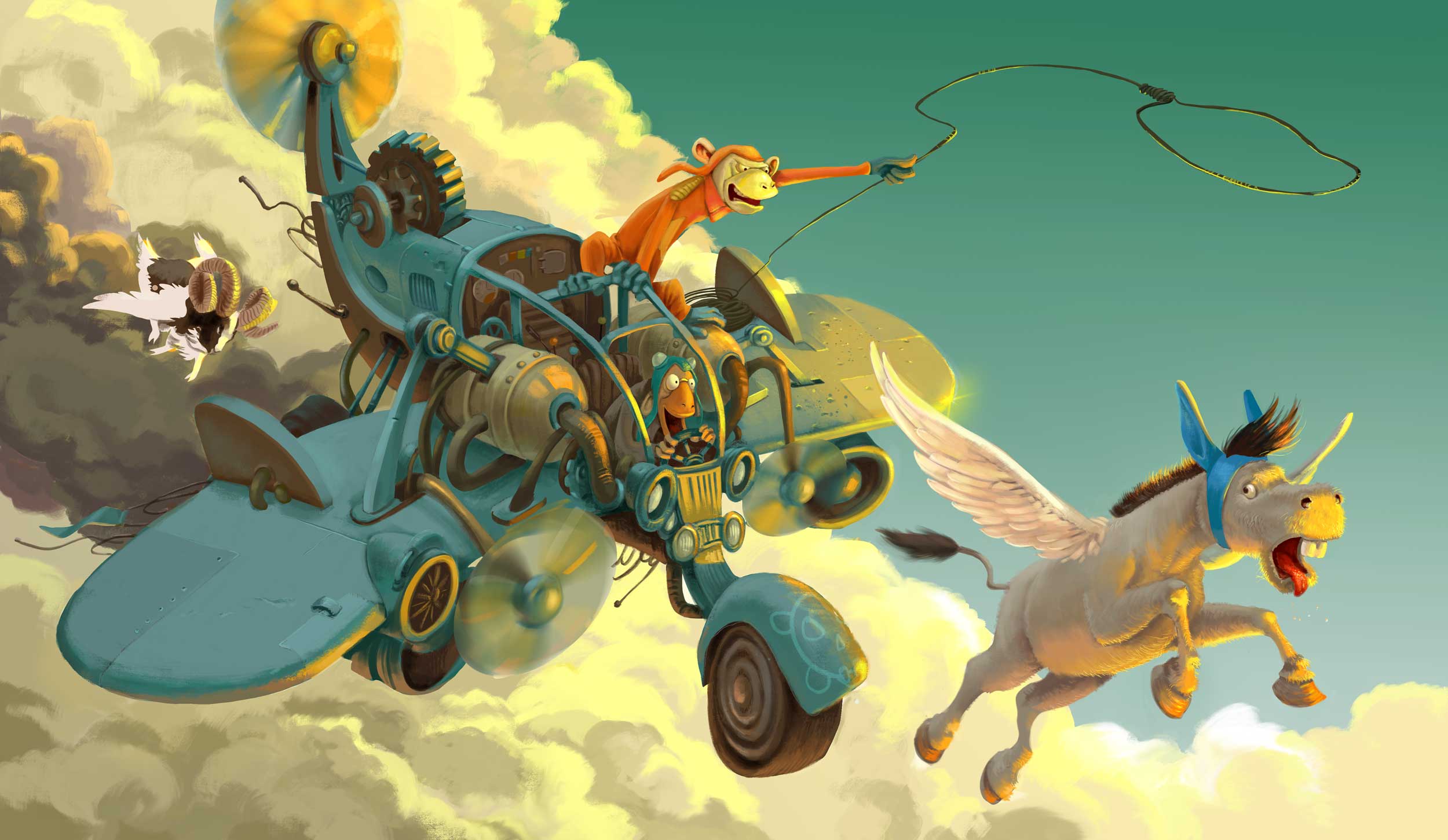
                                          It looks amazing, no doubt about that! I think there is enough going on in that picture that you don't need the goat - he is a lovely concept, but I think there is enough tension and excitement with the plane, the donkey and the monkeys trying to catch the donkey....if you took the goat out, your eye would travel in a nice circle around the three remaining characters, all edged by that gorgeous sunlight. And if it means you have more time to get a better finish, then maybe that will help with the competition!

                                          One more thought...I keep reading the furthest wing of Donkey as a unicorn horn...even though I know it isn't....maybe if it were a little whiter it would help separate from Donkey's head a bit more....

                                          www.dulciemascord.com
                                          https://www.instagram.com/dulciemascord
                                          https://twitter.com/dulciemascord
                                          https://www.facebook.com/dulciemascord

                                          1 Reply Last reply Reply Quote 1
                                          • evilrobot
                                            evilrobot SVS OG last edited by evilrobot

                                            I think you should get rid of the goat (even though he's super cool) Then I think if you work on the shadow side and make it darker it will make that light pop so much better. I messed around with it in Photoshop and once I darkened the shadow side your rim light/ bounce light popped out way better. I darkened the cloud behind and under the plane in that corner and it seemed to work pretty well. Give it a shot on a layer above everything real quick and see what you think.

                                            http://www.palacioillustration.com/

                                            https://www.scbwi.org/illustrator-gallery/illustrator-detail/?illustrator_id=84142

                                            https://www.pinterest.com/evilrobot2/pins/

                                            https://twitter.com/MyEvilRobot

                                            1 Reply Last reply Reply Quote 0
                                            • First post
                                              Last post