Swift_SCBWI September prompt and beyond
-
@smceccarelli beautiful work! I love it!!
-
Amazing! Love it!
-
Really great work. Can't wait to see this painted.
-
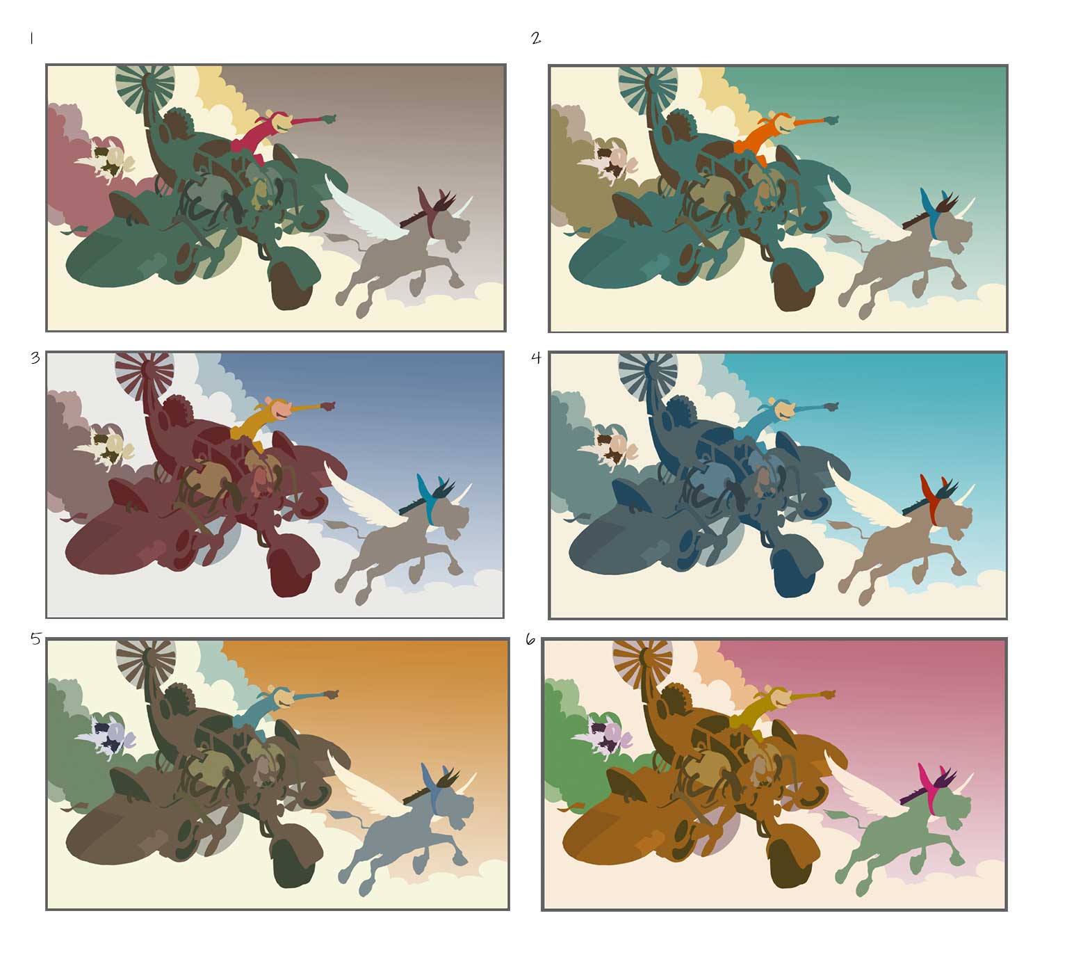
Thank you for the feedback everybody! I have corrected the drawing as per @Dulcie and @Rebecca-Hirsch suggestions. I think I am happy with the value structure, but now is color time! Which scheme? Unfortunately need to decide fast - I have studio time in the next few hours...

-
I like #5 and #2 best...very difficult to pick between those...followed by #4. I like that in #5 the plane is brown - lends itself well to a rough piratey look, and the blue monkey on yellow is nice contrast... then with #2 you also have the monkey in bright orange against the green...overall it is a pleasing colour set but still different. With #4 I like it, it looks very much like midday, bright sunshine, a bit cleaner...it is nice but I think the slightly warmer palettes suit this better.
I wouldn't choose #1 because of the grey sky, and in #6 the pink sky is a bit distracting...though with your skills you could undoubtedly make any of these colour schemes work

-
@smceccarelli I really like #2 followed by #5.
-
I'm drawn most to #2.
-
Thank you! Across all media, favorites are (In this order) 4, 2 and 5. I will go for 2, as I think it is between 4 and 5 and 4 is a bit too happy/sunny for the mood I want.
-
In case anyone is interested in my process, this is my transition from color study to underpainting or painting master reference. This is for me where an illustration is born. From now on is just tightening and refining = meditative noodling for many, many hours watching webcasts/courses/tutorials. All decisions have been done (apart from minor adjustments) and I can relax.

-
@smceccarelli For me this is really great to see - i keep hoping you'll do another youtube video

-
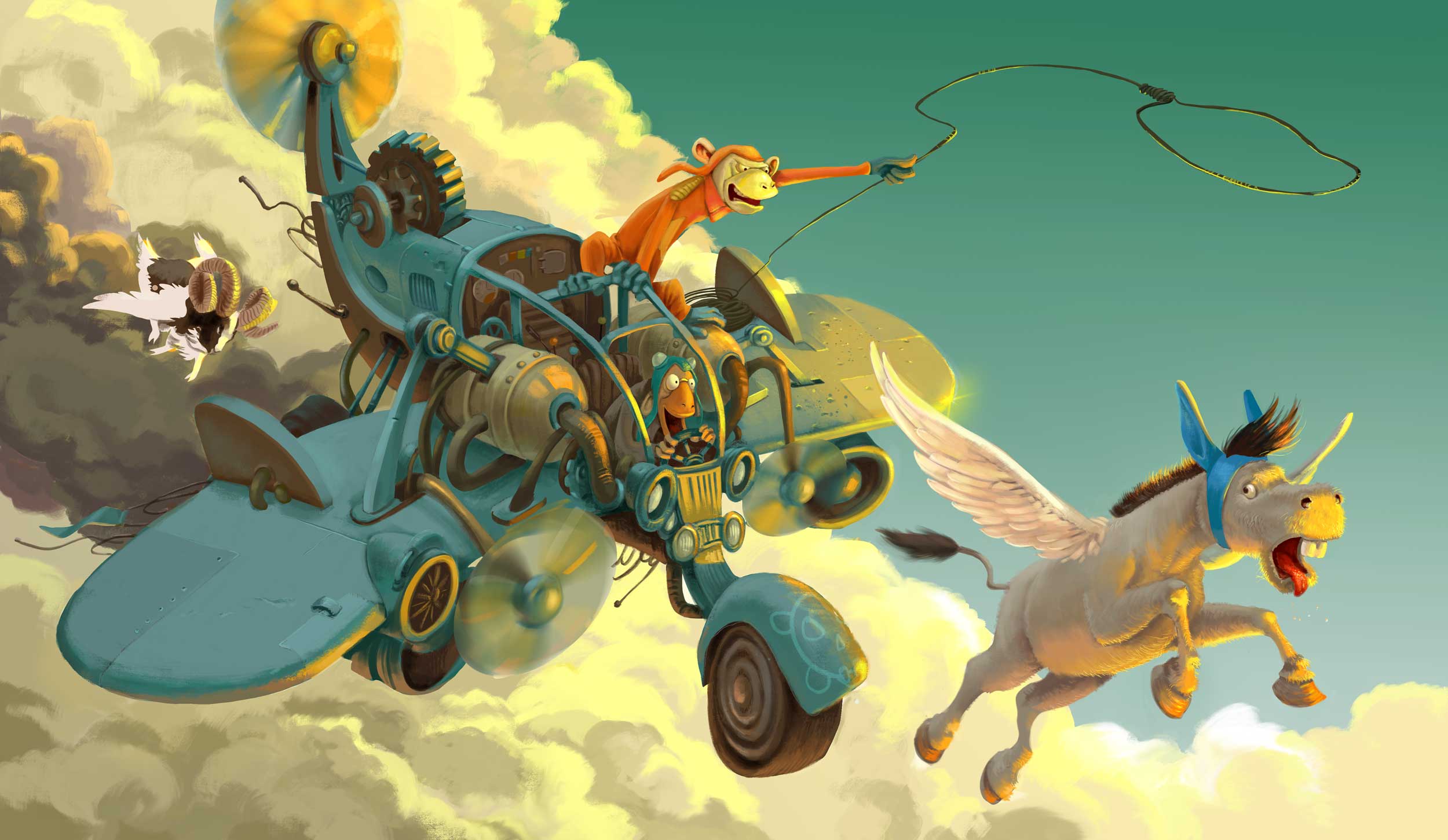
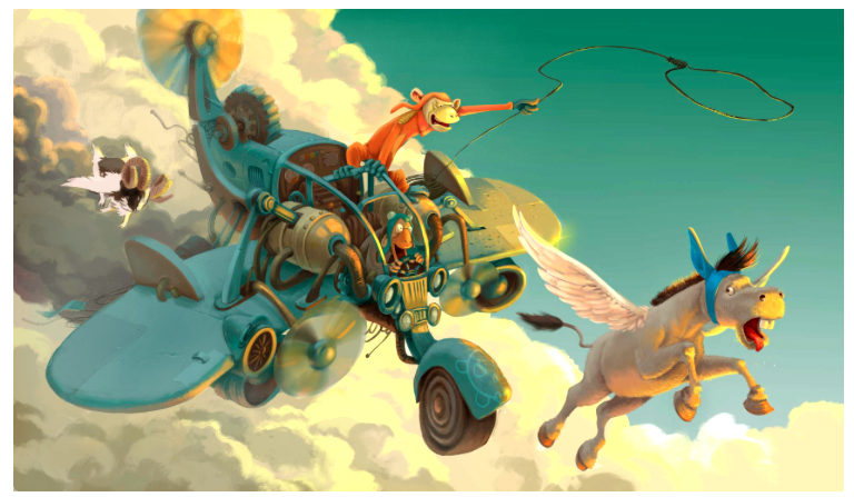
WIP - still need to render the goat and at this point, I am not sure if it should be in it at all. Actually, I am not sure about anything anymore, I have worked too many hours in a row and something is still not looking right, and I am running out of time... only about 4 hours of studio time left before deadline.
What do you see?
-
It looks amazing, no doubt about that! I think there is enough going on in that picture that you don't need the goat - he is a lovely concept, but I think there is enough tension and excitement with the plane, the donkey and the monkeys trying to catch the donkey....if you took the goat out, your eye would travel in a nice circle around the three remaining characters, all edged by that gorgeous sunlight. And if it means you have more time to get a better finish, then maybe that will help with the competition!
One more thought...I keep reading the furthest wing of Donkey as a unicorn horn...even though I know it isn't....maybe if it were a little whiter it would help separate from Donkey's head a bit more....
-
I think you should get rid of the goat (even though he's super cool) Then I think if you work on the shadow side and make it darker it will make that light pop so much better. I messed around with it in Photoshop and once I darkened the shadow side your rim light/ bounce light popped out way better. I darkened the cloud behind and under the plane in that corner and it seemed to work pretty well. Give it a shot on a layer above everything real quick and see what you think.
-
I agree, as cool as the goat is he doesn't add anything to the story - he's just kind of "there". Once you take him out you have a great flow around the image. Let us know how this worked out for you! Working on a prompt for my SCBWI conference myself and disgruntled with it...
-
@smceccarelli But i thought the goat was coming to the rescue? That's how i am reading it - he has a determined tilt to his head - he looks like he is going to solve the problem with the force of his brow to me - so my thought is possibly go a tiny bit larger with the goat if he seems ambiguous to folks - i could be way off of course
 really great painting!
 -
If the goat is coming to the rescue, then I think he should be larger so we can see the expression on his face more clearly. Also, maybe something to tie him to the donkey: maybe the goat could wear blue on his head as well - that would create a link between them for the viewer. I love the dynamic action in this piece.
-
Thank you everyone! Yes, the goat is coming to the rescue, and this should be (for portfolio considerations) one of three pieces about these characters. After a night sleep I am a little less negative about the goat staying in. I have painted it out and it looks like something is missing....which is no surprise, as the composition was built with the goat in. So I will follow your advice @Kevin-Longueil and @Dulcie and try to make it bigger and with a clearer expression, as well as think of a way of relating the characters. I have also made the furthest wing lighter and it helps solve the "unicorn" issue (thank you for that!). @evilrobot I have tried messing around with the levels of clouds and plane, but I have the impression that the value structure does not work anymore (the silhouette of the plane should stay dark over light). But I think you are describing the main issue here - the clouds are competing for attention. So that will be the focus of the next studio "window" - calming them down value and contrast-wise. And a lot of other things that are bugging me....
Thank you again - I will post the final when I am done! -
@Rebecca-Hirsch Being "disgruntled" is a good description of how I feel about my work nearly all the time ;-). It seems I can only like a piece (if it is any good) three or four weeks after finishing it...That gap between how you see things in your head and how they turn out on paper and/or screen....
-
Great piece Smceccarelli. I hope you don't mind but I did An adjustment layer on your work. I thought that you could add abit of mist and get rid of a little detail off the back of the plane. I may be wrong but just thought I could give some feedback.

-
my issue is the deepness of the saturation of the sky and the same color as the plane. I love this and i would hang this on my wall. I am a little jealous and will keep working hard until I match this level and beyond. Great job. I too, would liek to see the ram larger, you probably show him in other frames, so maybe that is not as important here...I want to read this book!