Kids...
-
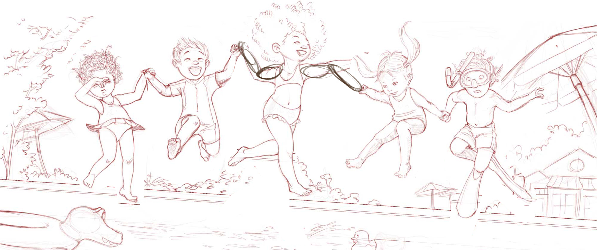
@smceccarelli Love this! My only comment on the middle girls position is I think if she is jumping in the pool her toes touching the water should be pointed. Right now to me it looks like she is standing on the water. I love the angle and the touches of background - great piece!
-
@smceccarelli - hope you dont mind but I did a little adjusting to your latest version:
I keep imagining that if the girl in the middle is a bit taller/older than the rest of the kids - that would make her "jump" a little stronger/higher than the rest. Plus she is so happy about jumping in - she is not tentative like the kids on the ends who would have jumped less or even a second or two later than the rest.
So I lowered the overall image down within your area a bit to give us a bit more sky - and then I moved your middle girl up above the rest. I adjusted the kids she is holding hands with to then make them each a bit higher than the other two. And to make the arms link up I also flipped the joyous boy. And in doing so I think having him facing in towards the center actually helps the composition and the direction the viewer follows within the image.
Some adjustments to the middle girls arm placement would be needed to properly link her hands to those kids but you get the idea.
And now her legs look like she is floating happily through the air and not walking/dancing on the water.
-
@Rich-Green Thank you a ton Rich, these are great suggestions, and I am going to implement them! Your flow looks a lot more dynamic and I agree with flipping the asian boy.
I will let it rest for a few days now rather than going to paint straight away - I am seeing quite some anatomy flaws and some of the poses do not look natural. I am getting back to it with fresh eyes during the weekend. So kid drawing no 10 is going to be a different one...;-) -
Well done with these smceccarelli The gestures look proportions look great.
-
Kids do not only jump in pools....So kid No 10 will finally heralds Fall, waiting for the pool-jumping kids to sort themselves out...

-
@smceccarelli I love all of these, I also have tried to do something besides my normal, which isn't developed as far as yours... I think maybe we should just embrace what we do and enjoy it. I am waiting to see what these will become. I would hire you...
-
It's really fun to see your kids project updates. You do really great work!
-
@smceccarelli love it!, theres so much fun in this!
-
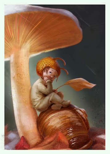
Kid No 11 - Getting into Inktober, I may or may not be able to do these for a while. But I may get so fed up with inking that I need to paint for a while ;-). This is part of a series of two that I sketched - so there will be a second snail-boy.

-
Wow @smceccarelli that is amazing work - I love the lustre on the snail, the concept - unusual but cute! - the lighting, the shine...all just perfect. Such a great piece!
-
@Dulcie Thank you! I was watching pictures of eels and frogs and snails and wanted to try to paint that weird skin translucency they have. It is fascinating how the light changes temperature and saturation going through their skin. And then I just bought Kyle´s rake brushes and wanted to try them out too
")
-
Oh, the new rake brushes! I had seen those but not got around to buying them yet...what a great use for them! I wondered how you did the shell stripes but didn't think of that. Will be interesting to see what else they are good for...
-
@smceccarelli Whoa - the snail and its shell are amazingly rendered out. Absolutely stunning.
-
@Dulcie They are pretty cool. They are tilt sensitive and follow the direction of the stroke. I can imagine using them for things like patterns on animals and insects, texture on tree bark and stuff like that. I was not sure about fur, but I think they are too coarse for that - worth a try though.
-
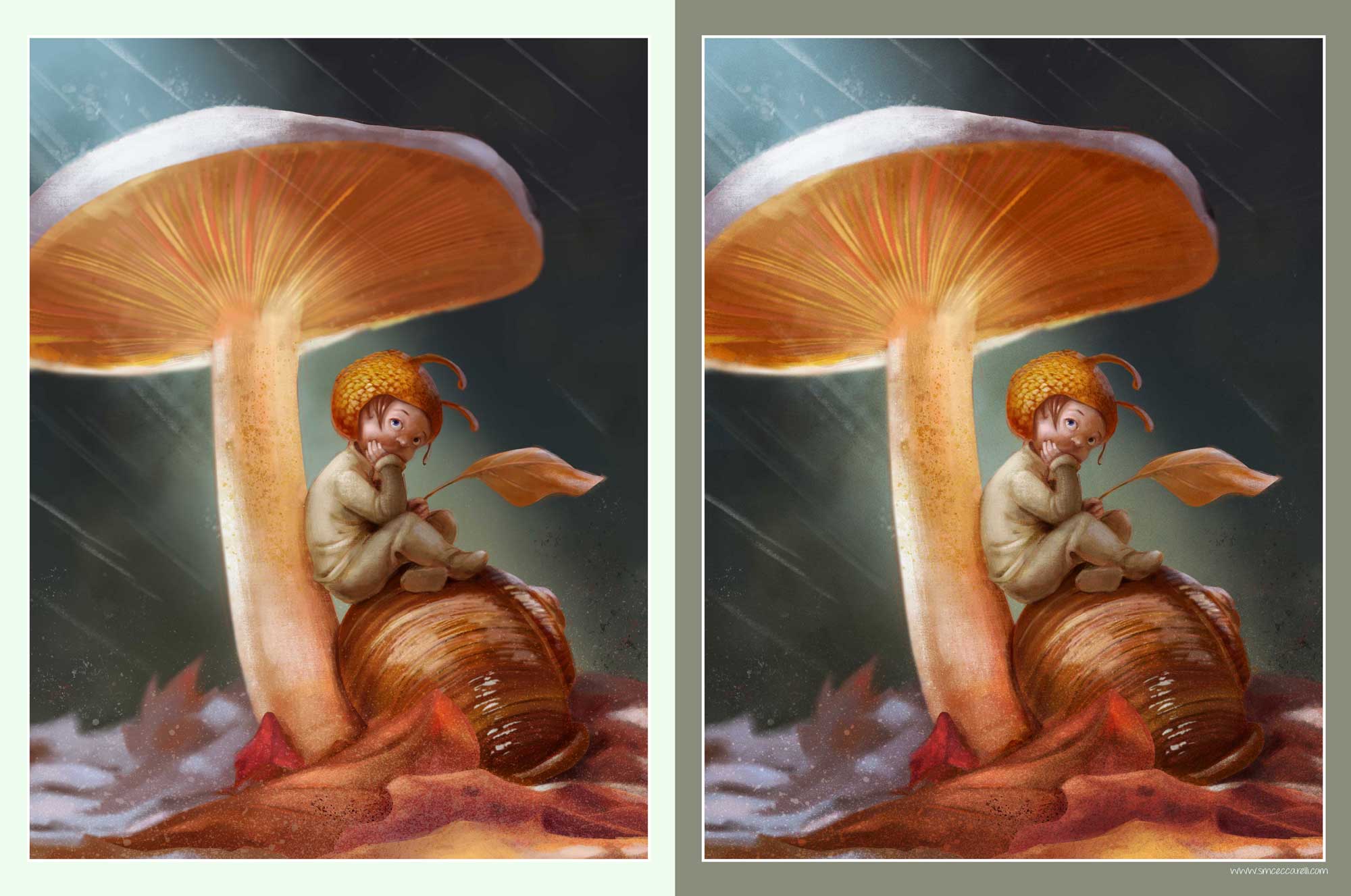
Two days into Inktober and already getting painting-withdrawal symptoms. So spent a miraculously kid-free Sunday afternoon doing Kid No 12 - a companion piece to the snail boy.

-
Something was disturbing me, and now looking at it in small I think I know what it is - there is a disbalance of value contrast between the boy and the mushroom - the boy has a broader value range. I will look into either crunching his value range or expanding the mushroom one - whichever looks best - before closing this one.
-
@smceccarelli Your Children series is looking so great! i love the lighting you are doing in the snail pieces also - this latest piece looks really nice to me - the thing that strikes me is that the space to the left of the mushroom is nearly equal to the right - my thought was that the value range might be just right at the moment on the mushroom so it does not become a focal point competing with the boy but reduce the visual weight of the left side of the composition and the mushroom by doing a quick crop - just a thought - these pieces are really looking great!
-
@Kevin-Longueil You are right - there is a misbalance and the space on the left is too uninteresting. I was thinking about a place for text actually. Not sure it works. Your crop looks really good - I will play with that before deciding wether to include in my portfolio or not! Meanwhile I have adjusted the value ranges and I am happier! Here is a before and after..
-
Your children are gorgeous
 Great expressions and beautifully rendered snail! Your understanding of light, value and colour is something I hope to have a better understanding of myself one day.
 -
WHAT.....this is ridiculously good! Really cool piece.