Cookies in Space - book dummy project
-
@Dulcie Wow, thank you! Excellent ideas! I love the feet and legs you designed for Peter - i am definitely going to adopt that! You are right, I like the idea of the spherical or spheroid-like shell - although the tortoise idea looks also cool. It was not inspired by any particular animal - I was trying to capture the idea of "pet-ness" and in the thumbnails I used several different animals, including fishes. I think the legs you put on your last idea are a great change - they give him an even stronger sense of goofiness and familiarity, which is excellent. Thanks a lot for that!
Norbert is a real difficult one so far...I have swapped him out several times as everything seemed to clash with the rest of the lineup. I will definitely try your idea - I have also just realised that I may need him to have hands...
Thank you so much for the great input! -
I like the idea of a human child meeting aliens. To my mind, this would be the most engaging/relatable for children.
I also think your design of the human child is superior to the aliens (which are great, don't get me wrong).Love the different robots. You definitely have a lot of variety going here.
-
I am loving these characters! Especially the little boy you posted earlier.
I agree with @Dulcie adding legs to Peter will make him more animated through the story.
Best of luck! Can't wait to see more of this. -
@smceccarelli Awesome as usual! - I vote for human boy, Norbert #5, and Peter #4 - they are all good though
 I agree with Dulcie that Mary is perfect.
 -
Very impressive! I like @Dulcie's suggestion for Peter's legs. I also vote for human boy sharing cookies with alien kids. Norbert is the only character that doesn't seem to fit his personality. He looks shy with his face half hiding in the cylindrical body. I like #1 the best. But really, they are all great!
-
Snap! I love these designs!
I think this would be a great design for a first book!
The silhouettes are strong on most of the characters and I could definitely see this as animated series or comic or something. -
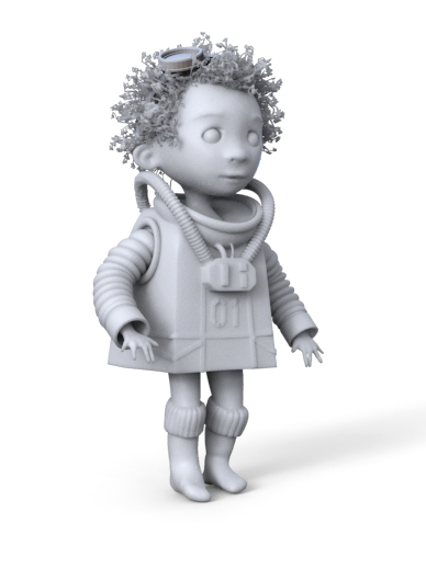
First pass at the maquette for the little kid. Needs to work more on the hands and ears and general refinement.
-
@smceccarelli Very nice! What 3d app are you using for this? Zbrush?
-
@natiwata Yes, my old friend ZBrush - had not used it for 6 moths and I feel so clunky....
-
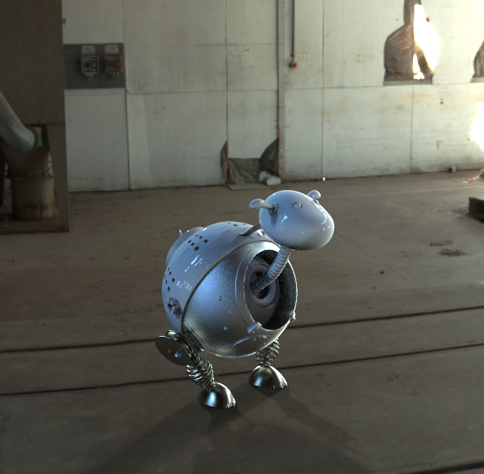
@Dulcie This is a collaborative design - I incorporated your suggestion for the legs as well as another colleague's suggestion to include kitchen-apparel-like elements (the story is about baking on a spaceship). I though you would like to see this - I love how ZBrush and Keyshot make designs come to life in the real world - it makes the artist's work feel so real and tangible for me!
-
@smceccarelli That looks great! - so real! - and I can definitely see the kitchen implements inspiration in the design. I think the springs in the legs match well with that idea, and I can see why that would fit with the baking concept
 Glad you are making progress, will be great to see the next steps
-
This looks totally awesome. I love the work flow of using zbrush to make a digital marquette too, great idea. I have been debating whether or not to buy zbrush, but the learning curve is quite steep from what I have heard. Have you found this to be the case?
-
@RobinSlee I would say about 3-4 months full immersion - I had a whole course on that during 15 weeks, plus a bunch of tutorials (Digital Tutors) and I still occasionally have to look up specific things. The interface is so different from any other software and not intuitive. Once you know your way around it though, everything clicks into place. It is much much easier than Maya (which they say takes about 3 years to master - I scared out of it very fast...).
-
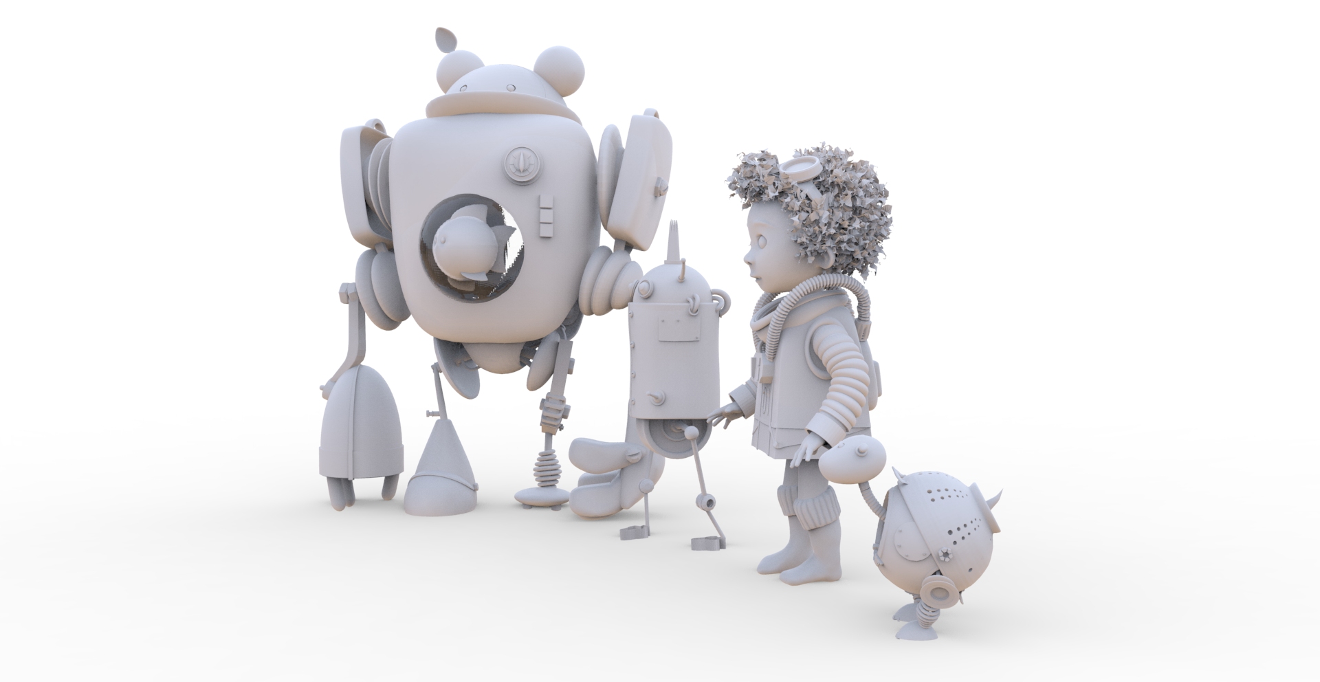
And finished with the maquettes! I wanted to do some environment modelling, but I think I will just skip that and try a more design-driven approach to environment.
I ended up keeping Norbert as in the original lineup - I tried several other alternatives but nothing worked. It seems like the lineup needed a simpler design to counterbalance the complexity of the other characters. I have swapped around roles in the story so that Norbert does not need hands - but his cookie-cutter feet will turn out handy! Each robot now includes also some subtle elements of kitchen apparel - let me know if you think it comes across (or not!).
I am quite happy with the designs - and funnily I am picking up some likes from Japanese artists on social media - which I think is really interesting!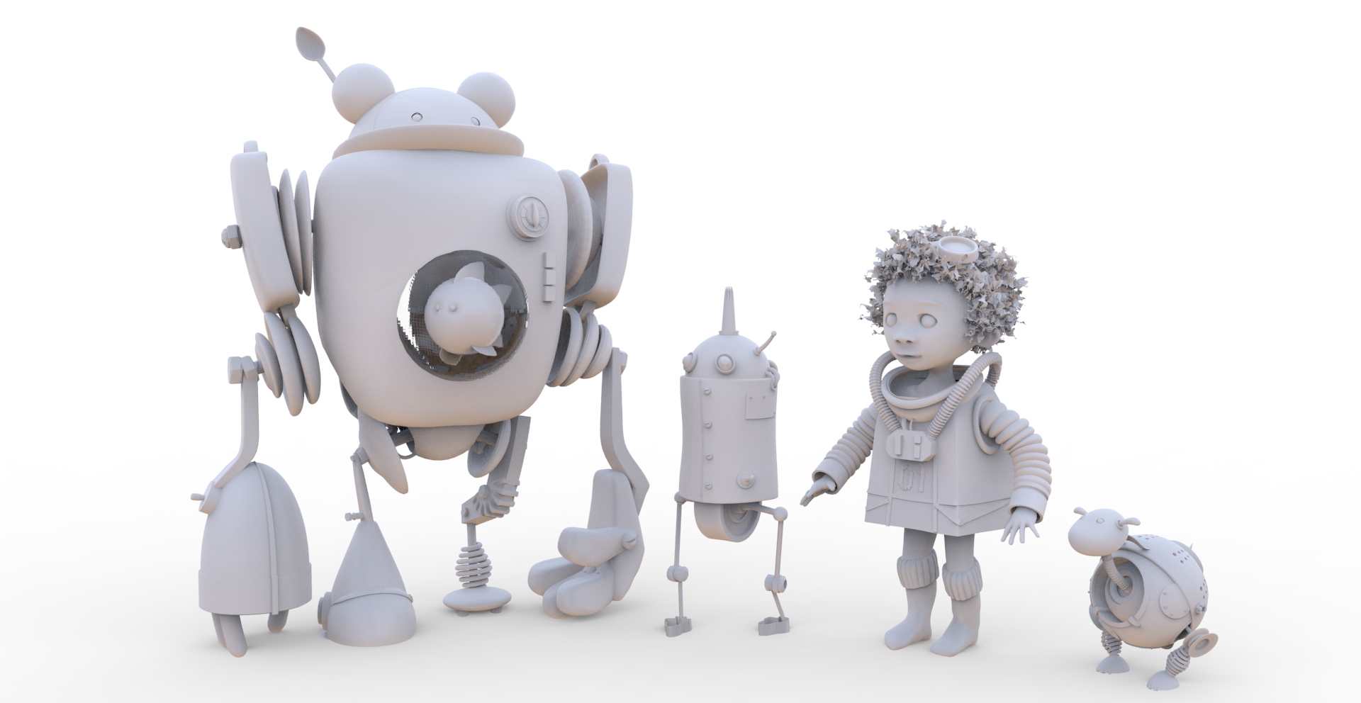
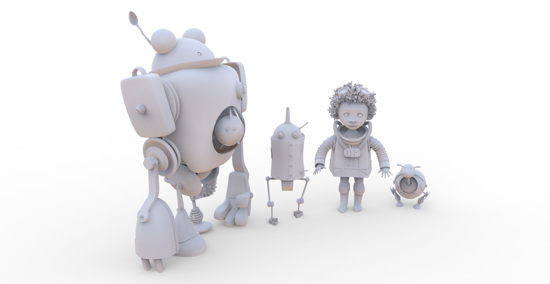
-
They look amazing - I'm sure this is going to work out really well. I can see a spoon, an oven dial, and the various springs remind me of whisks...oh, and a piping tube thing! I think Norbert looks better in the maquette version because his eyes pop out more...will be interesting to see how he does everything without arms

-
I don't have any useful critique at this time, everything is just so amazing! I was scrolling down the conversation and realized my jaw actually dropped haha! So I just wanted to let you know that I think your work is awesome!
