Another portfolio piece
-
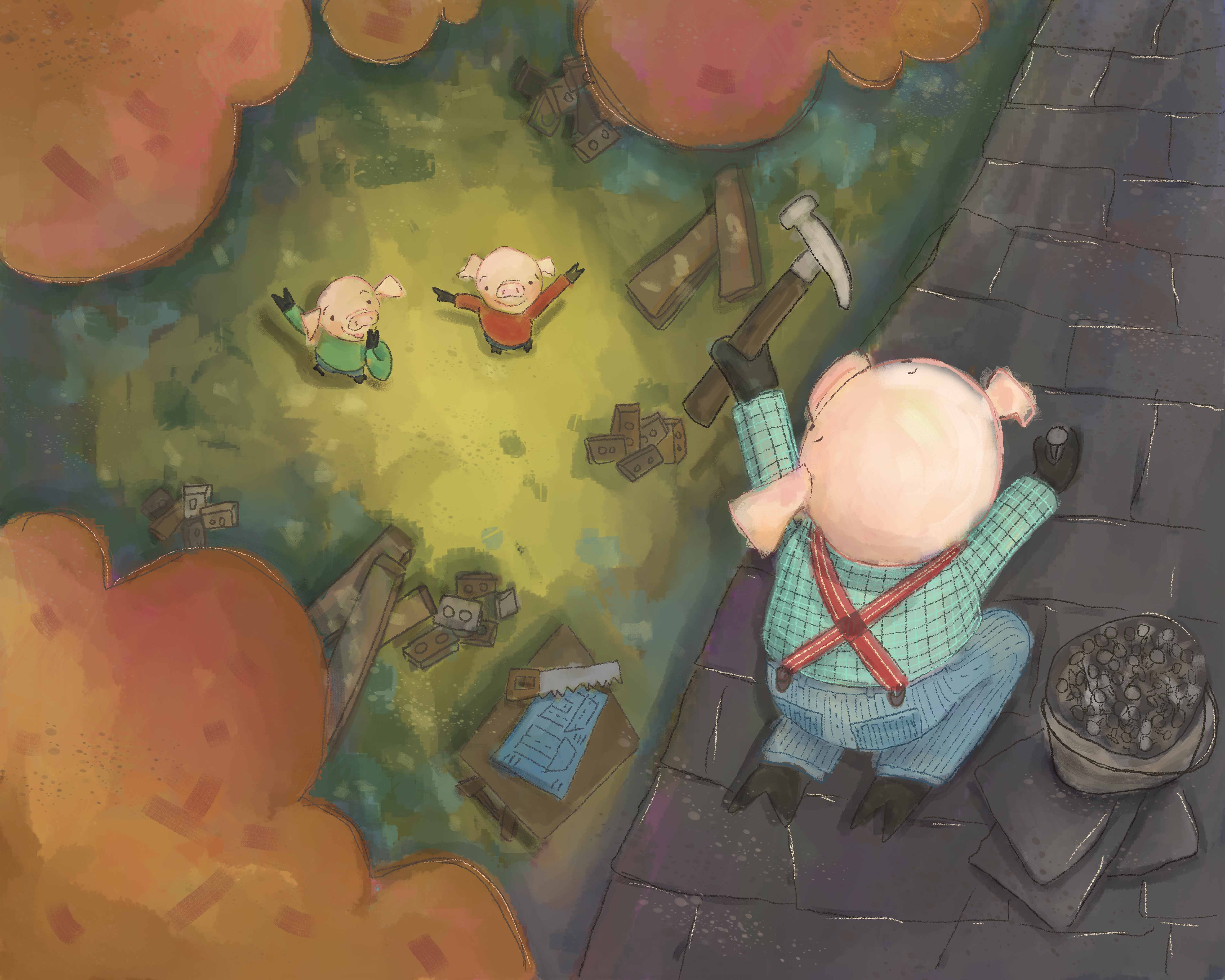
Here is another portfolio piece I'm working on. I could use a fresh pair of eyes to look at it! How is the composition/value working? Does it match the first 3 Little Pig illustration I did? (the first can be found here: http://forum.svslearn.com/topic/2585/fall-critique-update) What needs work? Thanks! I appreciate all your great advice!
-
Hi, first of all, I love your illustrations on 3 little pigs. I love the style, the characters and the colour scheme. One thing that feels funny in this piece is however the roof. From the tiles and the pig´s posture I guess you meant for the roof to run from the top corner down. But from perspective of all the other things I feel that the roof should run from right bottom part to left top part (so the right edge would be the highest point you have in the image and the line running from top to the bottom would be the lowest part, where you would normally have the gutter). And if it would be so you would need to change the posture of the pig to compensate the tilt of the roof, change his centre of gravity and sort of make him leaning more towards the right.
-
I am really loving the colors here.
And it does match the first illustration you did. (loved that one too.)
The only things I would suggest is cropping some of the edges, and pushing three a little pit to the middle.
Lovely illustration.")
-
Thank you so much @Hana-Hladikova and @Doha! I really appreciate the critiques! I'm working on improving it based on your suggestions. I will post again when done. Again, thank you!
Twitter: @Joy_Illustrated
Instagram: joy_illustrated
Website: joyheyer.com -
@Joy-Heyer Any update on this piece?
-
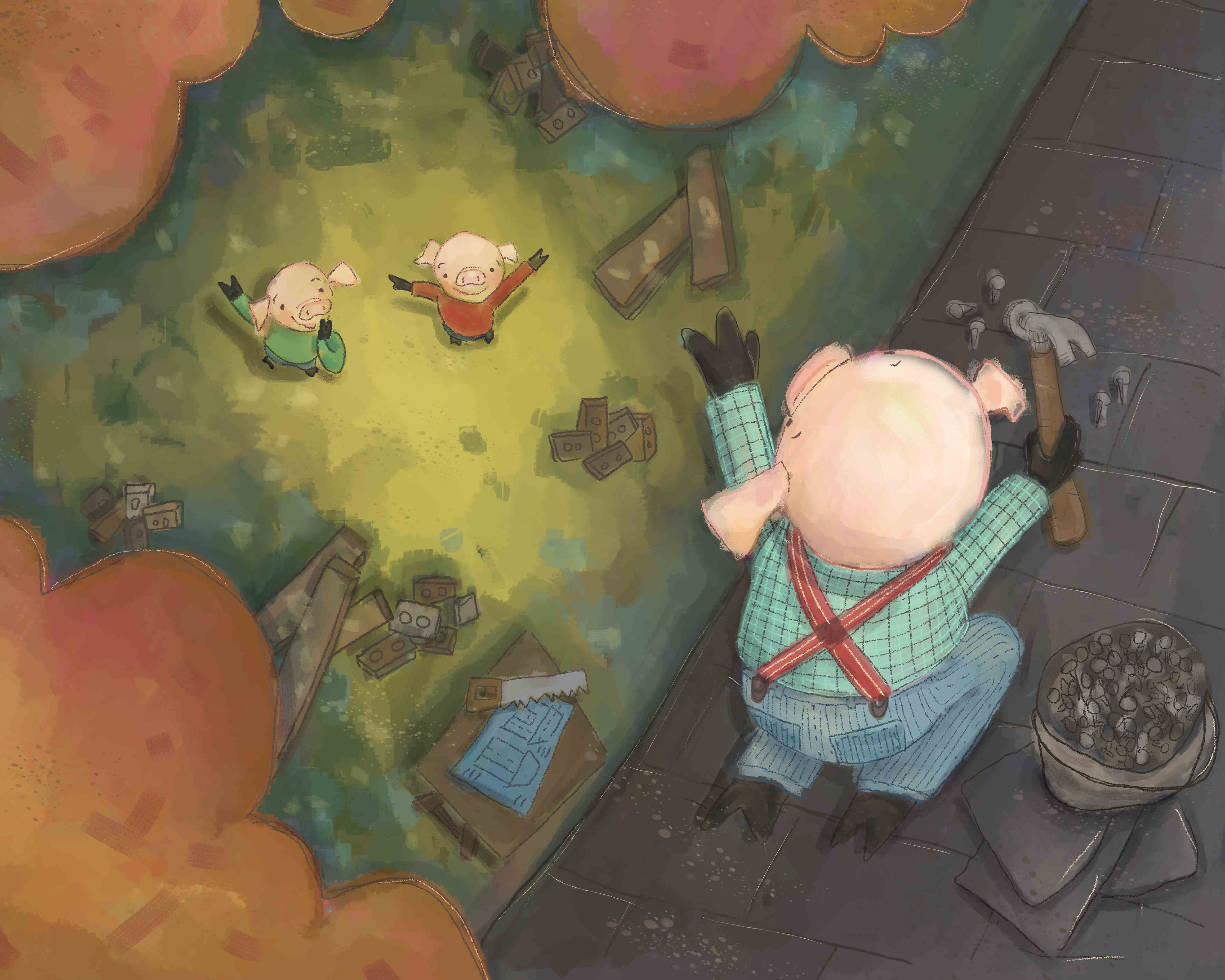
@RobinSlee Thanks for asking! It reminded me I needed to post my most recent version. Here it is... I tweaked the roof line and cropped in a bit. I also changed the position of the hammer. I would love any feed back!
-
@Joy-Heyer Hey, Joy! I like your changes. The position of the hammer looks much more convincing now. And also the roof improved in my eyes.
-
Hi Joy- The composition is working well. The juxtaposition with the two ground level pigs and the roof pig is a fun perspective.
One thing confusing me is the high contrast pink linework on the roof pig...I think it would look better if you toned it down some. The edge of the tree line has some of this line work but it’s more appealing because it’s in the same tonal range.
-
Loving the colours, loving the change to make the pig waving now, and overall looking really nice so far.
-
Hi Joy! Love this really! The thing I probably would revise is about the pig on the roof, his face is a bit aligned with the roof...I also would rotate his body so it's not aligned with the roof, but this is maybe only my preference! looks great!
-
Hello Joy!
Both pieces are just lovely in this collection. The colors and composition really came together so nicely in this piece.
I think the only feedback I have is piggy-backing (no pun intended ;-)) off of @Lucelfo and perhaps elongating the roof just a tad so there isn't quite so much of a tangent between the roof and the pig's head.
Thanks for sharing your work!!
-
I love it I wouldn't change a thing. I love your pigs! I am such a fan! Beautiful use of composition, color, and I especially love the vibration of color between the orange and the purple
Strong work! -
Really nice composition, characters are very cute! I feel like the colours need to be pumped up just a little in the tops of the trees to give the composition more balance and emphasize the perspective. The grass that the pigs are standing on has great colour and contrast and draws the eyes down. You definitely want that to be the stronger area of contrast so you don’t lose that effect, but if you increase the contrast a little in the trees (even just with some small highlights), I feel like they won’t look so flat and will round out the whole composition.
-
I think the style matches and the composition is good. You are using light well to put the focus on your characters. One thing I'd redo is the edge of the roof which is bulging. Very nice colors!