Value studies for fantasy illustration
-
looking good so far. keep going.
-
@audrey-dowling Hello Audrey - this is a really nice image! I think for me I would like to see the scale of the main character change just to see how it might look - if she were twice a large as she is now it would bring her face up into the area where clouds would be her backdrop - this would give a nice "dark on light" and help establish her as the main focal point in the circular composition - I think you did a very nice job on the figure and her hands for sure but one thing that keeps grabbing my eye is the position of her left hand on the bow which seems stiff somehow and does not look natural - I would shoot a quick reference photo of a volunteer and have them assume this pose but hold the bow in a comfortable manner - I think it is because the bow is straight up and down and away from her body that it has a strange feel to it - this piece really is looking great though so feel free to ignore
")
-
@Kevin-Longueil you're right Kevin, I will try your ideas, thanks (bloody hands give me a hard time every time!)
-
I don't like the proportions if I make the hunter big enough so the head reaches the clouds
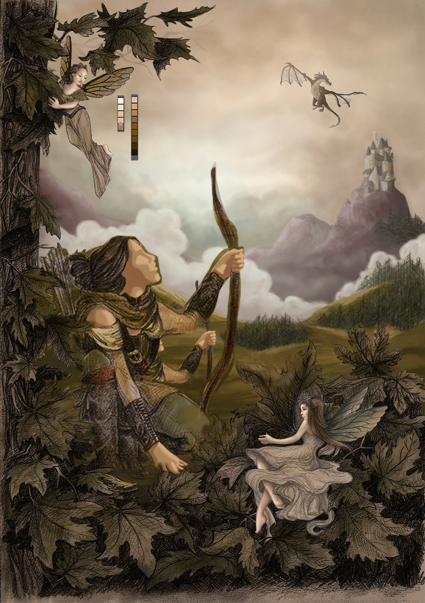
but I can make her slightly bigger and put a fog on the trees in the background. I kind of like that, as the trees were too "visible" to my liking before. it goes against my value study though...
what do you think?
-
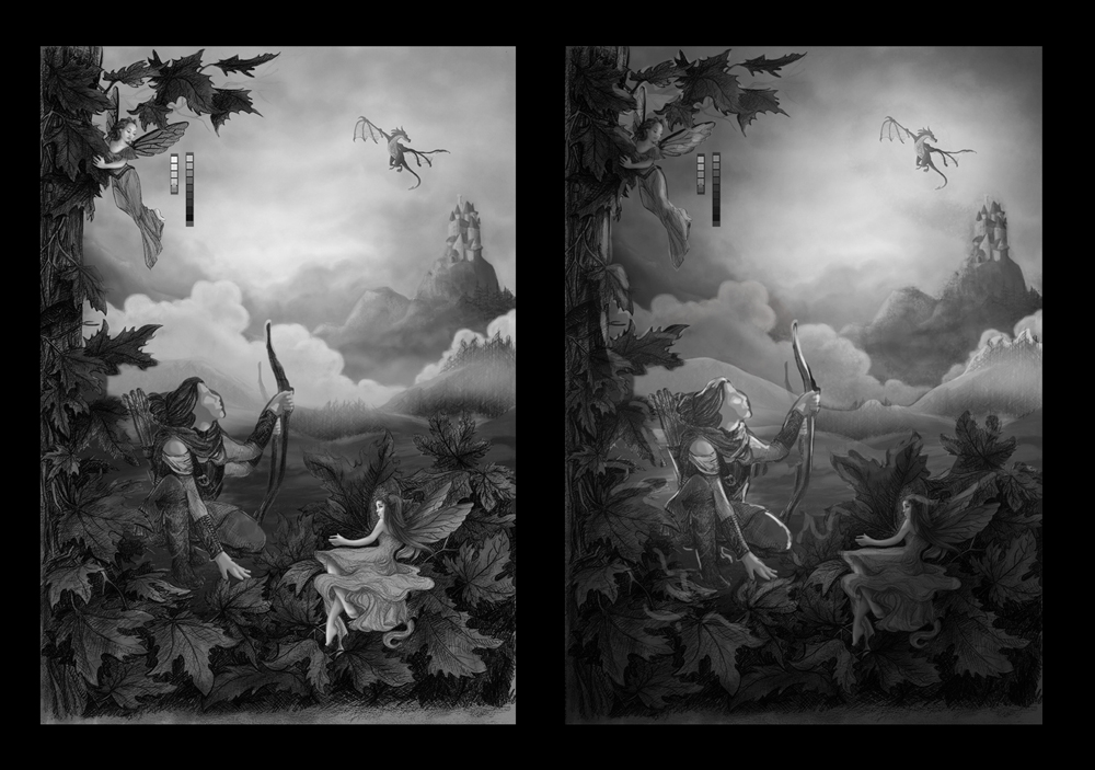
Cool image.
I would say your concern is right on, about the two competing figures being the same value. I am guessing you want the hunter to stand out more than the fairy. I would draw more attention to the hunter, make her stand out more and blend the fairy more into the leaves surroundings her. -
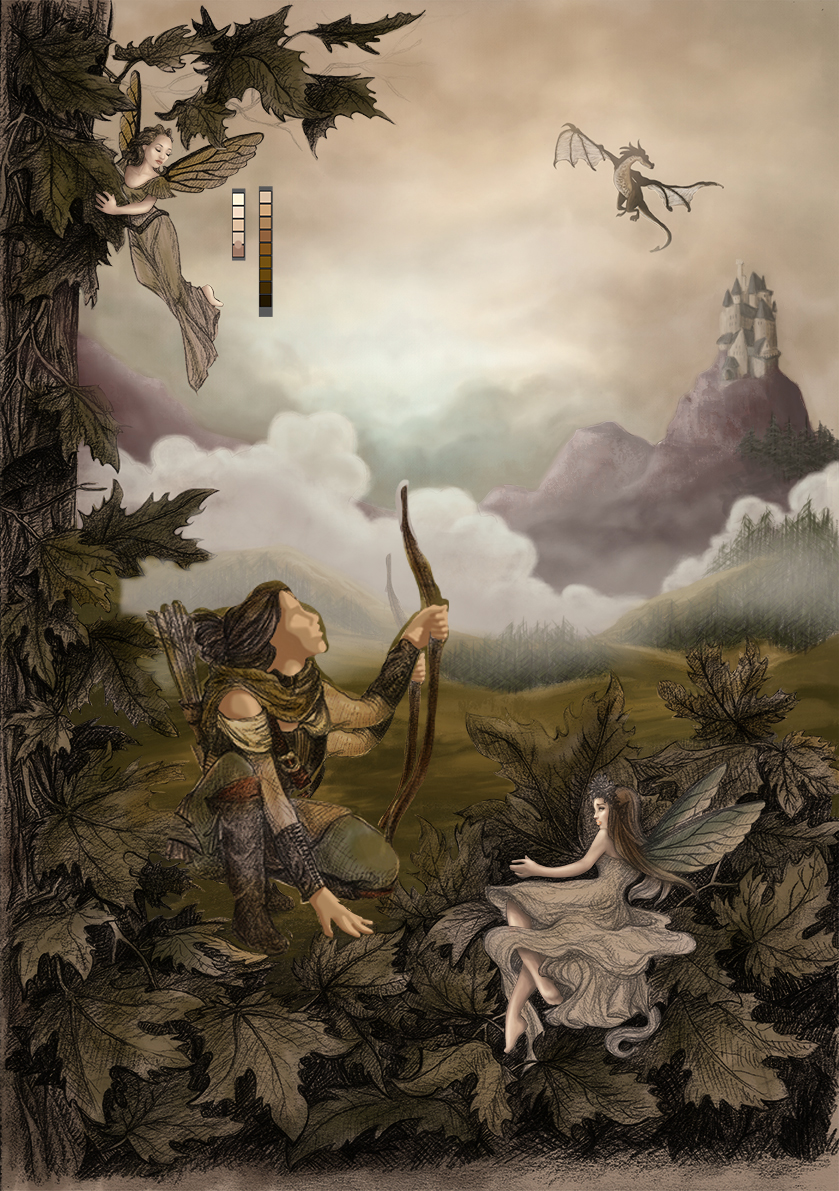
@audrey-dowling I do like it with the scale change and the value change behind her face for sure
-
This is really beautiful work! You've got mad drawing skills, and the crosshatched style, depth, and color pallet is really storybook feeling and detailed.
I think one way you might make the image feel more cohesive and bring some focus to the composition would be to structure your values a little more dark(foreground) to light(background). Someone else pointed out that the values on the main character and the fairies are similar and they do kind of compete for your eye. What about bringing the fairies more into the foreground and using some rim light to help define the layers of depth a little more? I played with it a little just to see what I could get with a few value changes. Hope this is helpful, it's really beautiful work whichever direction you decide!!!
-
@audrey-dowling A value study is just that, a study. It is not the final image. Feel free to change anything in a composition that is not working. The study is only there to inform you of the choices that you have and to see what is NOT working. I may do several studies (small scale) to see what works and what does not, before I enlarge the image and take it further. It is a confidence issue, do not be afraid to change things, right up until you call it done! Good luck. Oh, and if you want me to do a rough paint-over let me know.
-
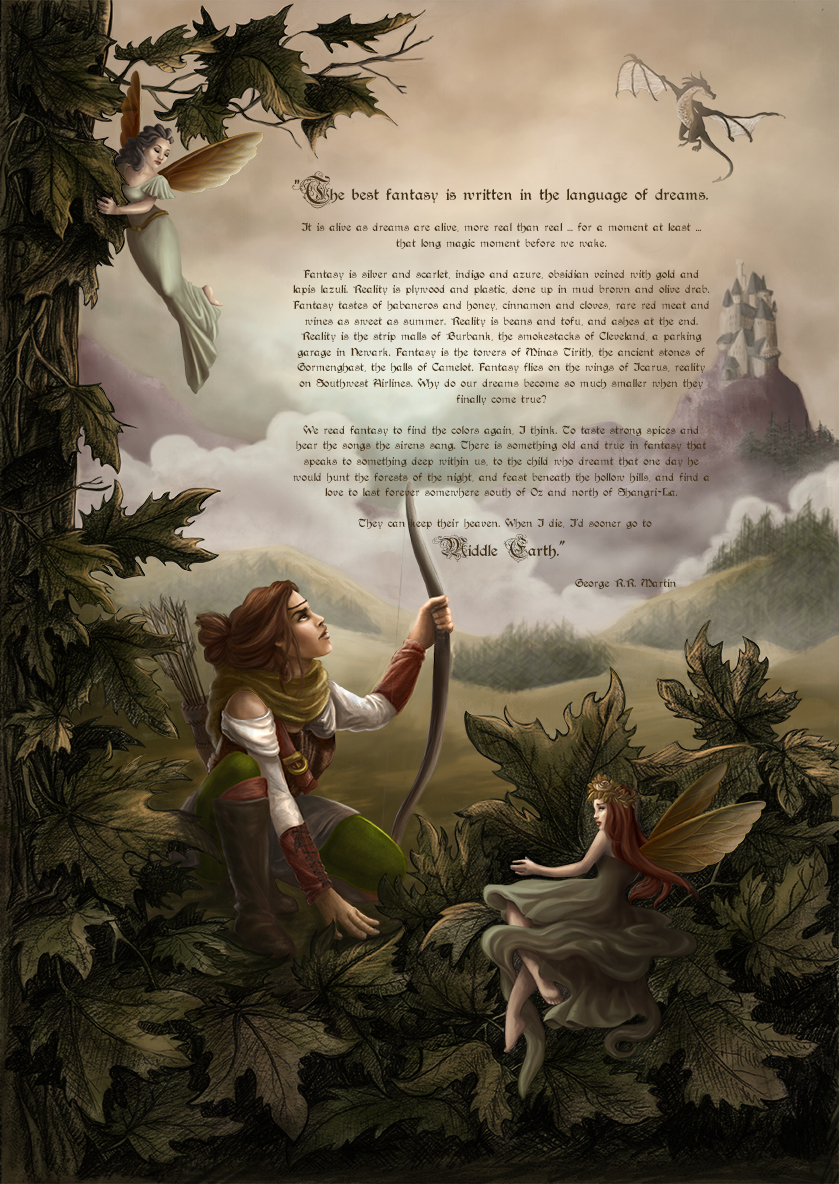
I think I'm finished!
I'll let it sit for a while now, just to make sure I'm happy with it
Feel free to critique, but I'm telling you, if you find something too long to fix, I won't do it! (re my post on working speed and getting fed up towards the end)
-
It looks beautiful! You did a great job controlling the values. I do see the hunter first but then I get curious about what the fairy in the front is looking at. What do you think about having the fairy look at the hunter to draw us back to her?
-
@audrey-dowling It's beautiful! It looks to me that the front fairy is glancing at the hunter. It's just beautiful.