All about the COLOR
-
Crowd sourced color>
Does anyone have any interesting take on color in any regard, wether swatch recourses or breakthroughs or any tidbit helpful for helping others grow in mastering color composition?
I love how masterfully color is used in good works of art. I have always had a wrestling match with color and I am growing in my use of it. This is a recent work I did where my excitement petered out with a dissatisfaction in my colors. I wanted to make the character pop so I used less contrast and cool colors with the background but just don't quite like the finish look and know it could be really cool with better color but I am a block with it. I intend on using this for my portfolio any suggestions for what can make it better?r.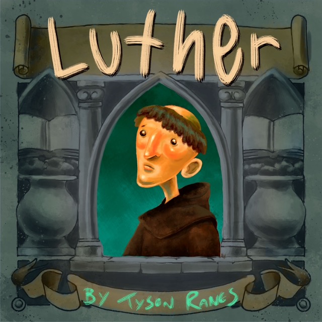
-
@Tyson-Ranes Hey Tyson - this looks good - i think if you desaturate the figure a little and the background a bit more than the figure that it will read a bit better - i would try a desaturated blue or desaturated redish-orange for the background around the portrait changing the highlight color in the hair to match also (complimentary or harmonious color scheme i think these would be) - one thing that is throwing it off a tiny bit for me is the lighting for the outer gray frame and the lighting for the figure are from opposite directions - desaturating the signature too i think would be good - anyways.. I'm not the best guy to ask but i had a solid opinion...thought i'd share
")
-
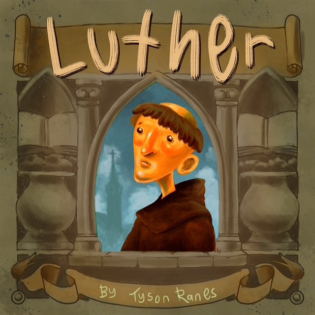
@Kevin-Longueil thank you for sharing just finished a new rework of this and read your comment so wasn't able to take it into account it might have hit some of what you shared with changing background to a warmer color unless I miss read. I appreciate your input and know it makes my work better. I never realized the shadow or lighting didn't match not sure how to fix that. Maybe if I stare at it a little longer I'll see the fix and hit it. Thank you again .
-
@Kevin-Longueil just saw the lighting mistake! Thank you I don't know how to fix that with out major rework ! Ugg!
-
If they are on different layers, maybe you could reverse one of them (the frame or the figure)?
I think that if you added some desaturated colors from the figure into the frame so that you don't have such different colors in both.
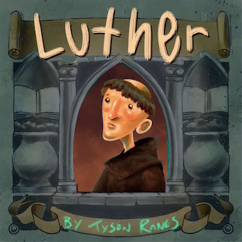
edit: Like in the first version I like how there is some green in his hair, it makes him seem part of the background.Or even if you desaturated the figure, he is so different from the frame, he doesn't look like he is in the same picture. Great rendering though!
-
@Tyson-Ranes Hey Tyson - this took about 2 minutes so it is not vey tight but you get the idea - i just cut out the frame and flipped it - there would need to be a bit of clean up though ..maybe more than a couple minutes - i like what you have done with the piece for sure.
Edit - i see Holley already suggested this
-
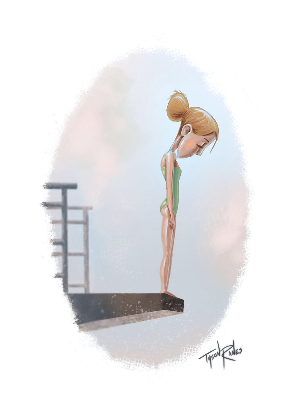
@Kevin-Longueil hey will check my latest post if you get time and give me your 2 cents if I should share this piece or not?
-
@Tyson-Ranes Hey Tyson it sounds like you do not love this piece so i would not share it for fear that the author might like it - when i look at your "not so daily sketch" thread i see something masterful about your sketches - maybe these are "just for fun" but i think they are diamonds and not in the rough - i would do a bunch of these type of sketches with the diving theme and see which ones you like and show the author a few of your favorites - this rendering style of this piece seems like it would take a lot of the energy away from what i am going to call your style (because i think i could recognize one of your drawings now) - there is a lot of life in your lines - there has to be a way that you can preserve the energy of your sketches into the final piece - i think i recall a post by Dulcie.... look it up..here it is http://forum.svslearn.com/topic/2973/50-things-challenge - in the middle of this thread Dulcie has some ideas on the subject that seem like they could apply to your drawings too - i totally understand though if you want to paint and not draw and color - if you do go with this painting i think i would correct the perspective of the girl a bit - if you were to draw a 3d rectangle around her i think you would need to stretch it quite a bit to the right and show more of her front to match the perspective of the diving platform - this would give us a 3/4 'ish view of her face too which would be good - that is my 2 cents - i'm sure whichever way you go will work out.
-
@Kevin-Longueil thank you so much your a great help!