50 Things Pet Shop
-
One other small note - the blue light coming out of the fish tank - would probably not create that area of blue that is between the edge of the tank and the boys head/neck/shoulder. As that is actually the floor behind the tank leading up to the register. So I would keep that as the floor color and just use fill/rim lighting on the tanks stand, the edge of the boy etc to get the glow of blue on them - as they are what it would impact. Not that floor area which is really in he mid-ground (not foreground).
-
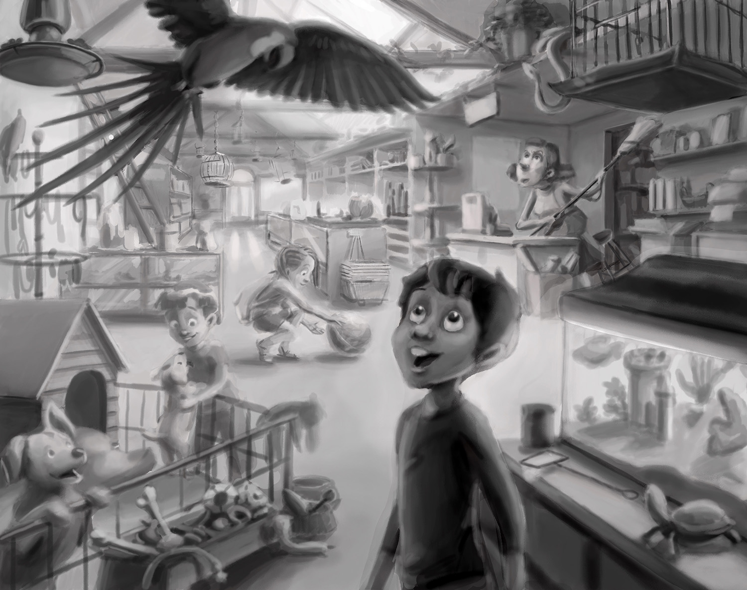
Thank you @Rich-Green! This is the value I have behind the color currently, but I lightened it to about 50% because I was concerned that I was going too dark for a kid's book-style image. But I really like the contrast as you've shown here and I think I will push it more. I'm glad for the photoshop advice too, that will make it easier to fix! I think , I'll keep the girl slightly more washed out in the yellow lighting of the back. I imagine I'll be playing a lot with color in the front characters to get the focus right.

Yes I agree that the fish tank won't put off that kind of light, you can probably tell I haven't gotten to the front of the image yet.

-
OMG!! This is fantastic! I really love it.
-
Oh wow!
 Love where you are headed with the colour!
 -
-
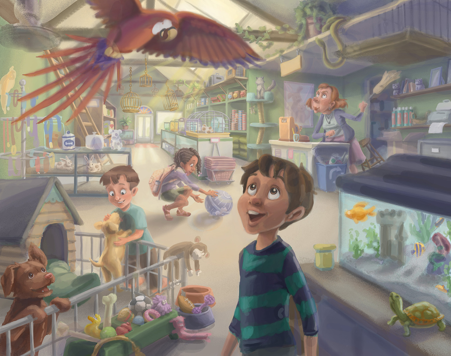
Hey everyone, getting to the point of sharpening everything, so what do you think? My concerns right now are the foreground colors, like the dog house and the chocolate lab (tribute to my sisters' family's new dog Cookie :)) Also did I go the right direction with the parrot reds contrasting cool and warms. The parrot will get a little darker value as I get into it.
Thank you!

-
@bharris it looks really great! Contrast is looking good, sounds like you want to push it further which will be good. This is going to be an awesome piece for your portfolio!
-
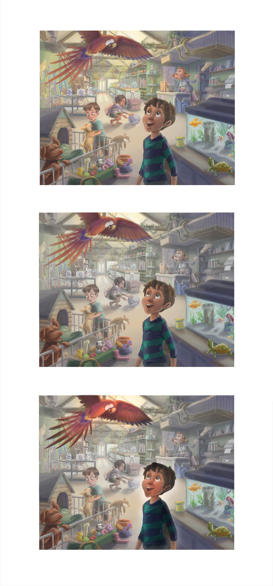
@bharris I hope I'm not too late to share. I don't know how finished you are and perhaps I'm getting ahead of you but I wanted to share an option for creating more focal point in the foreground and less distraction in the background. Your design is great and your muting of colors in the background is already working - I think you could push that even further... by darkening the foreground objects, saturating them, and washing out the areas directly behind them you can direct your viewer to the main idea and then let them experience the rest of the shop. This is one of the best #draw50things I've seen from SVS! Thank you!!

-
@holleywilliamson Thank you! Yes I am going to push it more and I'm so excited for it to be done

@Will-Terry I am still working on some things in it, but my plan was to washout that background more when I get into the lighting. I'm getting the front stuff pretty saturated in the foreground as well. Thank you so much for taking the time to look! I'm floored now!
 It's been a great challenge, thank you for sharing it because I think it's given me, and everyone, that 3rd Thursday type assignment which is a great way to add more work to our portfolios.
 -
@bharris You're welcome - it's looking great!

-
wow @bharris This is great - Love the successful way you have incorporated so many different things in the "50 things" - Wonderful illustration - definitively memorable....
www.lmuggliart.com
www.instagram.com/lmuggliart/
www.facebook.com/LMuggliArt/ -
@Laurie Thank you!
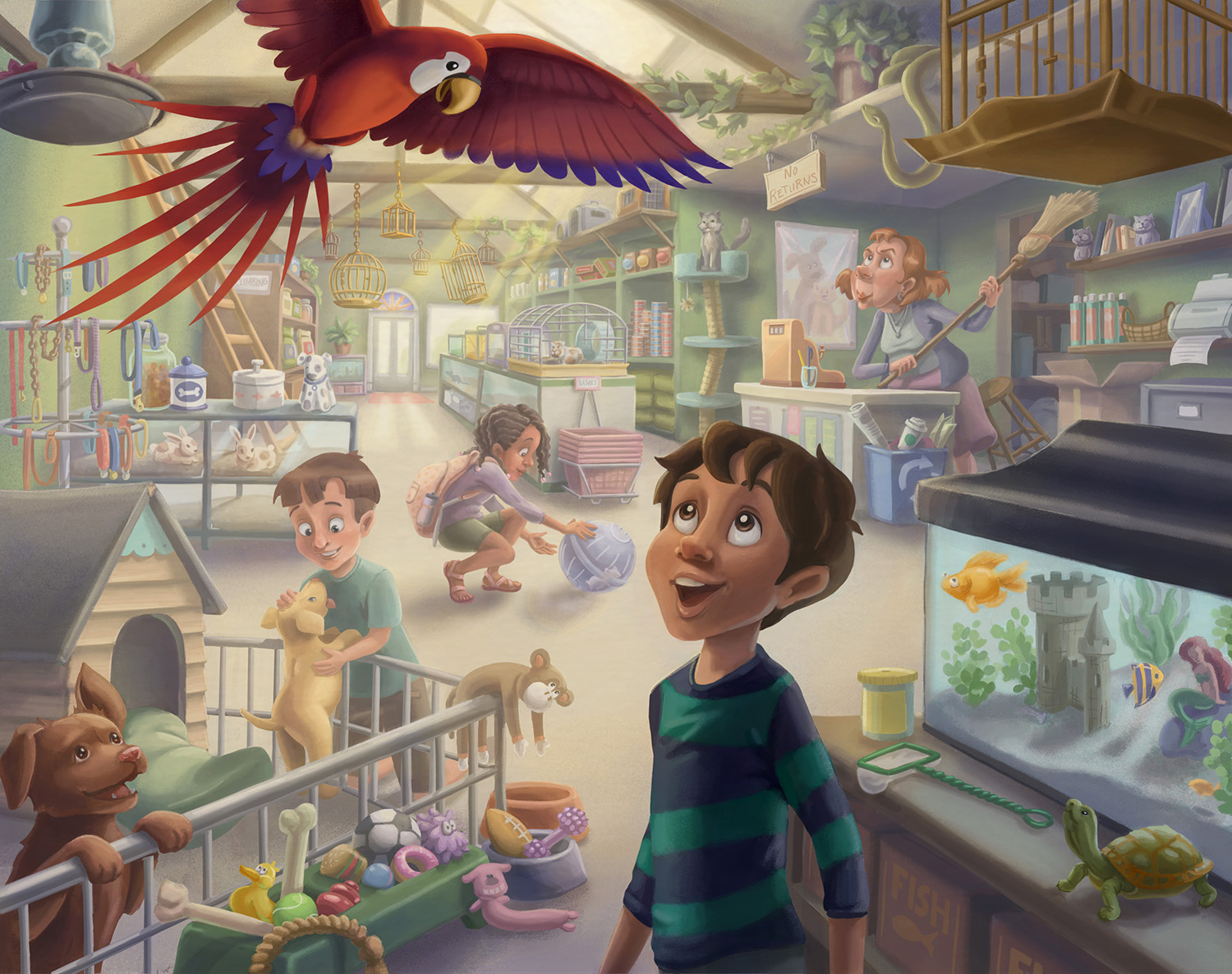
This is my submission. Finished, not perfect and a little on the fuzzy side. But man I'm glad to be done for now! Thanks everyone for the feedback and comments; this was hard!

-
@bharris its not perfect, its amazing!

-
@bharris I think it turned out very nicely!
-
Love it!
-
Looks awesome!!!

-
Absolutely gorgeous!!
I see one very nit picky thing... the roof of the dog house creates a tangent with the rabbit enclosure... My eyes keep getting pulled there so I think it's worth fixing. But otherwise it's just amazing!
-
@NoWayMe AH! Stupid tangents! I will fix that on the re-draw, thank you!

@aska @Kevin-Longueil @Tannie-Smith @K.W. Thank you guys!
