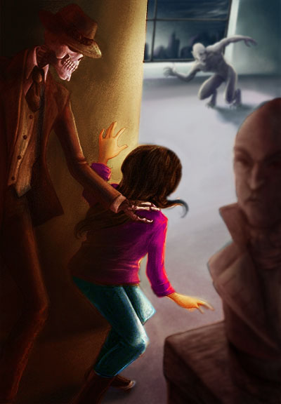
Skulduggery Pleasant illustration
-
thanks for the reminder @Rapteev . you're completely right and I've known that already but we tend to forget about it when we see everything black. thanks for the boost!
-
@audrey-dowling I think we all have those days

-
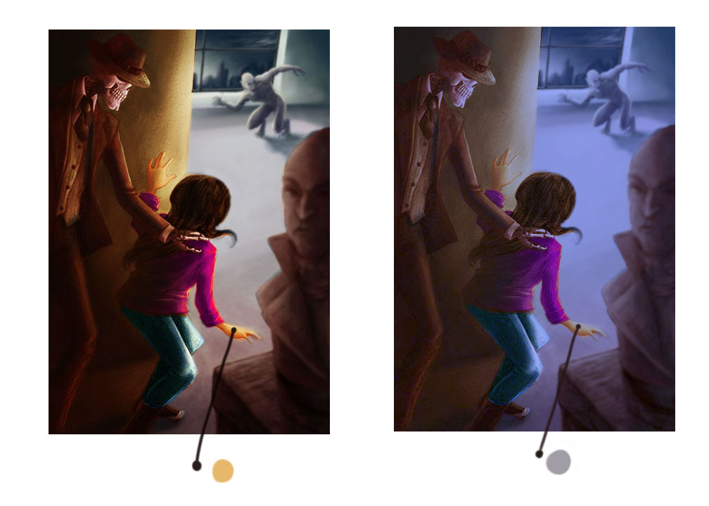
@audrey-dowling I took your graphic and warmed up the foreground a little and slightly blurred background. I really like this composition and the only tweaking I saw off the bat was creating more depth with contrasting warmer foreground with cooler background, also points of high contrast in the foreground where you want to draw the viewers eye makes it pop more as well and less contrast in the background. I just selected the foreground and tweaked it in the adjustments on Photoshop.

-
you're right in what you say @Tyson-Ranes
the difficulty is that the scene happens in the dark. It's at night, the museum is closed, they're sneaking in and the vampire guards the place, so no light is on. Their clothes are also black. It makes the warm light implausible. That's why I tried to work on a monochrome palette
I wonder what artists go for in cases like this: do they stick to what the book says or do they deviate to make the image look better? I'd be very curious to know what you think and advise, instructors @Will-Terry @Jake-Parker @Lee-White ? -
@audrey-dowling your right! The warm color is out of place for this environment and doesn't look right for this setting. I don't know what year this illustration is supposed to take place in but if it's current allot of buildings up to code have to have exit lighting which has a faint glow or sometimes night lighting.i am stumped as to the solution and I have a couple things I'm working on now one in peticular that has sat unfinished because of it and I really like it so I know how it can be a little frustrating getting down the road with these things! You are awesome God bless you!
-
@Tyson-Ranes Hi Audrey - You can still have warm tones that are actually cool. All color relationships are relative to the colors they appear with in an image. It's hard to believe that the grey tone is the top of her hand in the second image but it's true. All the colors are "glazed" cool in cool light. I hope this helps.

-
thanks for your answer @Will-Terry
that's what I have been struggling to find for the last few days (the right warm-cool colors), not completely realizing I was, but god, colors are hard for me!
I'll explore some more -
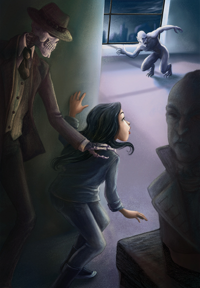
does this work better?

-
Just chiming in at the end.... @audrey-dowling your illustration looks great - the changes in lighting you have made are fascinating....don't really have anything helpful to add - i struggle with the lighting and color issues in my own work.
www.lmuggliart.com
www.instagram.com/lmuggliart/
www.facebook.com/LMuggliArt/ -
thanks @Laurie . yes, struggle is the word.
Looking back, I'm sure I have improved over the last year but it's still so painful for me to color an illustration
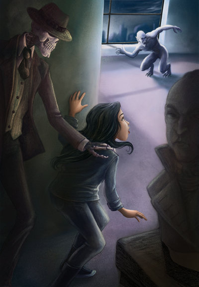
Here it is tonight. I'm going to let it sit for a day now and look at it with fresh eyes later, but I'm not too displeased with the result so far (I'm saying this now and I could hate it in 2 days ^_^ )
