Treehouse WIP
-
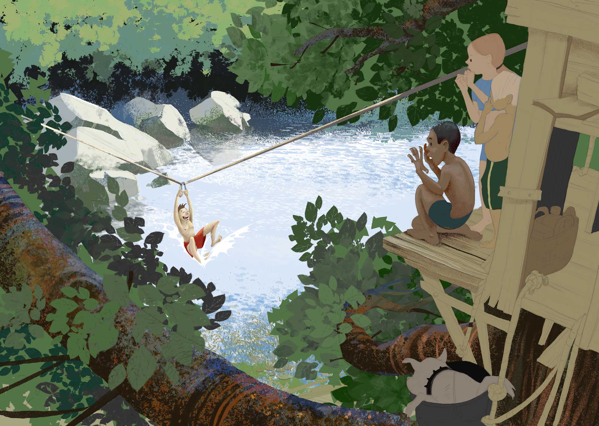
@Rich-Green Yes. Good points. Maybe I should turn him around? At this point I am more using it as a rendering exercise and experimenting with process. Which I am not sure it's working anyhow....Maybe I should start a new one...Here is the WIP for today.
-
@smceccarelli I don't know if you just aren't at the stage where you have gotten to rendering the boards but I think I'm really liking the juxtaposition of the rendered kids/rocks/trees and the more cartoony/flat boards.
-
Ok - was an interesting rendering exercise. I could noodle it forever but the storytelling is not very strong and this rendering process is not my favourite. But, I definitely learnt a lot and I like the lighting - it is the first time I am halfway happy with dappled light. Some things I learnt: the edge of the light needs to be slightly blurry and slightly more saturated. I will probably try it again sometime.
And I may do another one for the "treehouse" topic...if I find the time!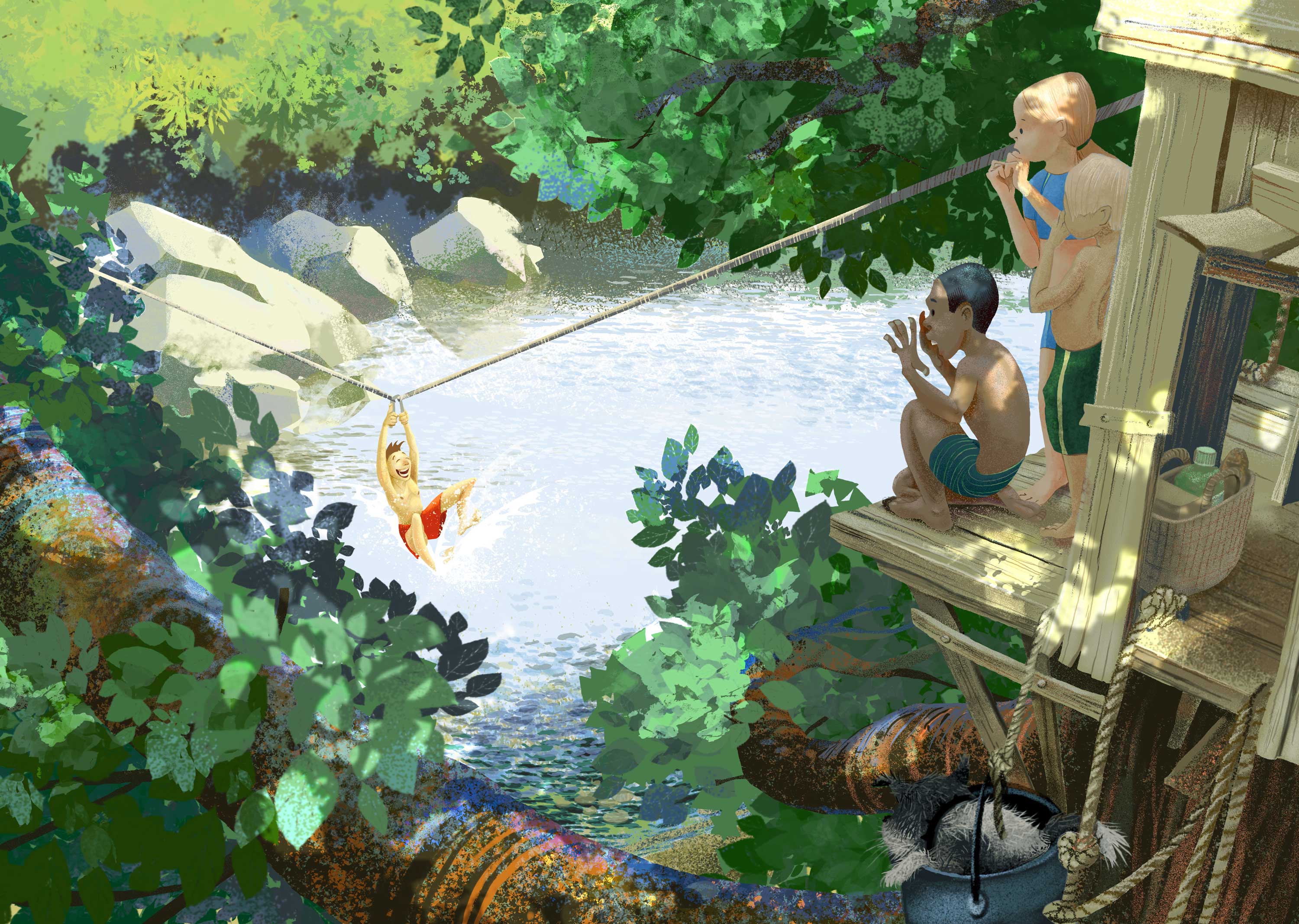
-
@smceccarelli This is incredible........now I must go an cry in the corner
")
-
@smceccarelli i love it!
-
@smceccarelli Lighting is so well done!!
-
Beautiful!
My one suggestion would be to tone down his nipples a bit.
This really is a stunning piece! Very inspirational- makes me want to do some art.
-
@smceccarelli this looks beautiful! What about about a shadow under the zip lining boy? That might make him pop a little more
-
@Eric-Castleman that is how I feel at least once a day, especially when I see beautifully designed, simple and charming styles like yours
@Kevin-Longueil I have been studying Szymon Biernacki obsessively for this piece - he has some time-lapse videos and some gifs out there, and I have been pausing at every frame to study his layer structure and his process. I have learnt some things, some still elude me (I could not reproduce his brushes, no matter how much I tweak settings). But the one thing I learnt from him is style independent: apparently you can do whatever you want with your brushwork - if you nail the value structure and the color relations, it will look realistic. Some of his pieces are extremely stylized if you look up close - nothing more than designed shapes. His bushes and trees are practically abstract design. But because he has such a masterful control of value and color, it looks like a real landscape. Also, he uses texture to suggest volume, while reducing value-based volume rendering to a minimum. It was a really interesting study for me, as I am struggling to simplify my style without loosing personality. -
@holleywilliamson Good idea! I will try that - or a reflection!
-
Love it! Id turn the boy on the bottom around too. would look more natural. going to check out that guy you mentioned. love the way this is rendered. I just started practicing with Adobe sketch on iPad, and its a trip uphill, but figuring it out.
-
Love it! Awesome composition!
")