Draw50Things Color Help
-
Hey everyone!
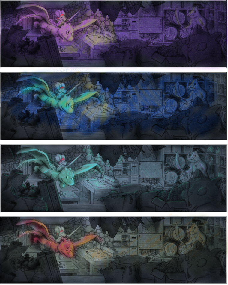
I took the Draw50Things critique a couple of months ago and I'm finally getting a chance to finalize this piece. I've been busy planning my wedding and I got a new job on top of that, so life put my art back for a little while. Anyway, I would appreciate any feedback anyone could offer regarding color choices. I've been playing around with it for awhile on a larger scale and couldn't seem to figure out the direction I really wanted to go, so I took a step back and colored some thumbnails again. And I realize my foreground elements are a lot darker than they probably should be, so I'll make sure I tone that down some

Originally I wanted to go with a cool blue tone for the background and use warm colors to make my focal point stand out. But after the thumbnail coloring, I can't decide which route to take. My gut is telling me to go with the purple hue thumbnail. It looks to me like the color in that design is the most cohesive, plus it's a color scheme I've never worked with before.
Any advice helps! Thanks!
")
-
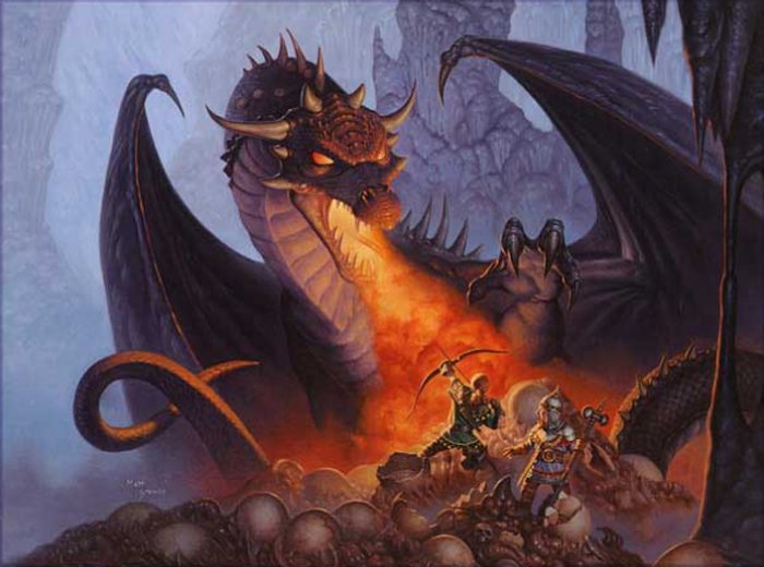
The purple color scheme works well and you could reference back to Will Terry's dragon painting for color suggestions if you wanted to.
-
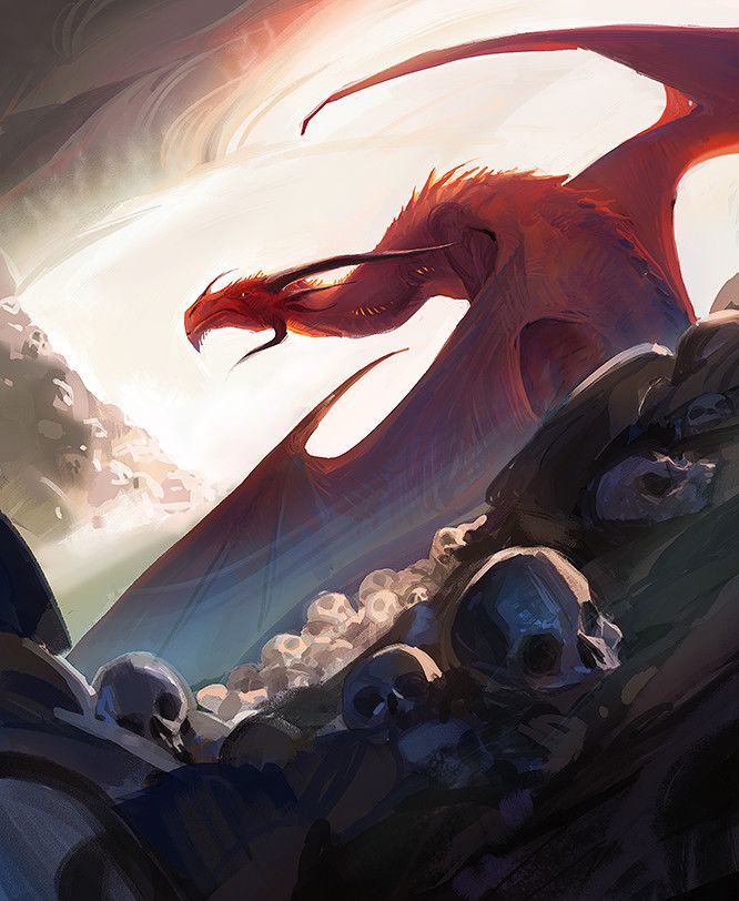
You could, "steal like an artist," and just grab the colors from a scheme similar to what you're going for. I grabbed a couple that might work.
-
Really lovely drawing I really like the third one (the greyblue)it just seems simpler and more realistic.
-
Cute concept! I like the feel of the 3rd drawing and it really brings your focal point forward.
-
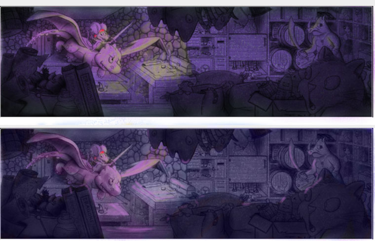
I would agree with the others that the 3rd one looks more natural. . . however, if you are drawn more toward the purple, I'd say go for it but explore a little more with thumbnails, tweaking the purples. I think if you made the background a cooler or desaturated purple and kept the dragon a little more intense and warm it might help.
Really think it's an awesome drawing, btw!