New Rendering
-
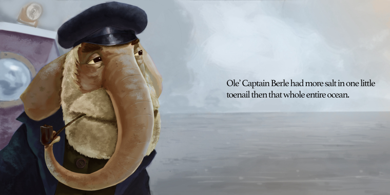
This is typically the level of rendering I'm at. I like this piece but it is not getting it to the level of quality I want. Any help with what I can do to evolve would be much appreciated. Thank you!
-
@tyson-ranes I like the rendering on it. I think you can push your values a little more. Needs some more cast shadows.
-
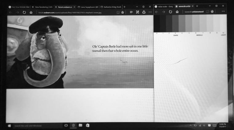
I took this picture of your illustration grayscale with a value scale. I'd say you have really dark darks then everywhere else seems to be 20%-50%. Basically there's a lot of light values with little darks and the colors are muted a bit. In general I think the muted colors and light values are fine since that's probably what your going for because it's a cloudy day, but the areas of light don't have enough dark and areas of dark don't have enough light. So the head looks like it's floating and the clothes grab so much attention my eyes don't want to look at the words. I like the concept, but generally it doesn't strike me as an interesting image which may be fine, but maybe trying out different angles could be a great idea. You could also try to add an island or a far off boat to the right of the image to balance the composition. I like Jake Parker's analogy of balance like a se-saw(He said that in this class) Just work on values and compositions and I think you'll be fine.
If you want to check out other artists then I love the artist Lena Sayaphoum
insta: https://www.instagram.com/lenasayaphoum/?hl=en
tumblr: lenasayaphoum.tumblr.com
The way she works with light and color is intense yet incredibly well done, and almost in a cinematic feel. -
Thanks @ben-migliore for the extra set of eyes. I'm taking what you said into account think it helped allot already starting picturing some fixes and also love the the artist link you sent me. My struggle is going to be with the overcast lighting which I am a bit unfamiliar with how it plays exactly with the strength of colors and highlights and shadows.
-
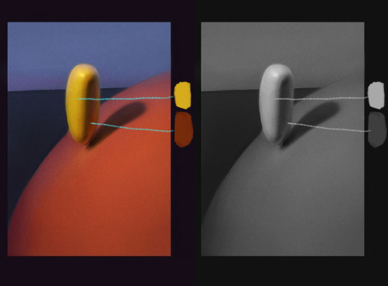
Hey Tyson, really cool piece. A couple of things stand out to me. First I think you could do with shading that left side of his beard further. Second, that strong solid line on the left side of his trunk is a bit distracting. One bit of advice I keep hearing from classes and books is that your lights on your shadow side shouldn't be as light as even the darkest parts of your light side.
Here is an example from Sam Nielson, that I've turned to gray scale so you can see. Even though the bounce light in the shaded portion looks really strong and light, it is not as light as the values in the light side.
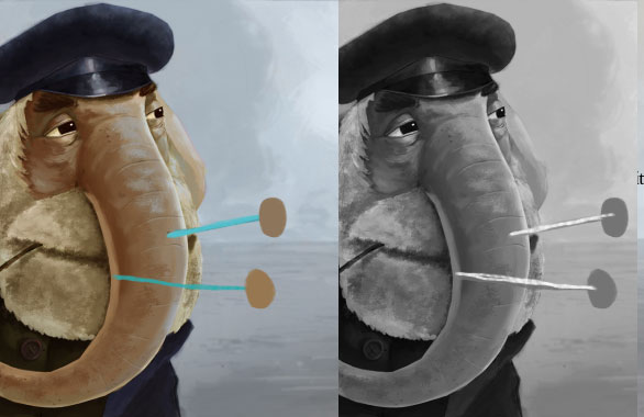
Here's your piece given the same treatment.
-
Nice rendering!