Critiques Please <3
-
Hi
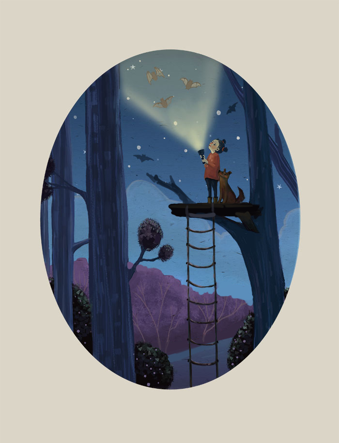
This is a piece I was working on for June's prompt, tree-house, but I didn't get it done in time. I really struggled with it, and halfway through painting happened to also go back and watch 10 Step Digital Painting. I was all over the place in my steps. So, I completely started over using the steps. I can't overstate how much that class helped. I'd love to hear any critiques before I call it done. Thanks everybody!

-
I love the story and the colors, there is something so sweet about this picture! Great job. I noticed a few things you could tweak; there are some perspective issues with the platform. Also I would make more sense structurally for the branch to continue through the platform. Also there were some spots where the tree line intersected with the other items in the picture that is distracting compositionally. I did a quick paint over to show you what I mean.

Bringing whimsical creatures to life.
www.stringfellowart.com
www.instagram/stringfellowart -
@sara-glennon beautiful and stylish
-
It´s a lovely piece, both charming and sophisticated. My suggestion would be to increase the contrast in the area of the light beam: the bats look not lit but washed out. Dark accents would kill the sense of light, but some highlights on the side where the bats are hit by light and a darker value on the shadow sides could do the trick. Also, the light beam would be interrupted by the bats, so you could have darkness fan out behind them (I am sure you know that effect when a ray of light hits something. I would keep it very subtle, but aim at having the bats pop a little more.
-
You might consider having more fall off on the light cone or dimming the cone over all, but keep the bats lit.
-
I think its beatiful
-
@stringfellowart Thank you! That really helps a lot, especially with the platform.
-
@smceccarelli I see what you mean.
")
-
Wow, gorgeous illustration! The only thing I'm seeing besides what others have pointed out is something really subtle. The highlight on the branch of the tree to the left, is overlapping the tree that's closer to us just a tad. You would just need to reinforce the dark edge of the tree closest to us at that part.

Love your style very much. Good work.
Website: www.tessawrathall.com
Instagram: www.instagram.com/tessawrathall_art/
-
I think this piece is so lovely, and most of my thoughts have been covered already.
Another thing you might try and see how you like them is to add a bit of bounce light on the tree and girl and dog to add even more contracts to them.I also thought maybe you could give us something of interest towards the bottom of the screen that adds to the story- right now everything interesting happens in the upper 1/3 of the image and there's nothing else to really lead us around the rest of that space, other than your lovely painting. (Very slap-dash) thoughts I had were low-contrast fireflies, a dark cat climbing the ladder, a sign tacked to the lower left tree that says "no boys allowed" or something like that, a few lizards or mice climbing up the ladder, more bats.
Alternatively, if you want her to be the center of the image and for the scene to feel serene, solid and strong, you could bring the action down more toward the center of the page, or extend the painting up a bit further.