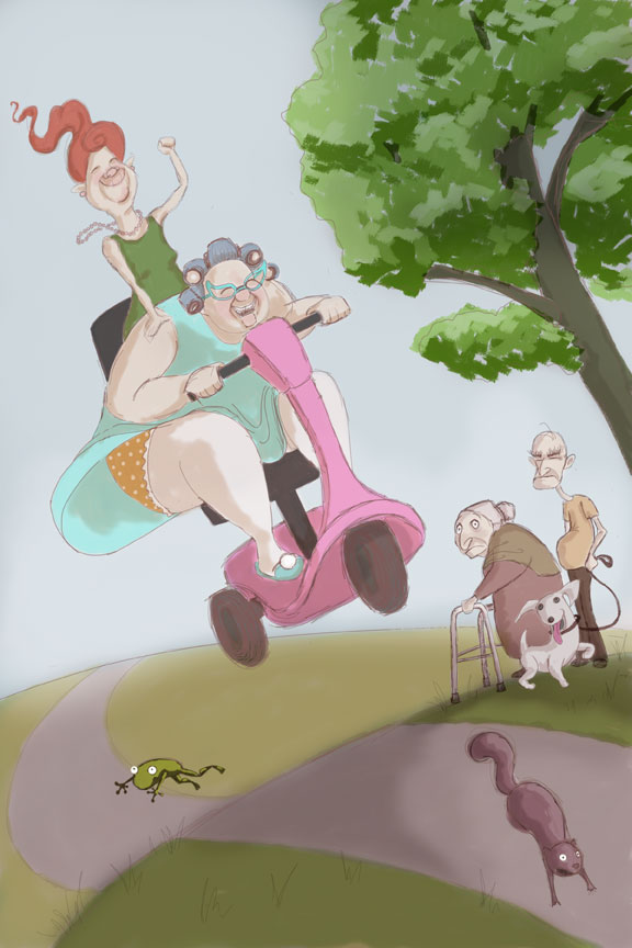
Society of Visual Storytelling

    SVSLearn Forums

    • Register
    • Login
    • Search
    • Recent
    • Tags
    • Popular
    • Users
    • Groups
    • Search

    Independent - WIP

    Artwork
    9
    19
    3435
    Loading More Posts
    • Oldest to Newest
    • Newest to Oldest
    • Most Votes
    Reply
    • Reply as topic
    Log in to reply
    This topic has been deleted. Only users with topic management privileges can see it.
    • tombarrettillo
      tombarrettillo last edited by

      I would have the frog jump off to the left, away from the scooter.

      https://www.youtube.com/@tombarrettart

      1 Reply Last reply Reply Quote 1
      • Will Terry
        Will Terry @Laurel Aylesworth last edited by

        @laurel-aylesworth Hi Laurel,

        I really like this piece a lot!

        I think you could benefit from reducing the size of the hill - or cropping it out more. That will give you more space for your main character. I also think you should push the concept a little further. Either make the person on the scooter bigger to show the contrast between the couple and the rider - or - make the rider another skinny elderly person - perhaps even a couple on the scooter to show the juxtaposition. 0_1500916374552_45646554.jpg

        Going with the fat person could get you heat online...we live in a very critical world online...I like both options.

        Cheers,
        Will

        SVS Instructor
        http://willterry.com/

        Laurel Aylesworth 1 Reply Last reply Reply Quote 0
        • Laurel Aylesworth
          Laurel Aylesworth @Will Terry last edited by

          @will-terry Thanks Will. These are all great suggestions, especially having two riders to contrasting with the slow couple on the right.

          www.laurelaylesworth.com
          instagram.com/laurelaylesworth

          1 Reply Last reply Reply Quote 1
          • TessaW
            TessaW last edited by

            Don't really have a critique, but just wanted to say that I'm excited for this piece. It's really funny. When I was hashing out ideas in my mind for the independence theme, I thought there might be something in showing independence for the elderly, and this is the idea I wish I had thought of! 🙂

            Website: www.tessawrathall.com

            Instagram: www.instagram.com/tessawrathall_art/

            Laurel Aylesworth 1 Reply Last reply Reply Quote 0
            • Laurel Aylesworth
              Laurel Aylesworth @TessaW last edited by

              @tessw Thanks Tess! Lee really thought of a challenging one this month, that's for sure.

              www.laurelaylesworth.com
              instagram.com/laurelaylesworth

              1 Reply Last reply Reply Quote 0
              • Laurel Aylesworth
                Laurel Aylesworth last edited by

                My eyes feel like they're about to pop out. If anyone has time to do a quick critique, it would be much appreciated. 0_1501356397146_independent4.jpg

                www.laurelaylesworth.com
                instagram.com/laurelaylesworth

                Tyson Ranes Kevin Longueil 2 Replies Last reply Reply Quote 3
                • Tyson Ranes
                  Tyson Ranes @Laurel Aylesworth last edited by

                  @laurel-aylesworth This whole concept is awesome. One critique would be to maybe play with a very washed out tree line in the background with maybe an old folks home rooftop hidden subtly in it. Also maybe simple park bench down the winding path / flag pole. Thats just an idea....it might busy things up a bit to much. Really like your character gestures, expressions and shapes!

                  Laurel Aylesworth 1 Reply Last reply Reply Quote 0
                  • Laurel Aylesworth
                    Laurel Aylesworth @Tyson Ranes last edited by

                    @tyson-ranes Thanks for your comments. Yes, I definitely need to busy up the background a bit. Will definitely work on that.

                    www.laurelaylesworth.com
                    instagram.com/laurelaylesworth

                    1 Reply Last reply Reply Quote 0
                    • tombarrettillo
                      tombarrettillo last edited by

                      take a look at Will's sketch again. Give the path a bit more perspective, bring the ladies on the scooter down closer to the ground like in your original sketch, and the frog and squirrel need to be much bigger.

                      https://www.youtube.com/@tombarrettart

                      1 Reply Last reply Reply Quote 1
                      • Kevin Longueil
                        Kevin Longueil SVS OG @Laurel Aylesworth last edited by

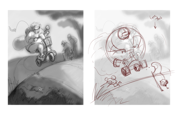
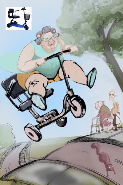
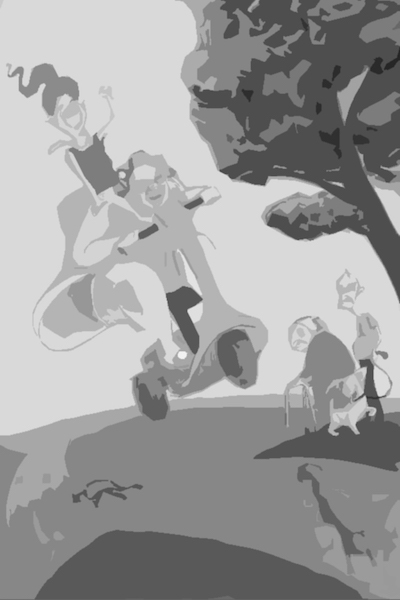
                        @laurel-aylesworth This is looking great - i think the thing i get a little stuck on is the anatomy of the scooter and the value range - i found a reference and did a quick sketch to see how it might look - i include a value cutout i did in photoshop (Lee White's advice to me in the past) - it looks like some things get lost without the color - maybe play with what is dark on light etc........a few really minor things that are just opinions are: i feel like we should see the side of her middle front roller? It looks like the scooter is shifted to our right a bit from center especially the back edge - the walker makes me think we should have a sidewalk for her - Just minor stuff really - i love the idea of this piece - really nice work!

                        0_1501372252371_Jump.jpg

                        0_1501372901637_cut out.jpg

                        Portfolio: kevinlongueil.com
                        https://www.instagram.com/kevinlongueil/

                        Laurel Aylesworth 2 Replies Last reply Reply Quote 1
                        • Laurel Aylesworth
                          Laurel Aylesworth @Kevin Longueil last edited by

                          @kevin-longueil Hey, you're good at these critiques. Maybe SVS has an opening for an instructor 🙂 Yes, you're so right about the anatomy of the scooter, which I'll work on next. And good observation about needing a smooth surface for the walker.

                          www.laurelaylesworth.com
                          instagram.com/laurelaylesworth

                          1 Reply Last reply Reply Quote 0
                          • Laurel Aylesworth
                            Laurel Aylesworth @Kevin Longueil last edited by

                            @kevin-longueil Also, what is a value cutout? Do you convert everything to greyscale in Photoshop and put some sort of layer adjustment?

                            www.laurelaylesworth.com
                            instagram.com/laurelaylesworth

                            Kevin Longueil 1 Reply Last reply Reply Quote 1
                            • Kevin Longueil
                              Kevin Longueil SVS OG @Laurel Aylesworth last edited by

                              @laurel-aylesworth Yes It is a filter in photoshop called "cutout" - I set it to 5 and then convert to black and white - it is a trick Lee shared a while back - really shows if we are getting the values right - thanks for the compliment too - I always hesitate to post draw overs 🙂

                              Portfolio: kevinlongueil.com
                              https://www.instagram.com/kevinlongueil/

                              1 Reply Last reply Reply Quote 1
                              • First post
                                Last post