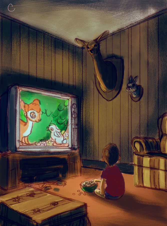
Help with another painting, please- Bambi
-
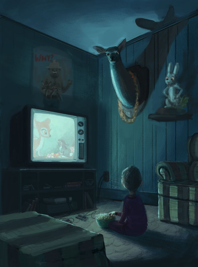
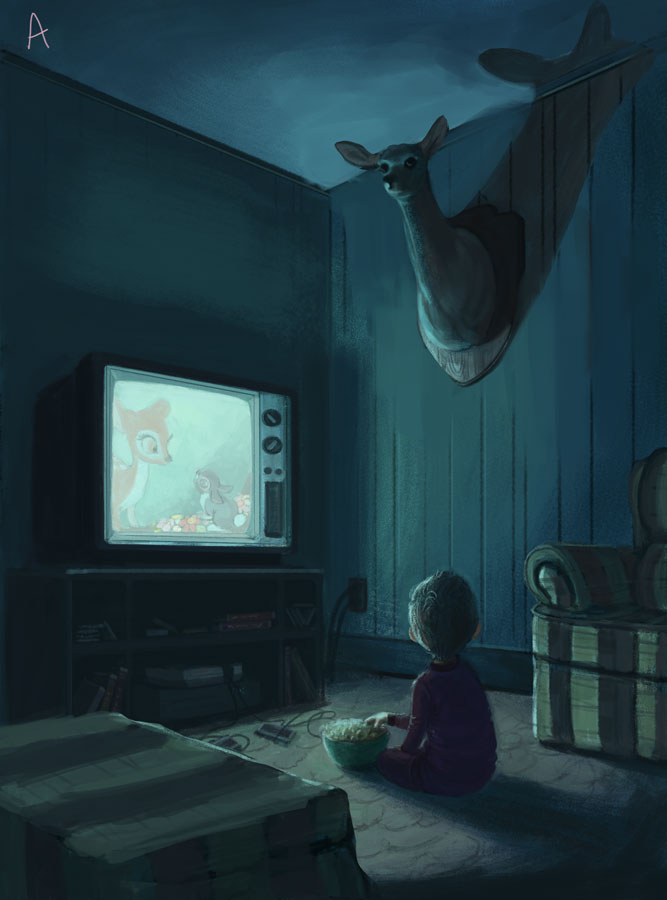
@missmarck Thanks for your thoughts! I was hoping that adding the bunny on the wall would amp up the absurdity and hopefully let the viewer know that it's supposed to be slightly humorous, but maybe it just makes it more horrific? I did have another comp with a different angle with just the deer, and maybe it would be more appropriate. I will ponder on this.
@evilrobot Thank you!
-
Love it. Love the creepy vibe! Love the wood paneling and what looks like old Atari game controllers on the floor. Sort of an 80's vibe.
The bunnies cheeks are a bit puffy if you want my 2 cents.
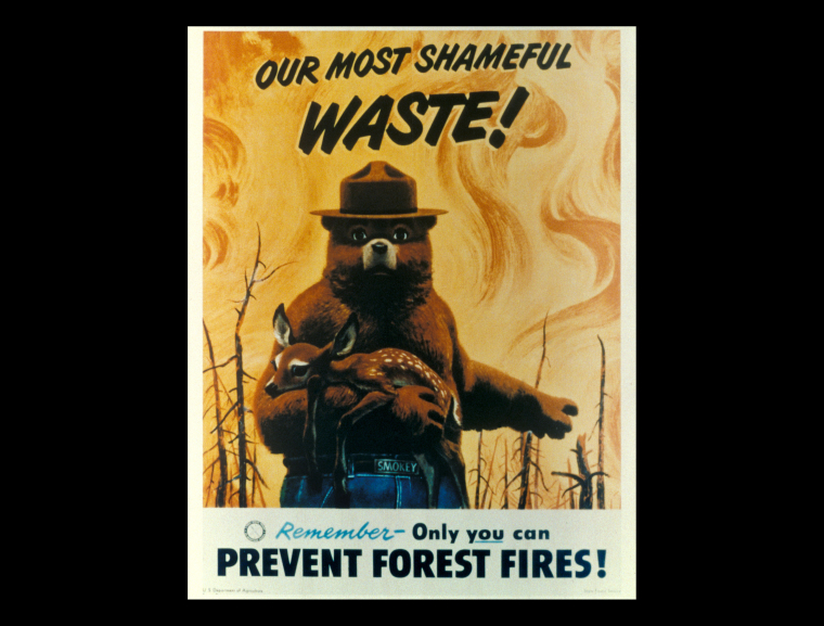
You should put a plaque/poster above the TV that says 'Only you can prevent Forest fires'. Too much!?
-
@tessw Really impressive! I agree with William that it is dark and twisted - if you are not going for this level of creepy maybe taking the rabbit back out will make it possibly creepy and poignant instead - i do enjoy dark humor but this piece seems to have a seriousness about it - just my thoughts - really nice painting
")
-
I agree with the others that the mounted rabbit head amps up the creepiness instead of making it comical, but that's also included in the the color scheme the way I perceive it. I don't think you should abandon the piece, just maybe the comical aspect, as this is shaping up to be a very nice image.
Back to the rabbit, most of the mounted rabbits I've seen were full body display in a hopping pose on a shelf or mantle. I don't know that having that included is necessary but having just the introduces more creep than you probably intended.
This is looking very nice. I can't wait to see how this turns out!
-
I love it Tess... very nice concept and solid paint skills.
")
-
@Katrina-Fowler I was definitely trying to set this in the 80s, so I'm glad you picked up on that.. . . and LOL. Smokey the Bear, what a hunk. How about this one though? What's funny is that in some of my sketches I had included a skunk as well.
Thank you everyone, your comments have been very helpful. I have discovered that mounting a bunny head is perhaps taking things too far, lol. I'll be playing around with things and post updates for additional opinions! Thanks again.
-
Hmmm...not sure if it's the fact that the bunny's head is mounted that is making it creepy.
In fact, I'd say it is the fact that the animals are "sorta" looking at the viewer or boy...it is kinda ambiguous where they are looking honestly.
It would possibly be less creepy if you just had the animals staring ahead (to the left of the frame).
However, even then, I can't decide if the boy is looking up with tears welling up in his eyes or is like "hey...wait a sec..." which is kinda funny--but still kinda sad.
It could be that the overall color pallet lends itself to a melancholy feel.
Personally, I think the ottoman is good as is. In fact, I think you've mastered form, lighting and material on 90% of this piece. It's just incredibly good.
The one crit I would have is that the animals themselves are coming across a little "fake"--not sure if that's the right word. For example, the deer neck (which comes across as very long, imo--maybe shorten a tad?) appears to be made of a smooth material rather than short fur.
But this is just so great overall. Portfolio piece for sure.
-
@mattramsey Thank you! Very helpful insights.
What do you think of this direction? Yay, or nay? I've also tried to make the boy a bit older looking.
Website: www.tessawrathall.com
Instagram: www.instagram.com/tessawrathall_art/
-
I agree with most of the replies here. It looks kinda creepy (wich I love by the way). To me, is that the animals in the wall look too "alive", their heads appears to be bending to face the viewer, and they should be facing the same direction as the wall they're mounted in. And maybe the deer neck should be a little shorter?. Besides that I love the composition and colors (maybe try warmer color composition too?) and the detail of the NES console!!
PS: this is just nitcpicking, but it would be really cool if you could bend the tv image and add some effect too make it look like an old TV a little more
-
@tessw its fantastic. I love the subject. My friend is a hunter and its one thing i dont like about him. I dont understand this 'sport':( Anyway, if i was picky, i would replace the bunny with a different animal (who puts bunnies on the wall anyway?;) and i would make the animals look straight so not at the boy nor the viewer, but just at opposite wall. This could create and intimate atmosphere, where the boy realises the horrible truth and perhaphs feels sorry for the animals. Anyway, its really well painted:)
-
The ottoman is fine, maybe experiment with angle of its position to have eye drawn back into the piece. Also, animal ornaments might add a different feel of creepy if they faced straight ahead and looked down from the corner of their eyes and/or glowed rather than facing their heads towards the boy. Just an idea to play with. Love the colors!
-
Thanks for the additional feedback. I will work on the anatomy of the deer once I get things figured out more.

An earlier color comp
Website: www.tessawrathall.com
Instagram: www.instagram.com/tessawrathall_art/
-
@tessw for me I liked what you had going in that very first post. But I also like this color comp you have with the brighter colors. I think it actually leans more the comedy end of things with the reds and oranges. Maybe even a shot gun or hunting riffle hanging on the wall over the TV. Could go farther even. He's sitting on bear skin rug. Some kind of pelt draped over the chair.
-
I think A looks awesome.
-
@tessw Did you try playing with smaller pupils in comp B? To show more of the whites of the eyes? I'm only focused on them because I am reading your composition as such that the main focal point of this piece is the eye connection/exchange between the boy and the ornament? Therefore, we want to make sure we really hit home with that portrayal. What you ultimately decide on is up to you.
-
I love love love B! I think those colors (combined with the TV) give the effect of "did I really see that" that the boy is probably experiencing. I imagine him turning off the TV and the deer is back to normal... did it really move, or did he imagine it?
-
This is awesome! So funny too. I think anything extra is unecessary as it might draw the viewer away from the deer and bunny on the wall, they are important to the piece, of course. It's amazing, Tess!!!! I love that it's a deer and a rabbit on the wall and it cracks me up. Poor Bambi...my nieces used to talk about that all teh time. Their dad was a deer hunter and they never wanted to eat the venison because of the Bambi movie. I'm not sure how kids will view it, depends on the kid I'm sure. I think it's beautifully done!
-
@evilrobot I didn't see the other ones before but, I agree with you that it's less creepy with the colors.
-
I like B the most. I agree with the mounting of a rabbits head, you wouldn't see that. But you would see a rabbits foot, like a key chain. Maybe have that resting on the floor next to the boy. I love the colors on it, keep it blue. Great piece overall.
-
I like B! I like the expression in the eyes, it reads to me like the deer is slightly surprised, but also a little concerned for the boy, like she is worried about the up coming moment of trauma "You okay Kid?" (I have to interject while you can hunt doe during certain times of the year, it is not something a hunter would usually mount as a trophy on the wall. But I think its hilarious anyways.)
I would also love to see some more toys/things on the floor. This painting make me want to explore the environment.
Also, this make me think of Stranger Things.