Society of Visual Storytelling

    SVSLearn Forums

    • Register
    • Login
    • Search
    • Recent
    • Tags
    • Popular
    • Users
    • Groups
    • Search

    WIP Worst fear

    Artwork
    15
    20
    3268
    Loading More Posts
    • Oldest to Newest
    • Newest to Oldest
    • Most Votes
    Reply
    • Reply as topic
    Log in to reply
    This topic has been deleted. Only users with topic management privileges can see it.
    • Gary Wilkinson
      Gary Wilkinson last edited by Gary Wilkinson

      (Updated color study below)

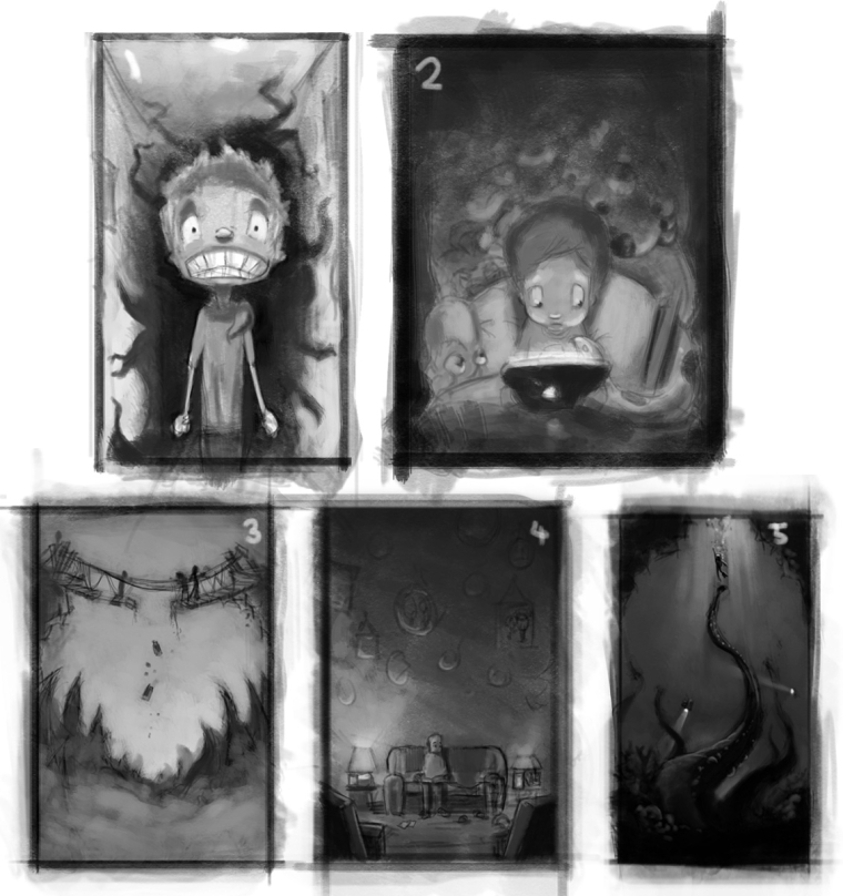
      Hey guys, first time giving this contest a go and played around with a few ideas, but not sure which is best to take forward.

      1. The fear when you are walking down a corridor and something is behind you.
      2. Kid in bed with his tablet whilst the monsters are looking over his shoulder.
      3. Stuck in the middle of a collapsing rope bridge (I hate heights)
      4. Old man looking through old photos on a sofa with an empty space.
      5. Scuba diver escaping from something below. (I hate the unknowns of the sea when im swimming)

      I think from a children book perspective I like 2, but it feels unoriginal. I like the concept of 4, but I dont know if it best conveys fear (it's more about the fear of been old and alone)

      Any thoughts are appreciated πŸ™‚

      0_1502764613841_worst fear.jpg

      www.garywilkinsonart.com
      www.instagram.com/gwillustration/
      www.twitter.com/GWillustration

      Kevin Longueil 1 Reply Last reply Reply Quote 6
      • artbytra
        artbytra SVS OG last edited by

        @Gary-Wilkinson Personally digging number 5! It could definitely be geared toward an exciting children's book theme with the right colors chosen... all are good though in my opinion.

        https://www.instagram.com/art.by.tra/

        1 Reply Last reply Reply Quote 1
        • RHirsch
          RHirsch last edited by

          Great thumbnails! I'm personally drawn to the tension in #3 and #5, although I might make the boards crumbling right under the character's feet.

          www.rhirschillustration.com
          https://www.facebook.com/rhirschillus
          Instagram: rhirschillus

          1 Reply Last reply Reply Quote 1
          • TessaW
            TessaW last edited by

            1 and 5 are my favorites. 5 is scarier, probably because that is one of my fears, and 1 is fun because of how you can play up the character. 3 has potential, but I feel it's not very scary from that vantage point. 2 is really good, but like you said, it's not as original. I think 4 is really well done as well, I think that's a super valid fear, but it will have a sadder tone to it, so it kind of depends if you want to spend time with that emotion.

            Haha, kind of feel like I'm not being very helpful, but wanted to stop in- you have very nice looking thumbnails!

            Website: www.tessawrathall.com

            Instagram: www.instagram.com/tessawrathall_art/

            1 Reply Last reply Reply Quote 1
            • Leontine
              Leontine last edited by

              Hi Gary! actually... I like them all... XD. as it go's for story telling the bottom row (#3 #4, #5) look really awesome, #5 has the most tension...!

              Leontine
              "A picture is worth a thousand words."

              https://leontineillustrator.com
              https://www.instagram.com/leontine.illustrator/
              http://www.facebook.com/leontineillustration

              1 Reply Last reply Reply Quote 1
              • bnewman
                bnewman last edited by

                I like #1 and #5.

                1 Reply Last reply Reply Quote 1
                • Jose Ramos
                  Jose Ramos last edited by

                  Number 5!, I think is the best one. πŸ™‚

                  1 Reply Last reply Reply Quote 1
                  • rcartwright
                    rcartwright last edited by

                    I like the initial character design from 2 because you can see the expressions on the characters.

                    https://www.scbwi.org/members/richard-cartwright/
                    https://www.instagram.com/richardwcartwright/
                    https://www.pinterest.ca/richcartwright3/art-of-richard-cartwright/
                    https://www.richardwcartwright.ca/

                    1 Reply Last reply Reply Quote 1
                    • Jason Bowen
                      Jason Bowen SVS OG last edited by

                      I really like #5

                      https://www.instagram.com/jasonbowenoils/

                      1 Reply Last reply Reply Quote 1
                      • Chip Valecek
                        Chip Valecek SVS Team SVS OG last edited by

                        I like #1


                        https://www.instagram.com/chipvalecek/
                        https://www.facebook.com/cvalecek
                        http://www.cshellmedia.com/

                        1 Reply Last reply Reply Quote 1
                        • Kevin Longueil
                          Kevin Longueil SVS OG @Gary Wilkinson last edited by

                          @gary-wilkinson Another vote for 5 - very striking

                          Portfolio: kevinlongueil.com
                          https://www.instagram.com/kevinlongueil/

                          1 Reply Last reply Reply Quote 1
                          • Gary Wilkinson
                            Gary Wilkinson last edited by

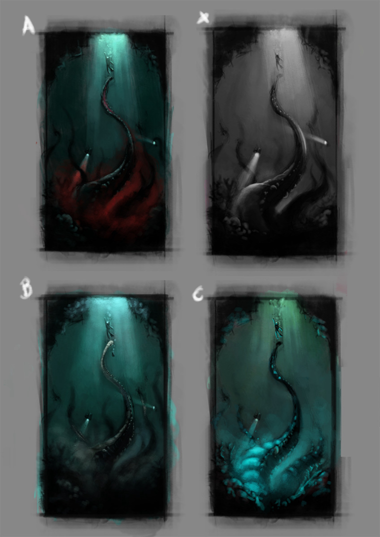
                            Thanks for all of your replies and feedback! I have tried some color studies with no.5 and a slightly different lighting on x, with the torches lighting up the tentacle. I'm leaning towards B, I like the 2 tone style of A, although I think the red is pushing towards a bit more of an adult theme πŸ˜•

                            0_1502845991830_scuba color studiessb.jpg

                            www.garywilkinsonart.com
                            www.instagram.com/gwillustration/
                            www.twitter.com/GWillustration

                            1 Reply Last reply Reply Quote 4
                            • Jose Ramos
                              Jose Ramos last edited by

                              @gary-wilkinson said in WIP Worst fear:

                              bit more of an adult theme πŸ˜•

                              I like upper half "B" and bottom half "C" πŸ™‚

                              Gary Wilkinson 1 Reply Last reply Reply Quote 0
                              • Gary Wilkinson
                                Gary Wilkinson @Jose Ramos last edited by

                                @jose-ramos thanks. I was thinking about those but i was a bit worried the focal point might be harder to see if they are both heavily lit

                                www.garywilkinsonart.com
                                www.instagram.com/gwillustration/
                                www.twitter.com/GWillustration

                                Jose Ramos Tyson Ranes 2 Replies Last reply Reply Quote 0
                                • NoWayMe
                                  NoWayMe last edited by

                                  Great work!

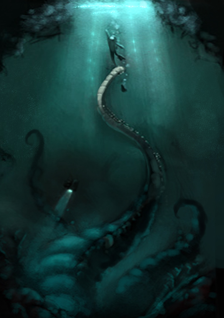
                                  I agree that your focal point would be diluted if you have two strong lighting sources. If you choose to do that, I would suggest making sure one of them if a lot stronger than the other. I would also move your character a bit more to the right. He is not RIGHT in the middle, but almost. I think if he was a little lower as well it would increase the tension (now, he is so close to reaching the surface that it's almost certain he will make it.)
                                  Hope it helps!
                                  Love it! πŸ™‚

                                  noemiegionetlandry.squarespace.com
                                  noemie_illustration on Instagram

                                  1 Reply Last reply Reply Quote 0
                                  • tombarrettillo
                                    tombarrettillo last edited by

                                    I like how you lit the art in the "x" concept, where you used the torches to light some of the tentacle. Leave the bottom darker like you have in "A", and I think "A" has the best lighting coming from the surface. And the size of the hole works best to me. So much more tension and drama as the diver attempts to make it to the top. The others are so brightly litβ€”and you have the hole largerβ€”that you lose a lot of that drama and urgency.

                                    https://www.youtube.com/@tombarrettart

                                    1 Reply Last reply Reply Quote 0
                                    • Jose Ramos
                                      Jose Ramos @Gary Wilkinson last edited by

                                      @gary-wilkinson Yes, youΒ΄re right about the focal point, but I think if you make one of them if a lot stronger than the other, it could be great, as NoWayMe said.
                                      0_1503073210270_1502845994718-scuba-color-studiessb.jpg

                                      1 Reply Last reply Reply Quote 0
                                      • Katrina Fowler
                                        Katrina Fowler last edited by

                                        I know you've chosen #5 and it's looking really good - but I had to give a shout out to #4. You could change the character to a kid instead of and adult. Being left alone and abandoned is a real fear for kids!

                                        "Never give up! Never surrender!" ~Commander Peter Quincy Taggert

                                        http://ziona4000.wixsite.com/katrinafowler

                                        1 Reply Last reply Reply Quote 0
                                        • Tyson Ranes
                                          Tyson Ranes @Gary Wilkinson last edited by

                                          @gary-wilkinson these are great I really like your work

                                          1 Reply Last reply Reply Quote 0
                                          • Gary Wilkinson
                                            Gary Wilkinson last edited by Gary Wilkinson

                                            Thanks for all the critiques everyone, it's a big help. There are some great pieces of work this month and hopefully I can finish it on time, I'm trying to finish my Conner Mcgregor caricature before the fight so finding time is a bit hard πŸ˜•

                                            @tombarrettillo I like the torches on x too, if I can work them in without the scene been too busy i'll try to. I always have a hard time deciding on which I personally like best. I agree about the added tension in A with the small hole, i'll try and work that style into the final piece

                                            @NoWayMe great advice with the light sources, I didn't notice about the guy not been in the center, he looks more to the right than the left to me though. It must be my eyes πŸ™‚

                                            @Jose-Ramos thanks for the paintover, I think that style works pretty well. I'm gonna have to steal the sparkly rays of water idea πŸ˜›

                                            @Katrina-Fowler I like your idea for #4, it would take a bit of a rework, but it's a great idea that I might use for the future, maybe have a few empty microwave trays scattered about the floor πŸ˜›

                                            @Tyson-Ranes thanks πŸ™‚ I'm trying to try work up an illustration portfolio. I mainly painted portraits/caricatures, so being part of the SVS forum has really helped teach me a lot about illustration πŸ™‚

                                            www.garywilkinsonart.com
                                            www.instagram.com/gwillustration/
                                            www.twitter.com/GWillustration

                                            1 Reply Last reply Reply Quote 1
                                            • First post
                                              Last post