Which one is better?
-
Hi guys, need your fresh eyes
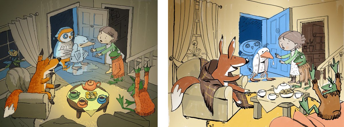
") Which one is better? What do I do to improve it? Do you see the story here? The story is - the Owl found the Duck at terrible cold and wet weather and brought it to the house where friends were waiting for them. Made two options and still not entirely happy... Thank you in advance!
Which one is better? What do I do to improve it? Do you see the story here? The story is - the Owl found the Duck at terrible cold and wet weather and brought it to the house where friends were waiting for them. Made two options and still not entirely happy... Thank you in advance!
-
I like the one on the left better. There is more contrast and I like the colors and compostion better.
-
@orangeni I like the composition on the right better, but I like the contrast on the left better. There's a bit too much emphasis on the table on the left (it seems to be the "star" of the story, opposed to the characters). Maybe work on the expression of the girl's hands too? I first read that as "please don't get my dry clean room all wet" instead of it being a gesture of concern.
-
@laurel-aylesworth I agree... I feel like making the third one, as there are some good features in both of them
Thank you for your critique, it is helpful. -
I really like the one on the right because it has depth and the duck is the focal point instantly. I just really like the way the colors are grouped in that one too. To improve it I'd change the expression of the girl. On first read it looks like she's saying "No! Don't come in here!" A smile, one hand on the duck's shoulder and the other gesturing to the room might work better. Bring the owl in closer too - poking his head in or something.
-
I like the one on the right but you should look at the values like the brown door behind the girl there is no reason to create contrast there. I would darken around the characters more like a vignette and put in shadows on the floor in areas such as under the table. I like how the duck in half in the light. The frog next to the girl gets lost. Unless he is a key point to the story consider taking him out.
-
@orangeni Right hand side for me - maybe with the round table though instead of the square - really nice work
-
I like the one on the right, though I would crop off the left side up to the blanket on the fox, and maybe a bit off the bottom to really bring the viewer into the scene. Maybe pull the fox back to the left a bit to give the duck and owl room, and move the frog away from the girl a bit.
-
A lot to think about! Thank you so much
I ll be back with the remake of the right one -
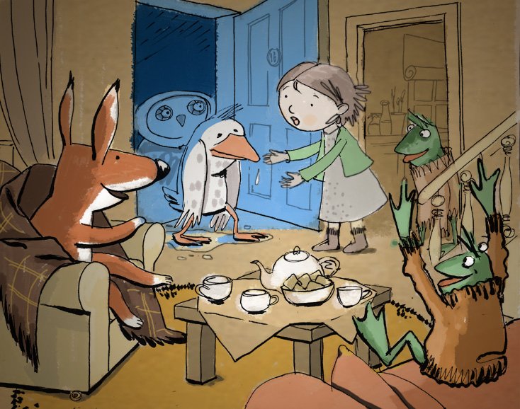
Thank you very much for your time guys, it was really-really helpful. Here is the final version. There may be some more room for improvement, but I am happy with this at the moment and moving on
-
@orangeni ! Cool stuff
-
Really really nice work I love the fox in his blanket