Society of Visual Storytelling

    SVSLearn Forums

    • Register
    • Login
    • Search
    • Recent
    • Tags
    • Popular
    • Users
    • Groups
    • Search

    Feedback on Portfolio Piece

    Artwork
    9
    12
    2258
    Loading More Posts
    • Oldest to Newest
    • Newest to Oldest
    • Most Votes
    Reply
    • Reply as topic
    Log in to reply
    This topic has been deleted. Only users with topic management privileges can see it.
    • MissMarck
      MissMarck last edited by

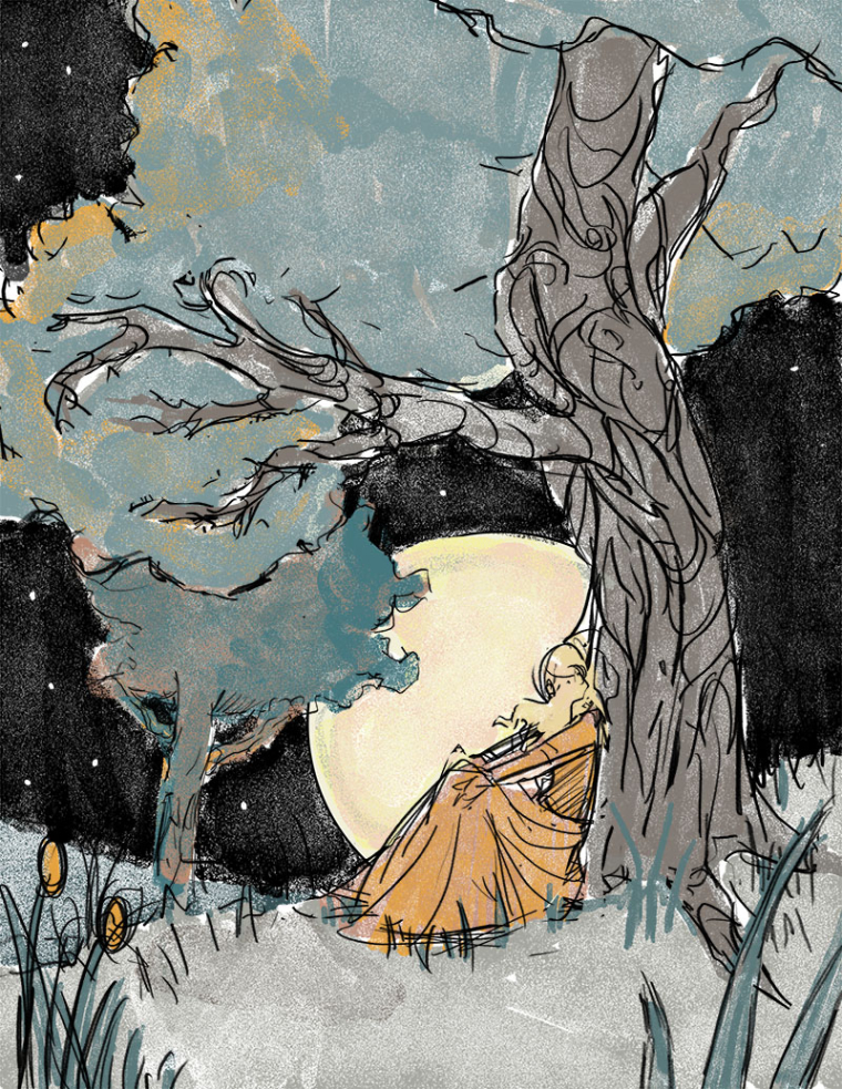
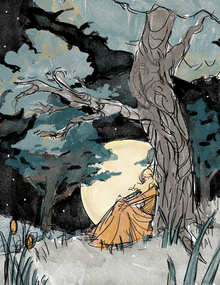
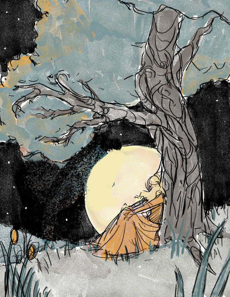
      Hi there! I'm looking for some feedback on an illustration I'm working on. It's a personal/portfolio piece, inspired by some of the "Dream Portfolio" stuff I've been doing (I've been studying a lot of vintage book illustrations.) Below are 3 different versions, all of which I like... But I'm not sure about the trees. What do you guys think?

      A
      0_1504158686851_moonlight A.jpg

      B
      0_1504159097699_moonlight B.jpg

      C (I'm kinda leaning towards this more simple composition...)
      0_1504159131935_moonlight C.jpg

      Thanks!!

      1 Reply Last reply Reply Quote 1
      • DOTTYP
        DOTTYP last edited by

        I like number 2 best,the trees look great,The colour palette is wonderful very subtle and beautiful.

        scribbles.artstation.com
        www.instagram.com/dottypaints

        1 Reply Last reply Reply Quote 0
        • seelliott
          seelliott last edited by seelliott

          I like the loose linework and the colour pallet. Are these final images or are you going to refine them further?
          I like number 2 the best but the left-hand tree merges into the foreground tree a bit. It might be worth considering the values there.
          Also, there is a small tangent between the yellow reed/flowers at the bottom left and the sky.
          Looks great though. The ideal portfolio exercise was really useful for me.

          Website: http://www.seelliottcreations.com/
          Facebook: https://www.facebook.com/SEElliottCreations/

          1 Reply Last reply Reply Quote 0
          • HeidiGFX
            HeidiGFX last edited by

            i like the 2nd one better too. the spaces around the trees are much better. these are still wip, right?

            https://www.heidigfx.com/
            https://www.facebook.com/heidiGFX/
            https://www.instagram.com/heidigfx/

            1 Reply Last reply Reply Quote 0
            • julian beresford
              julian beresford SVS OG last edited by

              The composition of the third works best for me,

              Julian Beresford - Freelance Illustrator
              www. jgberesford.com
              https://www.instagram.com/jbfantasticalemporium/

              1 Reply Last reply Reply Quote 0
              • TessaW
                TessaW last edited by

                These are looking really cool. I like how you distributed the orange throughout the image. I like 2 or 3. Possibly make the background trees in 2 a little darker? May or may not work. I would definitely refine the linework a bit if you don't plan to already.

                Website: www.tessawrathall.com

                Instagram: www.instagram.com/tessawrathall_art/

                1 Reply Last reply Reply Quote 0
                • MissMarck
                  MissMarck last edited by

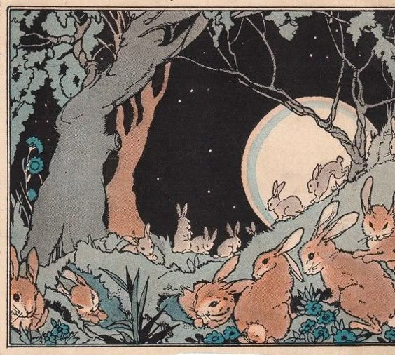
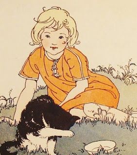
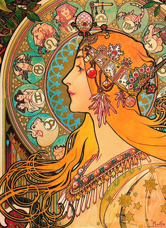
                  Thanks for all the feedback, everyone! These are definitely still in the rough stages, so lots of cleanup will be happening once I get settled on a composition. For an example, this are some of the pieces I used as a color reference:
                  alt text
                  alt text
                  So the line work is going to be somewhat cleaned up, but I want it to still have the effect of "mass produced" texture. (I might pull from Alphonse Mucha for the lineart.)
                  alt text

                  1 Reply Last reply Reply Quote 0
                  • MissMarck
                    MissMarck last edited by

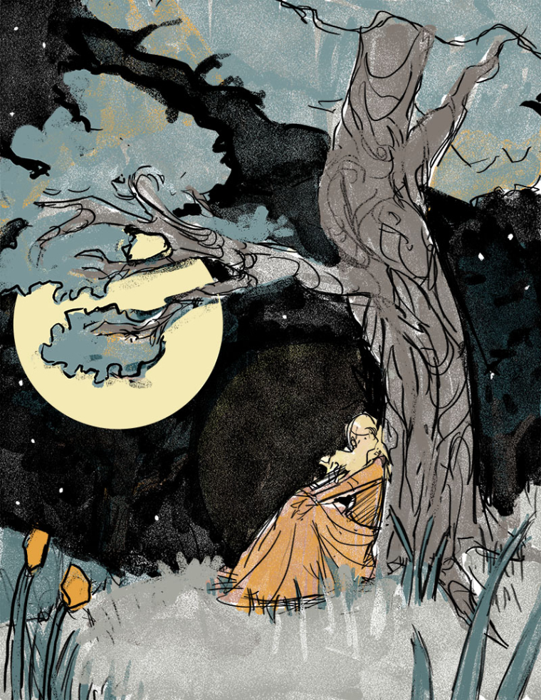
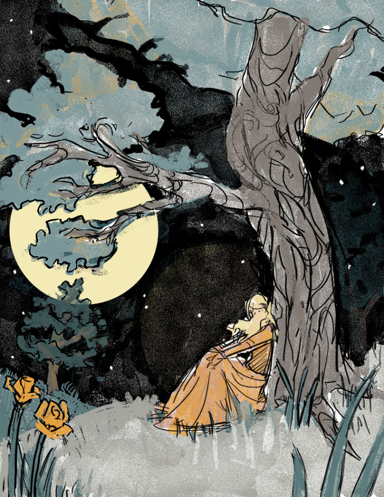
                    I decided to move the moon, and I think that really helps. Tried it with and without a tree.

                    D
                    0_1504202813568_moonlight D.jpg

                    E (I think I prefer this one!)
                    0_1504203570472_moonlight E.jpg

                    lmrush 1 Reply Last reply Reply Quote 0
                    • lmrush
                      lmrush Pro SVS OG @MissMarck last edited by

                      @missmarck gorgeous illustration such nice work with your consistency on style and awesome values. I just wanted to let you know I kept struggling to understand her head/face , I wanted to see/understand it better. Fantastic that you are using your dream portfolio pieces to guide you Congrats!

                      Lisa Rush
                      www.lisarushgallery.com
                      www.facebook.com/ArtbyLisaRush/
                      www.instagram.com/lisarush11/

                      MissMarck 1 Reply Last reply Reply Quote 0
                      • Mallette
                        Mallette last edited by

                        I love illustration B and your three inspirational images. 🙂 Either way you go though, I think this will be great. I can't wait to see the final image. ❤

                        mbillustrations.com
                        https://www.instagram.com/mbillustrations/
                        https://twitter.com/malletteart

                        1 Reply Last reply Reply Quote 0
                        • cmetznerdotcom
                          cmetznerdotcom last edited by

                          I love the second one because of the value in the trees! Lovely style by the way!

                          Currently taking on the monumental task of redesigning the first 151 Pokemon!
                          https://www.cmetzner.com/pokemon-redesign-project
                          Other social media:
                          https://www.instagram.com/cmetznerdotcom/?hl=en
                          https://twitter.com/cmetznerdotcom

                          1 Reply Last reply Reply Quote 0
                          • MissMarck
                            MissMarck @lmrush last edited by

                            @lmrush thanks for the feedback! I was originally going to have her facing the moon, so you can't see her face, but after taking a break, I think a profile shot would be better 🙂

                            1 Reply Last reply Reply Quote 1
                            • First post
                              Last post