Society of Visual Storytelling

    SVSLearn Forums

    • Register
    • Login
    • Search
    • Recent
    • Tags
    • Popular
    • Users
    • Groups
    • Search

    SCBWI Mystery

    Artwork
    11
    29
    5640
    Loading More Posts
    • Oldest to Newest
    • Newest to Oldest
    • Most Votes
    Reply
    • Reply as topic
    Log in to reply
    This topic has been deleted. Only users with topic management privileges can see it.
    • julian beresford
      julian beresford SVS OG last edited by

      @bharris No problem you're welcome, That's something I have to keep telling my self aswell

      Julian Beresford - Freelance Illustrator
      www. jgberesford.com
      https://www.instagram.com/jbfantasticalemporium/

      1 Reply Last reply Reply Quote 0
      • tombarrettillo
        tombarrettillo last edited by

        I think the story is coming though good, and even better with the unexpected ending. A few things I think could be improved. Taking a hint from @willterry, I would enlarge and darken the box at the front of the first panel, to help frame the action, and give the room more depth. The middle is perfect, though I might have all the kids looking at the old man, rather than each other. I like the last panel as well, but I would bring the little girl closer to the old man, so she is more involved in the story the old man is telling. Nice work!

        https://www.youtube.com/@tombarrettart

        1 Reply Last reply Reply Quote 2
        • lmrush
          lmrush Pro SVS OG last edited by

          these look great, so clever

          Lisa Rush
          www.lisarushgallery.com
          www.facebook.com/ArtbyLisaRush/
          www.instagram.com/lisarush11/

          1 Reply Last reply Reply Quote 1
          • bharris
            bharris last edited by

            @tombarrettillo The unexpected is what I was going for 🙂 so glad that is showing! I'll play with the kids' eyes, I still don't like their placement. With the first panel I was trying to really make the rest of the image almost disappear away from the focal point, but since you mention it, I don't think it's working. I might be changing the whole last image... but I really like it and I can't figure out how to show everything with a different perspective.

            Thank you for your help!

            @lmrush Thank you!

            www.brittanyharrisillustration.com/
            www.instagram.com/britillustration/

            1 Reply Last reply Reply Quote 0
            • TessaW
              TessaW last edited by TessaW

              Beautiful job so far. Love the concept and your lighting and values are really working well. Here are my suggestions.

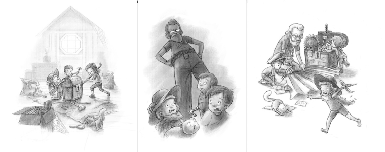
              1. I feel the drama is not quite being achieved with the kids in the middle image. It could be as simple as tweaking their expressions or you may have to change their poses, like Tom suggested, but the kids don't look as concerned or startled as I would expect. The cat is doing the best acting at the moment.

              2. With the first two panels you've established a composition based on a pretty strong triangle, but the last panel is not. I think the perspective of the third panel is fine, but I would think about making the last panel be based on a triangle as well to unify everything. I would lower the image on the third panel, so that it matches where the other two images are lining up in relation to the format.

              0_1504462745573_bharris.jpg

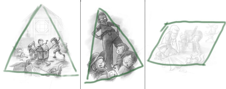
              Anyway, those are my thoughts. These are very well done overall and they were a pleasure to see.

              Website: www.tessawrathall.com

              Instagram: www.instagram.com/tessawrathall_art/

              1 Reply Last reply Reply Quote 0
              • bharris
                bharris last edited by

                @TessW Thank you for looking Tess, you saw so much! I changed the kids' expressions here. And the last image now has the triangle look, but doesn't line up, but I think it works okay. Really appreciate the feedback!

                0_1504493299639_mystery 2.jpg

                www.brittanyharrisillustration.com/
                www.instagram.com/britillustration/

                1 Reply Last reply Reply Quote 4
                • TessaW
                  TessaW last edited by

                  Very well done. Looks beautiful.

                  Website: www.tessawrathall.com

                  Instagram: www.instagram.com/tessawrathall_art/

                  1 Reply Last reply Reply Quote 1
                  • evilrobot
                    evilrobot SVS OG last edited by

                    These are fantastic way to go. Great work.

                    http://www.palacioillustration.com/

                    https://www.scbwi.org/illustrator-gallery/illustrator-detail/?illustrator_id=84142

                    https://www.pinterest.com/evilrobot2/pins/

                    https://twitter.com/MyEvilRobot

                    1 Reply Last reply Reply Quote 1
                    • bharris
                      bharris last edited by

                      @TessW and @evilrobot Thank you very much!

                      www.brittanyharrisillustration.com/
                      www.instagram.com/britillustration/

                      1 Reply Last reply Reply Quote 0
                      • NoWayMe
                        NoWayMe last edited by

                        Very nice work.The 2nd pannel works so much better now! Great work 🙂

                        noemiegionetlandry.squarespace.com
                        noemie_illustration on Instagram

                        1 Reply Last reply Reply Quote 1
                        • bharris
                          bharris last edited by

                          @NoWayMe Thank you, it was so necessary now that I look back. 🙂

                          www.brittanyharrisillustration.com/
                          www.instagram.com/britillustration/

                          1 Reply Last reply Reply Quote 0
                          • tombarrettillo
                            tombarrettillo last edited by

                            Looks good!

                            https://www.youtube.com/@tombarrettart

                            1 Reply Last reply Reply Quote 0
                            • julian beresford
                              julian beresford SVS OG last edited by julian beresford

                              @bharris I like the new expressions in the second panel, I still think the viewer is far away from the action/fun in the last panel though

                              Julian Beresford - Freelance Illustrator
                              www. jgberesford.com
                              https://www.instagram.com/jbfantasticalemporium/

                              1 Reply Last reply Reply Quote 0
                              • bharris
                                bharris last edited by

                                @tombarrettillo Thanks!
                                @julian-beresford That really helped a lot. I know it could be better, but this is what I decided to go with. 🙂

                                I got some help from @Rich-Green who helped me get the girl in teh last panel on the same plain as the rest. Here is where I'm at with color. I'm trying to keep the line work and texture as a part of the image, to hopefully get away from the digital look that most of my work has. I'm wondering if this is working...? I don't like doing stuff really lightly colored, but is is going together well? The kids in the first panel aren't done, but you can tell where it's going a bit.

                                0_1504643719710_Capture.JPG

                                www.brittanyharrisillustration.com/
                                www.instagram.com/britillustration/

                                Tyson Ranes Rich Green 2 Replies Last reply Reply Quote 6
                                • julian beresford
                                  julian beresford SVS OG last edited by

                                  @bharris I think the way your colouring Is great, It works really well - it has a nice textured traditional feel to it.

                                  Julian Beresford - Freelance Illustrator
                                  www. jgberesford.com
                                  https://www.instagram.com/jbfantasticalemporium/

                                  1 Reply Last reply Reply Quote 1
                                  • Tyson Ranes
                                    Tyson Ranes @bharris last edited by

                                    @bharris these are fantastic

                                    1 Reply Last reply Reply Quote 1
                                    • bharris
                                      bharris last edited by

                                      @julian-beresford and @Tyson-Ranes Thank you, I wasn't sure if it was coming out well. More eyes are so helpful!

                                      www.brittanyharrisillustration.com/
                                      www.instagram.com/britillustration/

                                      1 Reply Last reply Reply Quote 0
                                      • Rich Green
                                        Rich Green SVS OG @bharris last edited by

                                        @bharris looking great and I think you are hitting the style you are going for very well too!

                                        www.richgreenart.com instagram.com/richgreenart/

                                        1 Reply Last reply Reply Quote 1
                                        • TessaW
                                          TessaW last edited by

                                          Ok, so I was hesitant to post this comment, because I'm not sure how important it is, but the warm light source in the first image is coming from the left, and then it switches to the right in the second image. I think I might be being picky about this, because I've been studying light and shade, but maybe it doesn't really matter? Either way it's looking really good. My one suggestion would be to maybe add more orange light to some of the edges of the man, but that might be personal taste.

                                          Anyway, I think it's looking really appealing. Love the overall color palette and the way you've kept the drawing elements.

                                          0_1504658695960_bharris.jpg

                                          Website: www.tessawrathall.com

                                          Instagram: www.instagram.com/tessawrathall_art/

                                          1 Reply Last reply Reply Quote 1
                                          • bharris
                                            bharris last edited by

                                            @Rich-Green Thank you!

                                            @TessW I can't make the ghost face emoji... but darn it! I was going to tone down the warmth just a bit anyway, so maybe it's just emoting more than being direct. My original thought with the grandpa was that he was just a total shadow, but I like your suggestion, it looks good. Thanks Tess! Congratulations on winning the contest, that piece is outstanding!!

                                            www.brittanyharrisillustration.com/
                                            www.instagram.com/britillustration/

                                            1 Reply Last reply Reply Quote 0
                                            • First post
                                              Last post