Need some help with a piece
-
Ok so there will be an ‘H” above the picture. Don’t think too deeply about that.
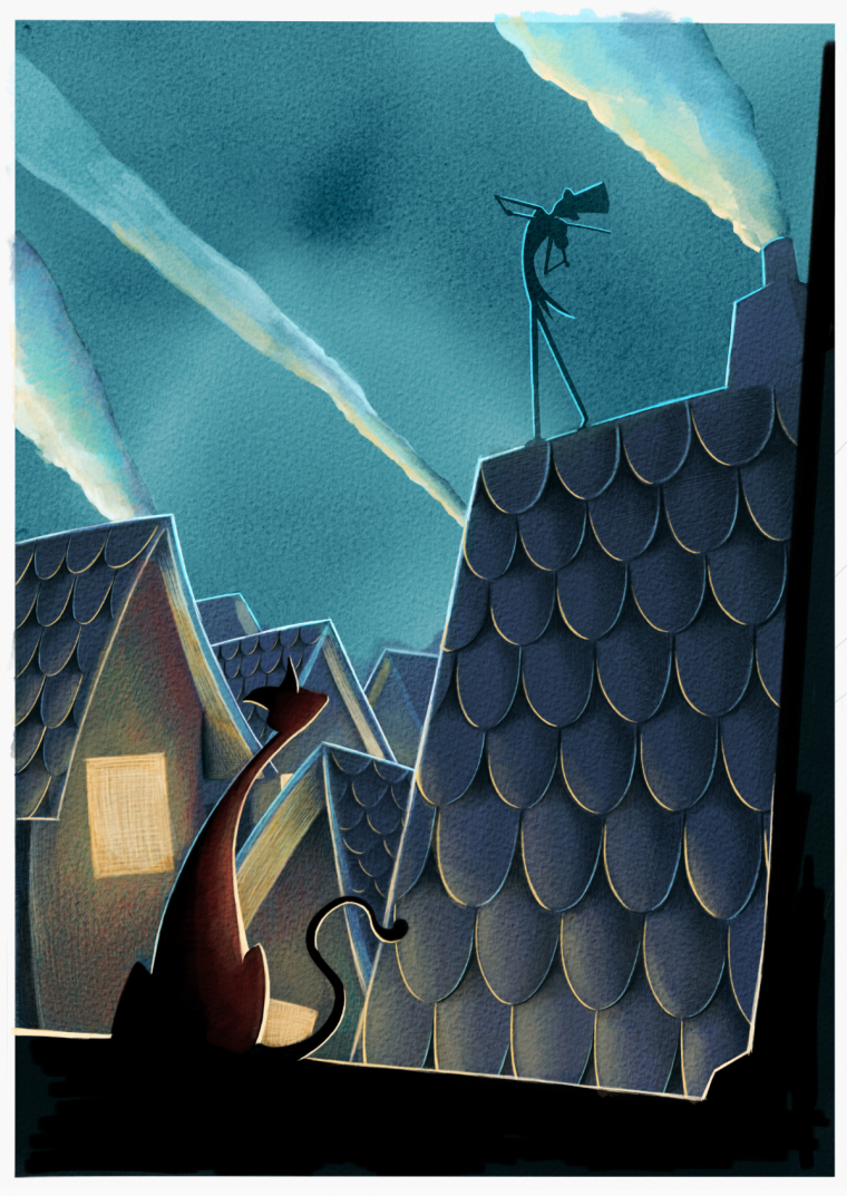
I am wondering if these smoke streams look right. I am just sitting here looking at the screen, and I cannot move forward because of my artistic OCD. Any thoughts?
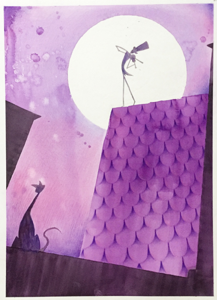
P.s this is a reworking of an older image I did last year when I was relatively new to SVS.
H
-
The piece looks really good. Concerning your question, I think it it depends what music he is playing
") Looking at the smoke, I would imagine its something epic and rocky (aim onto '2CELLOS' and this moment so I believe you can play this kind of music on any instrument). If you drew him thinking of calm music, then the smoke could be softer and less concentrated? Iam probably just talking jibber jabber Perhaps try moving the middle smoke so i ends in the top left corner. Can you post previous version?
Looking at the smoke, I would imagine its something epic and rocky (aim onto '2CELLOS' and this moment so I believe you can play this kind of music on any instrument). If you drew him thinking of calm music, then the smoke could be softer and less concentrated? Iam probably just talking jibber jabber Perhaps try moving the middle smoke so i ends in the top left corner. Can you post previous version? -
Thanks for your input @aska I guess the way I see the violinist is as a wonky oddball character, who plays in the middle of the night, and is probably the type that knows every little story about every song he plays. I imagined the story to be about the cat and the violinist, and for it to be a wordless picturebook, however, I have somewhat moved on from the story. I have three other book dummies I’m suppose to be working on, but I can’t help but make more pieces out of fear that I will stagnate.
Anywho, here is the piece from a year ago. I was working more traditional, and still trying to figure out how values worked, as well as perspective. So you can see the then and now I guess.
-
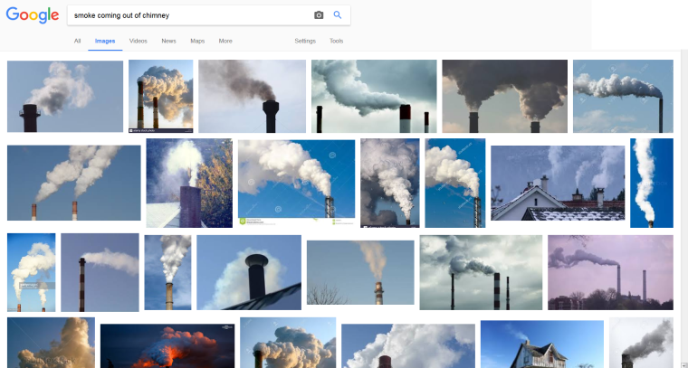
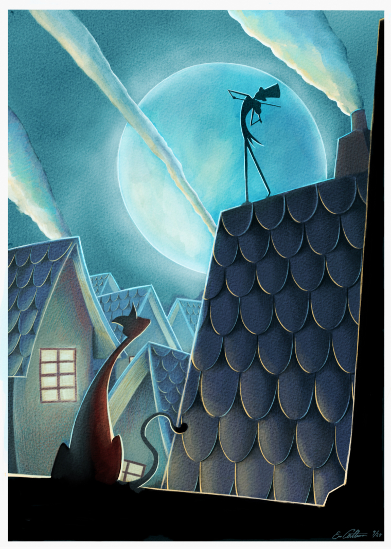
Take a look at some references that I screenshot from google. Maybe your smoke feels too much like a jet of smoke - direction, motion and shape. Maybe smoke from house chimneys may be weaker and fading away faster. If the wind is strong an blowing the smoke in that direction, so the musician coat should also be moving towards the left and not point towards the right. Also, the right and left smokes are creating some small triangular empty spaces on the image.
-
@eric-castleman i agree with @Diego_BioSteam with the reference. The smoke on the right looks good, the other two seem to be a strong line down and too much on an angle.
-
I think they all look a bit "fast" and narrow, so to speak, kind of like the smoke emerging from the stack of a fast moving steam locomotive. And it might help with clarity to add smoke stacks for the left 2 plumes. Also, another thing I notice is the smoke plumes all have highlights from the building lights below them, but the violinist does not. I actually think taking the yellow highlights off the smoke, darkening the bottoms, and adding more highlight from the moon would help tie the top of the illustration together better.
-
@eric-castleman Love the updated version looks really good. I'd say to design the smoke a bit....all the other elements of the piece have your style (design to them) I'd take the same same approach to the smoke. Illustrate it make it your way of doing smoke....don't know if that helps...great work
-
Looking good! It really has a nice feeling to it, and I dig the shapes. I would maybe lighten the buildings behind the cat to make it stand out some more. I also consider bringing back the moon or using some smoke to make the main guy stand out more as well. Just squint you eyes or shrink the art down to see if it still reads well.
-
I really dig the concept and the composition is powerful. I think maybe bringing the moon back to help the violinist stand out more could be cool. Also, if the smoke kind of meandered into the sky that might eliminate the sharp direction it's giving off.
-
Hi Eric!
I love this piece")
However, there's a few element in your original piece that I like better than the new version. Like @Spencer-Hale and @adamdohrmann , I would definitely bring the moon back behind the guy (or lighten the sky and make him darker). I would also find a way to have the cat against the sky again (as oppose to having houses behind) as I feel he was reading much better then. Of course, your handling of light, color, perspective and just global rendering is way better in the new version, but the composition was a little stronger in the original on these two points. Great work
-
Awesome feedback everyone!! I will take everything everyone said and put a few changes to it and update up you all soon. Thanks again.
-
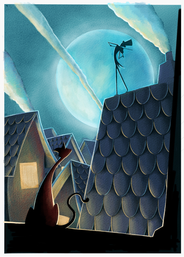
So I added the moon in, and before I put much more detail in I wanted to see what people thought. I moved the middle smoke stream a bit so that it doesn’t imply too much wind. I assume that a little breeze would push the smoke, but not his jacket. Or, I can just assume that he is really into his music and flinging his butt in such a way that the coat moves that way (idk lol)
-
Nice! the main guy stands out much better now. Now I'd take a look at the cat and see You can make is stand out more too.
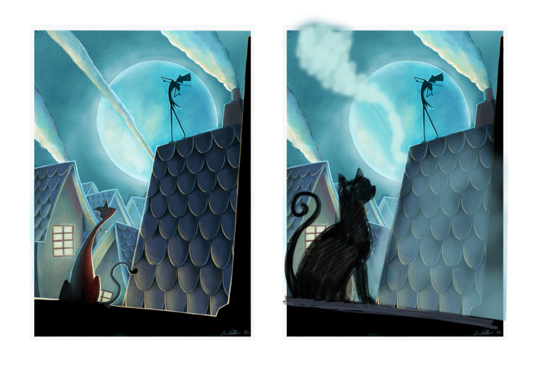
I tried to do a quick and ugly photoshop adjustment to see how you could approach it.
i lightened the houses and enlarged the cat a bit to frame him better an avoid some tangents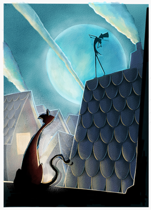
I really like the warm/cool diffence between the characters. maybe you could push that some more as well.
It is a great piece! I can't wait to see the final. -
@eric-castleman Better with the moon, though I think it works better brighter like the original. And is this digital?
-
@spencer-hale great idea. That is what I will do.
-
Here it is with the houses lightened up. Next I will work on the cat a bit more.
-
This looks so stunning. Amazing job!
-
@eric-castleman Hi Eric, This is a really nice piece and I think it might have more impact if the cat were bigger than the cricket...right now there're about the same size on the page. Your cat has more character than mine but I think you could stylize the profile better than from straight behind the cat? I don't know - judgement call? Also I don't think you need rim lighting to highlight everything - I think you have enough plane changes to do it with value. Hope this helps...
SVS Instructor
http://willterry.com/ -
@will-terry thanks for your time!! I like the direction you took this, and is very similar to the other critiques I recieved from Lee White. I will rework it with your recommendation.