Would love your feedback on this piece
-
I am pulling an all nighter and finishing up my book dummy so it can get printed before this weekend’s agent day. I hate this piece, but due to time restriction, I am forced to like
it.Any input would be appreciated. I will be up for another six hours, so if you are on and have anything to add to this piece I will be checking in every so often while I fight sleep...
-
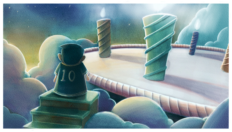
@eric-castleman I think it's all in the character could be a reasonably quick fix. He appears to be tweaked a little to much to the left I think if you rotate him clockwise more in line with the direction of the staircase it should be a good impact. Just getting a tiny shot of the side or edge of his face. Also make the body language a little more readable unless what you have is reading what you want it to. Cool work as always!
-
Hope I am not to late!
The main thing for me is the character... I agree with what @Tyson-Ranes said. I think it would also help to show his feet. Right now he kinda look like a wedding cake topper... He looks glued to the stair.
Love the color of the clouds and sky. I really struggle with using color freely. I am taking a class with Marco Bucci next month which I hope will help me.
Good luck on your project!
-
Could the character's shirt be shifted a bit more towards a warmer color? It might help him stand out against all of those cool colors. On a related note, the candle on the far right throws me off a little since its one of the more dominant warm tones but not really part of the focal point. The left-most candle seems like a better fit for that particular warm tone as it seems to match up with the characters line of sight.
Just some thoughts and observations! I think it's really not such a bad piece. It just needs a little nudging. Good luck!
")
-
Thanks everyone for all the help. Unfortunately I couldn’t pull it off. I just am not satisfied with the piece, and don’t want to present it this weekend. It is my fault for procrastinating. However, I will still be able to participate as an illustrator and have my portfolio with me. Thanks again.