Society of Visual Storytelling

    SVSLearn Forums

    • Register
    • Login
    • Search
    • Recent
    • Tags
    • Popular
    • Users
    • Groups
    • Search

    Hallow-ink wip

    Artwork
    3
    8
    1552
    Loading More Posts
    • Oldest to Newest
    • Newest to Oldest
    • Most Votes
    Reply
    • Reply as topic
    Log in to reply
    This topic has been deleted. Only users with topic management privileges can see it.
    • Russ Van Dine
      Russ Van Dine last edited by

      Looking for a critique, help me make this spectacular!
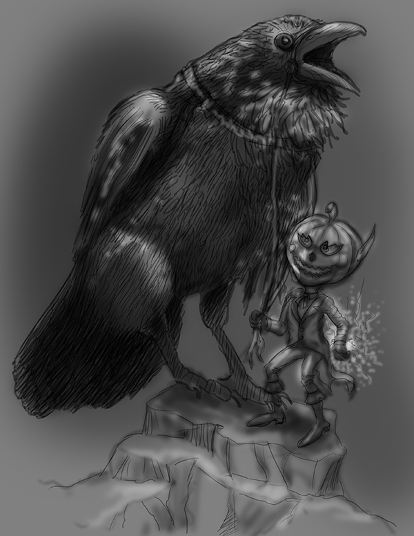
      0_1507350956110_raven.jpg

      Bursaroo 1 Reply Last reply Reply Quote 1
      • Bursaroo
        Bursaroo @Russ Van Dine last edited by

        @russ-van-dine tell me about this image what are you trying to accomplish? I like the raven, you've found a good reference for the energy I think you were trying to catch. personally, i think there are too many hatch lines evenly distributed over the body of the bird in a uniform fashion, which flattens the bird out but thats a small nit pick.

        https://www.instagram.com/bursaroo/

        https://bursaroo.deviantart.com/

        1 Reply Last reply Reply Quote 0
        • Russ Van Dine
          Russ Van Dine last edited by

          I will work the lines to bring more dimension in the bird, this is an updated version, worked the little pumpkin head a bit. I will add blues, greens and especially oranges with photoshop later. Trying to get the layout and design, and feeling complete with just black and white... thanks for your help.
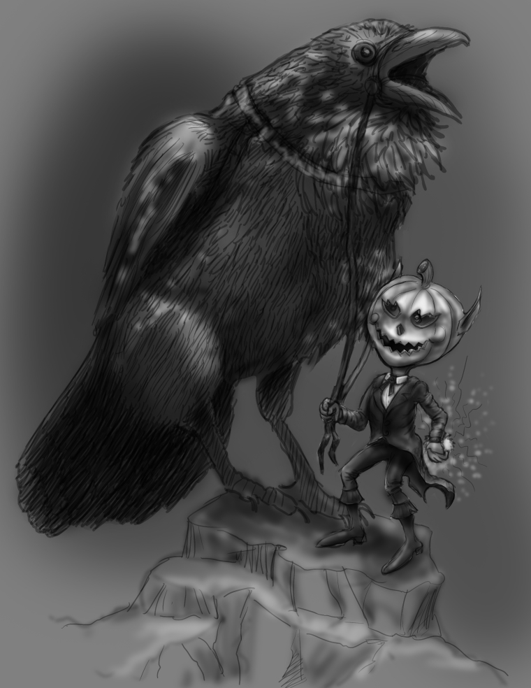
          0_1507404891874_raven1.jpg

          1 Reply Last reply Reply Quote 2
          • Russ Van Dine
            Russ Van Dine last edited by

            worked on the figure of the Halloween guy, changed arms and legs a bit and worked on his outfit.
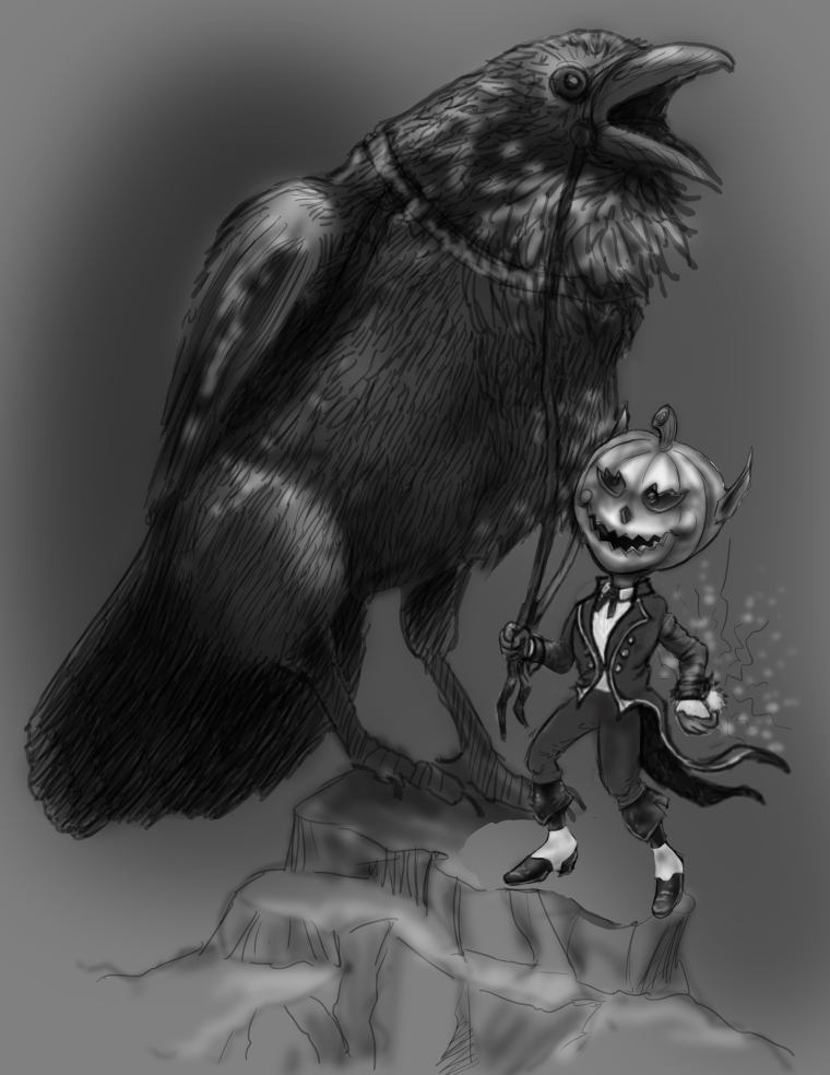
            0_1507500265936_raven2.jpg

            Russ Van Dine 1 Reply Last reply Reply Quote 0
            • Russ Van Dine
              Russ Van Dine @Russ Van Dine last edited by

              @russ-van-dine I think the left arm needs to move up a bit and he needs more of a shoulder...

              1 Reply Last reply Reply Quote 0
              • Russ Van Dine
                Russ Van Dine last edited by

                Coming along...

                0_1507709448190_raven33.jpg

                1 Reply Last reply Reply Quote 0
                • Russ Van Dine
                  Russ Van Dine last edited by

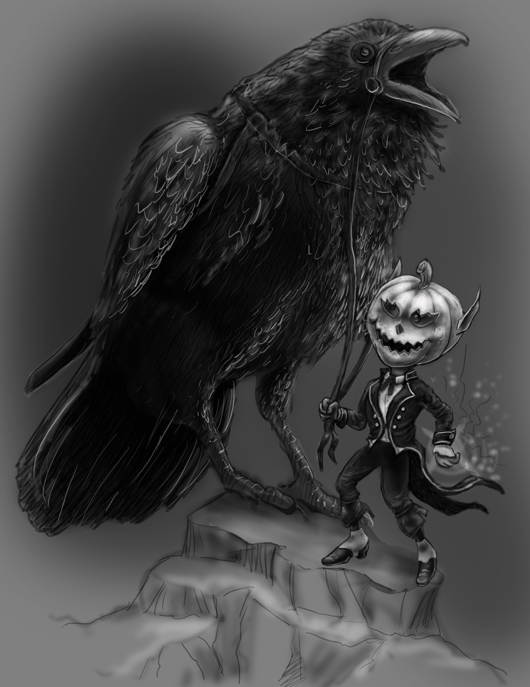
                  the character's head is the illumination point...

                  1 Reply Last reply Reply Quote 0
                  • DOTTYP
                    DOTTYP last edited by

                    Hi russ I dont really like to give critque but i really like this piece(nice idea) The white highlights seem a bit fuzzy and could be brighter and sharper it maybe needs more contrast or more differences in values.I know everyone wants something different and this is just my opinion.

                    scribbles.artstation.com
                    www.instagram.com/dottypaints

                    1 Reply Last reply Reply Quote 2
                    • First post
                      Last post