Alice in Wonderland - illustration series
-
Can I just say how much I LOVE the up/down text?
These are all amazing, seeing your process and the feedback has been so helpful. Thank you for sharing!
As to your questions.... I personally prefer the white border (over full bleed), and would likely trim them to keep the border thickness consistent - like you've done in the collage. Mostly hope that you get the most size you can squeeze out with each format because there are so many wonderful details to look at.
~ Pam
-
@smceccarelli Love the Rabbit Hole drawing! I agree with Pam about the border looking nice too. Do you think you will continue with this series? Are you submitting through SCBWI or will your rep be representing you in Bologna? Either way good luck to you - this a very impressive group of images!
-
@kevin-longueil @Pam-Boutilier thank you so much for the feedback! I will keep the white border then - I agree with your judgement.
I am submitting with the SCBWI extension, which is until Dec 2nd. The prints need to be physically in Bologna by then, so I am leaving two weeks for printing and shipment, which gives me three weeks to complete with color.
What with the expense and the loss of time, I really hate print submissions....
The illustrators accepted into the showcase (only about a third or a quarter of the submissions, I believe) get free access to the conference, plus a page in the conference annual. My agent would not be there in any case (she does not travel to Bologna), but for me it's only about 300 miles away - so if I get a spot it would be a good deal...
As for continuing beyond five, it depends how I like the style when they are finished. This is a bit of an experiment for me, it's much more design-driven than usual and I am a bit out of my comfort zone... -
@smceccarelli all so lovely--my favorites are the chesire cat (unique) and the bunny hole
-
I really like all of them. I'm sure they'll end up looking amazing in colour too.
-
Ok, first one close to finish. The final decisions are on texture and the balance of rendered and unrendered elements and final polish on light and color....feedback on either of those or on anything else is highly appreciated!
Also, I initially wanted to have a bit of text as part of every illustration, but now I am not so sure...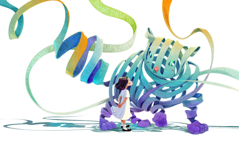
-
@smceccarelli Fantastic Illustrations! I think the words are a nice element to have. I guess you could try it all over the cat and see what happens, it might be really effective and clarify the idea more- either way you can save different versions of it if it doesn't work.
-
It's great, really. I like the text in the illustration. Is it acrylics?
http://wakeupmonster.co.uk/
instagram - @mfjamesillustrations -
@mf-james Thanks! I only work digitally...actually never used acrylics - my medium of preference used to be oil and pastel, but that was a long time ago....;-)
-
@smceccarelli These are amazing! I absolutely LOVE the ribbon Cheshire cat, colors, and texture! I
-
I got nothing constructive to say apart from that these are great pieces!
")
-
@smceccarelli This is looking really nice! I like the text in the illustrations - it gives a kind logic to the abstraction - for feedback i just have a couple little things - I know you have a deadline and this can easily stand the way it is - the first thing is that possibly the lines on three of the four paws are too dark and crisp - this is the only place where line seems to define form in the drawing - maybe just softening the lines a bit? The other thing is I keep getting pulled away from what should be the focal point - i don't have any good ideas to help solve this - maybe desaturate the extremities of the image and bring out Alice's silhouette out a bit? i feel like Alice could maybe pop more (possibly putting a wider ribbon behind her face so that you could really dial in that area of contrast?)...my eye keeps getting pulled to the saturated paws and the rich oranges and the high contrast spot in the ribbons that forms the tail - I'm at work at the moment so i have not tried this but I'm wondering how this would look using Lee's trick of applying the "cutout filter" in photoshop set to 5? - i think that spot on the tail might show as being focal - i could be totally off though
....feel free to ignore all of this - It really does look great! -
really good work here. I think you are leveling up on this one. Looks like your work just keeps getting better and better. : )
SVS Faculty Instructor
www.leewhiteillustration.com -
@kevin-longueil Thank you Kevin! I always hope to get your feedback because you always make such good points. The paws were disturbing me as well. So much so that I wiped them out and re-did them completely yesterday ;-).
As for the focal point, you are right. Alice is the point of highest contrast, but the saturation is getting in the way, so I am going to play with reducing the saturation of the outer sections and maybe also blurring the edges slightly, and reducing the contrast at the end of the tail (which is spot on the thirds line, so it´s a natural focal point as well). Thank you for pointing that out! -
@lee-white Thank you Lee - your words mean a lot to me here, because I am seeing my style change and it´s scary! I am so attracted by highly graphical work (Charlie Harper and co) and I had to see if there was a way to bring some of that sensibility into my own work - it´s a constant fight against the pull to render
")
I hope these could be both an exploration and a showcase - and if they bring me into Bologna, that´s just added bonus... -
I think you are finding a great balance between doing your more rendered style and including more graphical elements. Bravo! I always love seeing your work. I have to say, I love the shadow below the cheshire cat, its an odd thing to notice but it really helps with the believability of the image.
-
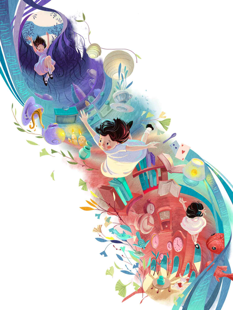
@smceccarelli These floor me. Especially the Down the Rabbit Hole. WOW.
-
I'm so glad you have a deadline because I want to see MORE!!!!

-
Second one down - missing final adjustments and of course hungry for feedback on anything that could be improved..
-
This is extraordinary @smceccarelli! I think this is perhaps my favourite of anything I've seen of yours. Well done! I could seriously look at that last one for days.
The only thing I'd say for a critique is that Alice is dressed pretty plain in my opinion. I'm wondering though if you did that on purpose - so that her surroundings really stand out and so then she looks even more out of place in this world? If that's the case, even just adding a simple ribbon around her waist would help I think. The middle one in particular looks a bit hospital gown-ish at the moment with how it's billowing.
I seriously think a publisher should hire you to illustrate a new take on Alice