Critique on memoir comic
-
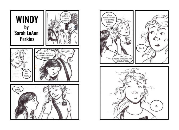
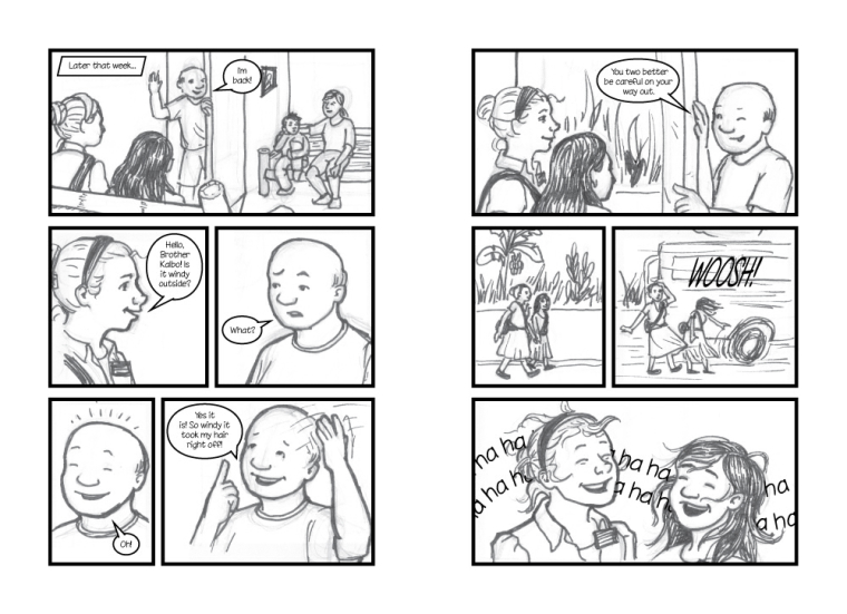
So I'm participating in a group creating a collection of memoir comics. They're all done by Mormon Missionaries about their experiences, though there is no religious message or moral. This is due on November 15th, though ideally I'd like to have it finished and turned in a bit before that.
This is my "tight sketch" version, there are obvious places where the drawing isn't right or I made a mistake on the lines, etc.. Its time to make any final changes before I ink the final version. I will be the first to admit that I'm pretty new to comics, so any hard core comics readers who can point out something that doesn't make sense with the way a comic "reads" would be especially helpful, along with anything else that I can fix before making the final. @Jake-Parker 's advice would be especially appreciated
")
Unfortunately, because the due date is coming up, I don't have time to make any LARGE edits. I did run it through a few critiques before bringing it to this point, just not on this forum.
")
-
Very fun story! I do have a two things: in the first panel, the dark hair of the sister on the left gets lost with the bag strap. Maybe shift the sister more to the left so she isn't in line with the strap. (I also don't think you need the left door jam showing...which would give you more room for the left sister.) And in the second panel you may want to draw a little more of the body. Right now it looks like a floating head--but that may be because it is halloween and I'm surrounded by that sort of thing.
It looks great, as usual! -
Great job Sarah stepping outside your comfort zone to try something new. I am not the one to critique a comic but as always I love your line work
-
Thanks guys
The funny thing is, both those things you mentioned @Joy-Heyer are because of how I dropped the sketches in--the "door jam" you mentioned was actually the edge of the panel in my sketch, but I decided to move it over for a bit more space, but my sketch didn't have that part completed. And I originally had the thought bubble filling the bottom of the second panel, but realized it worked better in the next panel when I was laying out the text, thus the floating head. Thats a good point about the shoulder strap and the hair though, I will have to keep my eye on that as I ink the final.