Portfolio piece Critique and Feedback
-
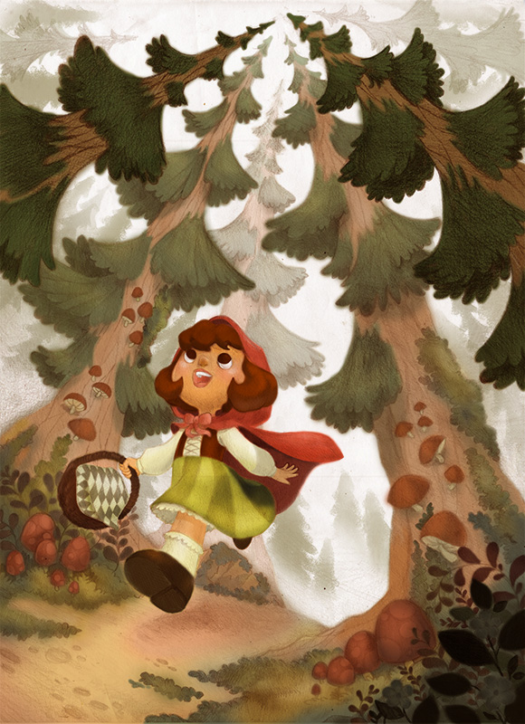
Hi, guys! I made this illustration hoping to add it to my portfolio. Before I do, I would like to ask some critiques from you, lovely people of SVS. I first sketched and shaded it on paper and then I colored it in photoshop. Please let me know if there's anything I should work on more. Thank you so much!
-
Very cool illustration, love the style! One thing that strikes as food for thought is the mood control through color and light. At the moment I could not say what the mood of the illustration is. The expression on the face suggests “happy” but the lighting is diffuse like in an overcast day and the yellow sky has a hint of ominous - yet the color palette is too light and saturated to convey a sense of impeding danger. Also, I would suggest changing the cast shadows to be consistent through the illustration as well as with the lighting. In an overcast day (as the one suggested here by the uniform lighting of the background) there is nearly no cast shadows - they are very very subtle. On a bright sunny day, the cast shadows have sharp edges and a high contrast with the rest of the environment. Here you are somewhere in between and the edge of the shadow is mushy but the shadows are too dark and too defined -it makes them look artificial. Just some thoughts on how to make a good illustration possibly even better!
-
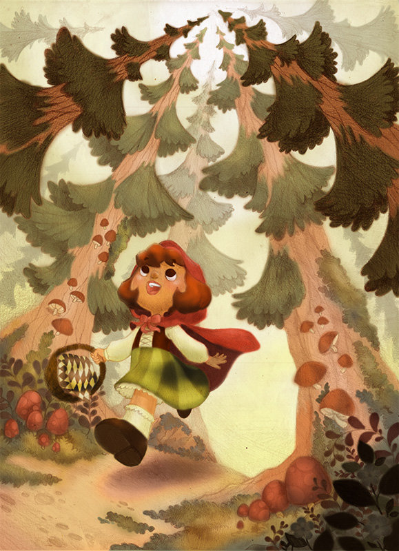
@smceccarelli Hi!! Thank you so much for your feedback. Yes, I do think I can improve on my colors. I must admit I wasn't really sure if I wanted a light and happy atmosphere or a dark and ominous one. Now that you've pointed that out, I guess I have to make up my mind right here and now :3 ... I feel like gravitating towards the ominous vide. An ominous vide would indeed add variety to my portfolio which is currently full of glitter and happy unicorn poop (just joking)... I might need to add more trees in the background. Possibly some fog and perhaps a silhouette of the Big Bad wolf staring at our character. As for the cast shadows, thanks for pointing that out too. I didn't really put much thought on that and just thought that I could get away with it. hehe... I'll work on that too. Again, thank you for your feedback. It helps a lot.
-
Here's my revised version. I was going for the slightly dark and ominous feel. I changed the background color to a muted warm grey. I also added more trees to emphasize that our character is in a forest, a fog covered forest. I also tweaked the shadows a bit in the middle ground. I hope you like this guys. Please tell me what you think.
Portfolio: nyrrylcadiz.com
Instagram: https://www.instagram.com/nyrryl_cadiz/
YouTube: https://www.youtube.com/channel/UCbJCF1Im8ZO7hpGWTKOJMuA -
Hello, you have some very nice work here. I noticed a couple of things for you to consider, the red on the mushrooms is very close to that of the girls cloak which is good for unity but being red it lends attention to them. I feel like the trees create a strong directional element that lead the eye from the girl right out of the picture. The shadow from the girl's arm seems a little dark. I hope these comments help.
-
This is wonderful! Only critiques I have are:
-
I think the cast shadow from the arm onto the dress is too dark.
-
You have wonderful pencil textures going on in the piece, I'd bring them into the hair as well.
Website: www.tessawrathall.com
Instagram: www.instagram.com/tessawrathall_art/
-
-
@rcartwright I'll take note of the mushroom's color. I'll try to choose another color.
-
@tessw Thank you! you're very helpful. Yeah, the hair doesn't have a lot of texture. I was planning on making the character a blonde so I kept the pencil shading to a minimum. Now that you've pointed that out, I'll try to add in more texture.
-
@nyrryl-cadiz The pattern on the cloth in the basket is competing with the ferns on the ground a bit for me, and the basket overall is getting a little lost against the similar color palette of the midground. I'm also wondering if the shadow that her arm is casting on her dress is a bit dark considering the overall lighting? But I'm loving the trees and the texture.
-
@laurel-aylesworth Hi! Thank you for the feedback. The pattern on her cloth in the basket is supposed to be in contrast with the ferns. Since its a key element of our character, I decided that It should have more emphasis than our ferns in the midground. As for the shadow on her dress, that is not actually caused by her hand. It is caused by the bending of the fabric. But I must admit it is a tad bit too dark. Again, thanks. I'll consider all of your feedbacks.
-
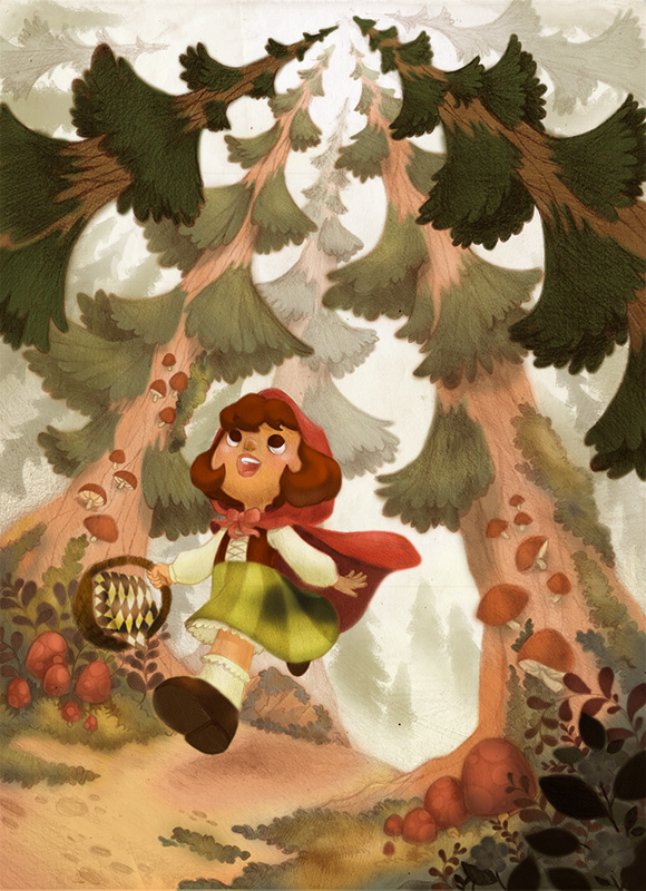
Hi, Everybody! Here's my final illustration. Here, I added texture to the hair by making some cross-hatching using adobe. I also added shadows on the character especially on her right arm to emphasize that it is under the hood/cape. I removed the cast shadow on her skirt to avoid confusion. That shadow wasn't created by her hand but by the bending of the fabric. then I changed the color of the basket to add contrast with the midground. I was going to change the color of the mushrooms but I decided not to. I like the piece as it already is. I hope you guys love it. Again, thank you for all your feedback. Thank you for helping me polish this piece. I'll be uploading it to my portfolio shortly. If you want to view it please click on this link https://nyrrylcadiz.wixsite.com/portfolio