SOCK MONSTERS
-
Continuing to experiment - and doing scary things.
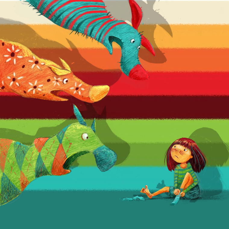
I am doing mini-series of three illustrations for my Instagram channel. This week it will be socks monsters. The background came in by a lucky accident, and now I quite like it - but I am wondering if it is too much or just, scarily, the right thing for this piece.
Opinions welcome!
-
Awesome piece!! I love the monsters and the colors, and for me, the background works great. It ties together the palette and, more importantly, is wonderfully SOCK-y!
-
I love it (I love all of your stuff!).
For me the middle dark burgundy/brown stripe competes with the girl a bit (maybe it's the contrast?). The concept is so cool, and I think the other stripe colours tie it together so nicely!
~ Pam -
at first its super great!
 however i you are looking how to make it perfect, then perhaps switch colors round so the red nose of the top monster stands out more. I have noticed that you are using a lot of vibrant colors lately, works well! Anyway its very joyful!
 -
Thank you all! @aska I will change the red nose or add a rim light to it. @Pam-Boutilier I tried things around, but the burgundy stripe in the middle actually help direct the focus to the girl, so I decided to leave it. This is truly an experiment for me - and now I am starting to enjoy this experimental phase - I think every artist should try extreme things now and then!
-
@smceccarelli Love it as usual

-
Hi @smceccarelli this is great, love the designs and concept
-
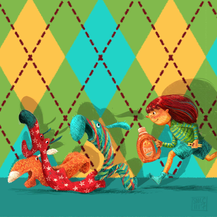
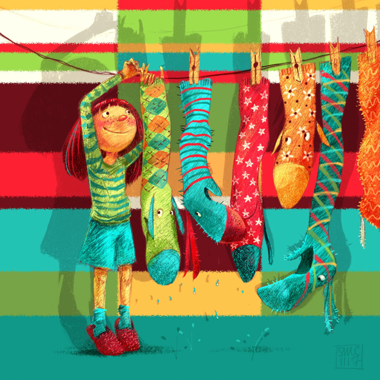
Posting the other two in the series (as mentioned elsewhere, I do series of three for social media) - not only they make IG look a lot better, one also learns much more from any single experiment or idea!


-
@smceccarelli These are all so good!
-
@smceccarelli I love the pencil texture on it and vibrant colors, so cool!
 Concerning the middle one, do you mind showing it without red crosses on the wall? Just curious, but if you don't want to, just ignore me
-
@smceccarelli These are fantastic!
-
Love love love!
 ️
️  ️
️