Would love to give a critique
-
This was a piece that I worked on in the past week and although I want to consider it to be finished, if there is anything you would recommend to improve upon then I would appreciate the advice. Thanks
-
@aska Hi Aska,
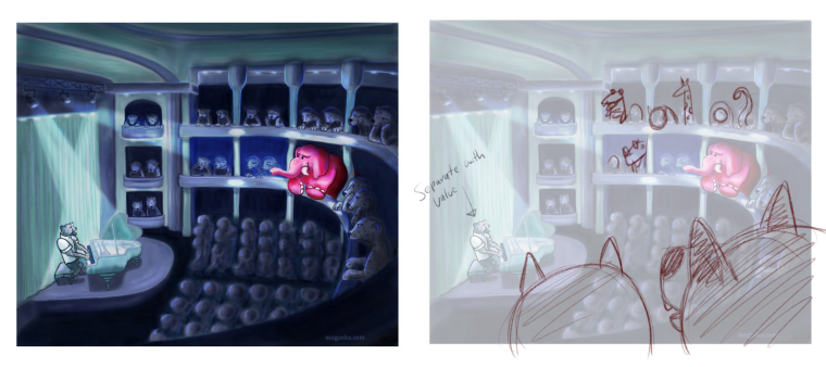
Thank you for sharing this! It's a really fun piece! It's also the nightmare for many illustrators - the dreaded crowd scene! So here's what I would change:
-
If you bite it off you have to chew it. So you have to add more detail to the individual animals in each seat. Your characters aren't far enough away to paint as simple color/value shapes. So you need to add more detail to most of these.
-
BUT! There's a way to minimize the pain - by overlapping a few patrons in the foreground you can both increase your dynamic design and reduce the work load.
-
The main character is separated from the background with black line work while many of the characters are defined by value. You need to pick one or the other for consistency.
-
I would vary the animals/shapes of the others to create variety and interest.
Again - thank you!
SVS Instructor
http://willterry.com/ -
-
Hey glad I saw this! I am very new at SVS - first time looking at the forum. And I am not a student.. I graduated art school back in 1993! But I am trying to break free from the graphic design world and improve my illustration marketability. Would LOVE your feedback. This is not from a book, but it is my latest client work and still geared towards kids. My work is all vectors.

-
This is called Glacier. I was trying a different style focused on more graphic shapes. -
it is WIP, but I would like to hear some critique at this stage too!
-
@will-terry Thank you for your comments! I must admit that I got a bit overwhelmed with this piece because of the crowd. It was just too much for my abilities and speed of drawing. So i was secretly hoping that I can get away with it, drawing attention to the elephant, but clearly it didn't work 100%
") I will keep your valuable tips and try to rework it in few months. Thanks again
I will keep your valuable tips and try to rework it in few months. Thanks again ")
-
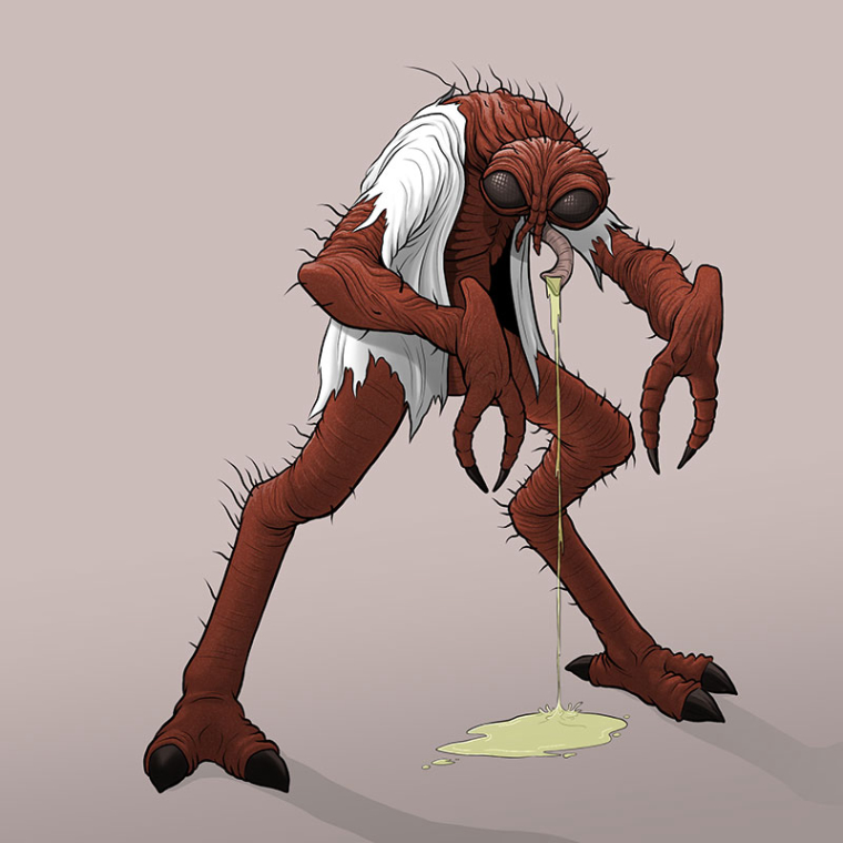
I've not been doing full illustrations with backgrounds for a while, just characters for the #animalalphabets challenge to keep my eye in. I'm not sure how much of a crit you can give based on a single character but I'd be happy to hear your thoughts! This was F for The Fly. They've gone from cute animals to horror for some reason. I think I'm better at the scarier animals than the cute ones!
-
@ben-migliore That is lovely!
-
@ians thank you

-
Here is one I am proud of, but feel it is lacking and could be even better.
-
@laurel-aylesworth I love this Laurel!
-
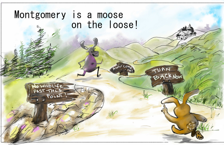
Trying to figure out composition - still have to redesign moose as well. Any critiques welcome!
-
@will-terry I would appreciate any feedback you have time for on this piece. I am fairly new to SVS . Your classes have been very helpful. I am trying a career transition from Industrial Design to illustration. This is a stand alone sketch used for rendering practice. Not part of a larger story. I am a sketcher trying to develop my color and paint technique and less emphasis on line. Thank you

-
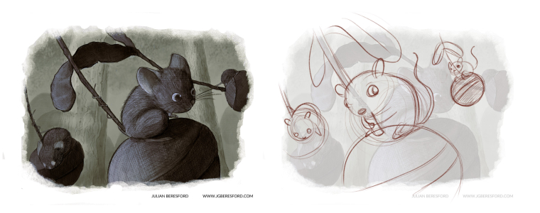
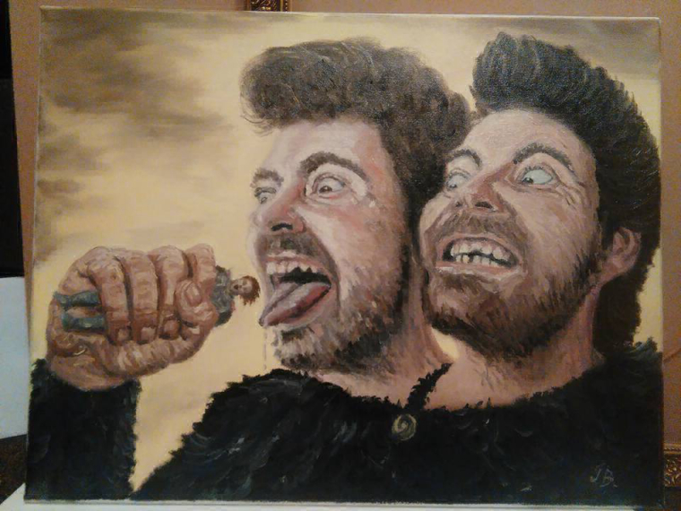 Hey Will, you can critique my slovember painting if you have time. Thanks
 -
@julian-beresford Hi Julian - thanks for playing!
I really like your subtle color scheme and textures - also your value relationship between the foreground and background is nice and legible. Here's what I would change:
-
You're too zoomed in and I'm having a hard time understand what the structures the mice are actually sitting on? It's like if you tried to put this into words but you started in the middle of the story instead of giving your viewer set up. "...started swinging back and forth." but if you pan out you could be saying, "The mice jumped on the _________ (I don't know what they are) and started swinging back and forth". You have to realize that your viewer is coming in cold. So- you need to show us an entire___________ that they are swinging on - not have all of them cropping out of the image.
-
Unless you wrote a story about mice with prehensile tails you should probably not give them powers they don't normally have - otherwise it draws a lot of attention to an aspect that isn't part of the story.
-
Your drawing on the mouse in the foreground is a little off - it will come with more observation and practice.
Thank you - I love the feel of this one!
SVS Instructor
http://willterry.com/ -
-
Hi Will, thanks for giving us this opportunity
If I may, here's something to throw in the ring. I was proud of it last month but now it feels too empty in some parts and too full in others and everything feels too sharp? I'm not sure how to balance things out

-
@will-terry Hi Will, Thanks this is great, I think being too zoomed in is what was throwing me off. I've been playing around with adding more texture to my illustrations, so I'm glad that's working.
I based my characters on the British harvest mouse which has a prehensile tail but I guess the viewer might not know that.
I'm going to redo this one with your suggestion and repost it, Glad you liked it and thanks again, it's appreciated.
-
@pamela-fraley Thank you for posting this image! Your drawing and design are really nice. It really depends what you want to say with this one. I don't think there is much to change if anything if this is a gallery piece. If it's for decoration you may not want to change it.
I'm usually in illustration mode so for the sake of this thread I assumed you might be trying to say something about this particular artist. If so - I would try to draw more attention to her than the rest of the objects in the room. As you have it everything that's a light color (white - off white) is contrasting against the dark blue walls - which gives everything of equal contrast - equal attention or focal point. If you knock all the non-essentials back in value and keep the contrast on the artist you can make a more powerful statement.
I also changed her light to a desk lamp so the back and background in the upper right could also go dark to keep the eye out of the corner.
Thank you,
Will
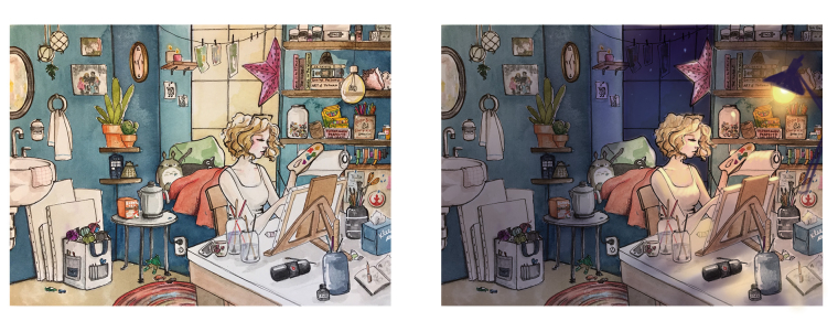
SVS Instructor
http://willterry.com/ -
@will-terry Thank you! It’s amazing how much that refocuses the piece! THis is actually an imaginative picture of me in my dream art studio... that I don’t actually have. I’d like to revisit it again, but since I work traditionally, it’ll be a bit. I really loved how accessible you made this assignment with the class.
-
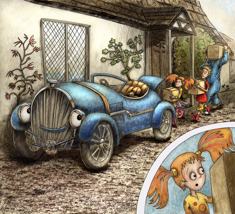
Scary putting this up for a critique. Just to say, the box is supposed to cover grandads face. The writer has the grandfather a kind Wilson character from home improvement. It’s supposed to be early morning, but I couldn’t quite get the light right on it.
Helping writers tell their stories