Would love to give a critique
-
@will-terry Thank you ! oh yeah that is true... I will not post WIP next time for this type of critique

-
@miriam Hello! just now checking back in after the holidays and saw your very thoughtful crit. Thank you for spending the time to give feedback. Lighting and color is a big struggle for me. I agree with all your comments, not sure how to fix yet. With a night scene I know things are diffused but I was trying to add some color ...Yes, shadow will help and the ear is odd now that I look at it. Speckles were to be stars but since you picked fireflies, I will say that was what I was going for
") I will go back and review rabbit feet anatomy. Thanks again for the time and effort to give some great feedback, very much appreciated!
I will go back and review rabbit feet anatomy. Thanks again for the time and effort to give some great feedback, very much appreciated! -
@jbleau
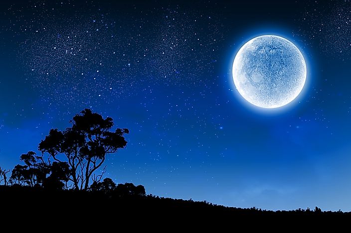
Ha, ha! Of course that's what you were going for.") They do make good stars, too. The reason I went with fireflies is because there are a few speckles in front of the moon & a couple of the boards that are flying up above the dog. For stars, I would make sure they aren't overlapping anything. With a full moon, I might keep them away from the moon--or at least have less right next to the moon, as the brighter light would probably drown them out. Mist/Clouds would diffuse the stars as well. Another idea is to vary the size and brightness. Something like this (just images from a quick Google search):
They do make good stars, too. The reason I went with fireflies is because there are a few speckles in front of the moon & a couple of the boards that are flying up above the dog. For stars, I would make sure they aren't overlapping anything. With a full moon, I might keep them away from the moon--or at least have less right next to the moon, as the brighter light would probably drown them out. Mist/Clouds would diffuse the stars as well. Another idea is to vary the size and brightness. Something like this (just images from a quick Google search):
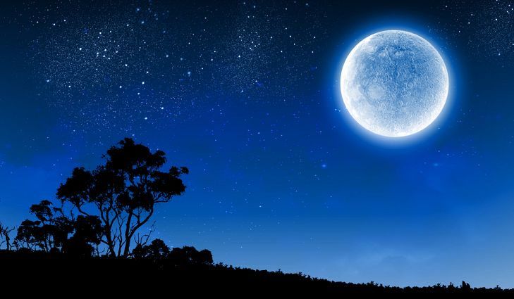 https://www.worldatlas.com/r/w728-h425-c728x425/upload/88/8c/97/shutterstock-230650243.jpg
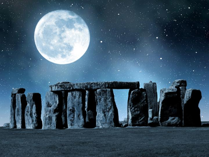
https://www.almanac.com/sites/default/files/styles/primary_image_in_article/public/image_nodes/stonehenge-moon.jpg?itok=-DKAyI-r...but of course, there's always artistic license!
I did another Google search for "rabbit foot underside" and it looked like I might be wrong when I saw a photo with spots on that end of the feet, but it turned out to be a condition called "sore hocks". Rabbits need to have appropriate bedding or their fur can get rubbed off & even develop sores. Poor bunnies!

It looks like (at least some--maybe all?) rabbits don't have pads like dogs and cats. They just have fuzzy feet. They're pretty cute!:
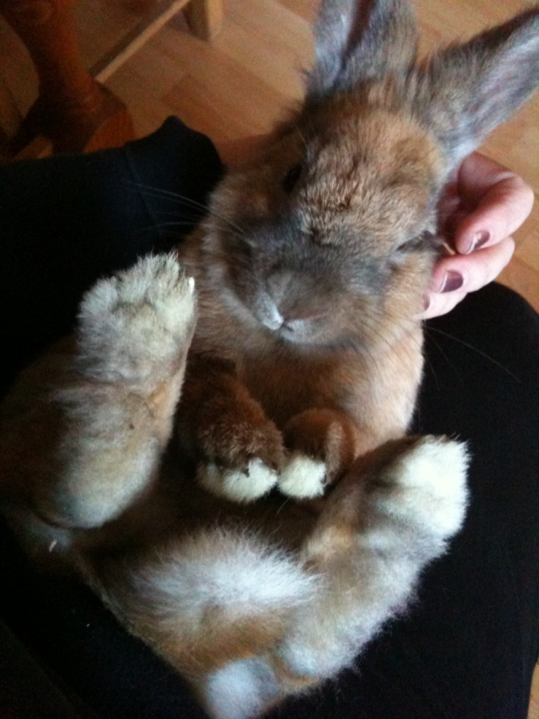
https://static1.squarespace.com/static/59171732db29d6960a15348e/592091cb890b277866d108fc/59209334890b277866d16516/1495804362859/2011%2C+11-17+What+Big+Feet+You+Have!.jpg?format=1000w
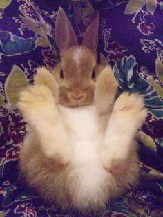 http://aapetservices.com/wp-content/uploads/2016/03/rabbit.jpg
I love Google image search! It's great for reference.
-
@jbleau
I know what you mean about light and color! I'm completely clueless, and excited to learn about it, but I'm not sure if I should try to learn a little bit of different techniques and skills, or first focus on basic drawing skills. I think I'll at least get through the "How to Draw Everything" and other basic classes first, before studying color and light.It just amazes me when I pay attention to the lighting effects applied to some illustrations! ...someday (I hope!)
It's good to have things to work toward and aspire to!I need to work on practicing the drawing exercises, and drawing pictures, then be brave like you and post stuff!
-
Hi Tom,
Thank you for sending this one! I like the overall feel and style. My comments are mostly going to be about utilization of space, variation of the size of shapes and overall design. Some of what I think you should change is very subjective.
-
When you add a strong foreground item like the wheel - it will often melt into the environment if it overlaps your focal point characters.
-
When you introduce a non-focal point item - the same wheel in the foreground - you should look to vary the exit lines where it crops - not keep them the same or else it draws attention to the corner.
-
If you vary the line weights of your objects you can build more interest and make your images more dynamic! The trim on your mirror, the mechanical belt, the pipes, the braces, etc. are almost all the same width.
-
Overall it's important to know that the beginning artist tends to make interior spaces more open and sparse and the more advanced illustrator tends to fill interior spaces in a more natural predictable way.
I hope this helps! Thank you,
Will
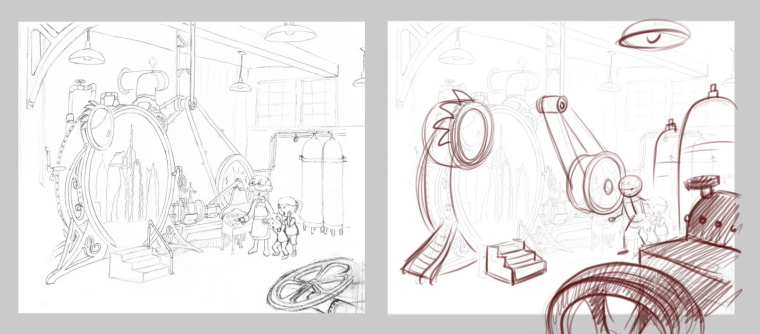
SVS Instructor
http://willterry.com/ -
-
@will-terry Thanks for taking the time to comment on my illustration. Helps immensely. Will rework this and try and repost here in the forum soon.
-
@missmushy Thank you for posting this one...
Here's what I would change:
-
Figures are more dynamic and interesting than signs so I would make the moose much larger in your composition.
-
If you arrange your signs in the voided spaces between your figures you will create a more natural fitting composition. Right now you have the sign bumping into the top of the rabbit's head.
-
In general if you treat your text as an object along with the signs and the figures you can use up your dead space giving more space to the essentials. In this case I think the text fits better at the bottom.
-
Working on getting more accurate anatomy in your characters will be less distracting to your viewer.
Thank you - fun piece!
Will
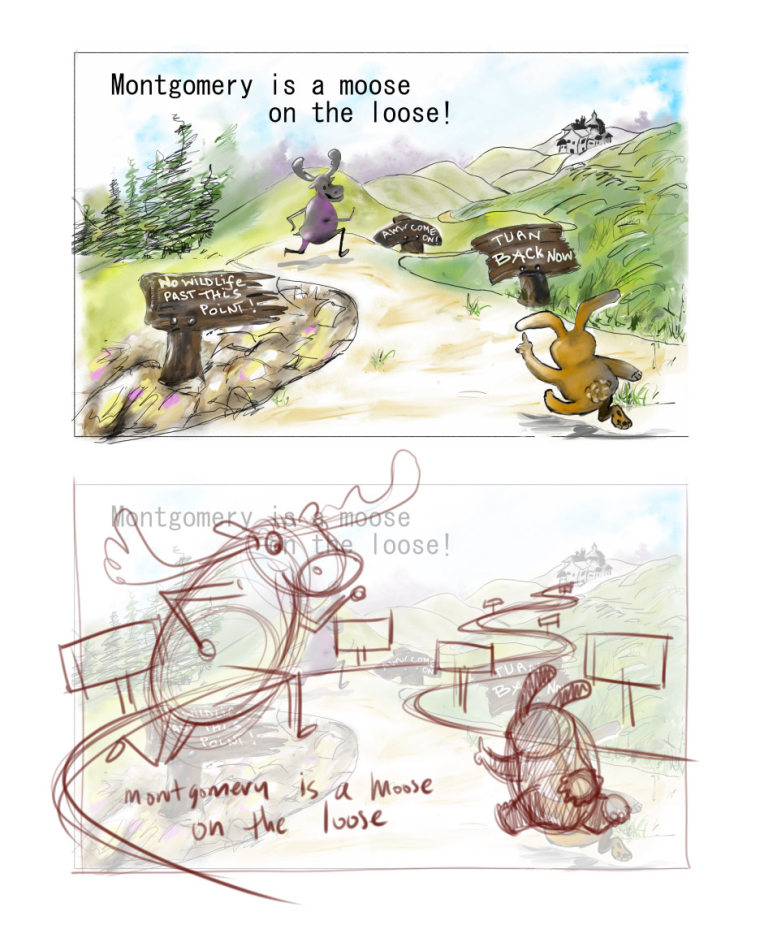
SVS Instructor
http://willterry.com/ -
-
@will-terry Thanks soooo much! I was struggling with fitting those signs into the frame that I was thinking I would just lose them altogether but I see how it could work now. I see what you mean about character size. I think I was thinking moose was in distance so should look smaller but I see what you mean. Just watched your classes on character design and poses so have lots of beans to draw to get my characters right! Thanks again for taking your time to give me feedback - truly appreciate it!
-
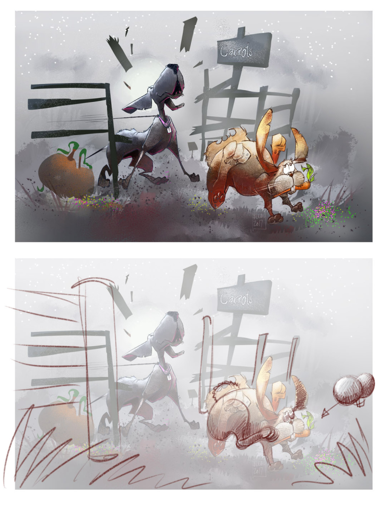
@jbleau Thank you for uploading this one!
I'm not going to critique story content as you mentioned that you're just using this piece for rendering practice.
Here's what I would change:
-
I made some drawing changes and even though they aren't part of the rendering - I think they are worth mentioning. Watch your perspective on objects that come toward your viewer - they need to get larger.
-
Whenever you can avoid objects with severe fore-shortening you'll be able to communicate more easily - so I moved the rabbit's leg more towards 3/4 view.
-
Your lighting needs to remain consistent throughout. Looking at your dog for lighting cues we can tell that the light is coming from above and behind your characters - but it breaks down on the rabbit.
-
I would add some foreground elements to build depth.
I really hope this helps!
Will
-
-
Hi Will! Thank you so much for this opportunity to get feedback.
-
Hi everyone,
Thank you for participating!!!!
I'm going to close out this thread since it's getting really hard for people to find now.
I started a new one today for critiques. If you didn't get your piece critiqued here on this thread you can re-upload to the new one. I decided to try to help more people and generate more interest by showing my critique in a Facebook Live Broadcast.
Here's the link to the new thread: http://forum.svslearn.com/topic/5418/critiques-for-a-facebook-live-in-february
-
@will-terry I hadn't checked in a while, didn't realize you did this. Thanks for taking the time!